

To really move the needle on your website's conversion rates, you have to get inside your users' heads. What do they actually want? What's stopping them from clicking that "buy" button? This all starts with a deep dive into user behavior, using tools like heatmaps, picking apart underperforming pages, and setting a clear, data-backed baseline before you change a single thing.
Auditing Your Current Conversion Performance

Before you can start boosting conversions, you need to know exactly where you're starting from. It’s tempting to jump right into making design tweaks or rewriting copy, but without a solid baseline, you're just guessing. Think of it as trying to navigate a new city without a map—you'll end up somewhere, but probably not where you wanted to go.
A proper audit gives you the hard data you need to build a smart, targeted optimization plan. This isn't about hunches; it's about finding concrete evidence of what's working and, more importantly, what’s falling flat. And the very first thing you need to do is define what a "conversion" actually means for your business.
Defining Your Key Conversions
Let's be clear: not all conversions are the same. For an e-commerce store, a sale is obviously the big prize, but plenty of other user actions are valuable signals that someone is on the right path. We usually break these down into two groups:
- Macro-conversions: These are your main business goals. We're talking about the big-ticket items like making a purchase, requesting a quote, or signing up for a paid subscription.
- Micro-conversions: These are the smaller, yet crucial, steps a user takes on their way to a macro-conversion. Think of them as breadcrumbs of engagement—signing up for a newsletter, adding an item to a cart, or watching a product demo.
Tracking both gives you a complete picture of the customer journey. You'll start to see how small wins on micro-conversions can directly lead to those bigger, business-defining results.
Pinpointing Performance Issues with Analytics
With your goals clearly defined, it's time to get your hands dirty in the data. Your analytics platform, like Google Analytics, is a goldmine for spotting which pages are letting you down. Start by looking for the outliers—pages with tons of traffic but terrible conversion rates or unusually high exit rates. These are your low-hanging fruit.
A high exit rate on a product page isn't just a number; it's a giant red flag telling you that something is pushing people away at a make-or-break moment.
Take a look at your user behavior flows. They can show you the exact spot where visitors are giving up and leaving your site. For example, if you see that 70% of users are abandoning their cart right after they see the shipping costs, you’ve just uncovered a massive friction point that needs to be fixed, fast.
For a step-by-step guide on digging into these issues, you can follow our complete process for an e-commerce website audit.
Boosting Conversions with Better UX and Design

Great design isn’t just about looking good—it’s about making your website feel effortless. When someone lands on your site, they shouldn't have to think. The path from "just browsing" to taking action should be so intuitive it feels like second nature.
A clunky or confusing experience is the digital version of a locked door. It creates friction, breeds frustration, and is a surefire way to send potential customers straight to your competitors. Improving your user experience (UX) and overall design is one of the most powerful ways to build trust and guide visitors smoothly toward a conversion.
Streamline Navigation and Declutter Your Pages
Think about walking into a messy, disorganized store. You’d probably turn around and walk right out. Your website is no different. If people can't find what they're looking for in just a few seconds, they'll leave.
Your navigation needs to be simple and predictable. Stick with clear, common labels like "Products" or "Contact Us" instead of trying to be clever with vague terms that just confuse people. A clean layout with plenty of white space is your best friend—it helps users focus on what actually matters: your message and your call-to-action.
Good UX design isn't about adding more features; it's about removing every possible obstacle between the user and their goal. Each unnecessary element you remove makes the conversion path clearer.
For instance, a landing page crammed with competing offers, pop-ups, and rambling text is overwhelming. By stripping it down to a single, focused message with one clear CTA, you create a direct and persuasive path to conversion. For a deeper dive, check out these essential eCommerce user experience best practices.
Master Your Mobile Experience
Let's be blunt: a poor mobile experience is no longer an option. A huge chunk of web traffic comes from smartphones, so a site that isn’t built for mobile is actively turning away business. A responsive design that adapts flawlessly to any screen size is just the starting point.
Buttons need to be large enough for a thumb to tap easily. Forms should be simple to fill out on a small screen. And text must be readable without the dreaded pinch-and-zoom. If your checkout process is a nightmare on a phone, you're losing sales, plain and simple. The goal is to make the mobile journey just as seamless—if not more so—than the desktop one.
The numbers don't lie. Data consistently shows desktop users convert at a much higher rate (4.8%) compared to mobile users (2.9%), even though phones drive most of the traffic. This gap is a massive opportunity for any business that can nail mobile usability. You can dig into more industry data by reading the full Statista report on conversion rates.
Create Calls-to-Action That Demand a Click
Your call-to-action (CTA) is arguably the most important element on any page. It's the final instruction, the nudge that gets a user to act. To make it work, it has to be impossible to miss and irresistible to click.
Here are a few quick tips to make your CTAs more powerful:
- Use Action-Oriented Language: Ditch "Submit" and try something like "Get Your Free Quote."
- Create Visual Contrast: The button's color should pop against the rest of the page.
- Keep It Above the Fold: Place your primary CTA where people see it without having to scroll.
By focusing on these design and UX fundamentals, you can build a website that doesn't just attract visitors, but actually turns them into loyal customers.
Writing Compelling Copy That Actually Sells
A slick design can catch someone's eye, but it's your words that have to do the heavy lifting. They're what ultimately convinces a person to stick around, sign up, or buy. Conversion copywriting is less about sounding clever and more about answering one simple question for every visitor: "What's in it for me?"
If your copy doesn't nail that answer right away, they're gone.
This all starts with your unique value proposition (UVP). Think of it as your elevator pitch, boiled down to a single, powerful sentence. It needs to tell people exactly what you do, who you help, and why you're the best choice. Make it the first thing they see, and leave no room for confusion.
From Features to Benefits
Here’s a classic mistake I see all the time: businesses get caught up listing features instead of selling benefits. A feature is what something is—like "10GB of cloud storage." A benefit is the real-world outcome—"Never worry about losing your important files again."
People don't buy drills; they buy holes in the wall. They’re buying a better version of themselves or a solution to a nagging problem. Your copy needs to be all about that desired outcome.
Remember, your customer is the hero of the story. Your product is just the trusty sidekick that helps them succeed. Frame every headline, description, and call-to-action around their win, not your product's specs.
Making this mental shift from features to benefits is one of the fastest ways to improve your conversion rates. It bridges the gap between what your product does and what your customer actually wants.
This infographic breaks down just how much of an impact benefit-driven copy can have on the numbers that matter.
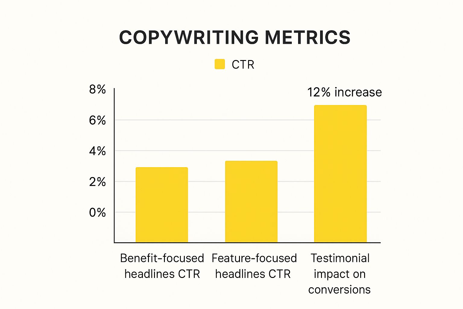
As you can see, simply rephrasing a headline to focus on a benefit can seriously boost your click-through rate. And adding social proof like testimonials? That's a proven conversion-lifter.
Building Trust with Social Proof and Microcopy
Trust is the bedrock of any transaction. Without it, you get nothing. The good news is you can actively build it right on your website by weaving in social proof.
Here are a few ways to do it:
- Customer Testimonials: Don't just pull a generic quote. Use real words from real people, and add their name and photo for an instant dose of authenticity.
- Case Studies: Go deep. Tell a detailed story about how you took a client from point A to point B, solving a specific, relatable problem.
- Trust Badges: Little logos from security providers, industry awards, or well-known partners can go a long way in building instant credibility.
Even the tiniest bits of text—what we call microcopy—can have a massive impact. Swapping out a generic button like "Submit" for something like "Get My Free Guide" does two things: it clarifies what happens next and frames the action as a win for the user.
These small tweaks chip away at friction and user anxiety. Keep in mind that conversion rates can swing wildly depending on your industry and where your visitors are coming from. People who type your URL directly into their browser already trust you, so they naturally convert at a higher rate. If you're curious how you stack up, you can discover insights about industry conversion rates on ruleranalytics.com.
Optimizing Your Website Speed and Performance

Let's be blunt: in e-commerce, speed is money. A slow website isn't just a minor annoyance for your visitors; it's a conversion killer that actively costs you sales.
Think of your site's load time as the line outside a physical store. If it’s too long, people will leave before they even see what you're selling. Shaving off seconds—or even milliseconds—from your load time is one of the most powerful things you can do to boost your bottom line.
Why a Slow Site Sinks Sales
The link between a snappy website and a happy customer is crystal clear. Faster sites just feel more professional and trustworthy, which goes a long way in convincing someone to pull out their credit card. More importantly, speed removes friction. It keeps a potential buyer engaged from the moment they land on your page all the way through checkout.
The data doesn't lie. Even tiny delays can have a massive ripple effect on your revenue. One study found that websites loading in one second had conversion rates five times higher than sites that took ten seconds to load. Despite this, so many online stores are sluggish, which creates a huge opportunity for you to get ahead.
A mere one-second delay in page load time can lead to a 7% drop in conversions. If your store makes $100,000 per day, that single second is costing you $2.5 million in lost sales every year.
This stat alone should make it obvious: site performance isn't just a job for your developer. It’s a core part of your business strategy.
Based on industry averages, the potential for improvement is staggering. A faster site doesn't just provide a better user experience; it directly translates to more sales.
Impact of Load Time on Conversion Rate Lift
| Page Load Time | Potential Conversion Rate Lift (vs 5s Load Time) |
|---|---|
| 5 seconds | Baseline |
| 4 seconds | +5% to +10% |
| 3 seconds | +15% to +25% |
| 2 seconds | +30% to +50% |
| 1 second | +60% to +100% or more |
As you can see, the gains become exponential as you get closer to that instant-load feeling. Every second you cut makes a real, measurable difference.
Actionable Steps for a Faster Website
So, how do you get faster? You don't necessarily need a complete site overhaul. Often, the biggest performance boosts come from a few strategic tweaks that are easier to implement than you might think.
Here are three high-impact areas to get you started:
-
Shrink Your Images. This is the low-hanging fruit of site speed. Huge, unoptimized images are the number one cause of slow pages. They eat up bandwidth and take forever to load, especially on a phone. The good news is you can compress them to dramatically reduce file size without any noticeable loss in quality. It's crucial to learn how to speed up your website by compressing images.
-
Use Browser Caching. Caching is like giving your returning visitors a VIP pass. It stores static parts of your site (like your logo, CSS files, and key images) directly on their device. The next time they visit, their browser loads those files from its local memory instead of downloading them all over again. The result? Near-instant page loads for repeat customers.
-
Cut the Code Bloat. Every app, plugin, and third-party script you add to your store adds a little bit of weight. Over time, this can really bog things down. Do a regular audit of everything you have installed. If you're not using it, get rid of it. A lean, clean codebase is the foundation of a fast-loading website.
Tackling these three areas will put you well on your way to a faster, higher-converting store. For a deeper dive into these and other powerful techniques, check out our complete guide on how to improve website loading speed.
Using A/B Testing to Make Data-Driven Decisions
So you've fine-tuned your copy and boosted your site's speed. Your website is already faster and more persuasive. But the real work—and the real gains—never stops. To push your conversion rates even higher, you need to get out of the guessing game and start making decisions with cold, hard data.
That’s where A/B testing comes in. It’s your secret weapon.
Also known as split testing, it's a straightforward (but powerful) way to compare two versions of a webpage to see which one gets better results. You simply show the original version (the control) to one group of visitors and a new version (the variation) to another. By tracking which version drives more conversions, you can base your decisions on what people actually do, not just what you think they’ll do.
This process removes the emotion and guesswork from website optimization, making sure every change you make is a proven step forward.
Forming a Strong Hypothesis
Every great A/B test is built on a strong hypothesis, not just a random idea. This is where all that user data from your analytics and heatmaps comes into play.
Let's say you spotted that tons of users are abandoning a specific form on your site. A solid hypothesis would sound something like this: "By reducing the form fields from six to four, we can reduce friction and lift submissions by at least 15%."
See how that works? It's clear, it's measurable, and it's tied directly to a business outcome. A vague idea like, "Let's change the button color and see what happens," doesn't give you a clear goal, making it impossible to learn anything meaningful from the results, whether you win or lose.
Your hypothesis is your roadmap. It forces you to articulate exactly what you believe the problem is, how you plan to fix it, and what success will look like. Without one, you’re just testing for the sake of testing.
What Elements Should You Test?
You can test almost anything, but your time is valuable. I always recommend starting with the high-impact elements that have the most direct influence on a user’s decision to convert.
Here are a few classic battlegrounds for A/B tests:
- Headlines: Pit a benefit-driven headline against a feature-focused one. Which one resonates more?
- Calls-to-Action (CTAs): This is a big one. Test the button copy ("Get Started Now" vs. "Try for Free"), color, size, and even its placement on the page.
- Images and Videos: Does an engaging product video outperform a gallery of static images? What about showing a real person using your product?
- Page Layout: Sometimes a major structural change is needed. I've seen massive lifts from simply moving a key CTA "above the fold" so it's the first thing visitors see.
One crucial rule: test only one variable at a time. If you change the headline and the button color in the same test, you’ll have no idea which change actually caused the lift (or drop) in conversions.
Finally, be patient. Let your test run until it reaches statistical significance—the industry standard is a 95% confidence level. This ensures your results are reliable and not just a random fluke. This disciplined approach is how you build a website that systematically gets better and better.
Common Questions About Improving Conversion Rates
Once you start digging into conversion rate optimization, you'll find a few key questions pop up again and again. Let's tackle some of the most common ones I hear from business owners and marketers who are just getting their feet wet.
What Is a Good Website Conversion Rate?
Honestly, there’s no magic number. A "good" conversion rate is all over the map depending on your industry, your price point, and even where your traffic comes from. You’ll see averages thrown around—often in the 2-3% range—but that’s not a number you should live or die by.
The only benchmark that truly matters is your own. Your goal shouldn't be to hit some universal average, but to consistently beat your own past performance. If you can aim for a 10-15% lift from where you are today, you’re on the right track. That’s a fantastic, achievable goal.
The most important benchmark is your own historical data. Focus on beating your last month's performance, not a generic industry average you read about online.
How Long Should I Run an A/B Test?
The real answer here depends entirely on how much traffic your site gets. You need to run a test long enough to reach statistical significance—typically a 95% confidence level. This is just a fancy way of saying you’re confident the results aren't a fluke.
For most sites, plan on running a test for at least two full weeks. Why two weeks? Because user behavior on a Tuesday is often completely different than on a Saturday. This timeframe helps smooth out those weekly peaks and valleys. Whatever you do, don't end the test early just because one version is pulling ahead. That's a classic rookie mistake that gives you data you can't trust.
Do Small Changes Really Make a Big Difference?
Oh, absolutely. It's easy to think you need a massive website redesign to see real results, but some of the most impactful wins I’ve seen came from tiny, data-backed tweaks.
Think about it:
- Changing a button color so it actually stands out.
- Rewriting a confusing headline to be crystal clear.
- Removing just one pointless field from a signup form.
These small adjustments can slash user friction and send your conversion rates climbing. The secret is that these changes aren't random guesses; they're targeted fixes based on real user data and behavior. If you want to go deeper, these data-driven conversion rate optimization tips offer some great ideas to get you started.
Where Should I Start Optimizing First?
You want the biggest bang for your buck, right? Start where the potential for impact is highest. Dive into your analytics and look for pages with high traffic but a disappointingly low conversion rate or a high exit rate. Your data will point you right to them.
I almost always tell people to look at these pages first:
- Your homepage
- Key product or service pages
- Your checkout or signup process
Think of your website as a funnel. Your analytics will show you exactly where the biggest "leaks" are. For instance, if you see a huge number of people abandoning their carts right before paying, that’s your red flag. That’s the first fire you need to put out.
Ready to turn more visitors into customers? The team at E-commerce Dev Group specializes in optimizing Shopify stores for maximum performance and conversions. Let's build a better, higher-converting website together.