
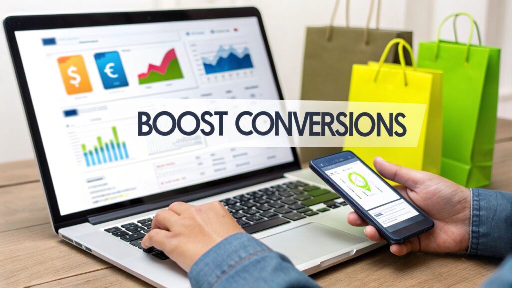
Before you can seriously boost your store's conversion rate, you have to know where you're starting from. It's tempting to jump right in and start tweaking button colors or rewriting product descriptions, but without a clear baseline, you're just guessing.
Think of it like using a map. You need to know your current location before you can plan a route to your destination. The first step is always to get a firm grip on your store's data.
1. Establish Your Conversion Baseline
Your current conversion rate isn't just a number; it tells a story about how real people interact with your brand online. By learning to read that story, you can spot the friction points that are costing you sales and uncover the hidden gems that could be your biggest wins.
Dig Into Your Data
The first stop is your analytics platform, most likely Google Analytics. Don't just look at the overall conversion rate. The real insights come from slicing the data to see the complete picture.
Start by asking a few key questions:
- Which traffic channels bring in the best customers? Maybe your paid social campaigns are great for traffic, but visitors from organic search are the ones who actually buy. This tells you exactly where to focus your marketing budget.
- How does performance change by device? It’s a classic story: tons of mobile traffic, but all the sales happen on desktop. That’s a massive red flag pointing to a clunky mobile experience that needs fixing.
- Where are people leaving? Use funnel reports to pinpoint the exact moment visitors decide to leave. Is it a specific product page? The cart? Or somewhere in the middle of your checkout flow?
A dashboard like this gives you a quick, high-level view of what’s working and what isn't. You can immediately see which channels are bringing in engaged users, guiding your next move.
Set Realistic Benchmarks
Okay, you've got your numbers. But are they any good? This is where benchmarking comes in. Context is everything.
A 2% conversion rate might be fantastic for a store selling high-end furniture, but it could be a serious problem for a low-cost accessory brand. Knowing the industry standard helps you set goals that are both ambitious and achievable.
To give you some perspective, a massive analysis of billions of customer sessions found the average global ecommerce conversion rate is around 2.7%. But it varies wildly. The UK averages a strong 4.1%, while the US sits closer to 2.5%.
Here's a quick look at how different industries and devices stack up.
Key Conversion Rate Benchmarks by Industry and Device
This table provides a quick overview of average conversion rates across different ecommerce sectors and devices, helping you benchmark your store's performance.
| Category | Average Conversion Rate |
|---|---|
| Industry: Food & Beverage | 6.2% |
| Industry: Beauty & Personal Care | 4.0% |
| Industry: Apparel & Fashion | 3.5% |
| Industry: Home & Garden | 2.1% |
| Device: Desktop | 3.9% |
| Device: Tablet | 3.1% |
| Device: Mobile | 2.2% |
Source: Data compiled from various industry reports.
Seeing these numbers helps ground your expectations. You can discover more about these ecommerce conversion rate benchmarks and see exactly how your store compares.
Find Your Biggest Opportunities
Now for the fun part. With your baseline established and some industry context, you can pinpoint your biggest areas for growth.
Let's say your clothing store has a decent overall conversion rate of 3.5%. But when you dig in, you find your mobile conversion rate is a dismal 1.2%. Boom. You’ve just found your top priority: fix the mobile shopping experience.
Or maybe you notice that traffic from a specific blog post converts incredibly well. That's a huge signal! You should probably create more content on that topic, or find ways to feature that post more prominently across your site. By looking at the right metrics, you turn raw data into a clear, actionable roadmap for improvement.
Designing a High-Converting User Experience
A clunky, slow, or confusing website is more than just an annoyance—it's a direct path to your competitor's checkout. When we talk about fixing your store's user experience (UX), it’s not about flashy redesigns. It's about systematically removing every little bit of friction that stands between a curious visitor and a happy customer. The goal is to make shopping on your site feel effortless, and even small tweaks can make a huge difference in your conversion rates.

Think of your website’s navigation as the layout of a physical store. If customers can't easily find the aisle they're looking for, they'll simply turn around and leave. Your job is to guide them so intuitively that they never have to stop and think about where to click next.
Crafting Intuitive Site Navigation
A great shopping experience starts with navigation that just makes sense. The first place to look is your main menu. Resist the urge to cram every category you have at the top level. That's a classic recipe for decision paralysis, which is a notorious conversion killer. Instead, group related products into logical, easy-to-scan subcategories.
Beyond the menu, a few other elements are absolutely critical for a smooth journey.
- A Can't-Miss Search Bar: Many of your most motivated shoppers know exactly what they want. They’ll look for the search bar immediately. Make it big, obvious, and powerful with features like autocomplete and typo correction to speed them on their way.
- Logical, Easy-to-Use Filters: On your category and collection pages, powerful filtering isn't a nice-to-have; it's a must. Let people narrow down their options by size, color, price, brand, and customer ratings. I once helped an apparel store see a 15% lift in add-to-cart actions just by making their size filters more prominent on mobile.
- Helpful Breadcrumbs: These little navigational trails (e.g., Home > Men > Shoes > Running) show customers exactly where they are on your site. They provide context and an easy escape route back to a previous category, which keeps people from getting frustrated and giving up.
Your customer should never feel lost. A seamless navigation system builds confidence and momentum, guiding shoppers from discovery to checkout without a second thought.
Optimizing Critical Product Pages
The product page is where the magic happens—or doesn't. This is your final sales pitch, so it has to be persuasive, informative, and visually stunning. The foundation of it all? High-quality images. Since your customers can't touch or feel the product, your photos have to do all the heavy lifting.
To really elevate your product presentation and build trust, you might want to look into specialized photo editing services for ecommerce. Professional shots from multiple angles, in-use lifestyle photos, and clear zoom capabilities are what bridge the gap between just looking and actually buying.
Your product description is just as vital. Don't just list specs—sell the benefits. Tell a story. Use bullet points to make key features scannable and write in a voice that connects with your ideal customer. And while you should weave in keywords for SEO, always write for the human first. To go even deeper, check out our comprehensive guide on how to https://scaleshopify.com/2025/06/27/increase-ecommerce-conversion-rate/ with specific, actionable strategies.
Prioritizing Mobile and Page Speed
Let's be clear: a mobile-first design isn't just a trend, it's the standard. While around 73% of ecommerce traffic now comes from mobile devices, desktop conversion rates often remain stubbornly higher. This gap is a massive red flag, usually pointing to a clunky mobile experience that's costing you sales.
Your mobile site needs to be built for thumbs. That means big, easy-to-tap buttons, simple forms, and a checkout process that doesn't feel like a chore.
Finally, nothing kills conversions faster than a slow website. A mere one-second delay in page load time can lead to a 7% drop in conversions. People have zero patience for waiting.
Here’s how you can speed things up:
- Compress Your Images: Use tools to shrink image file sizes without making them look pixelated.
- Minimize Your Code: Get rid of any bloated or unnecessary HTML, CSS, and JavaScript that could be slowing things down.
- Use a Content Delivery Network (CDN): A CDN stores copies of your site on servers across the globe, ensuring it loads lightning-fast for everyone, no matter where they are.
Building Unshakable Customer Trust
Before a customer ever hits "Add to Cart," they’re making a snap judgment: Can I trust this store?
If your site feels off, even in a small way—maybe it's confusing to navigate or looks a bit insecure—that trust never gets a chance to form. The sale is lost before it even begins. Building that unshakable trust isn't about flashy designs; it’s about sending clear, consistent signals that your brand is legit, reliable, and actually cares about its customers.
This all starts the second someone lands on your page. They are actively looking for proof that you're a real business they can feel good about buying from. Every single thing on your site, from your return policy to your 'About Us' page, adds to that crucial first impression.
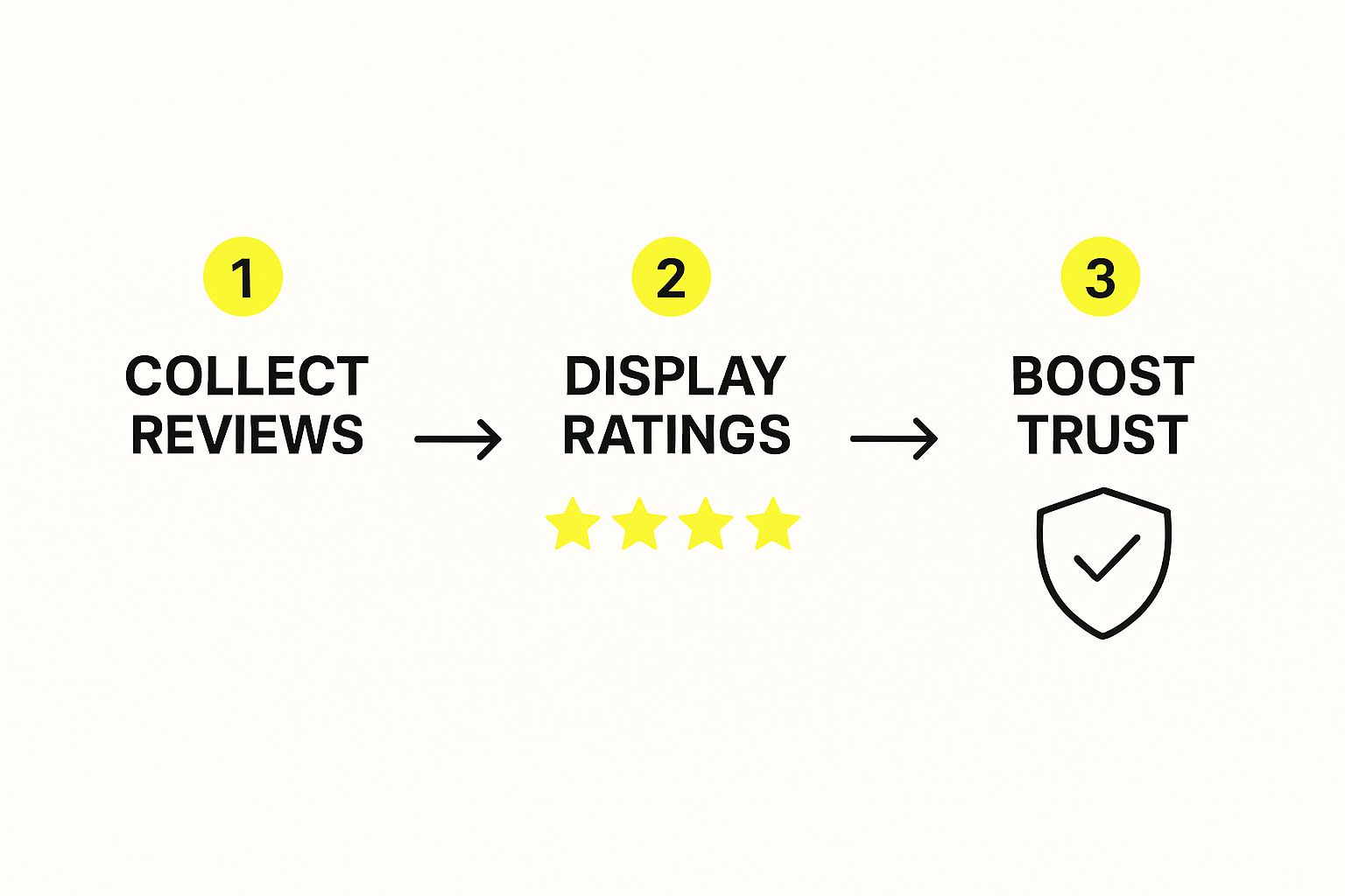
Let Your Customers Do the Talking With Social Proof
Nothing builds confidence faster than seeing that other people have already bought from you and had a great experience. That’s the magic of social proof, and frankly, it's one of the most effective tools you have for boosting conversions. When a new visitor sees those glowing reviews, it instantly reassures them they're making a smart choice.
But just having reviews isn't the whole story. Where you put them is just as important.
- Product Pages: Place your star ratings right under the product title where no one can miss them. A little further down the page, showcase a few of the most helpful written reviews that tackle common questions or hesitations head-on.
- Collection Pages: Don't make people click into a product just to see its rating. Displaying those stars right on your collection pages helps people sort through options and builds buying momentum from the get-go.
- Checkout: A simple message like, "Join 5,000+ happy customers!" can be that final little push someone needs. It reinforces their decision at the most critical point in the entire process.
Strategic social proof isn’t just for show. It’s about building a ladder of trust, one rung at a time. You’re offering reassurance at every single step, from the moment they discover you to that final click on the "Buy" button.
Tell a Real Story, Not a Corporate One
People want to connect with the humans and the mission behind the products they buy. A generic, corporate-sounding 'About Us' page is a huge missed opportunity to do just that. This is your chance to tell your story, share what you believe in, and make a genuine connection.
A great brand story doesn't have to be some epic novel. Just talk about why you started the company. What problems are you genuinely passionate about solving for your customers? That kind of authenticity makes your brand feel real and relatable, turning one-time buyers into loyal fans.
Be Radically Transparent
Transparency is the bedrock of trust. Online shoppers are naturally a bit skeptical, and any hidden fees or confusing policies will have them clicking away in a heartbeat. The only way to fight this is to be completely upfront about everything.
Your shipping and return policies should not be hidden in the footer. Think about it: one study found that 49% of shoppers ditch their carts simply because of unexpected extra costs. By putting your shipping info right on the product pages, you get rid of that nasty surprise.
Key Information to Make Obvious
| Policy Information | Best Placement | Why It Works |
|---|---|---|
| Shipping Costs/Thresholds | On product pages, in a site-wide banner, and in the cart. | No surprises. It also encourages shoppers to hit that free shipping minimum. |
| Return Policy Summary | Directly on product pages, often near the "Add to Cart" button. | Eases purchase anxiety by showing them returns are no big deal. |
| Contact Information | In the header, footer, and on a dedicated contact page. | Proves you're a real business that's easy to reach if they need help. |
This kind of clarity is a cornerstone of a great shopping experience. For more tips on smoothing out these friction points, you can dig into our full guide on ecommerce user experience best practices. When you make these details easy to find, you're showing respect for your customer's time and intelligence—and that builds a foundation of trust that pays off in more sales.
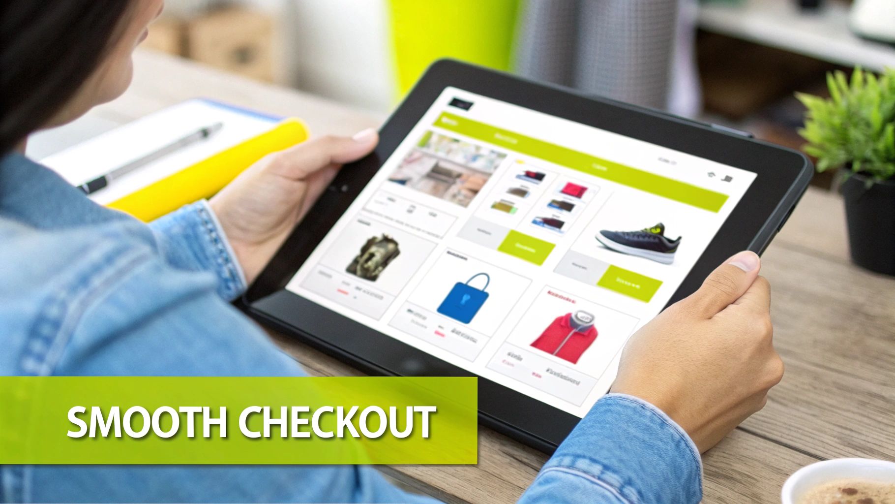
Streamlining Your Checkout to Stop Abandonment
You’ve done all the hard work. A customer landed on your site, found a product they love, and hit "Add to Cart." That's a huge win, but now comes the most critical part of their journey: the checkout. This is where an astonishing number of sales fall apart, usually because of small, completely fixable roadblocks.
Getting this final step right is one of the single most effective ways to boost your conversion rate. Every single field they have to fill out, every unexpected cost, is another opportunity for them to second-guess the purchase and simply leave.
Eliminate Unnecessary Hurdles
When it comes to checkout design, the guiding philosophy should be ruthless simplicity. Your job is to get the customer from their cart to your confirmation page with as little friction as possible. One of the most common—and most damaging—mistakes is forcing people to create an account before they can buy anything.
Sure, getting customers to create accounts is great for marketing down the road, but making it mandatory is a known conversion killer. Always, always offer a prominent guest checkout option. You can gently nudge them to create an account on the "Thank You" page after their payment is confirmed.
Think of it this way: you wouldn't make someone fill out a loyalty form just to buy a cup of coffee. Let them make the purchase first, then show them the benefits of an account for their next visit.
Take a hard look at every form field you're asking for. Do you really need their phone number? Is that second address line absolutely essential? Each field you can cut makes the process feel faster and less like an interrogation, which is a huge deal, especially for shoppers on mobile devices.
Be Radically Transparent About Costs
There’s no bigger reason for cart abandonment than surprise costs. Nothing kills a sale faster than a motivated buyer getting to the final screen only to be hit with an unexpectedly high shipping fee.
The fix is simple: be completely upfront about all costs, as early as you possibly can.
- Show shipping estimates directly in the cart, not just at the final payment step.
- Use a clear, site-wide banner to advertise your free shipping threshold (e.g., "Free Shipping on All Orders Over $50!").
- Make sure all taxes are calculated and displayed before the customer has to pull out their credit card.
This kind of transparency builds immediate trust. It manages their expectations and prevents the sticker shock that sends so many potential customers running.
Offer Flexible Payment Options
Today's shoppers expect choices. If they can't find their preferred way to pay, they won't hesitate to find another store that offers it. Relying only on traditional credit card fields just doesn’t cut it anymore.
By integrating express payment options like PayPal, Apple Pay, and Google Pay, you let customers breeze through checkout with a single tap, skipping the tedious process of typing in their address and card details. This is an absolute game-changer for mobile shoppers, where manual entry is a pain.
The easier you make it for someone to give you their money, the more likely they are to do it.
Now, let's break down some of the most common issues that crop up during checkout and how you can tackle them head-on.
Common Checkout Friction Points and Solutions
| Friction Point | Why It Hurts Conversions | Effective Solution |
|---|---|---|
| Forced Account Creation | Creates a significant barrier for new or impatient customers who just want to buy and leave. It feels like an unnecessary commitment. | Offer a prominent guest checkout option. Allow users to create an account after the purchase is complete on the confirmation page. |
| Surprise Shipping Costs | This is the #1 reason for cart abandonment. Unexpected fees at the final step feel deceptive and cause immediate frustration. | Display shipping costs or an estimator in the cart. Use a sitewide banner to announce your free shipping threshold. |
| Long, Complex Forms | Too many fields make the process feel overwhelming and time-consuming, especially on mobile. Every extra field is a reason to quit. | Remove all non-essential fields (e.g., second address line, optional phone number). Enable address auto-completion. |
| Limited Payment Methods | Customers have strong preferences (PayPal, Apple Pay, etc.). Not offering their go-to method can be a dealbreaker. | Integrate multiple payment gateways, especially one-click options like Shop Pay, Google Pay, and Apple Pay. |
| Lack of Trust Signals | Shoppers are wary of sharing financial info. Without security badges or clear return policies, they may feel unsafe. | Display SSL certificates, security badges (McAfee, Norton), and clear links to your return and privacy policies throughout the checkout. |
Tackling these friction points will make your checkout process smoother and more inviting, directly translating into more completed sales.
Even with a perfectly optimized checkout, some shoppers will still leave. That's why it's crucial to have solid strategies to recover abandoned carts in place. For an even deeper look at this, check out our guide on https://scaleshopify.com/2025/05/01/how-to-reduce-cart-abandonment/ for proven email tactics.
Using Data to Drive Continuous Improvement
Getting your store to convert well isn't a "set it and forget it" task. The most successful brands I've seen treat it as a constant process of figuring out what their customers really want and then delivering it. They don't rely on guesswork. Instead, they let data guide their decisions, creating a cycle of testing, learning, and refining that fuels real growth.
This is where you start to see the magic of conversion rate optimization. By embracing this idea of continuous improvement, your website becomes a living experiment. Every little tweak is a new chance to connect better with your audience and, ultimately, boost your bottom line.
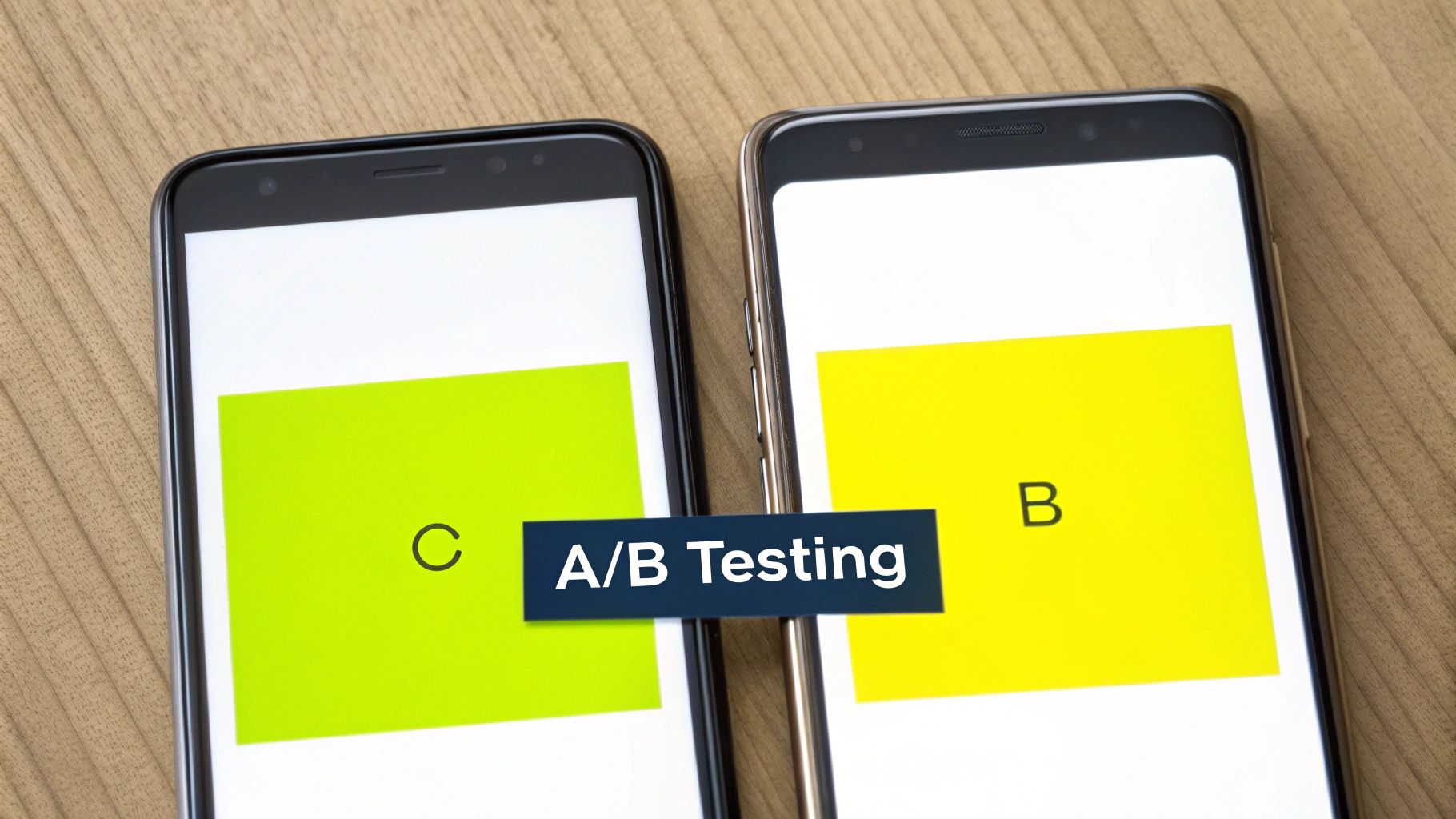
Embracing A/B Testing for Smarter Decisions
At its heart, A/B testing (also called split testing) is just a straightforward way to compare two versions of a webpage to see which one performs better. It's simple: you show version A to half your visitors and version B to the other half. By tracking which version gets more conversions, you get cold, hard proof of what actually works.
Don't feel like you need to overcomplicate this. You can start with some small, high-impact tests that are easy to set up.
- Test Your Headlines: Pit a benefit-driven headline ("Get Softer Skin in 7 Days") against one that's more about the features ("Contains Hyaluronic Acid and Vitamin C"). You'd be surprised what actually grabs people's attention.
- Play with CTA Wording: Does "Shop Now" work better than "Explore the Collection"? Or maybe something more specific, like "Get Your Summer Look"? Tiny word changes can make a huge difference in whether someone clicks.
- Vary Product Image Styles: Compare a clean, studio shot on a white background to a lifestyle photo showing your product in action. This helps you figure out if your customers are more interested in the technical details or the aspirational vibe.
The real goal of testing isn't just to find a "winner." It's to build a deep, data-backed understanding of your customers' psychology—what catches their eye, what makes them trust you, and what finally convinces them to hit that buy button.
Using Data for Meaningful Personalization
In today's crowded market, a generic, one-size-fits-all experience just won't cut it. Customers expect you to get them. This is where personalization comes in, using customer data to create tailored experiences that make every shopper feel like you’re speaking directly to them. If you're serious about figuring out how to increase ecommerce conversion rates, this is a must.
This doesn't have to be some massive, complex undertaking. You can start with some simple but powerful tactics using data you're probably already collecting.
- "Recently Viewed Items" Section: This is a classic for a reason. It reminds shoppers of products they’ve already shown interest in, making it incredibly easy for them to pick up where they left off.
- Smarter Product Recommendations: Based on a shopper's browsing history or what they've bought before, you can display a "You Might Also Like" section that's genuinely helpful, not just random.
- Personalized Pop-Ups: Instead of blasting everyone with the same 10% off coupon, you can get more strategic. For example, create pop-ups that only trigger for a specific product category a user has been browsing heavily.
A huge part of this process involves harnessing customer feedback to get inside your customers' heads. This qualitative data—the actual words from your customers—gives you the "why" behind all the numbers you see in your analytics.
Ultimately, both A/B testing and personalization are just different ways of listening to your customers. One listens to their actions in real-time, while the other pays attention to their history and preferences. Combine them, and you create a powerful feedback loop that drives not just a quick sales bump, but sustainable, long-term growth for your store.
Got Questions About Conversion Rates? We've Got Answers.
Jumping into conversion rate optimization always brings up a ton of questions. You've got the strategies down, but what about the real-world stuff that pops up when you start implementing them? Let's tackle some of the most common questions I hear from store owners.
What’s a "Good" Ecommerce Conversion Rate, Really?
This is the million-dollar question, and the honest answer is… it depends. A "good" rate is a moving target that hinges entirely on your industry, your price point, and even where your traffic is coming from.
Globally, the average ecommerce conversion rate usually sits somewhere between 2% and 3%. But treat that as a loose guideline, not a rule. For example, a store selling $2,500 custom furniture would be thrilled with a 1% conversion rate. On the other hand, a shop selling $15 phone cases probably needs to hit 5% or more just to stay in the game.
To give you a rough idea, here's how it often breaks down by industry:
- Food & Beverage: These stores often see the highest rates, sometimes getting over 5%.
- Fashion & Apparel: Typically lands in the 2-4% range.
- Electronics & High-Ticket Items: The rate here is often lower, around 1-2%, because people take a lot more time to think before buying.
The only benchmark that truly matters is your own. Stop chasing some universal number and focus on making steady, incremental gains on your current rate. That’s how you really win.
How Quickly Will I Actually See Results?
The timeline for seeing a real impact depends on two things: the changes you make and how much traffic your store gets.
Some quick, high-impact fixes can deliver results almost instantly. If you discover a broken "Add to Cart" button on your best-selling product and fix it, you could see sales jump within hours. The same goes for making your shipping costs crystal clear on the product page—that can cut down on abandoned carts overnight.
Bigger, more strategic changes need more time. If you're A/B testing a completely new product page layout or redesigning your entire checkout process, you'll need to be patient. To get a statistically significant result from a test, you might need to let it run for a few weeks, especially if you have a newer store with less traffic. The key is to let the data do the talking; it takes time but leads to much more reliable, long-term growth.
I Have a New Store. Which Strategies Have the Biggest Impact?
When you're just starting out, it's easy to get overwhelmed. The smartest move is to focus on building a rock-solid foundation of trust and usability.
From my experience, three areas deliver the biggest wins right out of the gate:
- Nail Your Product Pages: New visitors are skeptical. Win them over with high-quality photos from every conceivable angle, write descriptions that focus on benefits (not just features), and display customer reviews prominently the second you get them.
- Make Mobile Checkout Effortless: A huge chunk of your early traffic will be on a phone. Your checkout process needs to be dead simple on a small screen. Think big buttons, as few form fields as possible, and one-click payment options like Apple Pay or Google Pay.
- Be Radically Transparent with Policies: New shoppers are naturally wary. Erase any doubt by making your shipping and return policies ridiculously easy to find. Don't bury them in the footer—put a link right on the product page or in a site-wide banner. This one move builds a massive amount of trust and calms a lot of pre-purchase jitters.
Focusing on these core elements first will solve the most common reasons new visitors leave. Once you have this strong base, you can start layering on more advanced optimization tactics as your business grows.
Ready to turn these insights into action and build a Shopify store that converts? The team at E-commerce Dev Group specializes in creating seamless, trust-building experiences that drive sales. Get in touch with our experts today and let's talk about how we can help you grow.