

The Real Cost of Abandoned Carts: Beyond the Numbers

Every abandoned cart represents a potential lost sale, which directly impacts your profits. However, the true cost extends beyond just the immediate financial loss. Consider the marketing spend that initially attracted the customer. Abandoned carts mean a wasted marketing budget and a lower return on investment (ROI).
A high cart abandonment rate can also negatively affect your store's overall performance. Search engines like Google might interpret a high abandonment rate as a sign of a poor user experience, potentially hurting your search ranking. This makes it harder to attract new customers and further complicates efforts to reduce cart abandonment.
Calculating the True Cost
Understanding the financial impact of abandoned carts helps prioritize optimization efforts. To calculate your potential losses, first determine your average order value (AOV). Then, multiply your AOV by your current abandonment rate.
For example, if your AOV is $100 and your abandonment rate is 70%, your potential loss per 100 carts is $7,000. This calculation gives you a concrete target for improvement and justifies investing in cart abandonment solutions.
Benchmarking and Industry Insights
It's important to compare your abandonment rate to industry averages. This helps you understand the severity of the issue and identify areas for improvement. Cart abandonment continues to be a major challenge for ecommerce, with a global average of 70.19% as of 2025.
Many businesses are using email recovery strategies to combat this. Studies show that three-email abandoned cart campaigns generate $24.9 million in revenue, compared to $3.8 million from single-email campaigns. This highlights the importance of consistent follow-up. These email sequences have a 39.07% open rate and a 23.33% click-through rate. Conversion rates reach 10.7% when emails are sent within the first hour of abandonment. Multi-step campaigns recover up to 18.6% of lost sales, showing how well-timed, behavior-triggered messaging can recapture a significant portion of potential revenue. More detailed statistics can be found here: https://analyzify.com/statsup/cart-abandonment
Remember that industry averages are a general guideline, not a definitive benchmark. Your specific abandonment rate will depend on factors like your product type, target audience, and overall customer experience.
Beyond the Average: Identifying the Root Causes
While calculating the cost of abandoned carts gives you a financial perspective, addressing the root causes is crucial for long-term improvement. This means analyzing your data to understand why customers abandon their carts.
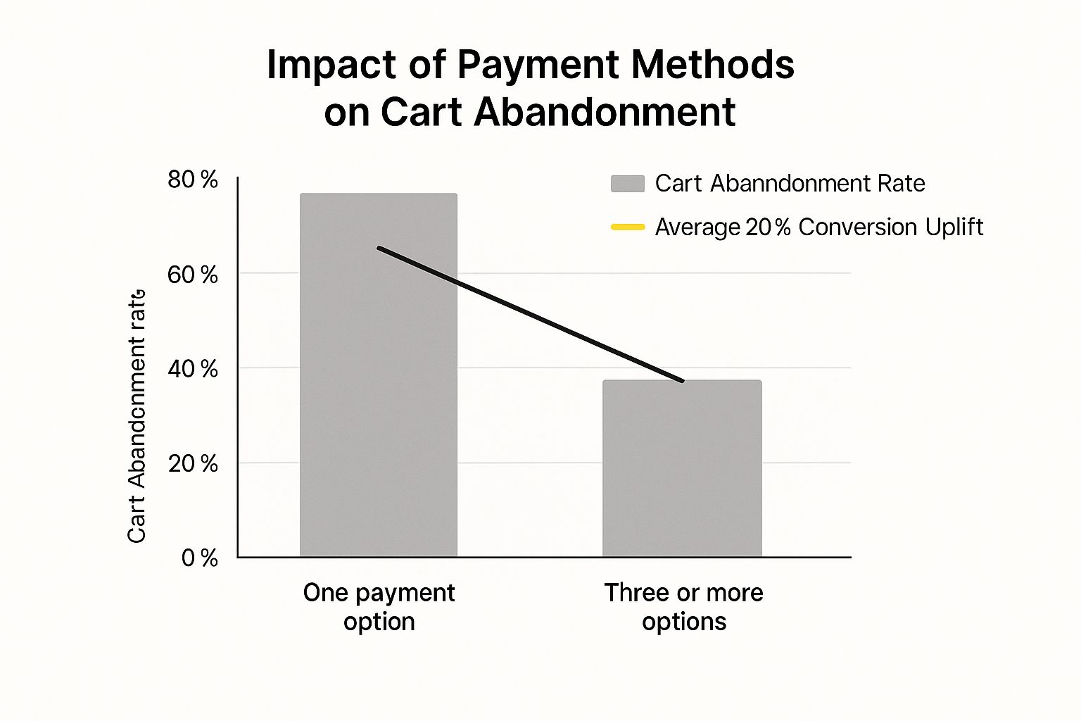
Are there issues with the checkout process? Hidden fees? A lack of payment options? Identifying these pain points offers valuable insights for optimizing your store and recovering lost revenue. This lays the foundation for a comprehensive strategy to reduce cart abandonment and improve your bottom line.
Crafting Device-Perfect Checkout Experiences
Today's online shoppers expect a smooth and easy checkout process, whether they're using a desktop, tablet, or smartphone. A checkout designed for desktop use can be difficult to navigate on a mobile device, leading to frustration and lost sales. Understanding and addressing these device-specific challenges is crucial for reducing cart abandonment and increasing conversions.
Understanding the Mobile Challenge
Mobile commerce is growing rapidly, but it also has the highest rate of cart abandonment. Smaller screens and touch interfaces present unique challenges. Cluttered layouts, small form fields, and slow loading times can frustrate mobile shoppers and lead them to abandon their purchases.
Responsive Design: Adapting to Every Screen
Responsive design is essential for a positive user experience. Your checkout process needs to adapt smoothly to different screen sizes, ensuring a consistent and user-friendly experience on all devices. This includes adjusting layouts, font sizes, and button placements to be easily usable on touchscreens.
Streamlining the Mobile Checkout Flow
Simplicity and speed are key to reducing mobile cart abandonment. Minimize the number of steps needed to complete a purchase. Features like auto-fill and mobile wallets can significantly streamline the checkout process.
- Touch-Friendly Elements: Make sure buttons and form fields are large enough to tap easily with a finger. This reduces errors and improves the user experience.
- Simplified Forms: Ask for only the essential information. Fewer required fields make the checkout process faster and less of a hassle.
- Mobile Wallets: Integrating mobile wallets like Apple Pay and Google Pay allows for one-tap checkout, greatly reducing friction.
Addressing Device-Specific Abandonment Rates
Optimizing your checkout for different devices has a big impact on reducing cart abandonment. Mobile users abandon 75.5% of carts, compared to 68.55% on tablets and 69.04% on desktops. Find more detailed statistics here: https://www.sellerscommerce.com/blog/shopping-cart-abandonment-statistics/
Let's take a closer look at the device-specific abandonment rates. The following data chart visualizes these rates, highlighting the need for platform-specific optimization.
[Infographic will be placed here – Bar Chart showing abandonment rates: Mobile (75.5%), Tablet (68.55%), Desktop (69.04%)]
As the data chart demonstrates, mobile has the highest abandonment rate. However, optimizing the checkout experience across all platforms, including desktop, can lead to significant improvements. Even with larger screens and easier input methods, desktops still see a relatively high abandonment rate, emphasizing the need for streamlined forms and a simplified checkout flow across the board. A key reason for this is that 22% of shoppers globally cite long forms as a reason for abandoning their carts.
The following table provides a more detailed breakdown of cart abandonment rates by device type, highlighting the key challenges and optimization focus for each.
Cart Abandonment Rates by Device Type
| Device Type | Abandonment Rate | Key Challenges | Optimization Focus |
|---|---|---|---|
| Mobile | 75.5% | Small screen, touch interface, slow loading times | Simplified forms, touch-friendly elements, mobile wallet integration |
| Tablet | 68.55% | Fewer touch optimization issues than mobile, but still smaller than desktop | Responsive design, easy navigation |
| Desktop | 69.04% | Lengthy forms, distractions | Streamlined checkout, clear calls to action |
This table clearly shows the specific challenges presented by each device type. Focusing on these challenges and implementing targeted optimizations will significantly reduce friction and improve conversion rates.
Optimizing for Every Customer Journey
Geography also plays a role in cart abandonment. The Asia Pacific region sees an 80.91% abandonment rate, while the Americas have a lower rate of 71.81%. Addressing region-specific challenges, such as high delivery costs (which contribute to 41% of global cart abandonments), is essential for success. By creating device-perfect checkout experiences tailored to both the device and the user's location, you can build a truly seamless shopping experience that encourages conversions and fosters customer loyalty.
Recovery Email Sequences That Actually Convert

Generic cart abandonment emails often don't work. To truly win back lost sales, your recovery email sequence needs to be smart, interesting, and tailored to the individual. This means understanding why some messages and timings are more effective than others. For example, research shows sending that first email within an hour of abandonment can boost conversion rates to 10.7%. This shows how important it is to act fast when a potential customer leaves items in their cart.
Timing Is Everything: The Golden Hour
The first email is the most important. Send it within the first hour of cart abandonment, while the customer still remembers the product. This quick reminder often solves simple problems like accidental abandonments. Data shows that three-email abandoned cart campaigns bring in much more money ($24.9 million) than single-email campaigns ($3.8 million). This highlights the benefit of a multi-stage approach.
The Power of Personalization: Speaking Directly to Your Customer
Beyond timely reminders, personalization is essential. Customize your emails to feature the specific items left behind, including product pictures and descriptions. Also, consider grouping your customers based on abandonment triggers. This lets you address specific concerns and provide relevant discounts.
Crafting Compelling Content: Beyond "Did You Forget Something?"
Your email content should be more than a simple nudge. Highlight the product's benefits, reinforce trust signals like security badges and customer reviews, and provide a clear call to action. For example, offering a limited-time discount or free shipping can create a sense of urgency. You might be interested in: How to master your sitemap.
Building a Multi-Stage Sequence: Addressing Different Objections
One email is rarely enough to recover all abandoned carts. A series of emails, usually three or four, works better, with each targeting a different potential reason for abandonment.
-
Email 1: The Gentle Reminder: Sent within one hour, this email reminds the customer about their cart and highlights key product features.
-
Email 2: Addressing Concerns: Sent within 24 hours, this email provides social proof, reassures about security, or addresses common purchase worries.
-
Email 3: The Incentive: Sent within 72 hours, this email offers a compelling reason to buy, such as a discount or free shipping.
-
Email 4 (Optional): The Last Chance: This final reminder emphasizes limited availability or a time-sensitive deal.
Examples of Effective Recovery Emails
Consider these examples:
-
Subject Line: "Still thinking about it? Your [product name] is waiting!" This subject line feels personal and reminds the customer about the item.
-
Body: "We noticed you left something special in your cart. Your [product name] is still available, and we've saved it for you. Complete your purchase now and enjoy [benefit 1] and [benefit 2]." This reinforces the value and encourages quick action.
By using these strategies, you can transform your abandoned cart emails into effective conversion tools, reducing cart abandonment and recovering lost revenue.
Streamlining Your Forms: Less Fields, More Conversions
A major source of frustration for online shoppers, and a significant contributor to cart abandonment, are lengthy or complex checkout forms. In fact, 22% of shoppers cite lengthy forms as their reason for abandoning a purchase. This means simplifying your checkout process is critical to reducing cart abandonment and boosting your conversion rates.
Identifying and Eliminating Friction Points
The first step towards streamlining your forms is identifying the friction points. Think of your checkout process like a funnel: any unnecessary step or complicated field can cause potential customers to drop off.
-
Analyze Your Current Form: Carefully examine each field in your checkout form. Ask yourself: Is this information absolutely essential? Can this field be shortened or combined with another?
-
User Testing: Observe real users navigating your checkout process. This can reveal unexpected pain points and provide valuable insights into areas for improvement.
Prioritizing Essential Information
While collecting customer data is important, prioritize only the absolutely essential information needed to complete the purchase. Unnecessary fields increase the perceived effort required to checkout, leading to higher abandonment rates.
-
Contact Information: Name, email address, and phone number are usually sufficient for contacting the customer regarding their order.
-
Shipping Address: Optimize this section with address validation tools to minimize errors and speed up the process. Consider tools like SmartyStreets for address validation and autocompletion.
-
Payment Information: Offer a variety of payment options and streamline the payment input process with features like saved payment methods. Consider integrating with payment gateways like Stripe or PayPal.
Implementing Smart Form Design Techniques
Several techniques can shorten and simplify your forms without compromising data collection. These strategies make the checkout process feel less demanding, improving the user experience and ultimately reducing cart abandonment.
-
Progressive Disclosure: Break the form into smaller, more manageable chunks, revealing only the necessary information at each step. This makes the form less intimidating and more user-friendly.
-
Smart Defaults: Pre-fill certain fields based on the customer's location or previous purchases. For instance, pre-filling the country field based on the user's IP address can save time and reduce friction.
-
Conditional Logic: Show or hide certain fields based on the customer's choices. For example, if the customer selects "ship to billing address," hide the separate shipping address fields.
Examples of Streamlined Forms
Here are examples of how to apply these techniques:
-
Combine First and Last Name: Instead of two separate fields, use one field for the customer's full name.
-
Use Dropdown Menus for Country and State: This makes selection faster and more convenient than typing.
-
Offer Account Creation After Checkout: Allowing guest checkout and offering account creation after the purchase removes a significant barrier for first-time buyers.
Form Field Analysis: A Step-by-Step Audit
The following table provides a framework for analyzing your form fields, their impact on abandonment, and recommended optimization techniques.
Checkout Form Field Analysis: This table shows how the number and type of form fields impact abandonment rates and provides recommendations for optimization.
| Form Element | Impact on Abandonment | Industry Best Practice | Optimization Technique |
|---|---|---|---|
| First/Last Name | Can feel repetitive | Combine into one field | Single "Full Name" field |
| Email Address | Essential | Required field, validate format | Clear error messages if invalid |
| Phone Number | Can be optional | Offer as optional for faster checkout | Clearly mark as optional |
| Address | Required, but can be complex | Address validation, auto-complete | Reduce manual input |
| Account Creation | Major friction point | Guest checkout option | Offer account creation after purchase |
Key insights from the table highlight the importance of minimizing required fields and streamlining data entry. Combining fields, using smart defaults, and offering guest checkout are practical ways to improve the user experience and reduce form abandonment.
By consistently analyzing and optimizing your forms using these strategies, you can create a smoother checkout experience that encourages conversions and reduces cart abandonment. A streamlined checkout process benefits both your customers and your bottom line.
Price Transparency: Ending the Shock at Checkout

Unexpected costs are a major turnoff for online shoppers. In fact, they are the top reason for 55% of abandoned carts. This section explores how transparent pricing builds trust and boosts conversions, reducing cart abandonment by being upfront about all costs before checkout.
This means clearly displaying all costs associated with a product directly on the product page so customers aren't surprised later.
The Psychology of Price Presentation
How you present prices significantly influences buying decisions. Discovering extra costs at the last minute feels like a hidden fee. This erodes trust and makes customers feel deceived.
Presenting all costs upfront, however, builds confidence and encourages shoppers to complete their purchase. It's a simple way to enhance the customer experience.
Tactical Approaches to Presenting Costs
Several strategies can achieve price transparency without impacting profits. Honesty about shipping costs, taxes, and other fees is crucial for maintaining trust and minimizing cart abandonment.
-
Display Prices Clearly on Product Pages: Show all costs associated with a product directly on the product page. This ensures customers know the total price before adding items to their cart.
-
Breakdown Costs in the Cart: Itemize each cost component in the cart: product price, taxes, shipping fees, and any discounts. Transparency helps customers make informed decisions.
-
Use a Shipping Cost Calculator: A shipping cost calculator on the product page lets customers determine shipping costs based on their location and preferred shipping method. This prevents checkout surprises and allows for better budgeting.
Free Shipping Strategies That Work
Free shipping is a powerful incentive to reduce cart abandonment. Offering blanket free shipping, however, may not be financially viable for all businesses. Finding a balance that benefits both you and your customers is key.
-
Threshold-Based Free Shipping: Offering free shipping above a specific order value encourages larger purchases, increasing your average order value. For example, free shipping on orders over $50 can incentivize customers to reach that threshold.
-
Conditional Free Shipping: Offer free shipping on specific product categories or during promotional periods. This targeted approach minimizes costs while still providing an incentive.
Region-Specific Pricing Strategies
Price sensitivity varies by region. A reasonable price in one country might be considered expensive in another.
-
Address Varying Price Perceptions: Research average price expectations in your target markets. Consider region-specific pricing or promotions.
-
Communicate Currency Conversions Clearly: For international sales, display accurate and transparent currency conversions to avoid confusion and build trust.
By implementing these pricing strategies, you create a transparent and trustworthy checkout experience. This reduces cart abandonment, increases conversions, and boosts your bottom line.
Building Trust When It Matters Most
Trust is essential for online shopping, especially during checkout. This is the point where customers share sensitive information and make financial decisions. Hesitation here can easily lead to abandoned carts. Strategically placed trust signals can ease these worries and boost conversions.
Visual and Textual Trust Signals
Trust signals come in two main types: visual and textual. Visual signals include recognizable security badges from companies like Norton or McAfee. These badges visually reassure customers their information is secure. Textual signals, such as guarantees and clear return policies, strengthen this message.
For example, a prominent "30-Day Money-Back Guarantee" can significantly reduce purchase anxiety. Both visual and textual cues work together to create an overall sense of security. A security badge coupled with a clear statement like "Your information is safe with us" can be very effective.
The placement of these elements is critical. They should be highly visible during the checkout process, particularly near fields where customers enter sensitive data. For tips on enhancing your website's structure and navigation, see our guide on How to master your sitemap.
Social Proof: Leveraging the Power of Others
Social proof, including customer reviews and testimonials, plays a key role in building trust. Displaying positive reviews near product images or on checkout pages can reinforce the purchase decision. Real-time notifications of recent purchases can also be useful, creating a sense of activity.
However, authenticity is vital with social proof. Fake or exaggerated reviews can erode trust. Focus on genuine customer experiences and testimonials. This fosters confidence and encourages purchases. Security badges should always link to valid certifications for transparency.
Addressing Specific Concerns
Different customers have different worries. Tailor your trust signals to address these specific anxieties. For example, if shipping costs are a frequent concern, clearly display them on product pages before checkout begins.
If payment security is a worry, highlight secure payment gateways and data encryption. By proactively addressing these concerns, you can create a more trustworthy checkout experience. This, in turn, minimizes hesitation and reduces cart abandonment, leading to more completed purchases.
Measuring What Matters: Your Continuous Improvement Plan
Implementing the discussed strategies is just the first step. Minimizing cart abandonment and maximizing revenue requires a continuous improvement plan. This means consistently measuring, analyzing, and refining your cart recovery efforts. It's like gardening: you wouldn't just plant seeds and walk away. Consistent attention and adjustment are key.
Setting Up Proper Tracking: Measuring Abandonment at Different Funnel Stages
Accurate measurement is foundational to any effective optimization strategy. Set up tracking mechanisms that monitor abandonment at different stages of the sales funnel. This pinpoints where customers are dropping off and identifies high-value optimization opportunities.
-
Cart Abandonment Rate: This common metric tracks the percentage of initiated checkouts that aren't completed.
-
Product Page Abandonment: Tracking the ratio of users adding items to their cart versus abandoning the product page can reveal issues with product information or pricing.
-
Checkout Funnel Analysis: Breaking the checkout process into individual steps and tracking the drop-off rate at each stage isolates friction points within the checkout flow.
A/B Testing for Checkout Optimization: Ensuring Your Findings are Valid
A/B testing is crucial for validating the effectiveness of your cart recovery strategies. It compares two versions of a checkout element (e.g., a form field or call-to-action button) to determine which performs better. A structured testing framework is essential for valid results.
-
Hypothesis-Driven Testing: Start each test with a clear hypothesis about the expected change and its rationale.
-
Statistical Significance: Use statistical analysis to ensure observed changes aren't due to random chance.
-
Iterative Testing: Continuously test and refine your checkout process based on A/B testing results for ongoing improvement.
Prioritization Matrix: Focus on High-Impact Improvements
Not all improvements are equally impactful. A prioritization matrix helps focus efforts on changes with the greatest return by ranking potential improvements based on impact and implementation effort.
-
High Impact/Low Effort: These are your "quick wins"—easy-to-implement changes with significant improvement potential.
-
High Impact/High Effort: More complex changes requiring significant effort, but potentially substantial gains.
-
Low Impact/Low Effort: Easy changes, but unlikely to have a large impact.
-
Low Impact/High Effort: Avoid these changes; they require considerable effort for minimal return.
Continuous Optimization Roadmap: Adapting to Changing Customer Expectations
The ecommerce world is constantly evolving. Customer expectations, technologies, and market trends shift. Your continuous improvement plan needs flexibility to adapt. Regularly review and update strategies to stay ahead.
By implementing this systematic approach to measurement, testing, and refinement, you’ll create a sustainable improvement cycle, progressively reducing your cart abandonment rate. This not only recovers lost revenue but also creates a smoother, more enjoyable shopping experience.
Ready to transform your Shopify store and drastically reduce cart abandonment? E-commerce Dev Group provides expert Shopify design, development, and support to optimize your checkout process, implement effective recovery strategies, and boost your bottom line. Learn more about how we can help.