


Before you can boost your ecommerce conversion rate, you need to know where you stand. It all starts with establishing a clear baseline. First, you'll calculate your current conversion rate—the percentage of visitors who actually buy something—and then you'll see how you stack up against others in your industry. This is the only way to set realistic, data-driven goals that you can actually hit.
What's Your Current Conversion Rate?

You can't map out a route for growth without knowing your starting point. Think of your ecommerce conversion rate as the most critical vital sign for your store's health. It tells you exactly how many browsers are turning into buyers. Without this number, you're just taking shots in the dark.
Figuring out your main conversion rate is pretty simple. Most tools, like Google Analytics or the built-in Shopify dashboard, will even do it for you. The formula behind it is straightforward:
(Total Number of Sales / Total Number of Website Visitors) x 100 = Conversion Rate
So, if your store pulled in 500 sales from 25,000 visitors last month, your conversion rate is 2%. This is your foundation—the number you'll be working to improve.
Don't Stop at the Basic Number
While that overall rate is essential, it doesn't paint the full picture. To really find opportunities, you have to dig deeper. Experienced store owners don't just ask, "What's my conversion rate?" They ask, "What are my conversion rates for different parts of my business?"
Try breaking down your analysis to get more specific insights:
- By Traffic Source: Do visitors from your Instagram ads convert better than people who find you through organic search? Knowing this helps you put your marketing budget where it counts.
- By Device: It’s common for shoppers to browse on mobile but buy on a desktop. Seeing the conversion rates for each can point out frustrating issues in your mobile experience.
- By Visitor Type: New visitors almost always convert at a lower rate than returning customers. When you track these separately, you can build smarter strategies for both acquiring new customers and keeping the old ones coming back.
You might find, for example, that your email marketing campaigns boast a 5% conversion rate, while your site average is just 1.5%. That’s a huge clue. It tells you your email list is incredibly valuable, and maybe those high-performing tactics from your emails are worth trying out on the rest of your site.
Set Realistic Goals Using Industry Benchmarks
Once you have your numbers, the next logical question is, "So… is my conversion rate any good?" The answer really depends on your industry. Comparing your store to a completely different sector is like comparing apples and oranges—it’s a waste of time and won't give you any useful information.
To get a feel for where you should be, it helps to look at industry benchmarks. These give you a realistic yardstick to measure your own performance against.
Ecommerce Conversion Rate Benchmarks by Industry
The table below shows average conversion rates across different ecommerce industries. Use it to see how your store's performance compares and to understand the unique challenges your sector might face.
| Industry | Average Conversion Rate | Key Challenge |
|---|---|---|
| Food & Beverage | 3.1% | High competition, encouraging repeat purchases. |
| Electronics & Home Appliances | 3.6% | Complex product specs, requires building trust. |
| Fashion & Apparel | 1.9% | High return rates, communicating fit and feel online. |
| Health & Beauty | 2.5% | Building brand loyalty, navigating regulations. |
| Home & Garden | 1.4% | Larger, considered purchases with longer buying cycles. |
| Sports & Recreation | 2.1% | Seasonal demand, appealing to niche communities. |
Source: Data compiled from various 2024-2025 industry reports.
Seeing these numbers helps put things in perspective. If you sell high-end furniture (a low-conversion industry) and your rate is 1.2%, trying to hit 4% overnight is just setting yourself up for failure. A much better goal would be to first reach the industry average of 1.4%, and then work your way up toward 2%.
This methodical approach turns vague hopes into a concrete plan. It’s the first real step in a smart strategy to actually increase your ecommerce conversion rate.
Building a High-Converting Website Experience
Think of your website’s design and user experience (UX) as your most dedicated employees. They're on the clock 24/7, either welcoming customers in or inadvertently showing them the door. A great website experience goes far beyond just looking pretty—it's built on a solid foundation of speed, clarity, and trust. Every single element, from your navigation menu down to your product photos, has a job to do: make the path to purchase as smooth as possible.
A confusing website is the online equivalent of a messy, disorganized store. If a customer can't find the aisle they're looking for, struggles to see a price tag, or can't get a good look at an item, they'll just leave. Online, that exit is just a single click away.
Make Navigation Effortless and Intuitive
The whole point of your site navigation is to reduce cognitive load—that's the mental energy someone has to spend just to figure out how to use your site. When shoppers aren't thinking about how to find something, they can focus all their attention on what they want to buy. This is a critical piece of any strategy to boost your ecommerce conversion rate.
An effortless navigation system is more than just a menu bar. It's an entire ecosystem designed to guide people where they need to go.
- Keep Your Main Menu Simple: Don't paralyze visitors with a dozen different choices. Stick to the essential categories that represent your main product lines.
- Use Logical Subcategories: Organize your products in a way that would make sense to a first-time visitor. They should be able to narrow down their search without clicking endlessly.
- Implement Breadcrumbs: Show people the path they took to get where they are (e.g., Home > Men's > Shoes > Running). This helps them get their bearings and easily step back without having to start their search all over again.
A seamless navigation structure doesn't just feel better for the user; it directly impacts your bottom line. When shoppers can find what they're looking for in three clicks or less, their likelihood of making a purchase goes way up.
Design Product Pages That Sell
Your product page is your final sales pitch. It’s the moment a casual browser decides to become a paying customer. This is where you have to overcome the biggest hurdle in ecommerce: people can't physically touch or feel the product. Your secret weapons here are high-quality visuals and copy that speaks to benefits, not just features.
Shoppers need to see an item from every angle, get a sense of its scale, and picture it in their own lives. So don't just list specs; sell the outcome.
Product Photo Checklist:
- High-Resolution Images: Use crisp, professional photos that allow visitors to zoom in smoothly without things getting blurry.
- Multiple Angles: Show the front, back, sides, and any other unique details.
- Contextual Shots: Put the product in a real-world setting. If it's a backpack, show it on someone's back. If it's a coffee mug, show someone holding it.
- Size and Scale References: For clothing, show it on a model and list their height and the size they're wearing. For furniture, place it in a furnished room.
Beyond the visuals, your words need to connect on an emotional level. Instead of just stating "100% merino wool," try something like, "Stay warm without the itch with our ultra-soft merino wool sweater." The first is a fact; the second is a benefit. This small shift in language can make a massive difference.
Master the Mobile-First Experience
With over 60% of ecommerce traffic now coming from smartphones, a mobile-first design isn't just a good idea—it's essential. Mobile shoppers are famously impatient and easily distracted. Your site needs to be fast, thumb-friendly, and completely free of clutter.
A common mistake is just taking a desktop site and squishing it onto a small screen. A true mobile experience is designed from the ground up with the mobile user in mind. This means large, tappable buttons, simple forms that use autofill, and a checkout process that's quick and painless. Site speed is especially crucial; a delay of even one second can send conversion rates plummeting. Our guide on complete Shopify store optimization dives much deeper into how you can improve your site's performance.
As you focus on the user experience, don't forget how powerful social proof can be. For instance, optimizing your website's testimonial page can directly influence conversion rates by building trust exactly where it’s needed most.
Ultimately, a high-converting experience is a trustworthy one. By focusing on intuitive navigation, compelling product pages, and a flawless mobile interface, you build the confidence a shopper needs to finally click "Add to Cart."
Fixing Your Leaky Checkout Funnel

This is it. The final, most crucial step in a customer's journey. The checkout is where all your hard work either pays off with a sale or disappears into the ether. If your website is a bucket, this is where the biggest leaks happen, draining away revenue through abandoned carts.
Think about the customer's mindset for a moment. They've navigated your site, found something they genuinely want, and added it to their cart. They are motivated and ready to hand over their money. Any friction from this point on can kill that momentum instantly. Your job is to make the final step so smooth it feels like the natural, easy conclusion to their shopping.
Eliminate Unpleasant Surprises
The number one conversion killer at checkout? Unexpected costs. It's not even close. Year after year, research points to the same culprit for high cart abandonment rates—which climbed past 70% in 2024. Surprise shipping fees, taxes, and other hidden charges are what send motivated buyers running for the hills. For more data, you can see how global conversion rates vary across industries on Statista.com.
This gives you a huge opportunity. You can seriously increase your ecommerce conversion rate just by being transparent.
The lesson here is simple: never make a customer feel tricked. Displaying all costs upfront—maybe with a shipping calculator right on the cart page—builds trust and sets clear expectations from the start.
This one act of transparency prevents the sticker shock that derails a purchase. It respects the customer and shows you have nothing to hide, which reinforces their confidence in you.
Streamline the Path to Purchase
Every extra click, every unnecessary form field, every slow page load is a chance for a customer to second-guess their purchase. You have to be ruthless here. Your mission is to slash every obstacle standing between the cart and the confirmation page.
Here are some actionable ways to simplify your checkout:
- Offer a Guest Checkout Option: Forcing someone to create an account is a massive roadblock. First-time buyers, in particular, don't want the commitment. Guest checkout removes this barrier instantly.
- Keep Your Forms Minimal: Only ask for what you absolutely need to fulfill the order. Do you really need a phone number? Can you get by without a second address line? Each field you cut makes the process feel faster and less invasive.
- Use a Progress Indicator: A simple visual bar showing where the user is in the checkout process (e.g., Shipping > Payment > Confirm) is a small touch that works wonders. It lowers anxiety and makes the whole thing feel manageable and quick.
By simplifying these elements, you’re meeting the modern shopper’s demand for speed and convenience. If you want to dig deeper into why customers leave, check out our guide on the top reasons for cart abandonment on Shopify.
Build Last-Minute Trust and Reassurance
Even with a perfectly streamlined process, some shoppers will hesitate right before hitting that final "Complete Order" button. This is your last chance to reassure them they're making a smart, safe choice.
Tiny trust signals can have a massive impact at this stage.
Displaying logos they already know and trust—like Visa, Mastercard, PayPal, and Apple Pay—provides an immediate sense of familiarity and security. Adding trust seals from security providers like Norton or McAfee also reassures customers that their sensitive information is safe with you.
Finally, don't underestimate the power of microcopy. A simple sentence right under the final button, like "You'll be able to review your order before it's final," can be incredibly powerful. It removes the fear of making an irreversible mistake and gives them that last little nudge of confidence they need to convert.
Earning Trust with Social Proof and Persuasive Copy
In ecommerce, trust isn't just a nice-to-have; it's the currency of every sale. Your customers can't hold your products or look you in the eye, so they rely on other signals to feel confident about buying from you. This is where social proof and great copy step in to do the heavy lifting.
Building that trust isn't about slapping a single testimonial on your homepage and calling it a day. It's about weaving genuine proof of customer satisfaction throughout the entire shopping experience. When a potential buyer sees that real people have already bought from you—and are happy they did—their own hesitation starts to melt away.
Let Your Customers Do the Selling
Honestly, the most powerful marketing doesn't come from your brand; it comes directly from your happy customers. Their unfiltered opinions, real-life photos, and personal stories are infinitely more convincing than any ad copy you could ever write. Putting this user-generated content front and center is a direct line to a better conversion rate.
Think about it: over 90% of us read reviews before clicking "buy." This isn't just a random statistic; it’s a core part of how we shop now. Your job is to make finding that feedback completely effortless.
Here’s how to put social proof to work:
- Make Star Ratings Unmissable: Don't hide your ratings on the product page. Display them right on your category pages and in search results. This gives shoppers an immediate sense of a product's popularity before they even click.
- Showcase Visual Proof: Ask customers to share photos or videos of themselves with your product. A real person enjoying your item builds an authentic connection that a polished, professional product shot just can't match.
- Use Review Snippets Strategically: Pull out the most powerful quotes from your best reviews. Place these little confidence boosters near "Add to Cart" buttons or on the checkout page to nudge hesitant shoppers over the finish line.
Social proof taps into a powerful psychological shortcut called social conformity. When we feel uncertain, we instinctively look to others for guidance. Seeing a flood of positive reviews reassures a shopper that they're making a smart choice.
Write Copy That Sells a Solution, Not a Product
Once you’ve earned a visitor's attention with social proof, your product descriptions need to close the deal. A common mistake I see is stores simply listing features and technical specs. While that information has its place, it doesn’t speak to the customer’s real motivation.
Great copy doesn't sell an object; it sells an outcome.
Shift your focus from what your product is to what it does for the customer. How will it fix their problem? How will it make their life better or easier? This simple change from features to benefits is what creates a genuine desire to own the product.
Let’s look at an example:
- Feature-focused: "This backpack is made from water-resistant nylon."
- Benefit-focused: "Keep your laptop and books perfectly dry on your commute, no matter what the weather throws at you."
See the difference? The second one tells a story. It lets the customer imagine a better version of their own life, making the purchase feel both practical and emotionally satisfying.
Master the Small Words That Make a Big Difference
Finally, let's talk about microcopy. These are the tiny bits of text on your site that guide users along—the words on buttons, in form fields, and in error messages. It might seem insignificant, but getting it right can have a massive impact on your conversion rate.
Think about the button that finalizes a sale. "Submit" is robotic and bland. "Complete My Order" is clear, action-oriented, and gives the user a sense of accomplishment.
Even a simple note under an email signup form like, "We promise not to spam you," can be the tiny bit of reassurance someone needs to subscribe. These details work together to reduce friction and anxiety, creating a smooth and pleasant path to conversion.
Creating a System for Continuous Optimization
Getting a better conversion rate isn't something you can just check off a to-do list. It’s a constant cycle of learning, testing, and tweaking. The most successful ecommerce stores don’t treat optimization like a one-off project; they weave it into the very fabric of their daily operations. This is how you build real, sustainable growth.
It's all about making a mental shift. Instead of making changes based on a gut feeling, you start building a system that's driven by data. This means you’ll form educated guesses—we call them hypotheses—and then run structured tests to see if your ideas actually move the needle. You're building an engine for improvement.
The Foundation of Smart Testing
Before you jump in and start changing button colors or rewriting headlines, you need to start with a clear hypothesis. A weak guess is something vague like, "Improving the product page will increase sales." A strong one, on the other hand, is specific, measurable, and easy to test.
For instance, here’s a solid hypothesis: "Adding a prominent 'Free Returns on All Orders' banner below the 'Add to Cart' button will reduce shopper anxiety and increase add-to-cart clicks by 5% because it directly addresses a common reason for hesitation." See the difference? This gives you a clear change to make and a specific metric to watch.
With a good hypothesis in hand, the go-to method for testing it is A/B testing, sometimes called split testing. It’s pretty straightforward: you show one version of your page (the control, or 'A' version) to half your visitors, and the modified version (the variation, or 'B' version) to the other half. Then you simply measure which one did a better job of hitting your goal. If you're new to this, our guide on how to run A/B tests on Shopify for better conversions is a fantastic place to start.
The real goal of A/B testing isn't just to find a "winner." It's to learn what makes your audience tick. Honestly, a failed test that teaches you what your customers don't like is often just as valuable as a successful one.
Uncovering Hidden Friction Points
Sometimes, the best ideas for what to test don't come from a brainstorming meeting. They come from watching what your actual users are doing on your site. This is where qualitative data becomes your secret weapon, showing you all the frustrating glitches and confusing spots you’d never find on your own.
- Heatmaps: These tools give you a color-coded visual of where people are clicking, moving their mouse, and scrolling. A heatmap might show you that dozens of people are clicking on an image that isn't clickable—a dead-simple sign that you should probably make it a link.
- Session Recordings: Think of these as a screen recording of a user's entire visit. You can watch exactly where they pause, get stuck, or even rage-click in frustration right before they leave. It’s incredibly eye-opening.
Spending just an hour watching a few session recordings can give you more actionable ideas than a week of meetings. You might spot a broken link in the checkout flow or realize your shipping info is buried three clicks deep—both are perfect candidates for your next A/B test.
Prioritizing Your Optimization Efforts
Once you start digging in, you'll quickly have a long list of potential tests. You can't possibly run them all at once, so you need a way to prioritize. This is where a simple framework can save you a ton of time and get you results faster.
A prioritization matrix helps you weigh each idea based on its potential upside versus the effort it'll take to implement. This simple table can bring a lot of clarity.
A/B Testing Idea Prioritization Matrix
| Test Idea | Potential Impact (High/Medium/Low) | Implementation Effort (High/Medium/Low) | Priority Score |
|---|---|---|---|
| Add 'Free Returns' banner under Add to Cart | High | Low | High |
| Redesign the entire homepage | High | High | Low |
| Change the main CTA button color | Medium | Low | Medium |
| Add a video to the product page | Medium | Medium | Medium |
Focus on those "high-impact, low-effort" ideas first. These are your quick wins. A small copy change that takes five minutes but could lift add-to-carts by 2% is a much smarter place to start than a massive site redesign that will take six months. These wins build momentum and get everyone excited about optimization.
It also helps to know where you stand. Shopify, for example, reports that the average conversion rate across all its stores is around 1.4%. If you can get your store to 3.2%, you’re already performing in the top 20% of all merchants. It’s a good reminder that small, consistent improvements can put you way ahead of the competition. For more insight, check out these 8 proven strategies to increase ecommerce conversion rate.
This kind of systematic approach ensures your marketing isn't just a series of one-off campaigns, but a connected system that helps customers along their journey.
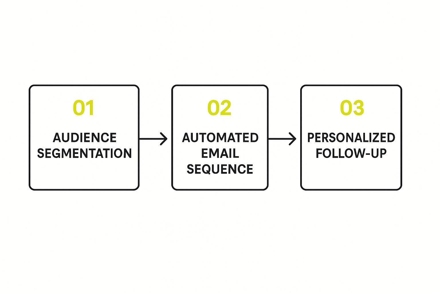
When you build a system like this—from finding friction points to testing smart solutions—you create a powerful engine for continuous improvement that will consistently drive your business forward.
Common Questions About Boosting Conversions
As you start digging into your store’s performance, you’ll probably find yourself asking the same questions I hear all the time. Getting straight answers to these common hurdles is the key to focusing your energy where it matters most and setting realistic goals.
Remember, this is a long game. It's about making a series of smart, informed decisions that stack up over time, not finding a single magic button.
How Long Does It Take to See a Higher Conversion Rate?
Honestly, it depends. A simple tweak, like testing a new color for your "Add to Cart" button, might give you clear results in just a few weeks if you have consistent traffic.
On the other hand, a major overhaul like redesigning your entire checkout flow could easily take a couple of months to build, test, and measure properly. The real secret is consistency. Think of it as an ongoing series of small, educated experiments rather than a one-and-done project.
The most successful stores I’ve worked with treat conversion optimization as a continuous process. Some tests will give you quick wins, while others simply teach you what doesn't work. It’s this constant cycle of improvement, not one magical fix, that builds real, sustainable growth.
If you’re ready for a deep dive, there are some fantastic resources out there. This ecommerce conversion rate optimization guide is a great place to start for a truly comprehensive look at improving your store's performance.
What Is the Single Best Way to Increase Conversions?
Everyone wants the silver bullet, and while there isn't one that works for every single store, I can tell you where to look first: simplify your checkout process. Cart abandonment is the arch-nemesis of conversions, and most of the time, it's caused by friction right at the finish line.
What are the usual suspects? Unexpected costs and forcing people to create an account. Fix those two things, and you’ve solved the biggest frustrations for most shoppers at the most critical moment.
Quick fixes that pack a punch:
- Offer Guest Checkout: Never force a first-time buyer to commit to creating an account. Let them buy now, and ask them to sign up later.
- Be Upfront About Costs: Show all shipping fees and taxes in the cart. No one likes a nasty surprise on the final payment screen.
- Trim Your Forms: Only ask for the absolute bare minimum you need to process the order. Every extra field is another reason to leave.
Should I Get More Traffic or Improve My Conversion Rate First?
For almost every store, the answer is to improve your conversion rate first. Why? Because optimizing your site means you squeeze more value out of the traffic you already have.
Driving more visitors to a site that can’t convert them is like pouring water into a leaky bucket. It's an expensive and frustrating way to try and grow. Once your site is converting visitors efficiently, every dollar you spend on ads or marketing will work that much harder for you, delivering a much better return.
At E-commerce Dev Group, we specialize in turning Shopify stores into high-performing sales machines. Our expert team focuses on rock-solid development and data-driven design to plug leaks in your funnel and boost your bottom line. Ready to turn more visitors into loyal customers? Visit us at scaleshopify.com to see how we can help you grow.
