
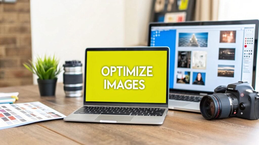
Optimizing your website's images is a balancing act. It's about picking the right file format, shrinking the file size without sacrificing quality, and making sure every image fits perfectly where it's supposed to go. When you get this right, you dramatically speed up your site, which is a game-changer for both your visitors and your search engine rankings.
Why Image Optimization Is a Must-Have Skill

Let's be blunt: learning how to optimize website images isn't just some technical busywork anymore. It’s a core skill for growing your business online.
Slow-loading images don't just frustrate visitors; they actively cost you money by killing user engagement and torpedoing your conversion rates. Your website is your digital storefront, and a slow, clunky experience is like having a door that’s hard to open. People will just turn around and leave.
The impact is bigger than you might think. Data shows that 39% of visitors will simply give up and leave a website if the images take too long to load. That’s a huge chunk of potential leads and sales walking right out the door.
This guide will show you how to turn what's often a major website headache into one of your most powerful assets.
The Pillars of a Solid Image Strategy
A smart image optimization strategy really comes down to a few fundamental ideas. If you get these right, you'll have a clear roadmap for every single image you upload. This isn't just about making files smaller; it's a complete approach that boosts performance, SEO, and even how accessible your site is.
For those running an e-commerce store, the stakes are even higher. If you're on Shopify, for example, this ties directly into your search performance, something we cover in our guide at https://scaleshopify.com/2025/08/03/how-to-improve-shopify-seo/.
Here's a quick look at the fundamental concepts we'll cover. Understanding these four areas is the key to mastering how you handle images on your site.
| The Core Pillars of Image Optimization |
| :— | :— | :— |
| Pillar | What It Is | Why It Matters for You |
| File Format | Choosing the right type of image file (like JPEG, PNG, or WebP) based on the image's content. | Affects image quality, file size, and browser compatibility. The right choice saves kilobytes without losing visual appeal. |
| Compression | Using algorithms to reduce an image's file size. This can be "lossy" (some data lost) or "lossless" (no data lost). | This is the most direct way to speed up load times. Smaller files mean a faster website, period. |
| Dimensions | Resizing images to the exact dimensions they will be displayed at on the screen. | Prevents browsers from having to shrink massive images on the fly, which wastes bandwidth and slows everything down. |
| Delivery | How the image is served to the user, including techniques like lazy loading and using a Content Delivery Network (CDN). | Ensures images load efficiently for every user, no matter their device or location. |
Mastering these pillars ensures you're not just patching a problem but building a better, faster, and more effective website from the ground up.
The benefits are clear and measurable:
- A Better User Experience: Quick-loading pages create a smooth, enjoyable experience that keeps people on your site longer and lowers bounce rates.
- Improved SEO Rankings: Search engines like Google use page speed as a major ranking signal. A faster site almost always ranks better.
- Higher Conversion Rates: A snappy, responsive website makes it easy for users to take action, whether that's buying a product or signing up for a newsletter.
Given that image optimization directly contributes to a smoother user experience and better search engine rankings, it is an essential skill to master. This is reinforced by broader discussions on how to improve website usability and accessibility.
Choosing the Right Image Format Every Time
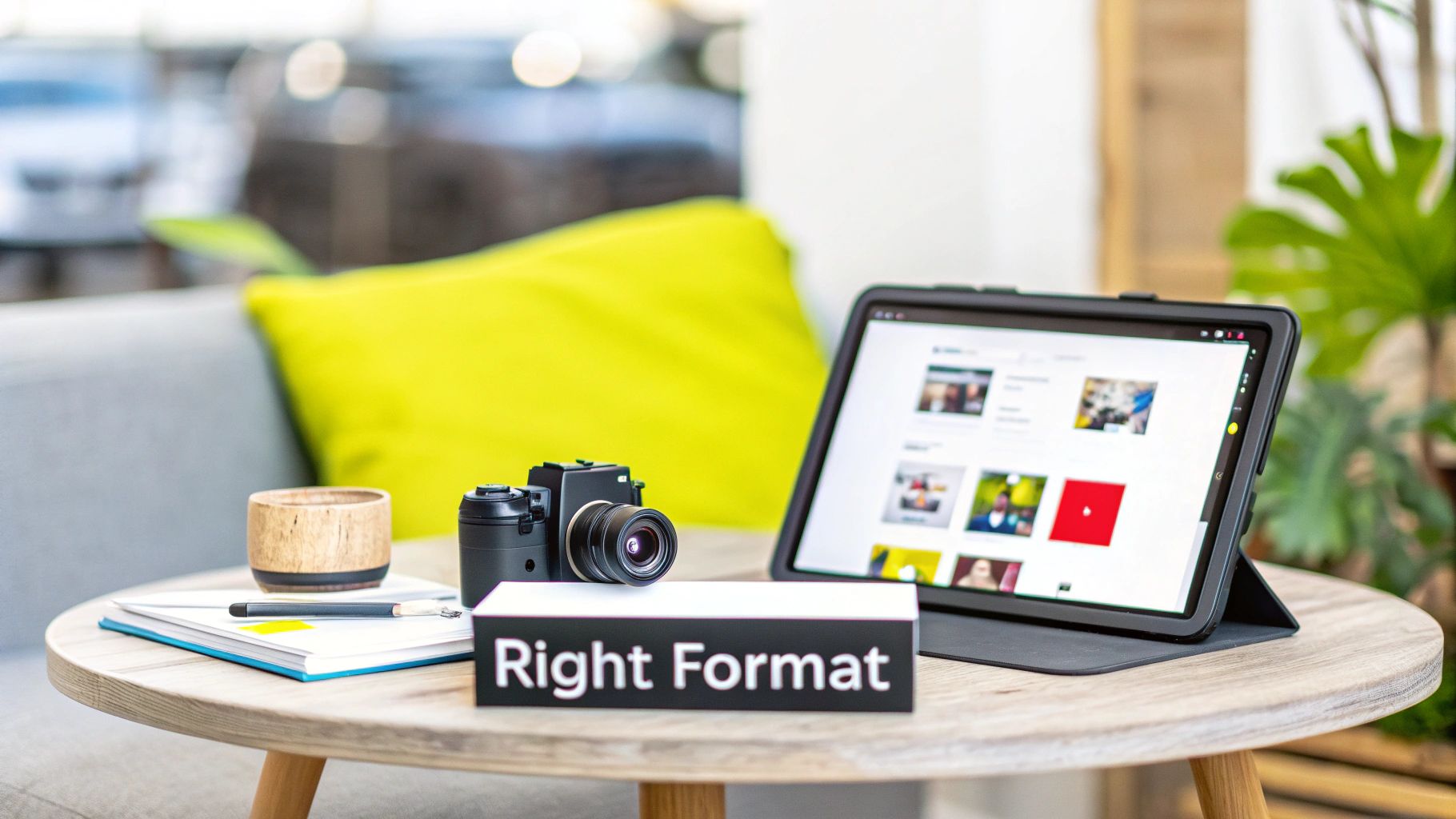
Before you even think about compression or lazy loading, your first big win in image optimization comes from picking the right file format. This isn't just a technical box to check; it’s a foundational choice that dictates file size, visual quality, and ultimately, how fast your pages load for visitors.
Think of it like packing for a trip. You wouldn't use a massive suitcase for a toothbrush, right? The same logic applies here. Using a huge, uncompressed PNG for a simple photo is the digital equivalent of that mistake.
Get this part right, and the rest of your optimization work becomes so much easier. Mess it up, and you'll be fighting an uphill battle against bloated files from the start.
The Workhorses: JPEG and PNG
For years, JPEGs and PNGs have been the bread and butter of the web, and they’re still incredibly relevant. Knowing when to use which is a core skill for anyone managing a website.
JPEG (Joint Photographic Experts Group) is your go-to for anything with a lot of colors and complex details. I'm talking about photographs. It uses what's called "lossy" compression, which sounds scary but is actually brilliant. It selectively removes bits of data the human eye can't easily see, which can drastically shrink file sizes.
You'll want to use JPEGs for things like:
- Product photos on your e-commerce store
- Big, beautiful hero images and banners
- Photographs in your blog posts
PNG (Portable Network Graphics), on the other hand, is the specialist. It uses "lossless" compression, meaning it keeps every single pixel perfectly intact. But its real superpower is transparency. If you need an image to have a transparent background, PNG is your format.
Reach for a PNG when you're working with:
- Your company logo that needs to sit on different colored backgrounds
- Icons, buttons, and user interface elements
- Screenshots where you need the text to be crystal clear
The tradeoff is file size. A PNG will almost always be larger than a JPEG of the same dimensions. So, only use it when you truly need that pixel-perfect quality or, more commonly, that transparent background.
The Modern Contender: WebP
Now, things get interesting. For a while now, we've had next-gen formats, and WebP (developed by Google) has firmly established itself as the new standard. It’s a fantastic all-rounder that can do both lossy and lossless compression, and it even supports transparency.
The real magic of WebP is in the file size savings. A WebP file can be 25-34% smaller than a comparable JPEG and 26% smaller than a PNG, often with no noticeable drop in quality.
This efficiency makes WebP an obvious choice for the vast majority of images on a modern website. Nearly all major browsers support it now, and it's simple to set up a "fallback" so that older browsers will just see a regular JPEG or PNG instead. For a Shopify store owner, this directly translates to faster product pages and a much smoother experience for mobile shoppers.
When to Use SVG for Ultimate Scalability
Finally, let's talk about a completely different beast: SVG (Scalable Vector Graphics). Unlike all the other formats we’ve discussed, which are made of pixels (raster), SVGs are made from mathematical formulas (vector).
This gives SVGs an incredible advantage: they can be scaled to any size—from a tiny favicon to a massive billboard—without ever losing quality. No pixelation, ever. This makes them the clear winner for specific types of graphics.
SVGs are perfect for:
- Logos: Your logo should always be an SVG if possible.
- Icons: Any simple icon used in your site’s interface.
- Simple Illustrations: Line art and graphics that don't need photographic detail.
Because SVGs are essentially just lines of code, their file sizes are often minuscule. They aren’t built for complex photos, but by using them for your logos and icons, you ensure those key brand elements are perfectly crisp and load instantly on every device.
Getting Image Compression Right Without Sacrificing Quality
Once you've picked the best format, the next big win is compression. This is where you really start to see your page speed improve. Compression is just a fancy word for using smart tools to shrink your image file sizes, which makes them load way faster for your visitors.
Think of it like packing a suitcase. You can just toss everything in—that's your uncompressed image, and it takes up a ton of space. Or, you can carefully fold and roll your clothes to fit much more in the same bag. That’s what good compression does; it gets rid of unnecessary data without making the image look messy or distorted.
Getting this right can be the difference between an image that takes five seconds to load and one that feels instantaneous.
Lossy vs. Lossless: The Two Flavors of Compression
When we talk about compression, it really boils down to two main approaches: lossy and lossless. Understanding the difference is crucial for making the right call for each image on your site.
Lossless compression is the careful packer. It reduces file size by organizing the data more efficiently, but it doesn't throw anything away. When the image is displayed, it's rebuilt exactly as it was, pixel for pixel. This is perfect for logos, icons, and technical drawings where every detail has to be perfectly crisp. The trade-off? The file size reduction is usually pretty modest.
Lossy compression, on the other hand, is a bit more aggressive. It cleverly removes bits of data that the human eye is unlikely to even notice. Imagine a photo with a vast blue sky. Lossy compression might take thousands of similar blue shades and simplify them down to a few hundred. This can slash file sizes by a massive amount—sometimes up to 80%—with little to no visible drop in quality.
For most web images, especially photos, the goal is to find that sweet spot with lossy compression. You want the smallest file size possible where the image still looks fantastic to the naked eye.
My Go-To Tools for Quick and Easy Compression
The great news is you don’t need to be a Photoshop wizard to do this well. There are some fantastic, and often free, online tools that make compression a breeze. My personal favorite, and the one I recommend to almost everyone, is TinyPNG.
Don't let the name fool you—it works its magic on JPEGs and WebPs just as well as PNGs. It uses smart lossy compression to dramatically shrink files while keeping them looking sharp.
Here's a peek at its simple drag-and-drop interface.
As you can see, it gives you a clear before-and-after, showing you exactly how much you saved. That instant feedback is a great way to see just how powerful a little compression can be.
Of course, there are other great options out there:
- ImageOptim: A fantastic free app for Mac users. Just drag your images onto it, and it does the rest.
- Squoosh: A powerful web tool from Google that offers more advanced controls. It’s perfect for when you want to see a live preview as you tweak the compression levels.
For most day-to-day work, simply running your images through a tool like TinyPNG before uploading them to your site is a fast, effective habit to build. It takes just a few seconds and ensures your files are as lean as possible. This is especially critical on platforms like Shopify, where media performance can make or break sales. You can learn more about this in our ultimate guide to media file optimization for Shopify migration.
Finding That Compression Sweet Spot
So how much is too much? It’s a bit of an art, but finding the right balance is pretty straightforward.
- Start with your original, high-quality image.
- Run it through your compression tool of choice. The default setting is often a great starting point.
- Place the original and the compressed version side-by-side and look closely. Do you see any weird blotches, fuzzy edges, or strange color bands?
- If you can’t tell the difference, you've nailed it. You've cut down the file size without any visible cost.
- If you do see a noticeable drop in quality, the compression was probably too aggressive. Tools like Squoosh are great here because they let you dial back the settings until it looks just right.
The goal is to be aggressive but not reckless. It’s tempting to shave off every last kilobyte, but not if it means your website ends up looking blurry and unprofessional. After a while, you’ll get a feel for it and be able to find that perfect compression balance every time.
Using Advanced Techniques for a Faster Website
Once your images are properly formatted and compressed, you’ve already won half the battle. Now, it’s time to shift our focus from the images themselves to how they get delivered to your visitors. This is where we get into the advanced stuff—the loading and delivery strategies that separate a fast website from a truly professional, high-performance one.
These techniques might sound a little technical at first glance, but they're surprisingly straightforward to put into practice. The payoff is huge, with an immediate, noticeable impact on both how fast your site feels and your Core Web Vitals scores.
Give Your Users a Head Start with Lazy Loading
Picture walking into a massive art gallery. Instead of flipping on every single light at once, what if the lights only turned on in the room you were standing in? This would save a ton of energy and let you start exploring right away. Lazy loading does the exact same thing for your website's images.
By default, a browser tries to download every single image on a page the moment it loads—even the ones buried at the very bottom that a visitor might never see. Lazy loading smartly tells the browser to hold off and only load an image right before it’s about to scroll into view.
The benefits here are massive:
- Faster Initial Page Load: The browser has far less to download upfront, so the content your user sees first appears much more quickly.
- Reduced Bandwidth Usage: This saves bandwidth for both your server and your visitors, which is a big deal for anyone on a mobile data plan.
- Improved LCP Scores: By deferring offscreen images, you let the browser prioritize the most important content at the top of the page, which can seriously improve your Largest Contentful Paint (LCP) score.
The best part? Modern browsers have made this incredibly simple to implement. All you need to do is add the
loading="lazy"attribute to your<img>tags. It's a tiny change that delivers a huge performance boost.
Serve the Perfect Image Every Time with Srcset
Ever notice how an image can look perfectly crisp on a desktop but a bit blurry on your high-res phone? Or worse, you're stuck downloading a massive desktop-sized image on a small mobile screen, wasting time and data. The srcset attribute is the solution to this exact problem.
It lets you give the browser a whole menu of different-sized versions of an image. The browser then intelligently picks the best one to download based on the user's screen size and resolution.
This ensures two critical things happen:
- People on big, high-resolution screens get a sharp, beautiful image that does your design justice.
- People on smaller, lower-res devices get a smaller, faster-loading version, saving them data and time.
Here's a quick look at the basic workflow for prepping your images before you even touch the code.
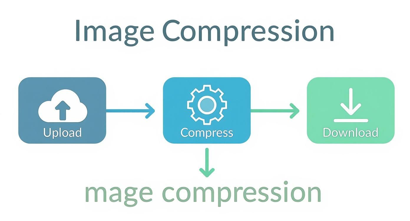
This workflow—upload, compress, download—is the foundational step you need to take before implementing responsive techniques like srcset.
Adding srcset is just a simple bit of HTML. Here’s a real-world example you can adapt:

In that snippet, the 500w, 1000w, and 1500w tell the browser the actual width of each image file. The browser does the rest, checking the device’s screen and picking the most appropriate file. It's the perfect balance of quality and performance.
Accelerate Global Delivery with a CDN
For any serious website, a Content Delivery Network (CDN) is simply non-negotiable. Think of a CDN as a global network of servers. Instead of your images living on just one server in one location, a CDN makes copies and stores them on dozens of servers all around the world.
So, when someone from Japan visits your site, the images are served from a local server in Asia, not from one halfway across the world in North America. This drastically cuts down the physical distance the data has to travel, which means much faster load times for your international audience.
Using a CDN is one of the single most effective ways to boost your site’s speed. Most modern web hosts and platforms offer easy CDN integration, making it a no-brainer. To see how it fits into the bigger picture, you can learn more about how to improve website loading speed.
When you combine a CDN with lazy loading and responsive images, you've created a powerful, three-pronged approach to world-class image delivery.
How to Automate Your Image Optimization Workflow
Let's be honest. If you're running a blog, an e-commerce shop, or any website with more than a handful of pages, manually compressing every single image is a recipe for burnout. It's tedious, mind-numbing work, and there are far better things you could be doing with your time.
This is where automation becomes your best friend.
When you set up an automated workflow, your images get optimized the moment they’re uploaded, all without you having to think about it. It keeps everything consistent, saves you countless hours, and ensures your site stays fast as it grows. This isn't just a nice-to-have; it's a non-negotiable system for maintaining a high-performance website.
If you're new to this, it helps to spend a little time understanding workflow automation in general. Knowing the basic principles will give you a much better grasp of how these tools work their magic behind the scenes.
Choosing Your Automation Tool
The good news is you've got options—lots of them. Whether you want a simple WordPress plugin or a more robust, all-in-one platform, there's a tool out there for you. Your final choice will come down to your technical comfort level, budget, and what your site actually needs.
One of the biggest culprits in slow websites is the use of oversized images. It's a surprisingly common problem. As of 2025, a whopping 36% of websites are still serving images that are way bigger than they need to be, which absolutely kills page load speeds. Automation is really the only sustainable way to fix this for good.
Let's look at the two main ways people tackle this.
WordPress Plugins: The Set-It-and-Forget-It Solution
For anyone on WordPress, plugins are the easiest and most direct route to automation. They hook right into your media library and get to work as soon as you upload a new image.
Here are a few of the top contenders I've used and recommended over the years:
- Smush: This is a crowd favorite for a reason—it’s just so easy to use. The free version gives you lossless compression (up to 5MB), lazy loading, and alerts for incorrectly sized images. If you need more power, the Pro version unlocks features like aggressive lossy compression and a CDN.
- ShortPixel: An absolute powerhouse. It handles both lossy and lossless compression, converts images to WebP, and can even deliver them in AVIF. It works on a credit system, but the free monthly credits are often plenty for smaller blogs.
- EWWW Image Optimizer: Another solid choice that’s popular with developers who like a bit more control. It can compress images on your own server for free or use its paid cloud service for more intensive processing.
The killer feature on almost all these plugins is the bulk optimizer. In one click, you can go back and crunch every single image you've ever uploaded. It’s an instant performance win for your entire site.
Image Management Platforms: The All-In-One Powerhouse
For bigger sites, e-commerce stores with thousands of product photos, or any business needing more than just basic compression, a dedicated image management platform is the way to go. These services don't just compress images; they manage their entire lifecycle.
Cloudinary is the big name in this space, and for good reason. Think of it as a complete digital asset management (DAM) system that lives in the cloud.
You just upload one high-resolution master image, and Cloudinary can automatically:
- Resize and crop it into all the different versions you need—thumbnails, hero banners, you name it.
- Apply smart compression and choose the best format (like WebP or AVIF) based on the user's browser.
- Add effects, filters, and even AI-powered touch-ups on the fly.
- Deliver everything through a lightning-fast global Content Delivery Network (CDN).
Sure, a platform like Cloudinary has a steeper learning curve than a simple plugin. But for a high-volume Shopify store, this kind of system is a game-changer. It guarantees that every product image is perfectly optimized for every visitor, on every device, without you ever lifting a finger. That leaves you free to focus on what actually matters—growing your business.
Answering Your Top Image Optimization Questions
Once you start digging into formats, compression, and delivery, the practical questions always bubble up. It's one thing to understand the theory, but it's another to apply it to your actual website.
Let's walk through some of the most common questions I hear from people who are just starting to get serious about optimizing their images. Think of this as your quick-start FAQ for getting things done right.
What's the "Perfect" File Size for a Website Image?
There’s no single magic number, but I have a rule of thumb that has served me well for years: aim for under 150 KB for most images. This works great for things like product photos, blog post illustrations, and other standard visuals.
Of course, there are exceptions. If you have a massive, full-width hero image at the top of your homepage, you might have to creep closer to 300 KB. But that should be a rare case, not your standard.
The real goal is to find that perfect balance—the smallest possible file size where you can't see a noticeable drop in quality.
My go-to process is simple: I run every image through a tool like TinyPNG and then I do a quick side-by-side comparison with the original file. If I can't spot the difference with my own eyes, it's good to go. This simple visual check is surprisingly effective.
Does Renaming an Image File Actually Help with SEO?
Yes, absolutely. This is one of the easiest SEO wins on the table, and it’s shocking how often it gets overlooked. A descriptive file name gives search engines like Google a powerful clue about your image's content before they even have to process the page.
Just look at these two filenames. Which one is more helpful?
IMG_9821.jpgblue-nike-air-zoom-running-shoes.jpg
The second one tells Google exactly what it's looking at. This simple habit helps your images rank in Google Images and reinforces the topical relevance of the page they're on. Always use descriptive, keyword-rich filenames, and separate the words with hyphens. It's a few extra seconds of work for real, long-term value.
Should I Use a Plugin or Optimize Images Manually?
This really comes down to one thing: scale.
If you're running a small personal blog and only upload a handful of images each month, doing it manually is perfectly fine. You get total control over the compression and final look.
But for just about everyone else—especially e-commerce sites, busy blogs, or any website with a significant amount of content—automation is a game-changer. Using a plugin or a dedicated service isn't just a convenience; it's a necessity.
Here’s why automation almost always wins out:
- It’s Consistent: Every single image gets optimized the same way, every time. No exceptions.
- It Saves Time: You get back countless hours you would have spent on a repetitive, manual task.
- It Fixes the Past: Many tools can scan your media library and optimize all your existing images, giving you an immediate site-wide speed boost.
For most website owners, a good plugin is the most practical and sustainable way to handle image optimization.
What’s More Important: Alt Text or the File Name?
This is a classic debate, but the answer is you need both. They serve different but equally important roles, and a solid image SEO strategy relies on them working together. Don't think of it as an either/or choice.
Here’s how to think about their distinct jobs:
- The File Name: This is your signal to search engines. It’s their first hint about the image’s subject matter. Keep it concise and keyword-focused.
- Example:
red-tesla-model-3-front-view.jpg
- Example:
- The Alt Text: This is for people first and search engines second. Its primary job is accessibility, describing the image for screen readers. It should be a complete, descriptive sentence.
- Example:
A red Tesla Model 3 parked on a sunny residential street.
- Example:
The best approach is to make them complement each other. Use your core keywords in the file name and then use the alt text to provide a more natural, human-friendly description.
Ready to take your Shopify store to the next level with expert optimization? The team at E-commerce Dev Group specializes in creating fast, high-converting websites. Let us handle the technical details so you can focus on growing your business. Learn more about our Shopify development services.