
Optimizing your images for the web really boils down to three key things: picking the right file format (like WebP), compressing the image to shrink its file size without trashing the quality, and then making sure it's delivered efficiently using responsive techniques. If you get these three things right, you’ll see a massive improvement in your site's speed and how users feel about it.
Why Image Optimization Is a Game Changer for Your Website
Let's be real for a second. The number one reason most websites feel slow and clunky? Huge, unoptimized images. We’ve all been there—you click on a site, and you're just staring at a blank space where an image is supposed to be. Nine times out of ten, that's a massive image file that was never prepped for the web. This isn't just a small hiccup; it can seriously hurt your business.
The Real Cost of Slow Images
Every extra second a visitor has to wait for your page to load, the odds of them bouncing go way up. A simple one-second delay can lead to a 7% drop in conversions. That's how crucial speed is. The main culprit behind these delays is almost always oversized images, which are a primary cause of high bounce rates.
In fact, Google found that when page load time jumps from one second to three seconds, the probability of a visitor leaving skyrockets by 32%.
Slow-loading pages aren't just a technical problem; they're a business problem. When a potential customer has to wait, you don't just risk the sale—you risk losing their trust.
Beyond Speed: A Direct Impact on SEO and Sales
The wins from optimizing your images don't stop at speed. Search engines like Google use page speed as a major ranking signal. A faster website means better visibility in search results, which translates directly to more organic traffic. Simple as that.
If you're running an e-commerce store, this is non-negotiable. Optimized product images load in a flash, creating a smooth, enjoyable browsing experience that keeps people on your site and looking at more products.
Picture the ideal customer journey:
- Someone lands on a product page.
- Crystal-clear, fast-loading images grab their attention immediately.
- They can flick through different product shots without any annoying lag.
This seamless interaction builds confidence and directly impacts whether they decide to buy. This guide is all about images, but for a broader look at performance, it's worth learning how to optimize website speed for peak performance.
Here's a quick rundown of the main tactics and why they matter.
Image Optimization Quick Wins
| Optimization Tactic | What It Does | Primary Benefit |
|---|---|---|
| Next-Gen Formats | Uses modern file types like WebP or AVIF. | Delivers high quality at a much smaller file size. |
| Compression | Reduces the image file size by removing unneeded data. | Drastically cuts down on load time. |
| Responsive Images | Serves different image sizes based on the user's screen. | Prevents mobile users from downloading huge desktop images. |
| Lazy Loading | Defers loading of off-screen images until they are needed. | Speeds up the initial page load for a faster first impression. |
Mastering these techniques isn't just about making your site faster; it's about creating a better experience that respects your visitors' time and ultimately helps your business grow.
Choosing the Right Image Format for the Job
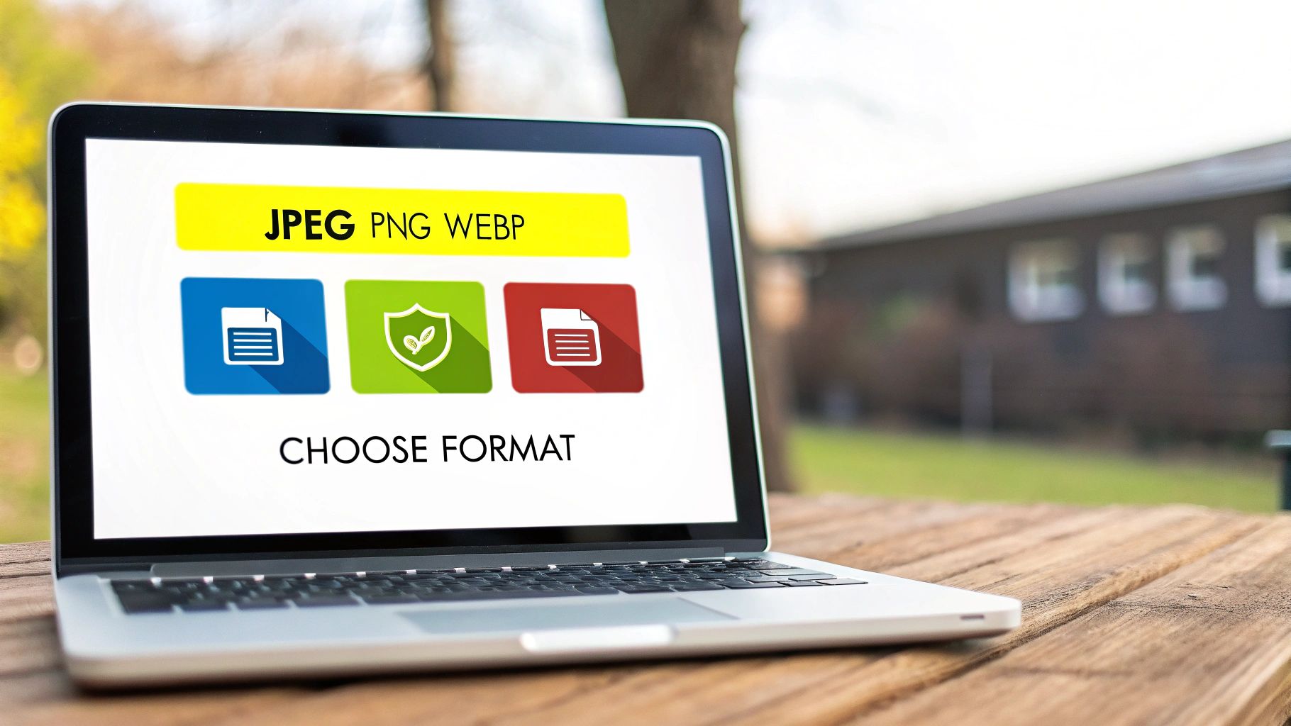
When it comes to optimizing images, picking the right format is one of the biggest levers you can pull. This isn't about finding a single "best" format for everything, but rather choosing the smartest tool for each specific job.
The whole game is a balancing act between visual quality and file size. A poor choice means you're either stuck with a beautiful-but-huge file that tanks your page speed, or a fast-loading image that looks like a pixelated mess. Let's walk through the common formats and where each one shines.
The Classic Contenders: JPEG and PNG
For years, JPEG and PNG were the undisputed champions of web imagery. They're still incredibly useful, but it's important to know their specific roles.
-
JPEG (or JPG): This should be your default choice for photographs and any image with lots of colors and gradients. JPEGs use "lossy" compression, which cleverly throws away a little bit of image data to dramatically shrink the file size. When you save it at a high-quality setting, you won't even notice the difference—except in your loading speed.
-
PNG: The superpower of PNG is transparency. If you need to place a logo, icon, or any graphic on a colored background without a clunky white box around it, PNG is your answer. It uses "lossless" compression, which means no data is lost, but the tradeoff is usually a much larger file compared to a JPEG.
One of the most common mistakes I see is people saving detailed photos as PNGs. The file size balloons for no good reason. On the flip side, saving a logo as a JPEG will kill its sharp lines and ruin any transparency.
Embracing Next-Gen Formats: WebP and AVIF
This is where the serious performance gains happen. Formats like WebP and AVIF were built from the ground up for the modern web, offering far better compression than their older cousins.
WebP is the reigning king of web performance right now. Developed by Google, it's incredibly versatile, supporting both lossy and lossless compression, transparency, and even animation. A WebP image can be 25-34% smaller than an equivalent JPEG and 26% smaller than a PNG, with no noticeable drop in quality.
Think about your website's main hero image. As a high-quality JPEG, it might be 350KB. The exact same image saved as a WebP could easily drop below 250KB. That's a huge saving that your visitors will feel.
AVIF is the newer kid on the block, often delivering even more dramatic file size reductions than WebP, especially for very detailed images. Browser support is still catching up, but it's an exciting option for anyone trying to squeeze out every last drop of performance.
Beyond just compression, choosing the best image format for web performance is a critical skill. The best strategy today is to serve modern formats like WebP to browsers that can handle them, while providing JPEGs or PNGs as a fallback for older ones. Thankfully, many modern platforms and plugins can do this for you automatically, so every user gets the best possible experience.
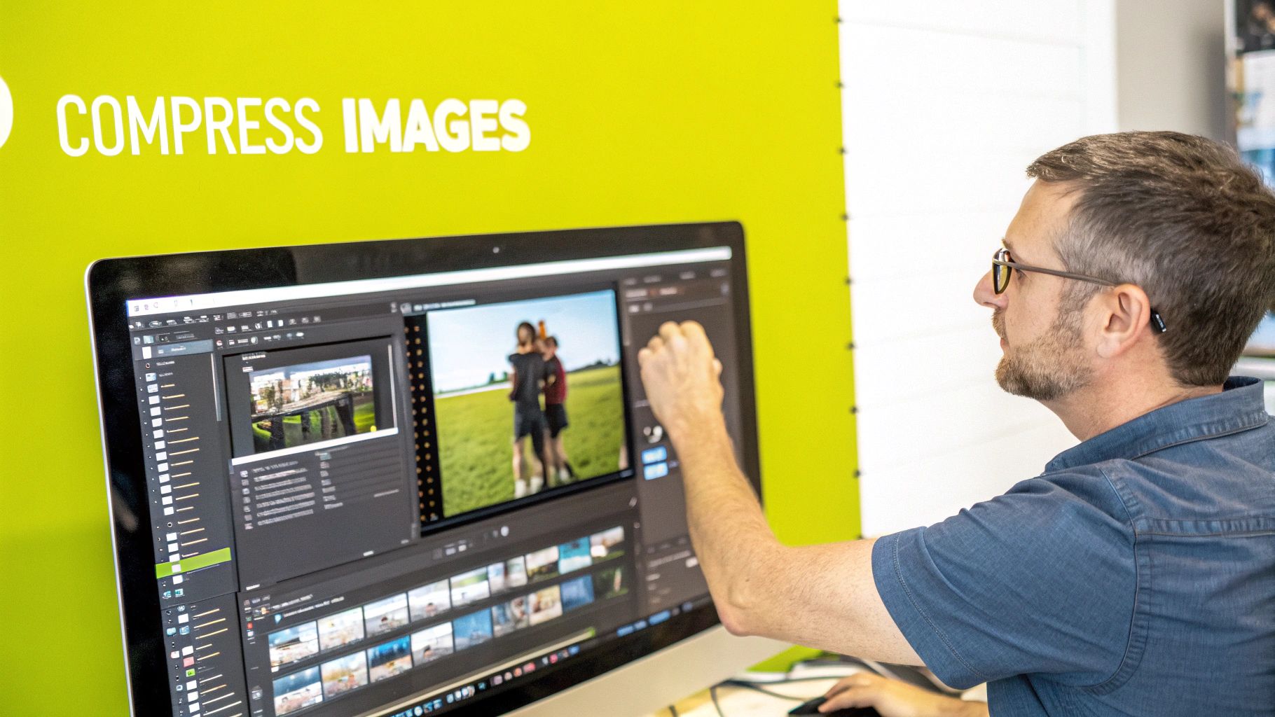
Getting Image Compression and Sizing Right
Once you've picked the right image format, the next step is to tackle its file size. This is where you get hands-on with compression and proper sizing, two things that directly impact how fast your pages load.
This part is absolutely critical. I can't tell you how many times I've seen a beautiful site brought to its knees by someone uploading a massive, high-resolution photo straight from their camera. It’s a common mistake that can single-handedly tank your performance.
Lossy vs. Lossless: What's the Difference?
When we talk about shrinking an image's file size, we're talking about compression. It really boils down to two types: lossy and lossless.
-
Lossless Compression: Think of this as a tidy-up. It reduces file size by getting rid of non-essential metadata from the image file. No visual information is lost, so the quality is identical to the original. This is perfect for technical diagrams or images with crisp text where every single pixel counts.
-
Lossy Compression: This is the heavy lifter. It intelligently removes some pixel data to make the file significantly smaller. For most photos on the web, a bit of lossy compression is completely unnoticeable to the human eye but can slash the file size by 70% or more.
For pretty much any photo on your website, lossy compression is the way to go. The savings in file size are just too good to pass up, and when you do it right, the quality difference is negligible.
Great Tools That Make Compression Easy
The good news is you don't need to be a graphic designer to compress your images well. There are some fantastic, user-friendly tools that handle all the complex stuff for you.
One of my go-to recommendations for beginners is TinyPNG. It's incredibly simple—you just drag and drop your JPEGs or PNGs, and the tool automatically applies smart lossy compression to shrink them down.
What I love is that it gives you a clear before-and-after, showing you exactly how much space you’ve saved. This kind of immediate feedback really helps you see the impact you're making.
Size Your Images Before You Upload
Compression is only one side of the coin; sizing is the other. You absolutely must resize your images to the correct dimensions before you upload them.
Uploading a 4000-pixel wide image just to display it in a 600-pixel space is a classic performance killer. The browser is forced to download that entire massive file and then shrink it on the fly, wasting a ton of bandwidth and slowing everything down.
As a general rule, try to keep most desktop images somewhere between 1280 and 1920 pixels wide, and always aim for a final file size under 200KB. For mobile, those dimensions should be much smaller to save on data.
My rule of thumb is simple: figure out the largest size an image will ever be displayed on your site, and then resize the image to be just a little bit bigger than that. No more. This keeps it looking sharp without any wasted pixels.
Knowing the ideal dimensions for different platforms is also a huge help. For example, a good guide on Pinterest image dimensions shows how sizing for a specific context improves performance and appearance. That principle holds true for your website, too. Always size with a purpose.
Responsive Images and Lazy Loading: The Final Polish
So you've picked the right formats and compressed your images. That's a huge step, but if you want to take your site’s performance to the next level, it’s time to get smarter about how you deliver those images. This is where responsive images and lazy loading come in—they ensure every visitor gets a fast, smooth experience, no matter what device they're using.
Think about it. Serving a massive, high-resolution hero image to someone on a tiny phone screen is just wasteful. It’s like trying to pour a gallon of water into a coffee cup. Responsive images fix this by letting the browser pick the perfect-sized image for the screen it’s being viewed on.
Use srcset to Serve Different Image Sizes
The real workhorse behind responsive images is the srcset attribute. Instead of just one src pointing to a single file, you give the browser a menu of options to choose from.
A standard image tag is simple:<img src="image-large.jpg" alt="A large, detailed product shot">
But with srcset, it gets a whole lot smarter:<img src="image-large.jpg" srcset="image-small.jpg 480w, image-medium.jpg 800w, image-large.jpg 1200w" alt="A responsive product shot">
Here, the browser checks the user's screen width and network speed, then downloads the most appropriate file. Someone on a phone might get the 480w version, while a visitor on a large desktop monitor gets the full 1200w image. This simple change can dramatically cut down load times for mobile users without sacrificing quality for desktop visitors.
The process of creating these different image versions isn't as complicated as it sounds, as this infographic lays out.
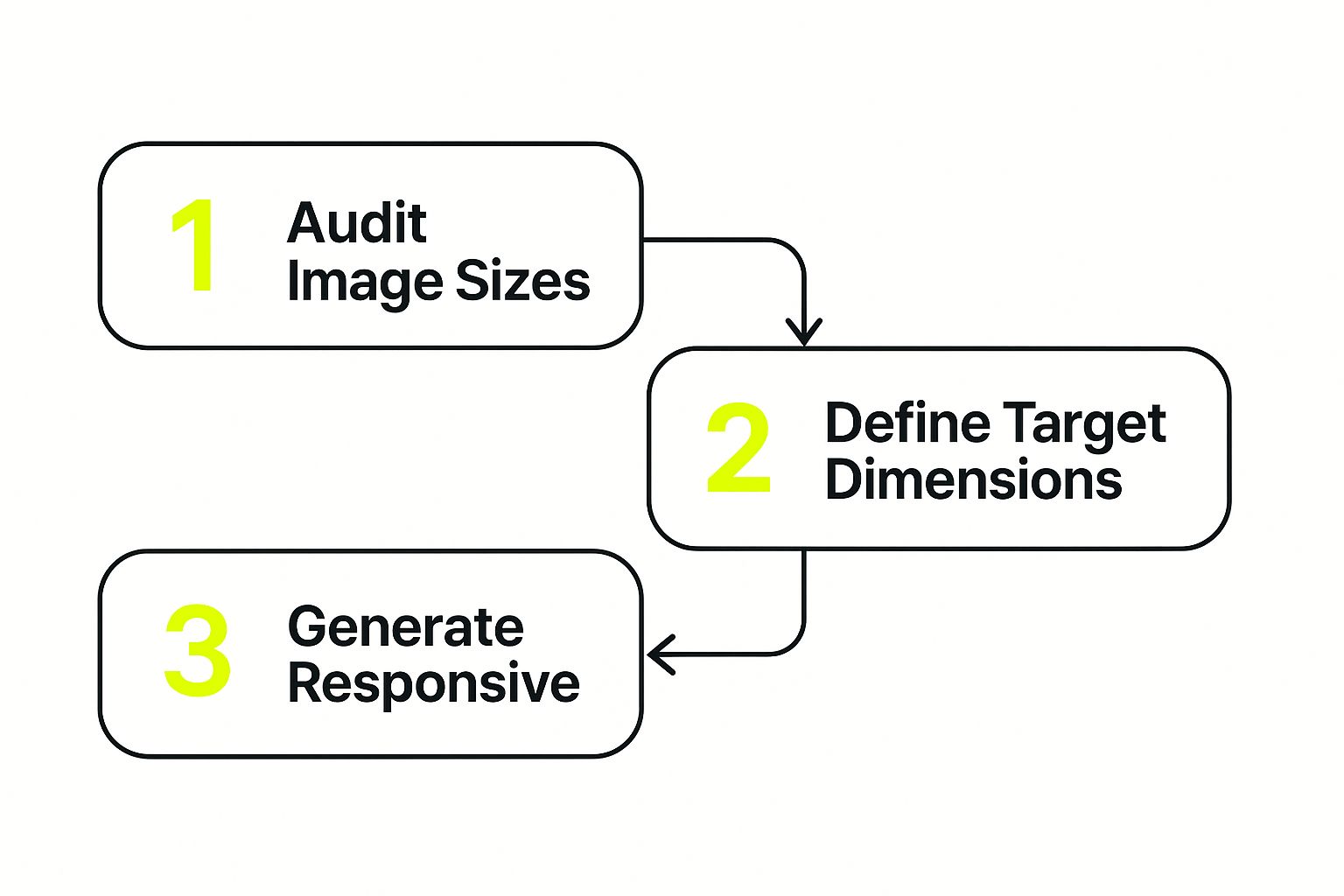
It all comes down to a simple workflow: figure out what sizes your layout needs, then create those specific image versions.
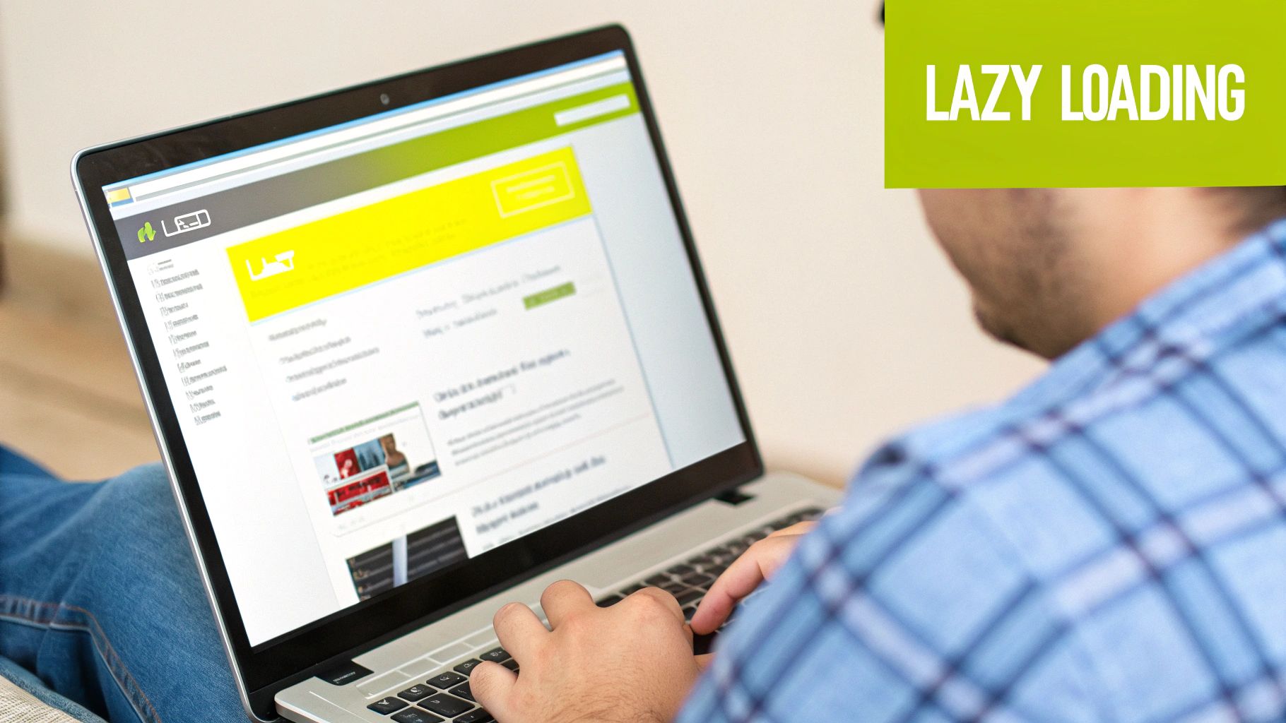
Make Your Site Feel Faster with Lazy Loading
Now for my favorite trick: lazy loading. This technique tells the browser to hold off on loading any images that aren't currently visible on the screen. As the user scrolls down, the images load just before they come into view.
The impact here is immediate. Your initial page load becomes much faster because the browser isn't trying to download every single image on the page at once. Why force a visitor to wait for the images in your footer to load before they can even see the hero banner?
By deferring off-screen images, you prioritize the content your visitor sees first. This makes your page feel incredibly responsive and gives a major boost to Core Web Vitals, especially Largest Contentful Paint (LCP).
The best part? Modern browsers have made this incredibly easy to implement. You can enable lazy loading by adding a simple loading="lazy" attribute to your image tags:
<img src="image.jpg" loading="lazy" alt="An image that will lazy load">
Most modern platforms like WordPress and Shopify already do this for you, either automatically or with a simple checkbox in the settings. If you're on Shopify, image optimization is just one piece of the puzzle; you can dive deeper into overall site performance in our guide on Shopify speed optimization.
When you pair responsive images with lazy loading, you’ve got a potent combination for web performance. You’re no longer just sending smaller files—you’re sending the right file at precisely the right time.
Boosting Your SEO with Smart Image Tactics
When we talk about image optimization, most people immediately think of page speed. And they're not wrong—faster load times are a definite ranking factor. But treating your images as just a technical box to check is a huge missed opportunity. A truly smart image strategy is a powerful, and often ignored, part of great SEO.
It's about more than just compression. To really get ahead, you need to think about how search engine crawlers read your website. They can't see the pictures, but they can read the data you attach to them. This is where you can gain a serious competitive edge, and it all starts with file names and alt text.
Crafting SEO-Friendly File Names
Every single image you upload needs a descriptive file name. This is one of the simplest SEO wins out there, yet it's something I see overlooked all the time.
Put yourself in a search engine's shoes. Which of these file names is more helpful?
IMG_7892.jpgblue-suede-running-shoes-side-view.jpg
It’s a no-brainer. The second one gives Google immediate context about the image, helping connect your page to relevant searches. The rule of thumb is simple: use hyphens between words and use keywords that genuinely describe what’s in the picture.
Writing Alt Text That Works for Everyone
Alt text (or alternative text) is just as important. Its main job is accessibility—it gives screen readers a description to read aloud for visually impaired users. But it also doubles as a direct signal to search engines about your image's content.
Good alt text is both descriptive and concise. It should feel natural, not like a list of stuffed keywords. Just imagine you're describing the image to someone over the phone.
My Two Cents: Think of your alt text as a way to reinforce your page's main topic. It should complement the surrounding text, creating a tighter, more cohesive experience for both your audience and the search bots crawling your site.
By getting these two things right, you’re doing more than just helping your main page rank. You're also giving your images a fighting chance to show up in Google Images, which can drive a surprising amount of traffic. Every optimized image becomes another entry point for customers to find you.
This kind of detailed image review is a core part of any solid SEO work, much like the process we follow in our guide to e-commerce SEO audits.
When you get right down to it, a savvy image strategy is about making your content more accessible, more discoverable, and far more valuable to search engines. It turns every visual on your site into an asset that works for you.
Measuring the Impact of Your Optimization Efforts
So, you've put in the work to optimize your images. That's great! But how do you actually know if it made a difference?
You can't just guess. You need to measure the results. This isn't just about patting yourself on the back; it's about proving the value of your efforts and making smart, data-driven decisions to keep improving your site's performance.
The best way to see the real impact is to get a baseline first. Before you touch a single image, run your key pages through a performance testing tool. This gives you a crucial "before" snapshot to compare everything against later.
Your Go-To Performance Analysis Tools
You don't need a huge budget or fancy software to get this done. Two of the best tools for the job are completely free and packed with insights you can act on immediately.
- Google PageSpeed Insights: This is your window into how Google sees your site. It gives you straightforward scores for both mobile and desktop and points out specific areas you can improve.
- GTmetrix: This tool provides a super detailed waterfall chart, showing you the loading sequence of every single element on your page. It’s fantastic for hunting down specific images that are creating bottlenecks.
Here’s a look at what a PageSpeed Insights report gives you, with the Core Web Vitals right at the top.
This report gives you a clear score out of 100 and breaks down the most critical metrics, making it easy to see exactly where your hard work paid off.
Focusing on the Metrics That Actually Matter
When you run these tests, you're going to see a lot of data. It’s easy to get lost in the numbers. My advice? Focus on the metrics that are directly tied to the user experience and image performance.
The goal isn't just chasing a perfect 100 score. It's about making the site feel faster to a real person. A quicker Largest Contentful Paint (LCP) time, for example, means the main image or block of text loads sooner, which dramatically improves a user's perception of speed.
Beyond the raw speed scores, take a look at your website analytics. Are people staying on your pages longer? Has your bounce rate dropped? These are powerful signs that a smoother, faster experience is keeping visitors engaged.
For Shopify store owners, tying these improvements directly to business results is what it's all about. It’s a core part of how we optimize Shopify speed for our clients. By tracking these key metrics, you can draw a straight line from your image optimization work to a better bottom line.
Answering Your Top Image Optimization Questions
Even with a solid plan, a few questions always seem to surface when people start optimizing their images. Getting the answers right can make a huge difference in your workflow and, more importantly, your site's performance. Let's dig into some of the most common ones I hear.
Does This Stuff Actually Help My SEO?
This is probably the number one question, and the answer is a resounding yes. Page speed is a well-known Google ranking factor, and what's the biggest culprit behind slow sites? Yep, heavy images. Faster pages don't just feel better to users; they often rank better, too.
But it goes beyond just speed. When you give your images descriptive file names and thoughtful alt text, you're handing search engines valuable context about your content. This helps them understand what your page is about, which can boost your chances of showing up in both regular search results and Google Images—a traffic source many people forget about.
Is There Such a Thing as "Too Compressed"?
Absolutely. It's easy to get carried away with compression sliders, but you can definitely overdo it. If you push lossy compression too far, you’ll end up with a pixelated, blocky mess. That kind of visual degradation makes your site look unprofessional and hurts the user experience.
Your goal is to find that perfect balance—the smallest file size you can get with no noticeable drop in quality. Always, always preview your images after compressing them to make sure they still look crisp and clean.
What About the Hundreds of Images Already on My Site?
The thought of going back to optimize a massive library of existing images can feel overwhelming. Don't panic. You don't have to do it all at once.
- Tackle your most valuable pages first. Start with your homepage, key landing pages, and most popular blog posts. Optimizing these will give you the biggest bang for your buck right away.
- Lean on bulk optimization tools. There are plenty of great plugins and services that can crawl your media library and compress everything automatically. This is a massive time-saver.
- Establish a new process. From this point forward, make sure every single new image you upload follows these best practices.
By tackling these common sticking points, you can build a more confident and efficient process for keeping your entire site fast and visually appealing.
Ready to turn these insights into action on your Shopify store? The team at E-commerce Dev Group specializes in performance optimization that drives real results. Let's make your site faster together.