
Before you can boost your Shopify store’s conversion rate, you need a clear target. What number are you actually aiming for? It’s easy to get hung up on averages, but the real goal is to establish a solid benchmark and then systematically beat it.
A "good" conversion rate is often considered anything over 3.2%, which would put you in the top 20% of all Shopify stores. The truly elite stores—the top 10%—are hitting numbers closer to 4.7%. But these are just points on a map; they don't tell you where your own journey should start.
Setting Realistic Conversion Benchmarks
So, what’s a realistic conversion rate for your store? Honestly, it depends. Chasing a single, universal number is a recipe for frustration because so many factors come into play. Your industry, the price of your products, and where your traffic comes from all dramatically influence what's possible.
Think about it this way: a store selling high-end, custom-built furniture will almost always have a lower conversion rate than a shop selling trendy, inexpensive phone cases. The first is a major, considered purchase, while the second is often an impulse buy. Likewise, warm traffic from your email list will naturally convert better than first-time visitors who just clicked a social media ad.
Understanding the Numbers
If you look at the big picture, the average conversion rate across all Shopify stores hovers around 1.4%. That means for every 100 people who visit, maybe one or two will actually buy something. But that average includes absolutely everyone, from brand-new stores to established giants.
A much better way to think about it is to look at what the top performers are doing. As mentioned, the top 20% of stores are converting at 3.2% or higher, with the top 10% pushing 4.7%. You can dig deeper into these numbers by checking out some recent Shopify conversion statistics.
Key Takeaway: Don’t get fixated on the global average. Your real mission is to beat your own numbers, month after month. Turning a 1% conversion rate into 1.5% is a massive 50% jump in sales—that's a huge win.
Defining Your Starting Point
To build a strategy that actually works, you need to know where you stand right now. Forget hitting 5% overnight. The goal is to consistently do better than you did last month.
Here’s how to get your bearings:
- Find Your Baseline: Jump into your Shopify Analytics and Google Analytics. What has your online store conversion rate been for the last 90 days? That's your starting line.
- Segment Your Traffic: Don't just look at the overall rate. Break it down by traffic source. How do visitors from organic search, paid ads, and social media compare? This will quickly show you which channels are pulling their weight.
- Set Tiered Goals: Start with small, achievable wins. If you're currently at 1.2%, make it a goal to hit 1.5% next quarter. Once you're there, aim for 1.8%.
This approach turns a vague goal like "improve conversions" into a focused, data-driven plan. You start making changes that are measured and meaningful, building momentum that leads to real, sustainable growth.
To give you a clearer picture of where to focus your efforts, here's a breakdown of the key optimization areas we'll cover in this guide.
High-Impact Areas for Shopify Conversion Rate Optimization
This table summarizes the key areas discussed in this guide, outlining the primary goal and potential impact of optimizing each one.
| Optimization Area | Primary Goal | Potential Impact on Conversion |
|---|---|---|
| User Experience (UX) | Make shopping intuitive, easy, and enjoyable. | High |
| Site Speed & Performance | Reduce load times to prevent visitor drop-off. | High |
| Product Pages | Persuade visitors with compelling copy, images, and social proof. | Very High |
| Trust & Credibility | Build confidence with reviews, security badges, and clear policies. | High |
| Checkout Process | Remove friction and simplify the final steps to purchase. | Very High |
| Mobile Optimization | Ensure a flawless shopping experience on smartphones and tablets. | High |
| A/B Testing | Use data to validate changes and make informed decisions. | Medium to High |
| Personalization | Show relevant products and offers to individual shoppers. | Medium |
Focusing on these elements—especially high-impact areas like your product pages and checkout process—is the surest way to start moving the needle on your conversion rate.
Crafting Product Pages That Actually Convert
Your product page is the final handshake before a sale. It's where a casual browser decides to become a customer, making it one of the most powerful levers you can pull to improve your Shopify conversion rate. A generic page with a few bullet points just doesn't cut it anymore; you have to create an experience.
The key is to stop listing features and start selling outcomes. A customer isn't buying a "water-resistant jacket"; they're buying the freedom to hike without worrying about a sudden downpour. This mental shift is everything when it comes to writing product descriptions that truly connect.
Write Copy That Sells Benefits, Not Features
The single most common mistake I see on product pages is a dry list of technical specs. Sure, details like dimensions and materials matter, but they rarely spark the desire to buy. People purchase solutions to their problems and upgrades to their lifestyle.
Your job is to translate every feature into a real, tangible benefit.
-
Feature: "Made with 100% organic cotton."
-
Benefit: "Enjoy breathable, all-day comfort that's gentle on your skin and the planet."
-
Feature: "Includes a 5,000 mAh battery."
-
Benefit: "Stay powered through your busiest days, from morning coffee to late-night emails."
This simple reframing helps shoppers see themselves using—and loving—your product. It directly answers their silent question: "What's in it for me?"
A great product page makes the customer feel understood. It anticipates their questions, addresses their hesitations, and clearly illustrates how the product will improve their life, making the 'Add to Cart' button a logical next step, not a leap of faith.
Use High-Quality Visuals to Build Desire
In ecommerce, your photos and videos are your storefront, your salesperson, and your dressing room, all rolled into one. Since shoppers can't hold your product, your visuals have to do all the heavy lifting. In fact, a staggering 75% of online shoppers say they rely on product photos when making a purchase decision.
Here’s how to make your visuals work harder:
- Showcase Multiple Angles: Give them the full 360-degree view. No surprises.
- Use Contextual Shots: A backpack looks better on a trail than on a plain white background. Show your product in its natural habitat.
- Include Detail Shots: Zoom in on the unique texture, the quality stitching, or the clever design features. This mimics the in-store experience of examining an item up close.
- Leverage Video: A quick video showing the product in action can do more to build confidence than a dozen static photos.
This example from a Shopify guide perfectly illustrates how to pull these elements together on the page.

Notice the clean layout. It blends crisp images, clear pricing, and a can't-miss call-to-action button, making the whole experience feel effortless for the user.
Build Instant Credibility with Social Proof
Let's be honest: shoppers trust other shoppers more than they trust brands. That's why displaying customer reviews, ratings, and user-generated content (UGC) is the fastest way to build trust and calm those pre-purchase jitters. A product with dozens of 5-star reviews just feels like a safer bet.
Don't bury this gold. Place social proof front and center on your product pages. Show star ratings directly under the product title where no one can miss them. If you have great photos from happy customers, create a gallery to show your product in the wild. It’s authentic, powerful, and it works.
Design Irresistible Calls to Action
Your "Add to Cart" button needs to pop. It should be the most obvious, unmissable thing on the page, using a color that stands out from your site's main palette. And please, place it above the fold so people don't have to go searching for it.
A great CTA isn't just a button, though. It's the whole ecosystem around it. Make sure these key details are nearby to knock down any last-second doubts:
| Element | Why It Matters |
|---|---|
| Transparent Pricing | Show the full price. If it's on sale, show both the old and new price to highlight the value. |
| Shipping Information | A simple line like "Free shipping on orders over $50" can be the final nudge someone needs. |
| Scarcity/Urgency Cues | Gentle prompts like "Only 3 left in stock" or "Sale ends Friday" encourage decisive action. |
When you combine compelling copy, stunning visuals, rock-solid social proof, and a clear call to action, your product pages transform from simple listings into powerful conversion engines.
Mastering Site Speed and Mobile Experience
Think of your product page as the final handshake. If that's the case, your site speed is the very first impression. A slow-loading store is an instant turn-off, and you'll lose potential customers before they even get a chance to see what you're selling.
Every single second matters. A mere one-second delay in mobile load times can slash conversion rates by a staggering 20%. Prioritizing speed isn't just a technical fix—it’s a core business strategy that builds trust and shows respect for your customer's time.
Conduct a Performance Audit
You can't fix a problem you don't understand. The first step is getting a real, honest look at your store's performance. My go-to tool for this is Google's PageSpeed Insights. It gives you a detailed report card on how your site performs on both desktop and mobile, with clear, actionable feedback.
Just plug in your store's URL, and you'll get a performance score along with specific opportunities for improvement. The report breaks down key metrics like First Contentful Paint (FCP), helping you see exactly what's causing the slowdown.
Once you have this baseline, you can start tackling the usual suspects that plague so many Shopify stores:
- Image Compression: Nine times out of ten, large, unoptimized images are the main culprit. Use a Shopify app like TinyIMG to automatically compress your images without making them look blurry or low-quality.
- App Overload: It’s easy to get carried away with apps, but each one adds extra code that can bog down your site. Do a regular "app audit" and get rid of anything you aren't actively using or that isn't providing significant value.
- Theme Choice: Not all themes are built the same. If you can, go with a lightweight, performance-focused theme like Dawn. It's built by Shopify with speed in mind. If you love your current theme, at least make sure it’s always updated to the latest version.
For a more detailed breakdown, we’ve put together a guide on how to https://scaleshopify.com/2025/08/11/improve-shopify-site-speed/ that covers everything from lazy loading to minimizing code.
Bridge the Mobile Conversion Gap
While a faster site helps everyone, the mobile experience needs its own spotlight. The numbers don't lie: mobile conversion rates often linger around 1.5% to 2%, while desktop can hit 4% or higher. This "mobile conversion gap" is a massive, untapped opportunity for growth.
Closing this gap means adopting a "mobile-first" mindset. It's not just about having a site that shrinks to fit a phone screen; it's about re-engineering the entire shopping journey to feel natural on a smaller, touch-based device.
A truly mobile-optimized store doesn't just shrink the desktop site; it reimagines the user flow for the mobile context. It prioritizes clarity, simplicity, and speed to remove every possible point of friction between the customer and the checkout button.
Create a Thumb-Friendly Shopping Experience
Picture how people actually use their phones—often one-handed, scrolling and tapping with their thumb while doing something else. Your store's design has to work with that reality, not against it.
Here’s a quick checklist for a killer mobile experience:
- Simplify Navigation: Use a clean hamburger menu. Make your search bar obvious and easy to tap. Ditch complex, multi-level dropdown menus that are a nightmare on a small screen.
- Enlarge Buttons and CTAs: All clickable elements, especially "Add to Cart" and "Checkout," need to be big, well-spaced, and easy to reach with a thumb.
- Streamline Forms: Keep checkout forms as short as humanly possible. Enable autofill and, most importantly, integrate one-tap payment options like Shop Pay, Apple Pay, and Google Pay.
- Optimize for Readability: Use a clear, legible font size with good contrast. Break up your product descriptions and other text into short, scannable paragraphs.
By focusing on both raw speed and the nuances of the mobile journey, you create a seamless path to purchase that works beautifully on any device. This dual approach doesn't just make customers happy—it directly translates into higher conversions and more revenue.
Fixing the Leaks in Your Checkout Process
Every abandoned cart is a story of a customer who was this close to buying. Something in that final stretch—the checkout—made them stop. This is often the leakiest part of the entire sales funnel, where potential revenue vanishes into thin air. Plugging these leaks is one of the fastest ways to improve your Shopify conversion rate.
What makes people leave? It’s usually the same old culprits. A surprise shipping cost pops up and feels like a bait-and-switch. Or they’re forced to create an account when all they want is to buy the thing and get on with their day. Every one of these moments creates friction and gives them a reason to second-guess the purchase.
Simplify and Streamline the Experience
Your checkout should feel like a smooth, effortless slide toward the finish line, not an obstacle course. The goal here is to get rid of every single unnecessary click, form field, and decision that stands between your customer and that "Thank You" page. Simplicity is your best friend.
Take a hard look at your checkout forms. Are you asking for information you don't really need? Every extra field—whether it's a mandatory phone number or a "How did you hear about us?" dropdown—is just another tiny reason for someone to give up and leave. Pare it down to the absolute bare minimum needed to process the order.
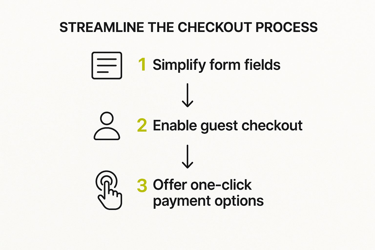
Think of it this way: the less a customer has to think, the more likely they are to complete their purchase. A clean path from simple forms to easy payment options is the key.
Eliminate the Account Creation Barrier
I can’t stress this enough: forcing people to create an account before they can buy is a massive conversion killer. Sure, building a customer list is important, but demanding that commitment right at the point of sale is a huge turn-off for first-time buyers.
The fix is surprisingly simple: always offer a guest checkout option.
Let customers buy on their own terms. Guest checkout tells them you respect their time and privacy. You can always invite them to create an account on the order confirmation page—after you've already made the sale.
This one tweak alone can make a huge difference in your abandonment rate, especially for new visitors who are still getting to know your brand.
Offer One-Click Payment Options
Let's be honest, nobody enjoys punching in a 16-digit credit card number and billing address anymore. We live in a world of instant everything, and your checkout needs to reflect that. Integrating one-click payment solutions like Shop Pay, Apple Pay, and Google Pay is no longer a "nice-to-have"; it's what customers expect.
These familiar, trusted logos at the top of your checkout page instantly signal a fast and secure process. It lets shoppers complete their purchase with a single tap using their stored information.
For a much deeper dive into fine-tuning every part of this crucial page, check out our guide on https://scaleshopify.com/2025/07/21/shopify-checkout-optimization/.
Build Reassurance with Trust Signals
As a customer gets ready to enter their payment details, their "is this site legit?" radar is on high alert. You need to show them, not just tell them, that their information is safe. This is where trust signals come into play.
- Security Badges: Make sure SSL certificates and logos from trusted names like Visa, Mastercard, and PayPal are clearly visible.
- Clear Return Policy: Don't hide your return policy. Link to it directly from the checkout. Knowing they have an out reduces the perceived risk of buying.
- Accessible Support: A visible contact email or a link to your help center shows you’re a real business that stands behind its products. And if you’re wondering if a proactive tool helps here, the data on does live chat increase conversions is pretty compelling.
Recapture Lost Sales with Abandoned Cart Emails
Even with a flawless checkout, life happens. The dog starts barking, the baby cries, a text comes through—distractions are everywhere. Your abandoned cart email sequence is the safety net that brings these distracted shoppers back.
The trick is to be helpful and timely, not annoying.
- First Email (1-3 hours later): Send a gentle nudge. A simple "Did you forget something?" subject line often works wonders.
- Second Email (24 hours later): Follow up by reminding them of the product's benefits or including a great customer review to build confidence.
- Third Email (48-72 hours later): If they still haven't purchased, consider offering a small incentive like 10% off or free shipping. Sometimes, that little push is all it takes.
When you consider that the average Shopify customer spends about $85 per order and the average checkout completion rate is just 45.2%, it's clear how much money is being left on the table. Recovering even a small fraction of those abandoned carts can have a massive impact on your bottom line.
Building Unshakeable Trust with Shoppers

In ecommerce, trust is everything. It’s not just a nice-to-have feature; it’s the currency that turns a hesitant browser into a confident buyer. If a shopper feels even a hint of skepticism, they’ll hit the back button, no matter how amazing your products are.
Building that confidence is fundamental if you want to improve your Shopify conversion rate. This process starts the second someone lands on your site and touches every single element they interact with. It's about creating an environment where customers feel secure, understood, and protected.
Go Beyond Basic Star Ratings with Authentic Social Proof
Star ratings are a good starting point, but they're not enough anymore. Today's shoppers are smart, and they dig deeper for real proof before they're willing to make a purchase. Seeing actual people using and loving your products is infinitely more persuasive than a simple five-star icon.
Try mixing in a few different types of social proof to build that all-important authenticity:
- Customer Photos and Videos: Get your customers involved! Encourage them to share unboxing videos or photos on social media with a unique hashtag. Then, feature the best user-generated content (UGC) right on your product pages. It’s a powerful, unbiased endorsement that shows your products in the real world.
- Video Testimonials: There's nothing quite like a short, genuine video from a happy customer. It puts a face to the feedback, making it far more relatable and trustworthy than plain text.
- Press Mentions and Expert Reviews: If your brand has been featured in a big-name publication or reviewed by an industry expert, show it off! A simple "as seen on" section with recognizable logos immediately validates your brand's quality.
Beyond just showing off the reviews you have, you need a plan for getting more. Learning effective strategies to get customer reviews that build trust will give you a steady stream of fresh, persuasive content.
Tell Your Story on a Compelling About Us Page
So many store owners treat their "About Us" page as an afterthought, and that's a huge mistake. This page is your golden opportunity to connect with customers on a human level. It's where you share the "why" behind your brand.
A great brand story transforms your business from a faceless website into a relatable group of people with a mission. Talk about why you started, what your values are, and introduce the team. That kind of transparency forges a real emotional connection, which is the bedrock of loyalty and trust.
Display Trust Badges and Clear Policies
When a customer gets to the checkout and pulls out their credit card, their guard is up. This is the moment you absolutely have to reassure them that their information is safe and their purchase is protected.
Trust is the foundation of any successful ecommerce transaction. By being transparent with security, shipping, and returns, you remove the biggest mental barriers that prevent a visitor from becoming a customer.
Make these trust signals impossible to miss:
| Trust Element | Where to Place It | Why It Works |
|---|---|---|
| SSL Security Badges | Footer, product pages, and checkout page | A clear visual sign that the connection is encrypted and their financial data is safe. |
| Payment Logos | Footer and checkout page | Shows you accept well-known, trusted payment methods like Visa, Mastercard, and PayPal. |
| Clear Return Policy | Linked in the footer, product page, and checkout | Reduces the customer's risk by showing them there's an easy way out if things don't work out. |
Finally, be completely upfront about shipping costs and timelines. Nothing kills a sale faster than a surprise shipping fee at the very last step—it's one of the biggest reasons for cart abandonment. Being transparent from the start shows you respect your customers, which is key to building the kind of trust that closes a sale.
For a deeper dive, check out our complete guide to conversion rate optimization strategies.
Your Top Shopify Conversion Rate Questions, Answered
If you're trying to improve your Shopify store's conversion rate, you've probably waded through a ton of advice—some good, some not so good. It can be confusing. This section is designed to give you straight answers to the most pressing questions we hear from store owners.
Let's clear the air and focus on what actually moves the needle, starting with the most common question of all: "What number should I be aiming for?"
What’s a Realistic Conversion Rate to Aim For?
It’s tempting to latch onto an industry average, but the much-talked-about 1.4% global figure is almost useless. It lumps a high-end furniture store in with a shop selling viral TikTok gadgets. They're completely different businesses with different customer behaviors.
A better way to gauge your performance is to see where you stack up against the broader Shopify ecosystem:
- Average Stores: Convert between 1.4% and 1.8%. This is where most businesses land.
- Good Stores: Hitting 3.2% puts you in the top 20% of all Shopify merchants.
- Excellent Stores: A conversion rate of 4.8% or more places you in the elite top 10%.
But here's the real secret: the most important number is your own. Forget everyone else for a minute. If you can bump your rate from 1% to 1.5%, that’s a 50% revenue increase. That's a massive win.
My Takeaway: Stop chasing a universal "good" number. The real goal is to consistently beat your own performance month after month. Small, steady gains are what build a truly successful store.
Where Should I Start My Optimization Efforts?
With endless things to tweak, it's easy to get lost in the weeds. The key is to start with the "big leaks" in your sales funnel—the places where you're losing the most customers.
For the biggest and fastest impact, zero in on these three areas first:
- Your Product Pages: This is where the decision to buy actually happens. You need amazing product photos, compelling descriptions that answer questions before they're asked, and a mountain of genuine customer reviews.
- Your Checkout Process: Is it smooth and easy, or a frustrating ordeal? Every extra field and unnecessary click is a reason for someone to abandon their cart. Streamline it with guest checkout and one-click payment options like Shop Pay or Apple Pay.
- The Mobile Experience: Most of your customers are probably browsing on their phones. If your site is slow, buttons are tiny, or menus are a pain to navigate, you're throwing sales away. It has to be flawless.
Once you’ve nailed these fundamentals, then you can start A/B testing button colors or fine-tuning your search results.
How Can I Quickly Build Trust with New Visitors?
Trust is everything in e-commerce. A new visitor lands on your site and immediately asks, "Is this place legit?" You have just a few seconds to convince them the answer is yes.
Here are a few simple, powerful ways to build that instant credibility:
- Show Real People Loving Your Stuff: Customer reviews, user-submitted photos, and logos from any press you've received are pure gold. This is social proof, and it works wonders.
- Flash Your Trust Badges: Don't hide your SSL security certificate and payment logos (Visa, PayPal, etc.). Put them in your footer and on the checkout page where people are looking for reassurance.
- Be Upfront About the Details: No one likes surprise shipping fees. State your shipping and return policies clearly and make them easy to find. Transparency builds trust.
- Tell Your Story: An "About Us" page isn't just filler. It’s your chance to connect with customers on a human level. Share your mission and who's behind the brand.
These elements aren't just nice-to-haves; they are essential for making a shopper feel safe enough to pull out their credit card.
FAQ Quick Reference
To wrap things up, here’s a quick summary of the key questions we've covered about boosting your Shopify conversion rate.
| Question | Key Takeaway |
|---|---|
| What's a good conversion rate? | Don't obsess over the global 1.4% average. Aim to beat your own past performance. Hitting 3.2%+ puts you in the top 20% of stores. |
| Where should I start optimizing? | Focus on the highest-impact areas first: product pages, the checkout process, and the mobile user experience. |
| How do I build trust quickly? | Use social proof (reviews, UGC), display security badges, be transparent with policies, and have a compelling "About Us" page. |
Hopefully, these answers give you a clear, actionable starting point for your own optimization efforts.
Ready to turn these insights into action and see a real impact on your bottom line? The team at E-commerce Dev Group specializes in custom Shopify solutions that drive growth. From performance optimization to a full store redesign, we build experiences that convert. Visit us at scaleshopify.com to learn how we can help you achieve your sales goals.