

At its core, mobile-first design is a simple but powerful idea: you design your website for the smallest screen first—a smartphone—and then you adapt that design for larger screens like tablets and desktops.
This flips the old way of doing things completely on its head. It forces you to get crystal clear on what's most important, because you don't have the luxury of space. It's not just a technical choice; it's a business strategy that puts your mobile customers at the very center of your universe.
Why Mobile First Design Matters For Your Store

Think about your customers for a second. Where are they really shopping from? They're scrolling through your products while waiting for a train, killing time in a waiting room, or lounging on the sofa. They're on their phones.
This is the reality of modern ecommerce, and it's exactly why a mobile-first approach isn't just a "nice-to-have" for your Shopify store anymore. It’s about meeting your buyers where they are.
The traditional method was to build a big, beautiful desktop site and then desperately try to cram it onto a tiny screen. This "shrinking" process almost always led to a clunky, frustrating mess with slow load times, confusing navigation, and buttons so small they were impossible to tap.
A Strategy For Growth, Not Just Design
Starting with the smallest screen solves these problems from the get-go. Since 2017, mobile devices have consistently driven over 50% of all web traffic worldwide, and that number isn't going down.
Designing mobile-first imposes a healthy discipline. You have to prioritize what truly matters, which naturally leads to some big wins for your business:
- Better User Experience: A clean, simple mobile site is a joy to use. It reduces friction and keeps shoppers happily browsing instead of furiously pinching and zooming.
- Faster Loading Speeds: By ditching the non-essential clutter, mobile-first sites are lean and quick. This is absolutely critical for on-the-go shoppers with spotty connections.
- Higher Conversion Rates: When finding a product and checking out is effortless on a phone, more people will actually do it. Our comprehensive mobile optimization guide for Shopify stores explores how to make this happen.
Adopting a mobile-first mindset isn't just about making your store look good on a phone. It's about fundamentally rethinking the customer journey to remove friction, build trust, and ultimately drive more sales.
To give you a clearer picture, let's break down the two philosophies side-by-side.
Mobile First vs Desktop First At a Glance
This table offers a quick comparison, showing just how different these two approaches are in their priorities and results.
| Aspect | Mobile First Design | Desktop First (Traditional) Design |
|---|---|---|
| Starting Point | Designs for the smallest screen (smartphone) | Designs for the largest screen (desktop) |
| Content Focus | Prioritizes core content and key features | Includes extensive features and content upfront |
| Performance | Naturally faster and more lightweight | Often slower on mobile due to scaling down |
| User Experience | Clean, focused, and goal-oriented on all devices | Can feel cluttered and overwhelming on mobile |
| Development | "Progressive Enhancement" – add features for bigger screens | "Graceful Degradation" – remove features for smaller screens |
As you can see, the end result is profoundly different. The mobile-first approach ensures your store is built on a solid, efficient foundation that works for everyone.
If you want to dig deeper into the core principles, this guide is a fantastic resource: What Is Mobile First Design: A Practical Guide. It’s an approach that sets your business up not just for today's shoppers, but for the future of ecommerce.
The Core Principles of Mobile-First Design
To put the theory into practice, you need to get familiar with the core mobile-first design principles. Don't think of these as strict rules. Instead, see them as a way of thinking—a strategic mindset for building a better ecommerce store from the ground up.
Adopting this approach forces you to focus on what really matters to your customers. It’s like being forced to pack for a week-long trip using only a small backpack. You can't bring everything, so you have to choose the absolute essentials first. This limitation is actually a gift, as it leads to a cleaner, faster, and more intuitive design for everyone, no matter what device they're on.
Prioritize Your Content Ruthlessly
The first and most important principle is content prioritization. With such limited screen space on a phone, you have to make some tough calls about what information is absolutely critical for a shopper to achieve their goal. Everything else is secondary.
Imagine a customer lands on your product page after tapping an Instagram ad. They’re probably on the move and have a very specific goal in mind. What do they need to see immediately?
- Clear, high-quality product images
- The price and any current discounts
- An unmissable "Add to Cart" button
- Key options like size or color
Long, drawn-out brand stories or detailed shipping policies can wait. By forcing yourself to prioritize, you automatically declutter the user experience and make the path to purchase as smooth as possible.
Design For Touch, Not Clicks
Desktop users have a precise mouse cursor, but mobile users navigate with their thumbs. This is a fundamental difference that demands a design that is thumb-friendly and touch-oriented. A button that's a breeze to click on a desktop can become an exercise in frustration on a phone.
You have to design with the physical reality of using a phone in mind. The most important actions should be placed within the "thumb zone"—the area of the screen a user can comfortably reach without stretching or shifting their grip. This is why so many successful mobile sites place their main navigation and cart buttons at the bottom of the screen.
A key aspect of mobile first design is recognizing the transient, on-the-go behaviors of modern users, who often interact in brief, interrupted sessions. This understanding has shaped a push toward simplicity and speed, serving immediate needs with polished, singular functionalities. Read more about the origins of this mobile-centric movement.
Embrace Progressive Enhancement
This principle is really the engine that powers the entire mobile-first philosophy. Progressive enhancement simply means you start by building a solid, functional baseline experience for the smallest screens. Then, as more screen space becomes available on tablets and desktops, you thoughtfully add features, content, and complexity.
This is the complete opposite of the old "graceful degradation" method, where a cluttered desktop site was stripped down for mobile—often resulting in a clunky, broken experience.
With progressive enhancement, you guarantee the core shopping journey is flawless on every single device. For your Shopify store, this might look something like this:
- Mobile: A clean, single-column layout with a hamburger menu and just the essential product info.
- Tablet: The layout might expand to two columns, perhaps revealing customer reviews alongside the product images.
- Desktop: Now you can add things like a persistent sidebar, mega menus for navigation, and maybe even high-resolution video backgrounds.
The core experience stays consistent, but it gets richer as the screen real estate grows. This is a core difference you can explore further by reading our guide on adaptive vs responsive design.
Make Performance Non-Negotiable
Finally, speed isn't just a feature; it's a fundamental requirement. Mobile users are impatient and often dealing with spotty internet connections. A slow-loading site is one of the fastest ways to lose a sale. In fact, studies show that more than half of mobile visitors will ditch a page if it takes longer than three seconds to load.
A mobile-first approach forces you to make performance a priority from day one. By starting with the limitations of mobile hardware and networks, you naturally make smarter, leaner choices. This means optimizing images, minimizing code, and avoiding heavy scripts that aren't essential to the core experience. The result? A lightning-fast site that keeps shoppers engaged and moving toward the checkout.
Putting Mobile-First Principles Into Action on Shopify
Knowing the theory is great, but applying it to a live Shopify store is where you actually see the results. This isn't about tearing your site down and starting from scratch. It’s all about making smart, targeted tweaks that put your mobile customers first at every single step of their journey.
Let's get practical and break down how to make this happen, from picking the right theme to obsessing over the tiny details that make a massive difference.
This infographic lays out the basic flow of a mobile-first strategy, highlighting the most critical steps to take first.
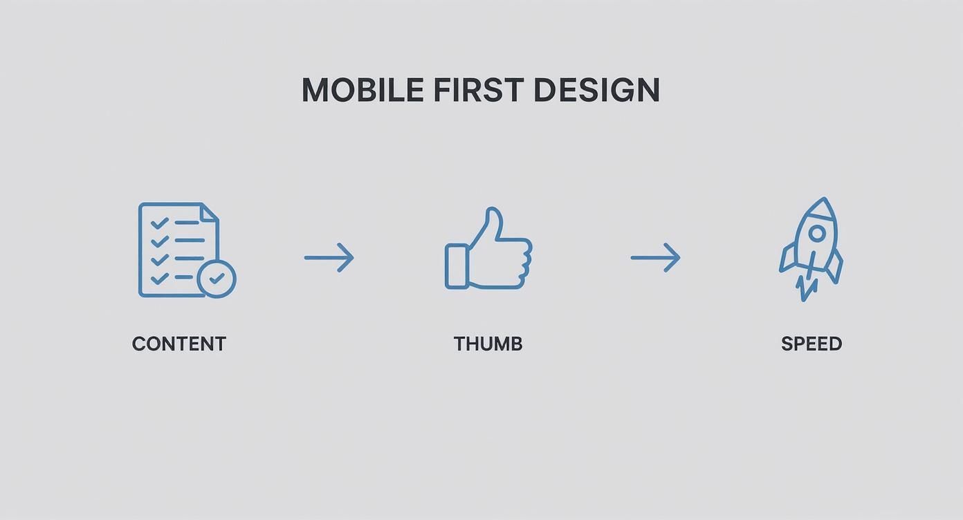
As you can see, it all starts with your content. From there, you build a thumb-friendly design and then you optimize for speed. It’s a logical progression that builds a solid, user-focused foundation.
Start With a Truly Mobile-First Theme
Your Shopify theme is the bedrock of your store. If you start with a theme designed for desktops and then squished down for mobile, you’re already fighting a losing battle. What you really need is a foundation that was built from the ground up with the limitations of a small screen in mind.
When you're browsing the Shopify Theme Store, don't just glance at the desktop demos. Pull every single one up on your phone and try to shop like a real customer.
This is exactly what you need to look for:
- Clean, simple navigation: A good mobile theme will use an obvious hamburger menu or maybe a bottom tab bar to get people where they need to go. No clutter.
- Legible typography: The text should be crystal clear on a small screen without anyone needing to pinch and zoom just to read a product description.
- Fast performance scores: Many theme developers boast about their speed scores. Pay attention to those. Speed is everything on mobile.
Audit Your Key Pages Through a Mobile Lens
Once your theme is solid, it’s time to put on your customer hat. Grab your phone, go to your store, and start navigating. Your only job is to find anything and everything that causes even a tiny bit of friction.
The heart of a good mobile audit is empathy. You have to imagine you’re a distracted shopper on the go and ask one simple question at every turn: "Is this as easy as it could possibly be?"
The Homepage
Think of your homepage as your digital front window. On a phone, its job is to instantly tell people what you sell and where they should tap next.
- Above the Fold: Can a new visitor see your main selling point and a clear call-to-action (CTA) without having to scroll?
- Navigation: How fast can you find the search bar or the main product categories? It should be immediate.
- Imagery: Do your main banners load quickly? Do they look good on a vertical screen, or are they awkwardly cropped?
Product Pages
This is where the magic happens—or doesn't. A mobile product page has to be ruthlessly efficient.
- Visuals First: Product photos need to be the star. Make sure they are high-quality, fill the screen, and allow for an easy pinch-to-zoom.
- Scannable Details: Use bullet points, dropdowns, or tabs to break up big blocks of text. No one is reading a novel about a t-shirt on their phone.
- The "Buy" Button: Your "Add to Cart" button should be impossible to miss. Make it big, use a high-contrast color, and seriously consider making it "sticky" so it follows the user as they scroll.
The Checkout Process
A clunky checkout is the number one killer of mobile sales. Shopify's default checkout is excellent, but you can still make it better.
- Minimize Form Fields: Only ask for what you absolutely need to ship the order. Every extra field is a reason for someone to give up.
- Enable Guest Checkout: Forcing people to create an account is a massive roadblock. Let them buy quickly and easily.
- Offer Mobile Wallets: Adding Apple Pay and Google Pay can turn a multi-step process into a single, satisfying tap.
When you're really looking to create a dynamic, fast-loading storefront, it helps to leverage modern frontend frameworks like React to build a smoother experience. For a much deeper dive, our complete Shopify mobile design checklist for 2024 gives you an exhaustive list of items to review on every page.
By methodically working through these steps, you’ll transform your store from just a website that works on a phone into a genuine mobile shopping experience that feels fast, intuitive, and built just for them.
Shopify Stores That Master Mobile-First Design
https://www.youtube.com/embed/x21Ivuz6cwE
Theory is great, but seeing mobile-first design in the wild is what really makes the concept click. The best way to learn what works is to look at brands that are already crushing it. Let’s break down how a few top Shopify stores build mobile experiences that aren’t just usable, but are actually a pleasure to shop on.
By looking at their design choices, you get a solid benchmark for your own store. This isn’t just a gallery of pretty sites; it's a practical look at what makes a mobile design convert.
Gymshark Prioritizing a Singular Goal
Pull up Gymshark on your phone, and you’re immediately looking at a masterclass in focus. The design gets that a mobile visitor is probably there for one reason: to shop. You won't find any distracting pop-ups or cluttered banners. What you get is a bold, clean visual and a direct call-to-action that points you straight to their products.
This ruthless focus is a core mobile-first principle. Gymshark removes friction right from the start, making the path from browsing to buying as smooth as possible.
- Clean Header: The top navigation is stripped down to the essentials, using icons for search, wishlist, and the cart to save precious screen space.
- Thumb-Friendly Navigation: Major categories are shown as large, tappable blocks that are easy to hit with a thumb without accidentally tapping something else.
- Performance: The site loads incredibly fast, which is a must-have for keeping impatient, on-the-go shoppers from bouncing.
Allbirds Designing for Touch and Simplicity
Allbirds has built its entire brand on simplicity, and its mobile site is the perfect extension of that idea. The user experience feels calm and intuitive, a direct result of designing for touch and valuing clarity above all else. Every single element feels like it's there for a reason.
Their product pages are where this really shines. Instead of long, dense paragraphs of text, they use icons, short bullet points, and expandable sections to share details. This makes the content super scannable and easy to absorb on a small screen.
A great mobile experience respects the user's context. It assumes they are distracted and short on time, and it designs the entire journey to be as intuitive and frictionless as possible. Allbirds achieves this by making every interaction feel natural and straightforward.
Fashion Nova Seamless Checkout and Visual Search
For a brand with a huge catalog like Fashion Nova, helping people find stuff is everything. Their mobile site nails this with a powerful visual search tool and smart filters that make discovery a breeze. They know mobile shoppers want to find what they're looking for, fast.
But where they really excel is in the checkout.
- Saved Information: They push hard for customers to save their payment and shipping details, enabling a near one-tap checkout on future visits.
- Clear Progress Bar: A simple visual bar shows shoppers exactly where they are in the checkout flow, which helps reduce confusion and cart abandonment.
- Mobile Wallets: Options like Apple Pay are front and center, letting customers skip the tedious process of typing in card numbers and addresses.
These stores prove that applying mobile-first design isn’t about cutting features. It’s about being smarter and more strategic with how you present them, making sure the mobile experience is fast, focused, and built for how people actually use their phones.
Common Mobile Design Mistakes and How to Fix Them

Understanding the theory behind mobile-first design principles is one thing, but putting it into practice is where things can get tricky. Even with the best intentions, it's easy to fall into a few common traps that create a frustrating experience for shoppers and tank your sales.
The biggest blunder we see is treating a mobile site like a miniature version of the desktop experience. This "shrink and squeeze" approach just doesn't work. It results in cramped layouts, text you have to squint to read, and buttons so tiny they’re impossible to tap. Customers shouldn't have to pinch and zoom just to get around your store.
This whole idea of designing for mobile first really took hold around 2010. It was a huge shift in thinking, forcing designers to prioritize the smallest screen first. Industry leaders saw where the puck was going, and they were right—today, there are nearly 7 billion smartphone users worldwide. You can read more about this mobile-first paradigm shift on appsflyer.com.
Ignoring the Human Thumb
A surprisingly common mistake is forgetting that people use their thumbs to get around on their phones, not a pinpoint-accurate mouse. No matter how great your site looks, if it's a pain to physically use, you've already lost.
Think about it: forcing someone to stretch their thumb to the top corner of a large phone screen just to tap the menu is bad design. Your customers shouldn't need to be thumb gymnasts to add a product to their cart.
The Fix: Design for the "thumb zone." Keep your most important buttons and navigation—like "Add to Cart," checkout, and primary menu tabs—in the lower part of the screen where they're easy to reach.
Hiding Essential Information
In the quest for a clean, minimalist design, it's tempting to tuck everything away. But hiding crucial information behind vague icons or burying it deep inside a hamburger menu can backfire spectacularly. Simplicity is the goal, but not at the expense of clarity.
Your search bar, shipping info, and contact details need to be front and center. A customer who has to go on a treasure hunt for basic information is a customer who's about to leave.
Common Culprits to Avoid:
- Unlabeled Icons: That clever icon might make sense to you, but not to everyone. When in doubt, add a simple text label.
- Overstuffed Menus: A hamburger menu with endless dropdowns and nested categories is a usability nightmare. Keep your main navigation lean and focused.
- Buried CTAs: Your main call-to-action should be impossible to miss. Don't make users scroll forever just to find it.
Neglecting Mobile Performance
Let's be blunt: a beautiful mobile store that takes forever to load is a useless mobile store. People on their phones are often on shaky Wi-Fi or cellular data, and their patience is paper-thin. Gigantic, unoptimized images and clunky code are performance killers.
Seriously, more than half of your mobile visitors will bounce if your site takes longer than three seconds to load. Performance isn't a "nice-to-have"—it's an absolute must for a good mobile experience.
Your Questions About Mobile-First Design, Answered
Even when you get the main idea, a few questions always seem to pop up when it's time to actually put mobile-first design into practice. Let's clear the air on these so you can move forward with confidence, knowing you're creating a great experience for every customer, no matter what device they're using.
Here are a few of the most common ones I hear.
What’s the Difference Between Mobile-First and Responsive Design?
This is a great question, and it's easy to get them mixed up.
Think of responsive design as the technical magic that makes your site shrink or stretch to fit any screen. Mobile-first, on the other hand, is the strategy that guides how you apply that magic. It’s the philosophy you start with from day one.
When you take a mobile-first approach, you design for the smallest screen first. You're forced to focus on only the most critical features and content. From there, you use a technique called "progressive enhancement" to add more complex elements as screen real estate grows for tablets and desktops.
In short, a site built with a mobile-first strategy will always be responsive. But a responsive site wasn't necessarily built mobile-first. The real difference is your starting point and what you prioritize.
Will a Mobile-First Approach Hurt My Desktop Experience?
Not at all. It's a common worry, but in my experience, it almost always makes the desktop version better.
Starting with mobile forces you to be disciplined. You have to cut the fluff and zero in on what truly matters to the customer journey. This leads to a cleaner, faster, and more intuitive design across the board.
When you scale up to the desktop view, you're building on that strong, clutter-free foundation. That's a whole lot easier—and more effective—than trying to subtract and simplify a design that was bloated from the start. The result is a more thoughtful and efficient experience for everyone.
How Can I Test if My Shopify Store Is Mobile-Friendly?
Testing is absolutely essential, but it doesn't have to be complicated. Honestly, the best way to start is to just grab your own phone and pretend you're a customer.
Go through the entire process, from start to finish:
- Try searching for a specific product. How easy is it?
- Browse through a category page.
- Add something to your cart.
- Most importantly, go all the way through the checkout.
For a more technical check, Google's Mobile-Friendly Test tool gives you a quick, automated report. You can also use the built-in device simulators in your web browser's developer tools (like in Google Chrome) to get a preview of how your store looks on different phones and tablets.
At E-commerce Dev Group, we build Shopify stores on a rock-solid mobile-first foundation to ensure a seamless experience for every customer. Learn how our expert development can drive growth for your business.