

Before you can pick the right design approach for your Shopify store, you have to get a handle on what makes these two philosophies different.Let's get straight to it: Responsive design uses a single, fluid layout that morphs to fit any screen, while adaptive design uses several distinct, fixed layouts created for specific screen sizes. We'll dig into why this distinction is so crucial for e-commerce, where every bit of the user experience can make or break a sale.
A Deeper Look at Core Design Philosophies
While that core difference sounds simple enough, its impact on your Shopify store is massive. Your choice between adaptive and responsive design will influence everything—your development costs, your maintenance workload, your site speed, and ultimately, the customer's entire journey on your site.
Responsive design has become the go-to choice, especially for new stores, and for good reason. It’s built on a single codebase that uses flexible grids and CSS media queries to work its magic. Think of it like pouring water into a glass; it simply fills the space it's given, whether that’s a small smartphone screen or a huge desktop monitor. This "one-size-fits-most" approach makes ongoing updates much simpler because you’re only managing one version of your site.
An adaptive design is tailored to specific devices. It detects the user's screen size and serves one of several predefined, static layouts. This is like having different sets of clothing for different occasions rather than one outfit that stretches to fit.
You'll often see this approach used to bring older, more complex websites into the mobile era without having to tear everything down and start from scratch. Because it only sends the assets needed for a specific device, adaptive design can often deliver faster load times—a huge win for impatient mobile shoppers. The trade-off? It requires more work upfront and means you have to maintain several separate layouts. Our full guide on responsive vs adaptive design for Shopify stores breaks down these trade-offs in much more detail.
Core Differences at a Glance
To help you see the practical differences side-by-side, this table cuts through the noise and highlights the fundamental distinctions between the two approaches. It’s a quick-reference guide to what truly sets them apart.
| Attribute | Responsive Design | Adaptive Design |
|---|---|---|
| Flexibility | Highly flexible and fluid, adjusts to any screen size. | Less flexible, uses fixed layouts for set screen sizes. |
| Layout | A single layout that reflows and resizes content. | Multiple distinct layouts for predefined breakpoints. |
| Development | Simpler upfront; one codebase to manage. | More complex; requires building multiple versions. |
| Maintenance | Easier to maintain and update a single design. | More difficult; changes must be made to all layouts. |
As you can see, the decision isn't just about how a site looks but also how it's built and maintained over time. Responsive offers simplicity and consistency, while adaptive can provide a more optimized, high-performance experience on specific devices, albeit with more effort.
The Shift to Mobile-First Web Design
To really get a handle on the adaptive vs. responsive debate, it helps to look back at how we got here. Not too long ago, the internet was a desktop-only affair. Websites had fixed widths, built for one kind of monitor. Simple.
Then the iPhone landed, and everything changed. Suddenly, people were browsing on tiny phone screens, tablets, and everything in between. This explosion of device sizes created a huge headache for businesses. Their old desktop sites were a mess on mobile—clunky, hard to navigate, and frustrating. Nobody enjoys pinching and zooming just to read a sentence.
The Rise of Mobile Optimization
This user frustration kicked off a revolution in web design. It became crystal clear that a bad mobile experience meant lost customers and a tarnished brand. Just having a website wasn't good enough anymore; it had to work perfectly everywhere.
This need for a better mobile experience pushed the industry away from rigid, fixed-width layouts toward something more flexible. This shift really took off around 2010, fueled by the unstoppable growth of smartphones and tablets. Ignoring shoppers on the go was no longer an option. It's why a solid mobile optimization guide for Shopify stores is non-negotiable for any serious e-commerce brand today.
This new reality gave us the two main approaches we're comparing: responsive and adaptive design. Both aim to solve the same problem—delivering a great user experience on any device—but they go about it in completely different ways.
Responsive design uses one flexible layout that adjusts to all screens. Adaptive design, on the other hand, creates several distinct layouts tailored to specific device sizes.
Why Mobile-First Became the Standard
At first, the common practice was "graceful degradation," which meant taking a full-blown desktop site and trying to shrink it down for mobile. It was often a clumsy process. Designers quickly figured out it was much smarter to flip that script.
The mobile-first approach was born. You start by designing for the smallest screen, focusing only on the most essential content and features. Then, you progressively add more complexity and features as the screen size increases. This forces you to prioritize, leading to cleaner, faster, and more user-friendly sites. It’s a big deal, considering a poor mobile experience is a top reason visitors leave—some studies show it's the culprit in over 73% of cases.
Understanding this history is crucial. The choice between adaptive and responsive design isn't just a technical detail. It’s a direct response to a fundamental change in how people browse and shop. The path you choose for your Shopify store will define how well you connect with today’s mobile-driven customers.
Comparing Critical Design Attributes
Alright, let's move past the textbook definitions. To really understand adaptive versus responsive design, we need to look at how they actually perform in the wild. The choice you make for your Shopify store isn't just a technical one—it will impact your store's flexibility, future development, maintenance budget, and even how well you rank on Google.
We're going to break down the most important attributes side-by-side to see the real-world trade-offs. This isn’t about finding one “best” answer, but about helping you find the right fit for your specific business goals and resources.
Flexibility and User Experience
Here's the core difference: responsive design is all about fluidity. It uses a single, flexible layout that stretches or shrinks to fit literally any screen, from a tiny smartwatch to a massive desktop monitor. The goal is to provide a consistent experience everywhere, even if it's not perfectly tailored to every single device.
Adaptive design, on the other hand, trades that fluidity for precision. It's not flexible in the same way. Instead, you create several distinct, fixed layouts for specific screen sizes (we call these breakpoints). This means your site won't magically adjust to a screen size you didn't plan for, but it gives you total control to create a truly optimized experience for the devices your customers actually use.
Think about it this way: an ecommerce store using adaptive design could create a unique tablet layout with bigger, more touch-friendly product images and navigation—an experience that might get a bit clunky or compromised in a one-size-fits-all responsive design.
Responsive design offers maximum flexibility to cover all possible screen sizes with one layout. Adaptive design offers targeted control, allowing you to create distinct, optimized experiences for specific devices.
Development Complexity and Initial Cost
When you're launching a new store or doing a major redesign, the upfront cost and effort are huge factors. Generally, responsive design is the quicker and cheaper path to get started. The "build it once, use it everywhere" approach means your developers are working from a single codebase. It demands careful planning and a ton of testing to make sure it doesn't break on some obscure screen size, but the overall project is usually less intensive upfront.
Adaptive design is much more work at the beginning. Your team has to design, build, and test multiple, separate layouts—often for at least three to six different screen widths (like mobile, tablet, and desktop). This can dramatically increase the initial time and money you need to invest. It's like building several different houses instead of one that can be easily rearranged.
But here’s a twist: if you have an older, complex website, sometimes tacking on an adaptive mobile version can be easier than rebuilding the entire thing to be responsive from the ground up.
Long-Term Maintenance and Updates
This is where responsive design really starts to pay off for most businesses. Since you only have one version of your site, making updates is a breeze. Need to add a new feature, change a button, or fix a bug? You do it once, and you're done. This simplified maintenance saves a ton of time and money over the long haul.
Maintaining an adaptive site is a different story. A simple change might have to be rolled out and tested across all your separate layouts. A five-minute fix can quickly turn into a multi-hour project, driving up your ongoing costs. And what happens when a new, popular phone or tablet hits the market? You might have to build an entirely new layout just to support it.
This infographic breaks down some key performance metrics between the two.
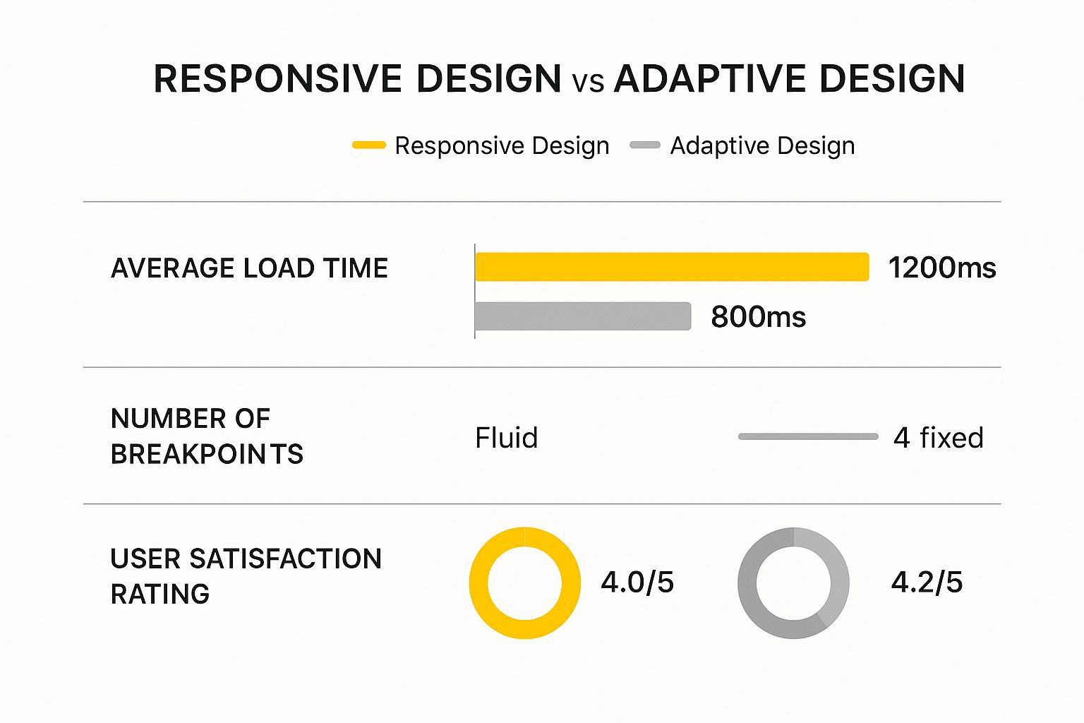
The data suggests that the targeted approach of adaptive design can lead to faster load times and higher user satisfaction, but you're giving up a lot of flexibility to get there.
SEO Implications and Performance
Let's be clear: both adaptive and responsive designs can be fantastic for SEO if they're done right. Google just wants to see a great mobile-friendly experience. That said, Google officially recommends responsive design. Having a single URL and codebase makes it much easier for their bots to crawl and index your site. It also avoids the duplicate content headaches that can sometimes pop up with separate mobile sites.
However, a well-built adaptive site can absolutely crush it in the rankings. Its biggest SEO weapon is often raw speed. Because adaptive sites only load the assets needed for the specific device viewing them, they can be noticeably faster, especially on mobile connections. Since site speed is a major ranking factor, a zippy experience leads to lower bounce rates and happier users—both strong signals to Google.
Ultimately, the best approach for SEO is the one that gives your customers the best experience. A slow, clunky responsive site will get beaten by a lightning-fast adaptive one every time. The key is to pick the path your team can execute to the highest possible standard.
How Each Design Impacts Performance and UX
When we talk about adaptive versus responsive design, the real-world impact boils down to two things that directly affect your sales: performance and user experience. For any Shopify store, a few extra seconds of load time can easily mean the difference between a happy customer and an abandoned cart. The way each of these design approaches handles your site's assets is what makes or breaks these critical metrics.
In a straight-up speed test, adaptive design often pulls ahead, especially on mobile. Think of it this way: because adaptive design uses pre-built layouts for specific screen sizes, it only has to load the code and images needed for that one device. A smartphone user isn't stuck downloading a massive, high-resolution banner meant for a 27-inch desktop monitor. This results in a much lighter, faster-loading page.
This tailored approach has a clear effect on how users behave. In fact, studies show that the speed boost from adaptive design can cut mobile bounce rates by as much as 20%. It’s not uncommon for an adaptive site to be 2 to 3 times faster than a responsive one, making it a powerful choice for stores where every millisecond counts.
The User Experience Tradeoff
While adaptive design might win the race on speed, responsive design is the champion of consistency. A responsive site feels like the same site, no matter where you view it. The branding, the navigation, and the overall feel stay predictable, which creates a seamless journey for a customer who might browse on their phone during their commute and buy later from their laptop.
This consistency is a huge UX advantage. Your customers don't have to re-learn where everything is when they switch devices. An adaptive site, on the other hand, could show a completely different interface on a tablet than on a phone. If not designed with incredible care, that shift can be jarring and confusing for users.
Key Takeaway: Adaptive design is all about delivering a device-optimized experience, sometimes trading consistency for raw speed. Responsive design focuses on a consistent brand experience, making sure your site feels familiar everywhere, even if it means a slightly heavier initial load.
At the end of the day, a great UX is about more than just speed—it’s about creating an intuitive experience that meets your customer’s expectations. A slow responsive site will always lose to a fast adaptive one, but a clunky, confusing adaptive site will frustrate users just as much. Getting a handle on how design choices affect the customer journey is vital, and you can explore some fantastic ecommerce user experience (UX) best practices to see what works.
Measuring Real-World Impact
So, which one should you choose? The best answer depends on what you're prioritizing and what your team can realistically deliver. A well-built responsive site can still be incredibly fast, but it demands serious discipline from your developers to keep images compressed and code squeaky clean.
To make the right call, you need to look at your own data and think through these key questions:
- Where does your traffic come from? If more than 70% of your customers are shopping only on their phones, the performance boost from adaptive design could be a game-changer.
- What kind of products do you sell? For stores with highly visual products, like fashion or art, serving up perfectly sized images through an adaptive approach can dramatically improve the mobile experience.
- What are your team's skills? Does your team have the expertise to build and maintain several distinct layouts for an adaptive site? Or would that time be better invested in perfecting a single, streamlined responsive codebase?
This isn't just a technical decision. It’s a strategic one that should be based on how your customers actually engage with your brand.
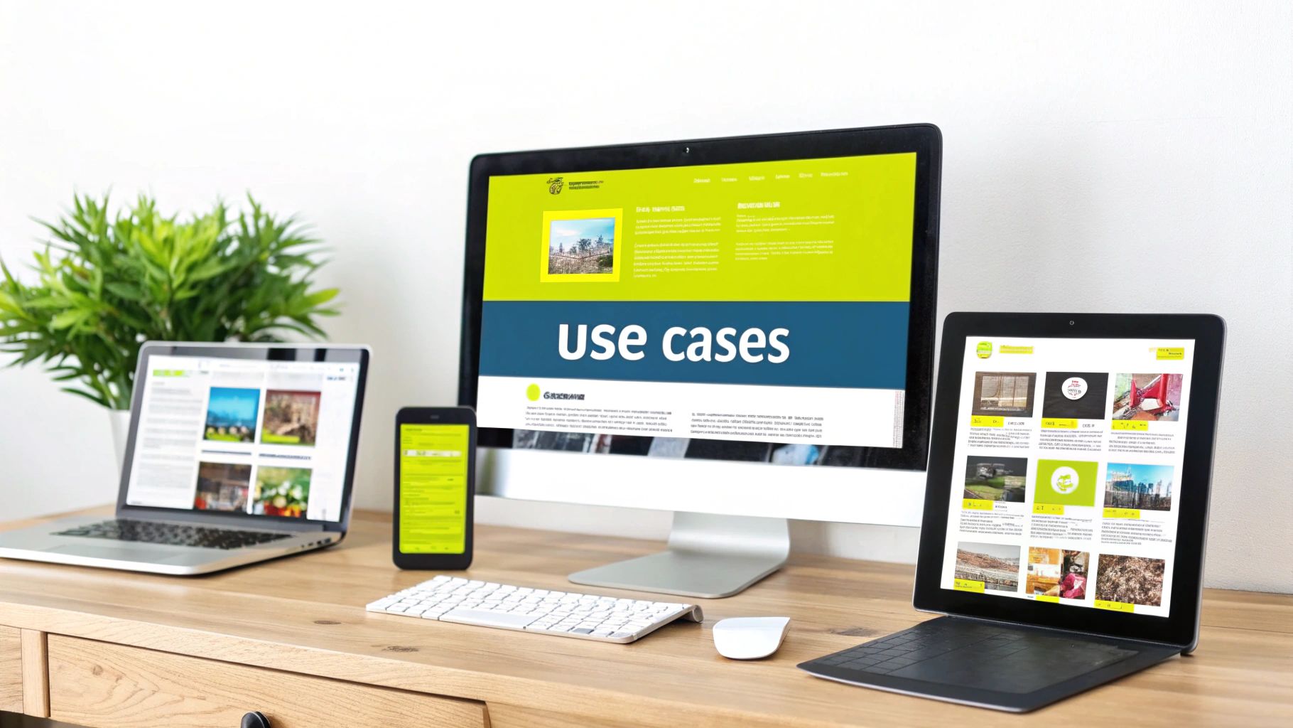
Which Approach Fits Your Shopify Store?
Choosing between adaptive and responsive design isn't about finding a technical "winner." It’s about being honest about your business reality. What makes sense for a scrappy startup is completely different from what a high-volume, established brand needs. This is where the rubber meets the road.
Let's walk through some real-world scenarios. By matching your design choice to your goals, budget, and customer behavior, you can build a Shopify store that actually works for you.
When to Choose a Responsive Design
For most Shopify merchants, especially if you're just getting started, responsive design is the way to go. It's efficient, affordable, and straightforward, which is why it has become the standard.
You should lean into responsive design if this sounds like you:
- You're a New Store or on a Tight Budget: Let's be real—building one flexible website is far cheaper than creating and managing several separate layouts. A responsive site gets you launched faster, letting you put your money into what matters most early on: marketing and inventory.
- You Need Consistent Branding: Customers today are all over the place. They might browse your products on their phone during their commute and then buy later from their laptop. Responsive design keeps your brand's look and feel consistent, building trust no matter how they shop.
- You Have Limited (or No) Dev Resources: If you’re a small team, managing one codebase is a lifesaver. It makes updates, maintenance, and bug fixes so much simpler and less costly over the long run.
For many merchants, the most practical way to implement this is by selecting a high-quality theme. You can find our breakdown of the top Shopify themes with built-in responsive design to get a head start on a solution that works out of the box.
Bottom line: if your priorities are affordability, simple maintenance, and a universally consistent experience, responsive design is your most dependable choice.
When to Consider an Adaptive Design
While it's the road less traveled, adaptive design can be a game-changing strategic move for certain established stores. This approach is for when a highly targeted experience can lead to a serious bump in revenue, but it demands a bigger budget and a skilled technical team.
An adaptive approach might be the right fit in these situations:
- You're a High-Traffic Store with a Mobile-First Audience: Take a look at your analytics. If you see that 70-80% or more of your traffic and sales come from smartphones, it could pay off big time to build a custom-tailored, lightning-fast experience just for that group.
- Your Store is Complex and Feature-Heavy: Think about B2B sites with complex order forms or stores with intricate product customizers. The ideal desktop interface for these tasks is often wildly different from what works on a small screen. Adaptive design lets you build distinct, no-compromise interfaces for each context.
- You're a Visual Brand Needing Pinpoint Control: A high-end fashion brand, for example, might want to serve a gorgeous, high-resolution lookbook to desktop users but a lightweight, quick-loading gallery to mobile browsers. Adaptive gives you that granular control over assets, ensuring perfect performance and presentation everywhere.
For Shopify store owners, the practical application of these design philosophies often comes down to the themes they choose; exploring the best converting Shopify themes can illustrate these principles in action. An adaptive build is a conscious decision to squeeze every bit of performance out of a specific device experience, justified only by a high volume of sales. It's a power move for mature businesses looking to perfect their conversion funnel for their most important customers.
Making Your Final Decision
When it comes to adaptive vs. responsive design, there's no single "right" answer. The real question isn't which one is better overall, but which one is the right strategic fit for your Shopify store. This isn't just a technical choice; it's a business decision that needs to line up with your budget, your customers, and your goals.
Let's cut through the theory. By asking yourself a few straightforward questions, the best path for your store will quickly become obvious.
Assess Your Budget and Resources
First things first: what can you realistically afford in terms of time and money? This is often the most important factor.
- Tight Budgets and Small Teams: If you're a startup or a smaller business, responsive design is almost always the way to go. It’s built on a single codebase, which makes it far cheaper to develop and easier to maintain. You can get a great-looking, functional site up and running without a massive upfront investment, freeing up cash for marketing and inventory.
- Established Stores with Technical Teams: If you're a bigger player with an in-house or dedicated development team, then adaptive design becomes a serious contender. Yes, the initial cost is higher, but if it can deliver a measurable lift in conversions from your main traffic source, that investment can pay for itself many times over.
Analyze Your Target Audience
Next, it’s time to look at your data. Who are your customers and how do they actually shop on your site?
Your customer data is your most valuable guide. A design choice made without understanding user behavior is just a guess. The goal is to build an experience for how your customers actually shop, not how you think they do.
Dive into your analytics and look at your traffic reports. If you see that 70% or more of your revenue comes from mobile phones, the extra speed and tailored experience of an adaptive layout could be a game-changer. But if your customers tend to browse on their phones and then complete the purchase on a desktop later, the seamless, consistent feel of a responsive design is probably more important to avoid confusing them.
Consider Your Business Goals and Product Type
Finally, what are you selling, and what are you trying to accomplish? Your product catalog and long-term vision should play a big role here.
A high-end fashion brand that relies on stunning, high-resolution imagery might choose adaptive design. This gives them pixel-perfect control to create a breathtaking experience on a large desktop monitor while ensuring the mobile version is lightning-fast and optimized.
On the other hand, a store with a simple product line that leans heavily on blog posts and content marketing will find a responsive site much more practical. It's easier to manage, better for SEO, and provides a solid, reliable experience everywhere.
Ultimately, the choice is a business decision in a technical wrapper. Responsive design is the dependable, efficient, and consistent path for most Shopify stores. Adaptive design is a high-reward strategy for established brands who know exactly who their dominant customers are and are ready to invest in optimizing for them. Weigh these factors carefully, and you’ll build a store that doesn’t just look good—it works hard for your business.
Frequently Asked Questions
As you dig into adaptive vs. responsive design, some practical questions are bound to pop up. Let's clear up some of the common sticking points so you can move forward with a solid plan for your Shopify store.
Is Responsive Design Always Better for SEO?
Not always, but it's what Google recommends. A responsive design keeps everything under one roof—a single URL and one set of code. This makes it incredibly straightforward for search engine bots to crawl and index your site without getting confused, which sidesteps any messy duplicate content problems.
But here’s where it gets interesting. A masterfully built adaptive site can actually pull ahead on SEO because of one thing: speed. Since adaptive design only loads the assets tailor-made for a specific device, pages can load much faster, especially for your mobile visitors. With page speed being a massive ranking factor, a blazing-fast adaptive site can easily outrank a clunky responsive one. Ultimately, the best choice for SEO is the one that gives your users the best experience.
How Much More Does Adaptive Design Cost?
The price gap is pretty substantial, both upfront and down the road. Building an adaptive site means creating several unique layouts—usually for at least three to six different screen sizes. That’s more time spent on design, development, and testing, which naturally leads to a much bigger initial investment than you'd see with a single responsive layout.
The complexity of adaptive design doesn't stop after launch. Every update, new feature, or bug fix has to be rolled out and checked across each separate layout. That can turn a quick five-minute fix on a responsive site into a multi-hour headache on an adaptive one, driving up your long-term maintenance costs.
Can I Switch from Responsive to Adaptive on Shopify Later?
Technically, yes, but it's not a simple switch. It’s a full-blown redesign. Moving from a responsive framework to an adaptive one means building entirely new, separate layouts from the ground up to match specific device breakpoints. Think of it as a major renovation project that requires a serious budget and a lot of development muscle.
Most Shopify stores start with a responsive theme—it's just more affordable and easier to manage. The jump to adaptive is usually a calculated move made by larger, high-traffic stores. They do it when they see a clear financial upside to creating a hyper-optimized experience for one particular group of users, like mobile shoppers. It’s a powerful move, but definitely a resource-heavy one.
Ready to build a Shopify store that not only looks incredible but also performs flawlessly for your customers? The team at E-commerce Dev Group specializes in creating custom design and development solutions that drive growth. Whether you need a lightning-fast responsive theme or a highly-optimized adaptive build, we have the expertise to make it happen. Let's build your perfect store together.