
We've all been there. A customer finds something they love, adds it to their cart… and then disappears. It’s one of the most frustrating parts of running an ecommerce store. But understanding why they leave is the key to plugging the leaks in your sales funnel. This isn't about a quick fix like changing a button color; it's about digging into the real experience your customers are having and smoothing out the bumps that cause them to bail.
Why Shoppers Really Abandon Carts
That abandoned cart isn't just a lost sale—it's a bright, flashing signal that something in the buying journey is broken. And this problem is huge. The average shopping cart abandonment rate has been floating between 70% and 78% for years, and as of August 2025, it hit a staggering 78.77% worldwide.
Think about that for a second. For every ten people who are interested enough to add a product to their cart, almost eight of them will walk away before paying. If you want to discover more insights about cart abandonment rates and see how you stack up, the data is eye-opening. This isn't just a number; it’s billions in revenue that's up for grabs for stores that nail their checkout experience.
To figure out how to reduce shopping cart abandonment, you have to put yourself in your customer's shoes and feel what they're feeling.
The Psychology Behind the Exit
Rarely does a shopper decide to leave in one single moment. It’s usually a slow burn—a series of small frustrations, sudden doubts, or unexpected surprises that chip away at their confidence until they just give up. Each one of these friction points adds a little bit of negative emotion, nudging them closer to that "close tab" button.
This infographic does a great job of showing the common emotional triggers that send shoppers running, from the shock of hidden fees to the sheer annoyance of a clunky checkout.
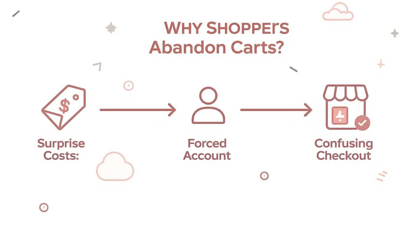
As you can see, the path from adding to cart to actually buying is more fragile than we think. Any little hurdle can throw the whole thing off course. Let's get into the main culprits.
Unpacking the Top Reasons for Abandonment
While a ton of minor things can contribute, a few big offenders are behind most lost sales. Getting a handle on these is the first step to figuring out what’s going wrong on your Shopify store.
Here’s a quick look at the top friction points and how to start thinking about them.
Common Friction Points and Where to Start Fixing Them
| Abandonment Reason | What the Customer Feels | Initial Solution to Explore |
|---|---|---|
| Surprise Costs | Deceived, sticker shock. "This costs way more than I thought." | Be transparent with all costs (shipping, taxes) upfront on the product or cart page. |
| Forced Account Creation | Annoyed, pressured. "I don't want to sign up for something just to buy this." | Offer a prominent guest checkout option. Make it the easiest path forward. |
| Long/Confusing Checkout | Frustrated, overwhelmed. "This is taking forever and asking for too much." | Simplify the form. Can you combine steps? Remove non-essential fields? |
These three issues consistently top the charts for a reason—they directly impact a customer's trust and patience. Let's break them down a bit more.
- Surprise Costs: This is the undisputed champion of conversion killers. When a shopper sees one price on the product page and a much higher total at checkout after shipping and taxes are added, it feels like a classic bait-and-switch. That feeling instantly erodes trust.
- Forced Account Creation: Putting a "Create an Account" wall in front of the "Buy" button is a massive roadblock. It adds time and effort to a process customers want to be fast and simple. Many people just don't want the commitment.
- A Long or Confusing Checkout: A clunky, multi-page checkout process with a dozen form fields is just plain exhausting. People expect a smooth, almost thoughtless experience. The second they have to stop and figure out what to do next, you're at risk.
A great checkout experience feels invisible. The moment a customer has to stop and figure out what to do next, you're at risk of losing them. The goal is to make buying easier than leaving.
By tackling these core issues head-on, you can start building a checkout that guides customers to the finish line instead of pushing them away.
Designing a Frictionless Checkout Experience
Once a customer hits that "checkout" button, the sale is officially yours to lose. This is the final step, and even the smallest bit of friction can make a shopper second-guess everything and bounce. The goal isn't just to have a checkout process; it's to create an experience so smooth that buying from you feels like the easiest, most natural thing to do.
Think about it—your product pages and marketing have worked hard to build positive momentum. A clunky, confusing checkout brings all of that to a screeching halt. In fact, a complicated process is why a staggering 22% of shoppers ditch their carts. They're ready to hand over their money, but you're accidentally making it too hard.
Make Guest Checkout the Default Path
Forcing a customer to create an account before they can buy is like putting a locked door in front of the cash register. It’s a huge conversion killer, responsible for 26% of all abandoned carts. First-time shoppers aren't looking for a commitment; they just want your product.
You should always lead with a prominent, impossible-to-miss guest checkout option. Make it the path of least resistance. You can always ask them to create an account after the sale is complete, framing it as a handy way to save their details for next time.
- Quick Tip: On your cart page, display "Checkout as Guest" and "Login" as two equally important buttons. Don't ever hide the guest option or make it look like a secondary choice.
Ruthlessly Simplify Your Forms
Every single field you ask a customer to fill out is a tiny hurdle. While you obviously need their shipping and payment details, so many stores ask for way too much information. It’s time to be ruthless and cut anything that isn't absolutely essential.
For instance, does your Shopify theme ask for a company name by default? Get rid of it. Is a phone number required? Make it optional unless your courier service absolutely needs it. Each field you remove gets a customer one step closer to completing that purchase.
The best checkout forms feel effortless. If a customer has to pause and wonder why you need a certain piece of information, you've just introduced friction and doubt.
To make things even smoother, enable address auto-fill and social logins. Tools like Google Autocomplete can populate an entire address from just a few keystrokes, which saves time and prevents typos. Similarly, letting customers log in with their Google or Facebook accounts means one less password for them to remember. These small conveniences create a much better checkout experience overall.
Offer Payment Flexibility and Build Trust
When a shopper finally gets to the payment step, they need to feel secure and see options they recognize. A lack of preferred payment methods is a classic reason for cart abandonment. It's no longer enough to just accept credit cards.
Displaying the logos for trusted payment providers like PayPal, Shop Pay, Apple Pay, and Google Pay accomplishes two things at once:
- It offers convenience: Shoppers can check out in seconds using their saved info.
- It builds trust: These logos are like security badges, reassuring customers that their financial data is safe with you.
Integrating "Buy Now, Pay Later" (BNPL) services like Klarna or Afterpay can be a game-changer, too. They lower the immediate financial barrier, making bigger purchases feel more manageable and giving shoppers that final nudge to complete their order. For a much deeper dive, our guide on Shopify checkout optimization has advanced tactics you can put into action today.
Visualize Progress to Maintain Momentum
A long, single-page form can look intimidating. On the other hand, a multi-page checkout without any clear direction can feel like it goes on forever. The fix is a simple progress bar or clear step indicators (e.g., Shipping > Payment > Confirm).
This visual cue shows people exactly where they are in the process and how close they are to the finish line. It manages their expectations and keeps them motivated to complete the purchase. This is just one of many powerful conversion rate optimization techniques that can turn more browsers into buyers. By designing a checkout that’s simple, transparent, and trustworthy, you’ll remove the final roadblocks that stand between a full cart and a completed sale.
Winning the Sale on Mobile Devices

Let’s be honest: a clunky, slow, or frustrating mobile experience is a guaranteed way to lose a sale. Your customers are shopping on their phones more than ever—in line at the coffee shop, on the couch, or during their commute. If your store isn't built for their thumbs, you're practically waving them over to your competitors.
The data tells a pretty stark story here. Mobile devices consistently have the highest cart abandonment rates, hovering around a staggering 80.2%. That’s a huge jump from desktop, which sits closer to 70-73%. The reason for this gap is simple: tiny screens, slower connections, and awkward form-filling create a minefield of friction. You can see the full breakdown of these cart abandonment statistics and their causes to get a better sense of the challenge.
Think Thumb-First, Not Just Mobile-First
Having a "responsive" design that just squishes your desktop site onto a small screen is old news. You need to be thinking about how people actually use their phones. We call this thumb-friendly design.
Picture someone holding their phone one-handed, scrolling and tapping with their thumb. Are your buttons big enough to tap without a prayer of hitting the wrong thing? Is the "Add to Cart" button sitting comfortably in the "thumb zone"—that easy-to-reach area at the bottom of the screen?
Here are a few things to focus on for a truly thumb-first experience:
- Big, Confident Buttons: Make sure every call-to-action (CTA) and clickable element is large and in charge. Tiny text links are a fast track to frustration.
- Minimalist Forms: On mobile, less is more. Kill every single field that isn't absolutely essential. Use features like address auto-fill and smart keyboards that pop up a number pad for phone or credit card fields.
- No Pinching and Zooming Allowed: A customer should never, ever have to pinch and zoom to read your text or fill out a form. Your font sizes need to be legible and the layout has to feel natural in a vertical view.
A great mobile checkout feels effortless. The moment a customer has to stop, squint, or awkwardly shift their grip, you’ve introduced friction—and that’s when you risk losing them for good.
Page Speed Is a Conversion Killer
On mobile, every second is precious. Your shoppers are impatient, and a slow-loading page is one of the fastest ways to get them to hit the back button. A delay of just one to three seconds can increase the odds of them bouncing by 32%.
What causes these slowdowns? It's usually a combination of massive, unoptimized images, bloated code, or an army of third-party apps running in the background. Finding the culprits is the first step toward a faster site and is key to figuring out how to reduce shopping cart abandonment.
A great starting point is a tool like Google's PageSpeed Insights. It’ll scan your mobile site and give you a clear, actionable punch list of what to fix, like compressing images or trimming down JavaScript. Tackling these issues will have a direct impact on your bottom line.
Streamline the Mobile Checkout Flow
The final stretch of the buying journey is make-or-break on mobile. Your job is to remove every last roadblock and make paying as simple as breathing.
- Offer Mobile Wallets: This one isn't optional anymore. Integrating express checkouts like Apple Pay, Google Pay, and Shop Pay is a must. They let customers buy with a fingerprint or face scan, completely skipping the soul-crushing task of typing in card numbers and shipping addresses.
- Use a Sticky CTA: Keep that "Checkout" or "Pay Now" button locked in place at the top or bottom of the screen as the user scrolls. The next step should always be just a thumb-tap away.
- Simplify Navigation: A clean progress bar is even more critical on a small screen. It shows shoppers exactly where they are in the process and how many steps are left, which manages expectations and makes them less likely to bail.
If you're ready to really dig in, our comprehensive guide on how to optimize your Shopify mobile checkout is packed with more advanced strategies. By building a fast, intuitive, and thumb-friendly mobile experience, you can transform the channel with the highest abandonment rate into your most powerful sales driver.
Building Trust and Wiping Out Surprise Costs
I've seen it happen a thousand times. A customer is excited, they've found the perfect product, and they're ready to buy. Then, two things can stop a sale dead in its tracks: a sudden jolt of sticker shock at checkout, or a nagging feeling of distrust. The moment a shopper feels either, their mouse instinctively drifts to that little "x" on the browser tab.
The root of this problem is a broken promise. The price a customer sees on the product page sets a mental anchor. When that number changes at the last second, it feels like a bait-and-switch. It’s no wonder that unexpected costs are the #1 reason people bail, accounting for a staggering 48% of all abandoned carts.
Be Radically Transparent With All Costs
Here’s the golden rule for your checkout: the first price should be the final price. This means you need to show everything—shipping, taxes, and any other fees—as early and as clearly as you possibly can. Hiding these numbers until the very end is a guaranteed way to lose customers.
A great way to do this is by adding a shipping calculator right on the product or cart page. Just a simple field for a zip code can give an accurate shipping estimate long before they even think about checking out. This one small feature builds a massive amount of confidence.
Your checkout page should be a confirmation, not a negotiation. When customers get there, they should already know the final cost and feel totally certain there are no more surprises waiting for them.
For a deeper dive into this, check out these other strategies to reduce cart abandonment and boost sales that can really fine-tune your process.
Visually Reassure Shoppers at Every Step
It's not just about the money. Shoppers need to feel like their personal and financial info is safe with you. This goes way beyond just having an SSL certificate; you have to show them they're secure. People are actively looking for clues that your store is legit.
Make these trust signals impossible to miss:
- Payment Logos: Put the logos for Visa, Mastercard, PayPal, and Shop Pay right where people can see them. These familiar symbols are a powerful visual shortcut for "safe."
- Security Badges: Place well-known security seals (like McAfee or Norton) right next to your payment fields and "Complete Purchase" button. This is crucial because it eases their anxiety at the exact moment they're about to hand over sensitive info.
- A Clear Return Policy: Don’t hide your return policy in the footer. A simple, easy-to-find policy gives people the confidence to buy, knowing they have an out if it’s not a perfect fit. Something like "30-Day Hassle-Free Returns" works wonders.
Leverage the Power of Social Proof
Nothing builds trust faster than seeing that other people have already bought from you and had a great experience. Social proof is a powerful validator that calms the nerves of a hesitant buyer and confirms they're making a smart choice.
Weave this directly into your shopping experience:
- Customer Reviews: Show star ratings and snippets from positive reviews on your product pages. It proves real people are out there enjoying your products.
- Testimonials: One glowing quote from a happy customer can be more persuasive than anything you could ever write. Place these on key pages where people might be on the fence.
- "As Seen On" Logos: If you’ve been featured in the media, show off those logos. It instantly borrows credibility from established brands and makes your own look more reputable.
By being upfront about costs and plastering your site with trust signals and social proof, you remove the two biggest emotional roadblocks in the buying journey. You swap anxiety for confidence, turning a stressful moment into a smooth, satisfying checkout.
Recovering Lost Sales with Smart Automation

Let's be real: even after you've polished every part of your store, from product pages to the checkout flow, people are going to get distracted and leave. A phone call, a crying baby, a browser crash—life just gets in the way.
But a shopper who walks away isn't a lost cause. Think of it as an opportunity. A solid recovery strategy is your automated safety net, designed to bring those would-be customers right back to finish their purchase.
The trick is to be quick and helpful, not pushy. A perfectly timed, automated email can work wonders here. We're not just guessing; the data shows that cart recovery emails see an average open rate of 41.18% and a click-through rate of 9.50%. This is much more than a simple "you forgot something" blast—it’s a strategic conversation.
Building Your Three-Part Recovery Email Sequence
A proven winner is a three-part email workflow. Each message has a specific job, gently nudging the customer back and clearing up any hesitation they might have.
Here’s a practical blueprint for a three-email automated workflow. It’s a simple, effective way to bring shoppers back without being aggressive.
An Effective Cart Recovery Email Sequence
| Email Timing | Subject Line Strategy | Core Message & Goal |
|---|---|---|
| 1 Hour After Abandonment | Friendly & Inquisitive | The goal here is a gentle reminder. Assume they just got distracted. Use a subject like, "Did you forget something?" and include images of their cart items with a clear link to resume their order. No discount needed yet. |
| 24 Hours After Abandonment | Reassuring & Supportive | Now, you want to build confidence and address potential blockers. Try "Still thinking it over?" or "Can we help?" Remind them of your easy return policy or point them to customer support. Social proof works great here, too. |
| 48-72 Hours After Abandonment | Scarcity & Incentive | This is your last shot. Create some urgency or offer a compelling reason to act now. A subject like, "An exclusive offer just for you" paired with a 10% discount or free shipping can be the final push they need. |
A well-crafted recovery sequence should feel like a helpful store associate checking in, not a desperate sales pitch. Your mission is to be a resource, remove friction, and make it ridiculously easy for the customer to pick up exactly where they left off.
This kind of strategy is a must-have in certain industries. Take fashion, for instance, which struggles with some of the highest cart abandonment rates out there. The top brands fight back with personalized follow-ups and exclusive deals to convince hesitant buyers. You can dive deeper into global fashion cart abandonment statistics to see how the pros turn browsers into buyers.
Your First Line of Defense: The Exit-Intent Popup
While emails are great for shoppers who've already left your site, an exit-intent popup can stop abandonment before it even starts. This clever tech detects when a user’s cursor moves toward the "close tab" or "back" button and triggers a last-second offer.
These popups aren't just annoying interruptions; they have an impressive average conversion rate of 17.12% when done right. The key is to make your offer genuinely compelling.
Here are a few ideas that work:
- Offer free shipping. This is often a more powerful motivator than a small discount.
- Provide a discount code. A simple "Take 10% off your first order" can be incredibly effective.
- Ask to save their cart. Offer to email a link to their cart so they can easily return later. This move also captures their email for your recovery sequence.
When you pair a smart email sequence with a strategic exit-intent offer, you build a powerful system that works 24/7 to claw back sales you would have otherwise lost.
And if you really want to level up, you can explore how email and SMS work together for cart recovery to meet customers on their favorite channels. This one-two punch ensures no sale is left on the table.
Your Cart Abandonment Questions Answered
Even with the best strategies in play, questions always come up. Tackling cart abandonment isn't a one-and-done task; it's an ongoing process of tweaking, testing, and getting inside your customers' heads. Here are some quick, practical answers to the questions we hear most often from Shopify merchants.
What Is a Good Shopping Cart Abandonment Rate?
Everyone wants to know the magic number, but the truth is, a "good" rate is a moving target. The industry average hovers around a stubborn 70-75%, but this figure can swing wildly depending on what you sell. A store selling high-end furniture will naturally have a different baseline than one selling coffee beans.
Instead of getting hung up on global averages, focus on your own numbers. A realistic and powerful goal is to slash your current rate by 10-15%. If you can get your rate below 60%, you're already way ahead of the curve. The real win is consistent, incremental improvement, not beating an arbitrary industry benchmark.
How Much of a Discount Should I Offer in Recovery Emails?
Here's my advice: start with no discount at all.
Your first recovery email, sent about an hour after they leave, should be a simple, helpful reminder. Life happens—the dog started barking, the doorbell rang—and often, a friendly nudge is all it takes. This approach brings people back without immediately cheapening your brand.
If that doesn't work and you decide to send a follow-up with an incentive, be smart about it.
- Free shipping is often a bigger psychological win than a small percentage off. After all, unexpected shipping costs are a top reason people bail in the first place.
- If you do offer a discount, keep it modest—think 10% off. Anything more, and you risk training your customers to abandon their carts on purpose, knowing a better deal is coming.
The goal of a recovery email is a gentle nudge, not a race to the bottom on price. Your first move should always be to remind and assist, not to immediately discount.
Should I Force Users to Create an Account?
Let me make this simple: absolutely not.
Forcing someone to create an account before they can buy is one of the fastest ways to kill a sale. It's consistently a top-three reason for abandonment, wiping out an estimated 26% of potential sales.
Always, always lead with a guest checkout option. Make it the most prominent, easiest path forward. Once the purchase is complete, you can then offer a simple, one-click option to save their details by creating an account. Frame it as a convenience for them ("Want to save your info for next time?") rather than a hurdle you put in their way.
How Do I Find Where Users Drop Off in My Checkout?
This is where your analytics become your most valuable tool. The best way to find the exact leaks in your checkout process is by using a tool like Google Analytics 4 (GA4).
Inside GA4, you can build what's called a 'Funnel exploration' report. This report lets you map out every single step of your checkout journey:
- Viewing the cart page
- Entering shipping information
- Choosing a payment method
- Reaching the final confirmation page
GA4 will then give you a crystal-clear visual of how many people drop off at each stage. This data is pure gold. It shifts the question from a vague "Why are people leaving?" to a specific "Why are 40% of our customers leaving after they see the shipping costs?" Now you know exactly where to focus your efforts for the biggest impact.
Ready to turn those abandoned carts into completed sales? The team at E-commerce Dev Group specializes in optimizing Shopify stores for maximum conversions. Get in touch with us today to see how we can build a frictionless checkout experience that drives revenue.