
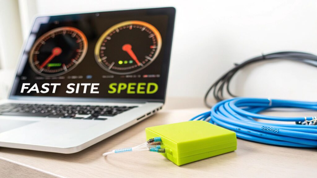
When we talk about improving your site's performance, it all comes down to a few key areas: slimming down assets like images and code, using browser caching and CDNs smartly, and always designing for a mobile-first world. A fast website isn’t just a nice-to-have; it's a make-or-break asset that directly shapes your user engagement, conversion rates, and search engine rankings.
Why Fast Websites Win
Before we get into the nuts and bolts, let’s talk about why this matters so much. A speedy website is one of the most effective tools you have. We live in a world of short attention spans, and online, every millisecond truly counts. Slow load times are a major source of friction, and they’re a great way to send frustrated customers straight to your competitors.
Just think about your own habits online. When a page hangs for too long, what do you do? You probably hit the back button without thinking twice. Your customers are exactly the same. That immediate negative experience doesn't just cost you a single sale; it chips away at your brand’s reputation. A fast, responsive site, on the other hand, signals professionalism and respect for your customer's time, building trust from the very first click.
The Financial Cost Of A Slow Site
The line between site speed and revenue is a straight one. Even a one-second delay can put a serious dent in your bottom line. For an ecommerce store, that means more abandoned carts and lost sales. For a service-based business, it's fewer contact form submissions and missed leads.
Let’s look at how this plays out in the real world. A customer is excited and ready to buy. They click on your product page and wait… one second, two, three. As the seconds tick by, that initial excitement fades into frustration. By the time the page finally loads, they’ve already decided to look elsewhere. This isn’t a rare event; it's what happens every single day on slow websites.
In 2025, website speed is no longer a secondary concern; it's central to the user experience. The data is clear: 40% of visitors will leave a website if it takes longer than three seconds to load. That number alone shows just how crucial it is to get your load times well under that mark. The real goal, especially with over 60% of web traffic coming from mobile, is to get under one second.
To really see how a few seconds can make or break your business, here’s a quick breakdown of how load times affect user behavior.
Impact of Load Time on Key Business Metrics
This table shows the direct relationship between how long your site takes to load and what your visitors actually do. As you can see, even small delays have a big impact.
| Load Time (Seconds) | Bounce Rate Increase | Conversion Rate Drop | Pages Per Session |
|---|---|---|---|
| 1-3 | +32% | 3-5% | -2.1 |
| 1-5 | +90% | 7-10% | -3.8 |
| 1-6 | +106% | 10-15% | -4.3 |
| 1-10 | +123% | 20-25% | -5.5 |
The takeaway here is that every second you shave off your load time directly translates into more engaged users, more page views, and ultimately, more revenue.
How Google Rewards Speed
Getting your site to load faster isn't just about keeping your visitors happy; it's also about staying on Google's good side. Google has been very clear that site speed is a ranking factor, and they measure it using a set of metrics called Core Web Vitals. These vitals are designed to quantify the real-world experience a user has on your page.
- LCP (Largest Contentful Paint): This measures how long it takes for the main piece of content on the page to become visible. A good LCP score tells Google your site feels fast to a real person.
- INP (Interaction to Next Paint): This one is all about responsiveness. It measures how quickly your site reacts to user interactions, like clicks or taps. A low INP means your site feels snappy and interactive.
- CLS (Cumulative Layout Shift): This measures visual stability. It catches those annoying moments when content jumps around the page as it loads.
A faster website creates a better user experience. A better user experience leads to higher rankings, more traffic, and, you guessed it, more conversions. Investing in performance is a direct investment in your business’s growth.
To really get the most out of these optimization efforts, it helps to have a good grasp of the fundamentals behind building fast, scalable websites. Diving into resources that cover performance and scalability in web applications can provide a deeper understanding. This knowledge helps you see every action—from compressing an image to refactoring code—not as a technical chore, but as a strategic business decision.
Before you can fix a slow website, you have to play detective. Guessing what’s slowing things down is just a waste of time. You need to pinpoint the exact culprits holding your site back. This isn't about just getting a simple pass/fail grade on a speed test; it's about digging into the data to find what’s really going on.
Think of performance tools as a diagnostic scan, not a report card. They show you precisely where the friction is for your visitors. Is it massive images? Inefficient code? Too many third-party apps? Your job is to find out.
The infographic below shows the costly journey a user takes when they hit a slow page, from that first moment of frustration right through to leaving your site for good.
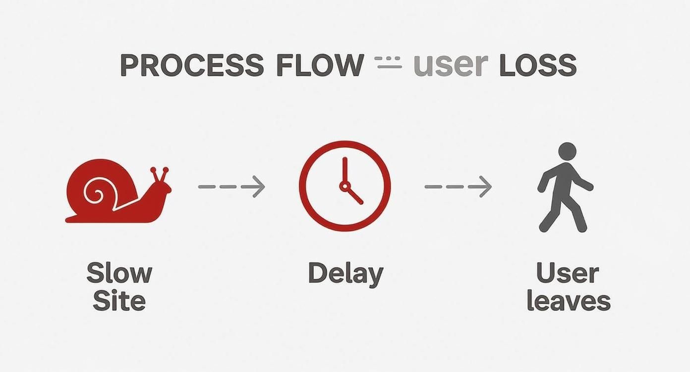
It’s a simple flow, but it drives home a critical point: site performance isn't just some technical metric. It's directly tied to lost customers and revenue.
How to Read a Performance Report
When you run your site through a tool like Google PageSpeed Insights, you get a flood of information. It's easy to feel overwhelmed, but you only need to focus on a few key areas to get started. Don't obsess over hitting a perfect 100 score right out of the gate. Instead, zoom in on the major "opportunities" the report flags for you.
These reports use standardized metrics to measure what a real user experiences. The most important ones are the Core Web Vitals, which give you clear benchmarks for what a "good" experience looks like. For instance, you want your Largest Contentful Paint (LCP) to be under 2.5 seconds. Setting a "performance budget" is a great way to keep these numbers in check as your site grows.
Pinpointing the Usual Suspects
While every site has its own quirks, most performance problems come from the same handful of issues. Once you learn to spot them in your diagnostic reports, you can quickly tackle the biggest drags on your site's speed.
Here are the most common bottlenecks I see:
- Unoptimized Images: Large, uncompressed images are the number one cause of slow load times. I see this all the time. Look for opportunities to properly size, compress, and use modern formats like WebP.
- Render-Blocking Resources: This sounds technical, but it just means you have CSS and JavaScript files that are forcing the browser to wait before it can show anything on the screen. Your report will point these out so you can figure out how to defer them.
- Too Many HTTP Requests: Every single image, script, and stylesheet on a page requires a separate request to the server. If you have too many, it’s like trying to get a hundred people through a single door at once.
- Slow Server Response Time: Also known as Time to First Byte (TTFB), this is how long it takes your server to even start sending information. A high TTFB usually points to problems with your hosting or backend code.
Your goal isn't just to make the site technically faster. It's to make it feel faster for the user. Focus on optimizing everything they see first—the "above the fold" content—to create an instant perception of speed.
Once you’ve got a list of your site’s bottlenecks, you can build a targeted plan. If you want to go deeper into the tools and methods for this diagnostic phase, check out our full guide on how to test website performance.
Turning Your Diagnosis Into Action
After you've run your tests and found the main issues, sort them by impact. Some fixes are quick wins—like compressing a few hero images—that can give you a noticeable boost right away. Others, like rewriting render-blocking JavaScript, are more involved but can lead to huge long-term gains.
My advice? Start with the low-hanging fruit. Tackle the items that your report says will give you the biggest time savings first. This whole process is a loop: test, identify, fix, and test again. By becoming your own performance detective, you take control of your customer's experience and, ultimately, your bottom line.
Practical Ways to Optimize Your Assets

Once you've pinpointed what's slowing your site down, the next move is to tackle the usual suspect: your site's assets. Unoptimized images, bulky code, and large media files are almost always the heaviest drag on your load times. It’s a simple concept—the more you ask a browser to download, the longer your customer has to wait.
The good news? Trimming down these assets is one of the most direct and impactful ways to speed things up. Every single kilobyte you shave off makes for a faster, smoother experience, especially for shoppers on mobile devices or slower connections. Let’s get our hands dirty and look at what you can actually do.
Tame Your Images with Modern Formats and Techniques
Images are the low-hanging fruit of site optimization. They’re usually the heaviest files on any given page, so starting here gives you the biggest bang for your buck. But just running your photos through a compression tool won't cut it anymore. A truly effective approach needs to factor in format, size, and how those images are delivered.
First things first, embrace modern image formats. Formats like WebP are a game-changer, offering much smaller file sizes than old-school JPEGs or PNGs without any noticeable drop in quality. Most browsers have supported WebP for years now, so it’s a safe and powerful way to reduce page weight.
How you serve images is just as important as the format. You absolutely need to be using responsive images. This is a simple HTML technique that tells the browser to load different-sized versions of an image depending on the user's screen. It stops a small smartphone from having to download a massive desktop-sized banner, which is a huge waste of data and time.
Another killer technique is lazy loading. Instead of loading every single image on a page right away, lazy loading waits to load images until they're about to scroll into view. This makes the initial page load feel lightning-fast and is a massive win for your Core Web Vitals, especially Largest Contentful Paint (LCP).
Remember, the goal of image optimization is to find that sweet spot between the smallest file size and preserving visual quality. A blurry, over-compressed product photo can hurt your brand just as much as a slow-loading page.
For a much deeper dive into this, check out our ultimate guide to media file optimization for Shopify migration, which covers everything you need to know.
Minify Your Code for Maximum Impact
It might not seem as obvious as a giant image file, but all the code that builds your site—HTML, CSS, and JavaScript—adds up. Every unnecessary character, from extra spaces and line breaks to comments left by developers, contributes to the file size. This is where minification comes in.
Minification is just an automated process that strips all that junk out of your code files without affecting how they work. It’s like creating a condensed, "just-the-facts" version of your code that browsers can download and process much more quickly.
Here’s what gets cut:
- HTML: Extra whitespace, comments, and optional closing tags are removed.
- CSS: Comments and spaces get stripped out, and some rules might even be merged.
- JavaScript: Comments and whitespace are deleted, and variable names are often shortened.
The impact is bigger than you might think. A CSS file that starts at 120 KB with all its formatting could easily shrink to 95 KB after minification. Saving 25 KB on one file might not sound like a lot, but multiply that across all the assets on your site, and you’re looking at a serious performance boost. Luckily, many Shopify themes, apps, and development tools can handle this for you automatically.
Combine and Defer Non-Essential Scripts
Beyond just shrinking your code, you need to think about how it’s being loaded. Every single CSS and JavaScript file on your page requires a separate trip to the server. If you have too many, it creates a bottleneck, and everything slows to a crawl.
A great strategy here is to combine multiple CSS or JavaScript files into one. Instead of the browser having to make ten separate requests for ten small files, it can make one request for a single, larger file, which is far more efficient.
You also need to defer any JavaScript that isn’t critical for showing that initial, above-the-fold content. Think about scripts for things like chatbots, social media widgets, or analytics. They don't need to load right away. By deferring them, you let the browser render the important stuff first, making the page feel instantly faster to your customers.
Winning the Mobile Performance Game

It’s no surprise that most of your visitors are browsing on their phones. But let's be honest—for too many stores, the mobile experience is an afterthought. It's often just a shrunken, clunky version of the desktop site that’s painfully slow. If you’re serious about site performance, you have to start thinking mobile-first.
Mobile devices come with their own unique challenges. They're often dealing with spotty network connections and have far less processing power than a desktop computer. This reality makes every kilobyte matter and every script a potential reason for a customer to abandon their cart.
The performance gap between devices can be shocking. A desktop page might load in a decent 1.7 to 2.5 seconds, but that same page on mobile can take over 8 seconds to become interactive. That's a massive problem when you realize over 61% of all web traffic is now mobile. If you want to see the data for yourself, these website speed statistics highlight just how critical this is.
Adopting a Mobile-First Mindset
Thinking mobile-first means designing for the smallest screen and the slowest connection first, then scaling up for larger devices. This simple shift in perspective forces you to prioritize what’s truly essential for your customers.
This is about more than just responsive design. It’s about building a responsive experience that feels fast and intuitive in the palm of your hand.
When you put mobile at the forefront, you naturally make smarter performance decisions. You start questioning if that heavy animation is really necessary or if a third-party script is worth the hit to your load time. The best part? A lean, fast mobile site almost always translates into a lightning-fast desktop site, so everyone wins.
For a deeper look at this, our complete mobile optimization guide for Shopify stores is packed with strategies you can use right away.
To help you prioritize, here’s a look at how you should approach common optimizations for different devices.
Desktop vs Mobile Performance Checklist
| Optimization Area | Desktop Priority | Mobile Priority |
|---|---|---|
| Image Compression | High | Critical – Every KB counts on mobile networks. |
| Above-the-Fold Content | Medium | Critical – Users need to see content instantly. |
| Third-Party Scripts | High | Critical – Mobile CPUs are slower; less JS is better. |
| Complex Animations | Medium | Low – Often too resource-intensive for mobile. |
| Lazy Loading Images | High | Critical – Prevents downloading unseen images on data plans. |
| Font Loading Strategy | Medium | High – Avoids blank text during slow network loads. |
| Clickable Element Sizing | Low | Critical – Ensure buttons and links are easy to tap. |
Focusing on the "Critical" mobile areas first will deliver the biggest impact for the majority of your audience.
Slashing Page Weight for Mobile Users
The single most effective thing you can do for mobile performance is to ruthlessly cut down your page weight. Mobile users are often on metered data plans or spotty Wi-Fi, and making them download a huge page is a surefire way to lose a sale.
Here are a few high-impact moves to get started:
- Serve Smaller Images: A mobile user should never download a massive hero image meant for a 27-inch monitor. Use responsive images with the
<picture>element orsrcsetattribute to serve appropriately sized images for every screen. - Conditionally Load Assets: Don't load desktop-only elements on mobile. If you're just hiding a feature with CSS (
display: none;), its assets are probably still being downloaded. Use a bit of JavaScript to stop those resources from loading on smaller screens altogether. - Prioritize Above-the-Fold Content: Make sure the content a user sees without scrolling loads instantly. You can defer everything else below the fold, from images and videos to non-essential scripts.
A fast mobile experience isn't about cramming a desktop site onto a small screen. It’s about delivering the most important content and functionality as quickly and efficiently as possible, respecting the user’s device and connection limitations.
Auditing Your Third-Party Scripts
Third-party scripts from apps, analytics tools, and ads are notorious performance killers, especially on mobile. Each script adds another network request and more JavaScript that has to be processed, which can bring a mobile browser to a crawl.
Get in the habit of regularly auditing every third-party script on your site. Ask the tough questions: Is this app providing enough value to justify the performance cost? Is there a lighter alternative? Often, removing just one or two heavy scripts can dramatically improve your mobile load times. That creates a much better experience for the majority of your visitors.
Advanced Techniques for a Faster Site
https://www.youtube.com/embed/RCdAGvtTYI0
Once you've trimmed down your assets and started thinking with a mobile-first mindset, you’re ready for the next level. These advanced strategies go beyond just optimizing what’s on the page and focus on how that page gets delivered and rendered.
Mastering these is what separates a good site from a great one. We're talking about creating that near-instant feel that keeps customers engaged and coming back for more. It's all about being smarter with server and browser resources, giving them shortcuts instead of making them do all the heavy lifting from scratch on every visit.
Leverage Browser Caching for Return Visitors
One of the most powerful tools in your performance arsenal is browser caching.
Think of it as your website giving first-time visitors a "cheat sheet." Their browser downloads your site’s core assets—like your logo, CSS files, and key scripts—and stores them right on their device.
The next time that person comes back, their browser doesn't have to re-download everything from your server. It just grabs the files from its local cache, which is incredibly fast. This simple trick can slice load times for repeat visitors by 50% or more, making every subsequent page they view feel almost instantaneous.
Use a Content Delivery Network for Global Speed
A Content Delivery Network (CDN) is non-negotiable for any store with a global audience.
Without one, every visitor—whether they're in New York or Tokyo—has to fetch your site's data from a single server location. That physical distance creates a noticeable delay, what we call latency.
A CDN solves this by creating a worldwide network of servers. It copies your static assets (images, CSS, JavaScript) and distributes them to servers all over the globe. When a customer from Tokyo visits your site, the CDN serves those assets from a server nearby, maybe even one in Tokyo. This dramatically shortens the distance the data has to travel, slashing latency and speeding up content delivery.
Using a CDN isn't just about speed; it's about providing a consistent, reliable experience for every user, regardless of their geographic location. It effectively brings your store's front door right to their neighborhood.
The good news? Shopify includes a world-class CDN for all stores. You’re already benefiting from this, with your product images and theme assets being served from locations close to your customers.
Optimize the Critical Rendering Path
This sounds highly technical, but the core idea is simple. The critical rendering path is just the sequence of steps a browser follows to process your HTML, CSS, and JavaScript before it can finally paint pixels on the screen. Optimizing it means helping the browser display the most important, "above-the-fold" content as fast as possible.
You're essentially giving the browser a prioritized to-do list.
Here’s what you can do to improve it:
- Inline Critical CSS: Instead of waiting for a big CSS file to download, embed the small bit of CSS needed to style the top of the page directly into the HTML. This lets the browser render the visible content almost instantly.
- Defer Non-Critical CSS: For the rest of your styles that apply to content further down the page, load them asynchronously so they don't block the initial render.
- Move JavaScript to the Bottom: Always try to place script tags just before the closing
</body>tag. This ensures the browser can show the page's visual content before it has to pause to parse and execute scripts.
These adjustments help visitors see a functional, styled page right away. This creates a powerful perception of speed, even while the rest of the site is still loading in the background.
For a deeper dive, especially on the backend, you might consider working with experts who offer Ruby on Rails performance optimization services, as they can fine-tune these rendering processes at their core.
Common Questions About Website Speed
Diving into website performance can feel a bit overwhelming at first. Suddenly, you're hit with a barrage of acronyms like LCP and CLS, trying to make sense of waterfall charts, and figuring out which fixes will actually make a difference. It's totally normal to have a few questions.
I've put this section together to tackle some of the most common things people ask. My goal is to give you clear, no-nonsense answers so you can make smarter decisions about improving your site's speed.
How Fast Is Fast Enough, Really?
This is the big one, isn't it? While getting a perfect 100/100 on a tool like PageSpeed Insights sounds great, it's not always the most realistic or even necessary goal. What truly matters is what your customers feel.
A great target to shoot for is a Largest Contentful Paint (LCP) under 2.5 seconds. From a user's perspective, that feels quick and responsive. Once you start creeping over 4 seconds, you're entering frustratingly slow territory.
But it’s about more than just one number. The real goal is a site that feels instant. When someone clicks a button, the page should react immediately. Nothing should jump around on the screen as it loads. "Fast enough" is when your site is so seamless that your customers never even think about its speed.
I Run a Local Business. Do I Actually Need a CDN?
It's a common misconception that a Content Delivery Network (CDN) is only for huge, global companies. If most of your customers are in the same city or state, it's easy to think a CDN is overkill. But the answer is almost always yes, you should still use one.
Here’s why a CDN is a smart move for any business:
- It Lightens the Load: A CDN takes the pressure of serving static files—like images, CSS, and JavaScript—off your main server. This frees up your server to focus on the heavy lifting, like processing checkouts, making the whole experience faster for everyone.
- It Boosts Reliability: CDNs are built on massive, distributed networks. If your hosting server has a momentary blip, the CDN can often keep serving the cached parts of your site, preventing a complete outage.
- It Sets You Up for Growth: Your "local" business might not stay local forever. With a CDN already in place, you're ready to provide a fast experience to customers anywhere in the world as soon as you start expanding.
A CDN isn’t just about covering long distances. It's about making your entire setup more efficient and resilient, which directly boosts performance for every single visitor.
Should I Optimize My Images or My Code First?
When you're looking at a long to-do list of potential optimizations, it can be hard to know where to start. My advice is always the same: go for the biggest, easiest wins first. And for most Shopify stores, that means starting with your images.
Nine times out of ten, unoptimized images are the heaviest things on your page. Simply compressing them, resizing them to the correct dimensions, and converting them to a modern format like WebP can shave seconds off your load time. It's the lowest-hanging fruit.
Once your images are sorted, you can then dig into the more technical side of things, like minifying code and deferring scripts that aren't critical. Think of it like cleaning a room—clear out the big clutter first before you start dusting the shelves. This approach gets you noticeable improvements right away and builds momentum for the finer details.
At E-commerce Dev Group, we turn these complex performance questions into straightforward solutions. If you're ready to stop guessing and start seeing real results, our team of Shopify experts is here to help you build a faster, more profitable online store. Learn more about our performance optimization services.