

A Practical CSS Grid Layout Tutorial
This guide is designed to get you building modern, responsive layouts with CSS Grid, starting from scratch. We'll walk through everything from defining basic columns and rows to tackling more advanced techniques, making those once-tricky designs feel surprisingly simple.
Why CSS Grid Is a Modern Web Design Essential
Let’s be real for a moment. Building complex, responsive layouts used to be a frustrating mix of floats, positioning hacks, and clearing floats. I've spent countless hours wrestling with code just to get elements to sit right, especially when trying to make a design work across different screen sizes.
CSS Grid completely changes the game. It’s a true, two-dimensional layout system built right into the browser.
This means you can finally control both rows and columns at the same time—something that was notoriously difficult before. Unlike its cousin, Flexbox (which is fantastic for one-dimensional layouts), Grid was specifically built to manage the entire page structure.
From Hacking to Harmony
Think about building a classic blog layout: a header, a main content area, a sidebar, and a footer. In the old days, you’d float the sidebar next to the content and then use a “clearfix” hack to keep the footer from wrapping up in the wrong place. It worked, but it always felt fragile and wasn't very intuitive.
With CSS Grid, you just define a grid container and tell each element exactly where it belongs. This approach leads to code that's cleaner, more predictable, and so much easier to maintain. You're actually describing the layout you want instead of fighting the browser's default flow.
Key Takeaway: CSS Grid simplifies layout creation by shifting from a content-first flow to a layout-first system. You design the container's structure and then place your content into it, giving you unprecedented control.
This shift hasn't gone unnoticed. The developer community has embraced Grid in a big way. In fact, a State of CSS survey revealed its usage jumped by 34% in just one year, making it the most adopted layout feature out there. To see how Grid fits into the bigger picture, it's also helpful to understand broader web design principles.
By working through this tutorial, you aren’t just learning another CSS feature. You’re adopting a modern workflow that saves a ton of time and cuts out the headaches of old-school layout methods.
Getting to Know the Language of CSS Grid

Before you can really start building with CSS Grid, you need to get familiar with its vocabulary. I always find it helpful to think of it like learning a new language—once the key terms click, the code just flows.
It all starts with the Grid Container. This is simply any element where you've set display: grid. Easy enough.
From there, every direct child of that container instantly becomes a Grid Item. These are the pieces you'll be arranging on your grid. Picture the container as a bookshelf and the items as the books you're about to organize. The rows and columns you create are called Grid Tracks, which form the fundamental structure of your layout.
Defining Your Grid's Blueprint
The real magic happens when you start defining those tracks. When you lay out your columns and rows with properties like grid-template-columns or grid-template-rows, you're building an explicit grid. This is the structure you’ve intentionally planned out.
But what if you have more items than cells? Grid doesn't just give up and break your layout. Instead, it creates an implicit grid, automatically adding new rows or columns to accommodate the extra content. It's this mix of predictability and flexibility that makes Grid so reliable.
One of the most useful tools in your Grid toolkit is the
frunit, which stands for 'fractional unit'. It lets you divvy up available space proportionally, making responsive columns a breeze without fiddling with messy percentages.
For example, a declaration like grid-template-columns: 2fr 1fr; tells the browser to give the first column two-thirds of the available space and the second column the remaining one-third. It just works.
Key Terms You'll Hear a Lot
To really get the hang of Grid, there are a few more concepts you'll need to know. These terms describe the building blocks of your grid:
- Grid Line: These are the horizontal and vertical dividing lines that form your grid's structure. You place items by referencing their numbers, which always start at 1.
- Grid Cell: This is the smallest single unit in your grid—the space between four intersecting grid lines. Think of it like a cell in a spreadsheet.
- Grid Area: A rectangular space that can be made up of one or more grid cells. You can even name these areas (like
headerorsidebar) for more intuitive placement.
Grasping these ideas helps shift your mindset from the one-dimensional flow of traditional layouts to a two-dimensional plane. While Flexbox is fantastic for arranging items along a single axis, Grid’s power lies in its ability to control both rows and columns simultaneously.
If you're wondering when to reach for one over the other, our guide comparing CSS Grid vs Flexbox for Shopify themes breaks it down with some real-world examples. With this vocabulary under your belt, you’re all set to start building.
Building Your First Responsive Grid Layout
Theory is great, but let's be honest—the real learning happens when you get your hands dirty with some code. It's time to put the concepts into practice and build a classic responsive webpage layout from the ground up.
We're going to create a layout you’ve seen a million times: a header, a sidebar, the main content area, and a footer. It’s a foundational pattern for a reason.
The magic all starts with a single line of CSS. By adding display: grid to a container element, you instantly unlock the full power of CSS Grid. From there, we just need to define the structure—telling the browser exactly how our columns and rows should behave.
The image below breaks down this fundamental process.
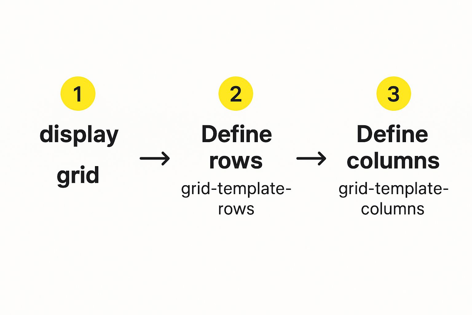
As you can see, activating the grid and defining its tracks are the essential first steps before you can place any content.
Defining Columns and Rows
To build our layout, we'll lean on the grid-template-columns and grid-template-rows properties. Let’s imagine we want a fixed-width sidebar next to a main content area that stretches to fill the remaining space.
Here’s what that looks like:
.container {
display: grid;
grid-template-columns: 250px 1fr;
grid-template-rows: auto 1fr auto;
}
With that simple snippet, we’ve created two columns. The first is a static 250px wide (perfect for a sidebar), and the second uses the 1fr unit to take up the rest of the available space. We’ve also defined three rows: one for the header, a flexible middle row that can grow, and one for the footer.
Now that the blueprint is in place, we can start positioning our content using grid line numbers. Remember, the lines are numbered starting from 1.
To place our main content, we could do this:
.main-content {
grid-column: 2 / 3;
grid-row: 2 / 3;
}
This code tells the .main-content element to start on column line 2 and stop at column line 3, neatly slotting it into our second column. It works, but as layouts grow in complexity, tracking all those numbers can become a real headache.
A More Semantic Approach with Grid Areas
There’s a much cleaner, more intuitive way to do this: named grid areas. This technique lets you assign human-readable names to different sections of your grid, making your CSS a lot easier to understand at a glance.
First, you assign a grid-area name to each of the child elements:
.header { grid-area: header; }.sidebar { grid-area: sidebar; }.main-content { grid-area: main; }.footer { grid-area: footer; }
Next, you draw a visual map of your layout directly on the parent container using grid-template-areas.
.container {
display: grid;
grid-template-columns: 250px 1fr;
grid-template-rows: auto 1fr auto;
grid-template-areas:
"header header"
"sidebar main"
"footer footer";
}
The beauty of this approach is how readable it is. Even better, it makes responsive design a breeze. You can completely rearrange your layout inside a media query just by shuffling the names in the
grid-template-areasproperty.
Building Responsively from the Start
Speaking of responsiveness, one of Grid's superpowers is creating fluid layouts that adapt beautifully, often without a single media query. This is largely thanks to the minmax() function, which allows you to set a minimum and maximum size for any grid track.
CSS Grid really hit its stride when all the major browsers finally came on board. The release of Microsoft Edge 16 in late 2017 was the final piece of the puzzle. By 2018, browser support was solid enough that major sites like Thomasnet.com felt confident enough to adopt it for massive redesigns.
When you're deep in responsive design, you often find yourself converting between different units. Having a handy REM converter tool can save a ton of time, especially when working with minmax() to make sure your typography scales perfectly along with your layout.
If you're ready to tackle more advanced projects, you should check out our guide on how to build https://scaleshopify.com/2025/01/18/responsive-grid-layouts-for-shopify-themes/.
Pushing the Boundaries with Advanced Grid Techniques

Once you're comfortable defining tracks and placing items, it's time to dig into the features that really make CSS Grid shine. This is where you graduate from building predictable layouts to crafting truly dynamic and visually engaging designs—all with surprisingly lean code.
A great example is the grid-auto-flow property. It dictates how the browser places items that you haven't explicitly positioned yourself. By default, it works in row mode, filling empty cells one row at a time.
But switching it to column can be perfect for things like a vertical timeline. The real magic, though, often comes from using the dense keyword. This tells the grid to go back and fill in any empty spots it might have skipped, creating a tightly packed, masonry-like layout without any awkward gaps.
The Famous Media-Query-Free Responsive Trick
If there's one pattern that gets developers excited about CSS Grid, it's creating a fully responsive component without a single media query. It's a game-changer for product listings, photo galleries, or any card-based layout.
The secret is a powerful one-liner for grid-template-columns that combines repeat(), auto-fit, and minmax().
.card-container {
display: grid;
grid-template-columns: repeat(auto-fit, minmax(250px, 1fr));
gap: 1rem;
}
Let's quickly break down what this line does, because it's brilliant:
repeat(): We're telling the browser to create as many columns as it needs.auto-fit: This is the key. It instructs the grid to fit as many columns as it can in the available space. When space runs out, items automatically wrap to the next line.minmax(250px, 1fr): This sets the rule for each column. It says, "Be at least 250px wide, but if there's extra space, grow to fill an equal fraction (1fr) of it."
This simple combination produces a perfectly fluid grid that just works, no matter the screen size. The implications for e-commerce are huge. In fact, understanding this concept is fundamental for anyone interested in building Shopify themes, where responsive product grids are non-negotiable.
Getting Precise with Alignment and Overlapping
Grid also gives you incredible control over how items align within their designated cells. Here, it borrows some familiar and powerful properties from Flexbox.
The table below summarizes the key properties you'll use to manage alignment. justify- properties control horizontal alignment (along the row axis), while align- properties control vertical alignment (along the column axis).
| Key CSS Grid Alignment Properties |
| :— | :— | :— |
| Property | Effect on Grid Items | Effect on Grid Container |
| justify-content | (N/A) | Distributes all grid items horizontally within the container. |
| align-content | (N/A) | Distributes all grid items vertically within the container. |
| justify-items | Aligns all items horizontally within their grid cells. | (N/A) |
| align-items | Aligns all items vertically within their grid cells. | (N/A) |
| justify-self | Overrides justify-items for a single grid item. | (N/A) |
| align-self | Overrides align-items for a single grid item. | (N/A) |
Using these properties makes it simple to perfectly center content or manage white space across the entire grid. The *-self properties are especially handy for creating exceptions and fine-tuning the position of a single element.
Finally, let's touch on overlapping elements. In the past, this meant wrestling with absolute positioning and
z-index. With CSS Grid, it's second nature. You can intentionally place multiple items into the same cell or have them span across the same grid tracks. The browser renders them in their HTML source order, but you can easily manage the stacking with thez-indexproperty, just like you always have.
Troubleshooting Common Grid Layout Issues
Even with a solid handle on CSS Grid, we all hit a point where a layout just refuses to behave. It happens to everyone. The real skill is knowing where to start looking when grid items go rogue.
One of the most common culprits I run into is content overflowing its cell. This is classic when you have something like a long, unbreakable word or a fixed-size image that's just too wide for the grid track. By default, Grid tries its best to accommodate the content's size, which can easily throw your whole design out of whack.
Pinpointing Problems with Browser Tools
Before you start tearing your hair out and changing random properties, your first move should always be to pop open your browser's developer tools. The built-in Grid Inspector is an absolute game-changer. Firefox, Chrome, and Edge all have one, and it lets you see your grid lines, tracks, and gaps overlaid right on the page.
Just by turning on the inspector, you can instantly see if the grid structure in the browser matches the one in your head. You might spot an implicit track you didn't know was there, or realize your fr units aren't divvying up space like you expected. This visual feedback makes debugging so much faster.
The speed at which CSS Grid was adopted was incredible. A mere three months after its official unprefixed release in 2017, global browser support skyrocketed to nearly 70%. That kind of rapid uptake showed just how powerful and needed it was, giving developers the confidence to use it in production almost immediately. Rachel Andrew gave a great presentation on this at CSS Day 2017 that really captures the moment.
Common Fixes for Frustrating Issues
Once you've spotted the problem, the fix is usually more straightforward than you think. Here are a few tricks I keep up my sleeve for those common grid headaches:
-
Overflowing Content: To stop content from blowing past its boundaries, try using
minmax(0, 1fr)for your flexible columns instead of just1fr. This simple change tells the item it's okay to shrink smaller than its natural content size. A quick and dirty fix can also beoverflow: hidden;on the grid item itself. -
Unexpected Gaps: Seeing extra space you didn't define with the
gapproperty? Check for margins on your grid items. Remember, margins are applied inside the grid cell and can create that pesky, unwanted space around your content. -
Alignment Issues: It's easy to mix up the alignment properties. If your items aren't lining up correctly side-to-side, you're dealing with a
justify-*property issue. If the vertical alignment is off, you need to be looking at thealign-*properties.
Common Questions About CSS Grid
As you start working more with CSS Grid, a few common questions always seem to come up. It's totally normal. Let's walk through some of the big ones so you can feel more confident building your layouts.
When Do I Use Grid Instead of Flexbox?
This is probably the most-asked question, and thankfully, the answer isn't that complicated. I always tell people to think about it this way: Flexbox is for one dimension, and Grid is for two.
If you're just trying to line things up in a single row (like a header nav) or a single column (like a blog post feed), Flexbox is your go-to. It’s fantastic at managing space along a single axis.
But the second you need to control a layout in both directions—rows and columns simultaneously—Grid is the clear winner. Think of a complete page layout with a header, sidebar, main content, and footer, or even a detailed image gallery. That's Grid's sweet spot.
They also play incredibly well together. It’s super common to lay out the big-picture page structure with Grid and then use Flexbox to align the little items inside one of those grid areas.
Is CSS Grid Actually Ready for Production Websites?
Absolutely, and it has been for years. Since about 2017, CSS Grid has had solid support across all the major browsers—Chrome, Firefox, Safari, and Edge. Today, global browser support is well over 95%.
You can use it with total confidence. The only time you'd even hesitate is if you have a strict requirement to support ancient browsers like Internet Explorer 10, and even then, you can provide fallback styles. For any modern web project, Grid is not just safe; it's the standard.
My Two Cents: The goal isn't to pick a "winner" between Grid and Flexbox. The real skill is knowing when to use each one. Getting comfortable with both is what will really level up your CSS game.
How Exactly Does the fr Unit Work?
The fr unit is one of the coolest things about Grid. It stands for "fractional unit," and it's a wonderfully simple way to divide up the available space in your grid container without touching messy percentage-based math.
Let's say you write this: grid-template-columns: 2fr 1fr;
What you're telling the browser is to take all the available width, chop it into three equal parts, and then give the first column two of those parts (2/3 of the space) and the second column the remaining part (1/3). It makes creating fluid, proportional layouts incredibly intuitive.
At E-commerce Dev Group, we rely on the power and precision of modern CSS like Grid and Flexbox to build high-performing, visually stunning Shopify stores. If you're looking to create an e-commerce experience that truly converts, our expert team can design a layout that's perfect for your brand. Visit us at https://scaleshopify.com to see how we can help you grow.