
Before you even think about subject lines or email designs, you need a plan. A solid strategy is the difference between a newsletter people look forward to and one that gets instantly deleted. It all comes down to knowing your "why," your "who," and your "how."
Let's break down what that actually means.
Building Your Newsletter's Foundation
So many e-commerce newsletters fizzle out because they skip this crucial first step. Without a clear plan, you end up sending a random mix of product announcements and generic updates that don’t really connect with anyone. That’s a one-way ticket to a high unsubscribe rate.
Think of your newsletter as its own product. It needs a purpose and a unique reason to exist. Why should someone give you their precious email address? The answer to that question is the very core of your strategy.
What’s the Goal Here?
First things first: what is the single most important thing you want your newsletter to accomplish? And no, "make more sales" isn't specific enough. While that's the ultimate goal for any business, your newsletter needs a more focused objective to get you there.
Get specific with what you're trying to achieve. Are you aiming to:
- Build a loyal community? You want to turn one-time buyers into genuine brand fans who feel like they're part of something.
- Drive repeat purchases? The focus is on helping existing customers get more value from your products, which naturally leads them to buy again.
- Establish yourself as an expert? Your goal is to be the go-to source in your niche by sharing valuable insights, tips, and tutorials.
- Generate direct sales? This is all about announcing new products, running exclusive subscriber-only promotions, and driving traffic directly to product pages.
Picking one primary goal will make all your content decisions a thousand times easier. A community-focused newsletter might feature customer stories, while a sales-focused one will lead with the week's best deals.
Who Are You Actually Writing For?
You can’t write a newsletter that hits the mark if you don’t have a crystal-clear picture of your reader. Go deeper than basic demographics like age and location. You need to understand their interests, their pain points, and what truly motivates them. A huge part of this is knowing how to build an email list that actually grows with the right people from day one.

Your newsletter isn’t for everyone. It’s for someone. The more specific you can be about who that "someone" is, the more powerful your content will become. It's the difference between shouting into a crowd and having a meaningful conversation.
This deep understanding helps you create content that genuinely solves a problem. For a skincare brand, this means writing about "5 Ways to Combat Winter Dryness" instead of just announcing a new moisturizer. One is helpful advice; the other is just an ad.
What Does Your Brand Sound Like?
Finally, let’s talk about your brand voice—it’s the personality of your newsletter. It’s what makes your emails feel familiar and helps build a real connection with subscribers. Are you witty and informal? Or are you more polished and educational?
Whatever you choose, consistency is everything. Your tone should match your website, your social media, and your product descriptions. This creates a seamless experience that builds trust over time.
Don't underestimate this foundational work. Email marketing is an absolute powerhouse. It's the preferred channel for 89% of marketers, and the return is massive—email is projected to generate an incredible €42 for every euro invested by 2025. That kind of ROI is only possible when you start with a rock-solid foundation.
Before you jump into writing, it’s worth mapping these core elements out. A simple table can help clarify your thinking and keep your team aligned.
Core Elements of Your Newsletter Strategy
| Strategy Component | Key Question to Answer | Example for an E-commerce Brand |
|---|---|---|
| Primary Goal | What's the #1 thing we want to achieve with this newsletter? | Drive repeat purchases from existing customers. |
| Target Audience | Who is our ideal subscriber and what do they care about? | Health-conscious new moms (28-40) looking for safe, organic baby skincare. |
| Brand Voice | What is our brand's personality? | Warm, reassuring, and knowledgeable—like a trusted friend who's also a pediatric dermatologist. |
Laying this groundwork ensures every email you send has a clear purpose and speaks directly to the people you want to reach.
Crafting Content That Connects and Converts
This is where the magic happens—turning your strategy into something your customers actually want to read. It's time to ditch the hard-sell tactics and generic company updates. Your real goal is to create emails that feel like a welcome conversation, not just another ad cluttering their inbox.
Think about it: the inbox is a battlefield for attention. The sheer volume of newsletters has exploded. The email platform beehiiv, for instance, saw its email sends jump from 402 million between 2021 and 2022 to a staggering 15.6 billion in 2024. That's not a typo. This insane growth means your content has to do more than just show up; it has to provide genuine value to stand out.
Content Ideas That Actually Work for E-Commerce
Your newsletter is more than a sales channel; it’s an extension of your brand experience. It’s your chance to build a relationship that goes far beyond a single purchase. So, instead of constantly pushing products, focus on content that educates, entertains, or inspires.
Here are a few content pillars I’ve seen work wonders for Shopify stores:
- Go Behind the Curtain: Show your subscribers how a popular product gets made. Introduce the people on your team. Share the real story behind why you started your brand. That kind of transparency builds a level of trust that a slick ad never could.
- Create Genuinely Useful How-To Guides: Help customers get more out of the products they already bought from you. If you sell high-end kitchen knives, send a guide on "3 Essential Knife Skills Every Home Cook Should Master." This positions you as the go-to expert and keeps them coming back.
- Showcase Your Community (UGC): Put your customers in the spotlight! Share their photos, unboxing videos, and glowing reviews (with their permission, of course). This is powerful social proof, and it makes your community feel seen and valued.
- Be a Helpful Curator: You don't have to create every single piece of content from scratch. Pull together a list of helpful articles, tools, or resources that your audience would love. A brand selling workout gear could curate a list of the best home workout apps. It saves your audience time and reinforces your authority.
The common thread here is value. Always be offering something worthwhile. If you're struggling for ideas, you can streamline the whole process by leveraging AI as an ultimate content solution to brainstorm topics and even help with the writing.
The Anatomy of a High-Converting Newsletter
Every email you send should follow a clear, logical path that pulls the reader from the subject line all the way to that final click. I like to think of it as a simple story with a beginning, a middle, and an end.
- The Hook (The Opener): You have about three seconds to grab their attention. Start with a compelling question, a surprising fact, or a relatable story. Make it instantly clear what this email is about and why it's worth their time.
- The Body (The Good Stuff): This is where you deliver on the promise you made in the hook. Keep your paragraphs short and punchy. Use bold text, bullet points, and images to break things up and make the email easy to scan.
- The Call-to-Action (The Ask): Every single newsletter needs a purpose. What do you want the reader to do? Your CTA needs to be crystal clear and singular. Don't ask them to "Shop Now" and "Read Our Blog" and "Follow Us on Instagram." Pick one.
This simple framework just works. For a much deeper dive into structuring your emails, we've put together a comprehensive guide on how to write a newsletter that gets results.
Don't bury the lead. Your subscribers are busy. The main point of your newsletter should be obvious the second they open it. If they have to hunt for the good stuff, they'll just hit delete.
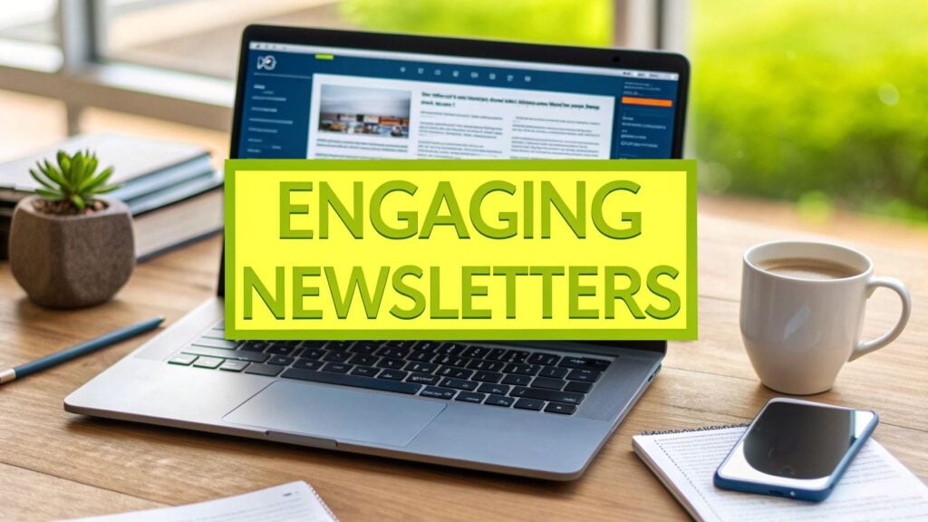
Check out this example. It perfectly shows how clean design and a clear value prop can guide the reader's eye right where you want it to go.

See how the visual flow pulls you down the page? It moves from that great image to the short, punchy text, and lands you right on that bright, impossible-to-miss CTA button. That’s good design.
Writing Subject Lines and Preview Text That Get Opens
Let's be real: your subject line and preview text are everything. If they don't convince someone to open the email, the amazing content inside doesn't matter one bit. The goal is to spark curiosity without sounding like spammy clickbait.
Here are a few quick tips for writing subject lines that work:
- Keep it Short & Sweet: Aim for under 50 characters. That way, it won't get cut off on a phone.
- Create Urgency (Sparingly): Phrases like "Last chance" or "24 hours left" are effective, but if you overuse them, they lose their power.
- Ask a Question: A good question ("Are you making this common skincare mistake?") can be far more intriguing than a statement.
- Get Personal: Using a subscriber's first name is a good start, but personalizing based on their past purchases or browsing history is next-level effective.
And don't forget the preview text! That little snippet of text after the subject line is your secret weapon. Use it to add context and give them one more compelling reason to click through.
Designing for Engagement and Accessibility
Let’s be honest: great content can fall flat if it’s wrapped in a terrible package. Your newsletter’s design isn’t just about looking pretty. It’s about creating a seamless, intuitive path that guides your reader from the subject line all the way to your call-to-action (CTA).
Think of your layout as the user experience of your email. If it's cluttered, slow to load, or impossible to read on a phone, even the most amazing offer will get ignored. Our job is to remove every bit of friction, making it dead simple for subscribers to get your message and act on it.
Embrace the Mobile-First Mindset
Here's a simple rule I live by: always design for the smallest screen first. The data doesn't lie. With nearly 4.8 billion active email users expected by 2027 and a massive 60% of emails being opened on mobile devices, your brand’s fate is decided in the mobile inbox. If you want to dive deeper into these trends, you can explore more statistics about email marketing.
A mobile-first approach usually means starting with a simple, single-column layout. This structure ensures your content flows logically and is easy for someone to scroll through with their thumb. Big, tappable buttons are also a must—if your CTA is a tiny text link that’s hard to hit, you're just throwing away sales.
To keep your mobile design on track, a quick checklist can make a world of difference. It helps you catch common mistakes before you hit send.
Mobile-First Design Checklist
Here’s a quick rundown of what to look for to make sure your newsletters are perfectly tuned for mobile readers.
| Design Element | Best Practice | Why It Matters |
|---|---|---|
| Layout | Use a single-column structure. | Ensures content stacks vertically and is easy to scroll through on narrow screens. |
| Font Size | Keep body text at 16px or larger. | Prevents users from having to pinch-and-zoom, which is a major point of friction. |
| Buttons (CTAs) | Make them full-width and at least 44×44 pixels. | Provides a large, easy-to-tap target for thumbs of all sizes. |
| Images | Compress them to reduce file size. | Speeds up load times, especially on slower mobile connections. A slow email is a deleted email. |
| Spacing | Add ample white space around text and buttons. | Improves readability and prevents the design from feeling cramped and overwhelming. |
This isn't just about ticking boxes; it's about respecting your reader's time and device. A smooth mobile experience shows you care.
Create a Clear Visual Hierarchy
When someone opens your email, their eyes should instantly know where to look. You achieve this with a strong visual hierarchy, which uses size, color, and placement to tell the reader what's most important.
- Your Headline: Make it the biggest, boldest text on the page. It's the hook.
- Your Images: Use high-quality visuals that support your message, not just decorate the email. They help break up the text and add some personality.
- Your Body Copy: Keep it clean and readable. I can't stress this enough: short paragraphs are your best friend.
- Your CTA Button: This needs to pop. Use a color that contrasts with the background so nobody has to hunt for it.
This kind of structure makes your email scannable. Most people don't read—they scan. A clear hierarchy ensures they catch the key points even if they're just skimming on their morning commute.
Good design is invisible. It guides the user without them ever realizing they're being guided. The moment a subscriber has to think about where to click or what to read next, you've introduced friction that can cause them to abandon your email.
Optimizing your images is another huge piece of this. Huge image files will kill your load times, which is a death sentence on mobile. I use tools like TinyPNG or the built-in compressors in email platforms to shrink file sizes without turning my images into a pixelated mess. And don't sleep on GIFs—a subtle, well-placed animation can grab attention much better than a static photo.
Designing for Every Subscriber
Accessibility isn't just a "nice-to-have" feature; it's a core part of professional design. An accessible newsletter means every single subscriber, regardless of their abilities, can have a good experience with your brand. Ignoring it is like telling a portion of your audience you don't care about their business.
Here are a few non-negotiable accessibility practices to bake into your process:
- Use Readable Fonts: Stick to simple, clean sans-serif fonts like Arial, Helvetica, or Verdana. I always aim for a body text size of at least 16px to make sure it’s legible without zooming.
- Check Your Color Contrast: Your text color needs to stand out clearly from its background. Use a tool like the WebAIM Contrast Checker to see if your color palette passes the test. This is especially critical for your CTA buttons.
- Write Descriptive Alt Text: Alt text is what a screen reader will say out loud to a visually impaired subscriber. Instead of a generic "image.jpg," write something helpful like, "A golden retriever puppy chewing on a red toy." It makes your content inclusive and saves the day if images don't load.
Automating and Optimizing Your Email Campaigns
Creating great content is a huge win, but it's only half the battle. Now it's time to put your newsletter to work for you. This is where you shift from one-off sends to a powerful, self-sustaining engine that nurtures leads, recovers sales, and builds loyalty—often while you sleep.
It all starts with ditching the "one-size-fits-all" email. Your subscribers are all at different points in their journey with your brand, and your emails need to reflect that. Sending the right message to the right person at the right time is how you turn a good newsletter into a great one.
Use Segmentation to Send Hyper Relevant Content
Segmentation is just a fancy word for dividing your email list into smaller, more focused groups based on what you know about them. Instead of blasting a generic product announcement to everyone, you can send targeted messages that feel personal and incredibly relevant.
Think about it: a brand new subscriber has very different needs than a VIP customer who's bought from you ten times. Sending them the same email is a massive missed opportunity.
Try breaking your list down by:
- Purchase History: Group customers who bought a specific product and send them a guide on how to use it or recommendations for complementary items.
- Engagement Level: Create a segment for your super-fans (who open and click everything) and another for subscribers who are slipping away. You can send your best stuff to the fans and a gentle re-engagement campaign to the quiet ones.
- Location: Running a pop-up shop in a specific city? Don't annoy your whole list—just email the subscribers who live nearby.
- Sign-up Source: If they subscribed after downloading a guide on a specific topic, send them more content related to that interest.
This simple act of tailoring your message can have an outsized impact. Marketers have reported a staggering 760% increase in email revenue from segmented campaigns.
The Power of A/B Testing Your Campaigns
How do you really know if your subject lines are working? Or if sending your newsletter on Tuesday morning is better than Thursday afternoon? You test.
A/B testing, or split testing, is just sending two slightly different versions of an email to a small portion of your audience to see which one gets better results. The key is to only change one thing at a time so you know exactly what made the difference.
You can get started by testing these key elements:
- Subject Lines: Test a straightforward subject line against one that asks a question. For example, "Our New Fall Collection Is Here" vs. "Ready for Your New Fall Look?"
- Calls to Action (CTA): Does "Shop Now" work better than "Explore the Collection"? Does a red button get more clicks than a green one? Small tweaks can lead to big changes.
- Send Times: Split your list and send the exact same email at 9 AM and again at 7 PM to see which time slot generates more opens and clicks for your specific audience.
Once you have a clear winner, send that version to the rest of your email list. Over time, these small, data-driven improvements add up to significantly better results.
This simple flow shows how to prep and test your newsletter templates so they're ready for these kinds of experiments.
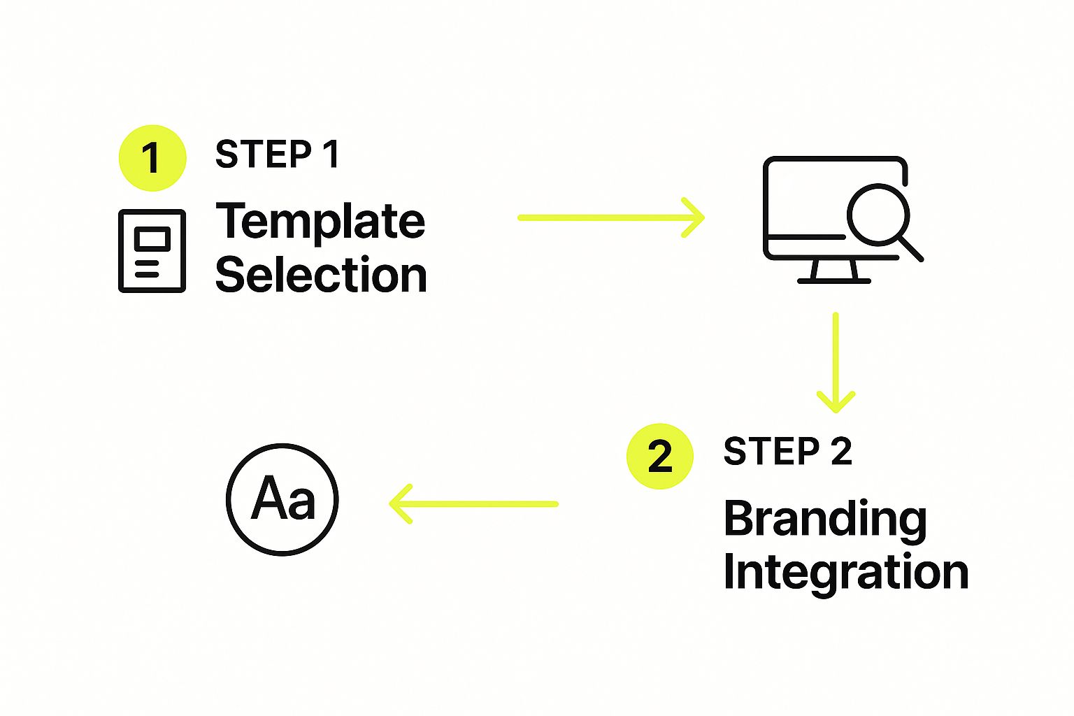
A systematic approach—from choosing a template all the way to final testing—is what makes optimization reliable.
Essential Automation Flows Every E-Commerce Brand Needs
Automation is where you truly start to save time and scale your marketing. These are pre-built email sequences triggered automatically by a subscriber's action. Think of them as your 24/7 marketing team. You can get a much deeper understanding of the possibilities by exploring guides on automated email marketing campaigns.
At a minimum, every Shopify store should have these three flows running:
- The Welcome Series: When someone new subscribes, don't just send one email. Create a 3-5 email series that introduces your brand story, showcases your best-selling products, and offers a small incentive to make that first purchase.
- The Abandoned Cart Reminder: Nearly 70% of online shopping carts are abandoned. An automated email (or a short series of them) sent a few hours after a customer leaves items behind can recover a serious chunk of that lost revenue.
- The Post-Purchase Follow-up: After a customer buys something, the relationship is just beginning. Send an email to thank them, provide shipping updates, ask for a review, and suggest related products they might love.
Automation isn't about being robotic; it's about being reliably helpful. These flows ensure no customer slips through the cracks and that every subscriber gets a consistent, high-quality experience with your brand.
Setting up these automations frees you up to focus on the bigger picture of your content strategy, knowing the essential touchpoints are covered. For merchants on Shopify, learning more about the platform's specific tools can be a game-changer. Our guide to https://scaleshopify.com/2024/12/05/shopify-marketing-automation/ provides a detailed walkthrough to help you get started.
Measuring Success and Refining Your Strategy
Hitting "send" on your newsletter isn't the finish line—it's the starting pistol. The real magic happens when you start paying attention to what your subscribers are telling you through their actions. You can't improve what you don't measure, and your email data is the key to turning good newsletters into great ones.
It's easy to get overwhelmed by all the numbers. Don't. Instead of trying to track every metric under the sun, let's focus on the handful that truly matter for an e-commerce brand. These are the vital signs of your newsletter's health.
Key Metrics Every Shopify Merchant Should Track
Let's dig into the essential metrics and, more importantly, what they're really telling you about your content and your connection with your audience.
-
Open Rate: This is the percentage of people who actually opened your email. Think of it as a direct grade on your subject line and your brand's reputation. If your open rates are consistently low, it's a strong sign your subject lines aren't compelling enough to cut through a crowded inbox.
-
Click-Through Rate (CTR): Of the people who opened your email, how many clicked on a link? Your CTR tells you if your content and calls-to-action were genuinely interesting. A high open rate with a low CTR is a classic sign of a great subject line but lackluster content inside.
-
Conversion Rate: This is the big one—the metric that ties your efforts directly to revenue. It tracks how many subscribers clicked a link and then went on to make a purchase. This number shows you exactly how much money your newsletter is making.
-
Unsubscribe Rate: It never feels great to see people leave, but this is an incredibly useful piece of feedback. A sudden spike in unsubscribes after a certain email is a clear signal that something—the content, the offer, the frequency—missed the mark.
Don't just glance at the numbers; look for the stories they tell. A high CTR on a blog post about how your products are made tells you that your audience loves behind-the-scenes content. Low conversions on a sales email might mean the discount wasn't juicy enough.
A Simple Framework for Continuous Improvement
Data is just noise until you have a plan to act on it. You don't need a complicated analytics setup, just a simple, repeatable process for reviewing what worked, what didn't, and what you'll do differently next time.
I’ve found a monthly review works best. Just pull up the stats for your last few newsletters and ask a few simple questions:
- What was our biggest win? Pinpoint the single best-performing email. What made it special? Was it a killer subject line? A new product you featured? The story you told?
- What was our biggest lesson? Find the email that flopped. Be honest—why do you think it didn't connect with people?
- What’s one thing we’ll try next month? Based on your win and your lesson, commit to one small experiment. Maybe you test more personal, question-based subject lines. Or perhaps you feature more customer photos.
This simple cycle—Measure, Analyze, Iterate—is how you build a newsletter that actually grows your business. Over time, these small, informed tweaks lead to massive results.
And remember, a great newsletter is just one piece of the puzzle. To make sure customers are finding you in the first place, you'll want to dive into our guide on Shopify SEO best practices. When you combine a powerful email strategy with a highly visible store, you create an unstoppable growth engine.
Your Top Newsletter Questions, Answered
Once you get into the rhythm of running a newsletter, some practical questions always seem to pop up. Let's walk through the most common ones I hear from e-commerce brands and get you some clear, straightforward answers.
How Often Should I Actually Send My Newsletter?
Ah, the million-dollar question. The honest-to-goodness answer is, it depends. There’s no magic number that works for everyone. The real goal is finding that sweet spot between staying on your customers' minds and just becoming noise in their inbox.
For most Shopify stores, sending an email once a week is a great starting point. It’s frequent enough to build a routine with your readers but not so often that you feel like you're spamming them.
But before you lock that in, think about these things:
- Your Content Reality: Can you genuinely create one great email every single week? A fantastic bi-weekly email will always beat a rushed, mediocre weekly one. Don't sacrifice quality for an arbitrary schedule.
- Your Business Pace: Are you dropping new products and running flash sales all the time? A higher frequency might be perfect. If your product cycle is slower, a bi-weekly or even monthly send can work beautifully.
- What Your Readers Are Telling You: Keep a close eye on your metrics. If you ramp up to twice a week and your open rates plummet while unsubscribes shoot up, that's your audience telling you to ease off the gas.
At the end of the day, consistency beats frequency. Pick a schedule you can realistically stick with, tell your subscribers what to expect, and then show up when you say you will.
What Should I Do About Unsubscribes?
I get it. Seeing that "unsubscribe" notification can sting a little. But you have to reframe it. An unsubscribe isn't a rejection—it's your list cleaning itself. It's a good thing!
This process ensures you're only talking to people who actually want to hear from you. That means better engagement, better deliverability, and a healthier email list overall. Your only job is to make their exit graceful.
Never, ever hide the unsubscribe link or make it a 5-step process to leave. That’s a fast track to getting marked as spam, which hurts your reputation way more than a simple opt-out ever could.
The best practice is a clean, one-click unsubscribe. If you want, you can add a super short, optional survey on the confirmation page to ask why they're leaving ("emails are too frequent," "content isn't for me," etc.). But don't make it a requirement. Just thank them and let them go.
I'm Completely Out of Ideas. Now What?
It happens to everyone. The content well feels dry. When you hit that wall, stop trying to invent ideas out of thin air and start looking at the goldmine of inspiration right in front of you: your own business.
Here's where to look when you feel stuck:
- Dig Into Your Data: Go look at your Shopify and Google Analytics. What are your all-time bestselling products? Which blog posts still get tons of traffic? Create an email that goes deeper on those proven winners.
- Talk to Your Support Team: Ask them, "What are the top three questions you get asked every single day?" Each one of those is a newsletter topic that solves a real problem for your audience.
- Repurpose, Repurpose, Repurpose: That awesome Instagram Reel you made? Turn it into a "how-to" guide in your next email. That glowing five-star review? Turn it into a mini-case study showing the product in action. You don't always need to build from scratch.
When you shift your perspective from "creating content" to "answering questions," you'll find you have more to talk about than you think.
Building a great newsletter is a long game, not a quick win. If you need a partner to help design and optimize a Shopify store that truly supports your marketing, E-commerce Dev Group is here to help. Discover how our expert team can elevate your brand.