

Creating an inclusive online experience isn’t just a best practice; it’s a business imperative. An accessible website ensures that everyone, including the one billion people worldwide living with disabilities, can navigate, understand, and interact with your content. Ignoring accessibility means excluding a significant portion of potential customers and risking legal complications under regulations like the Americans with Disabilities Act (ADA). More importantly, it means failing to provide a seamless and equitable user experience for all. This isn't about ticking boxes for compliance, it's about fundamentally improving your website's usability and reaching a wider audience.
The good news is that achieving accessibility doesn't have to be a complex, overwhelming process. This comprehensive website accessibility checklist breaks down the essential steps into manageable, actionable items. We will move beyond vague advice and provide clear, practical guidance you can implement immediately. Think of this as your roadmap to not only meet but exceed accessibility standards.
Throughout this guide, you will learn how to:
- Implement proper alternative text for all your images, making visual content understandable to screen reader users.
- Ensure full keyboard navigation so visitors can browse your site without a mouse.
- Verify color contrast to make text legible for people with visual impairments.
- Structure your content with semantic HTML for a logical and predictable user flow.
- Make your forms usable for everyone with clear labels and instructions.
By following this checklist, you’ll be equipped to build a more robust, user-friendly, and compliant e-commerce store that serves every single visitor, without exception. Let's get started.
1. Perfecting Alternative Text for All Visual Media
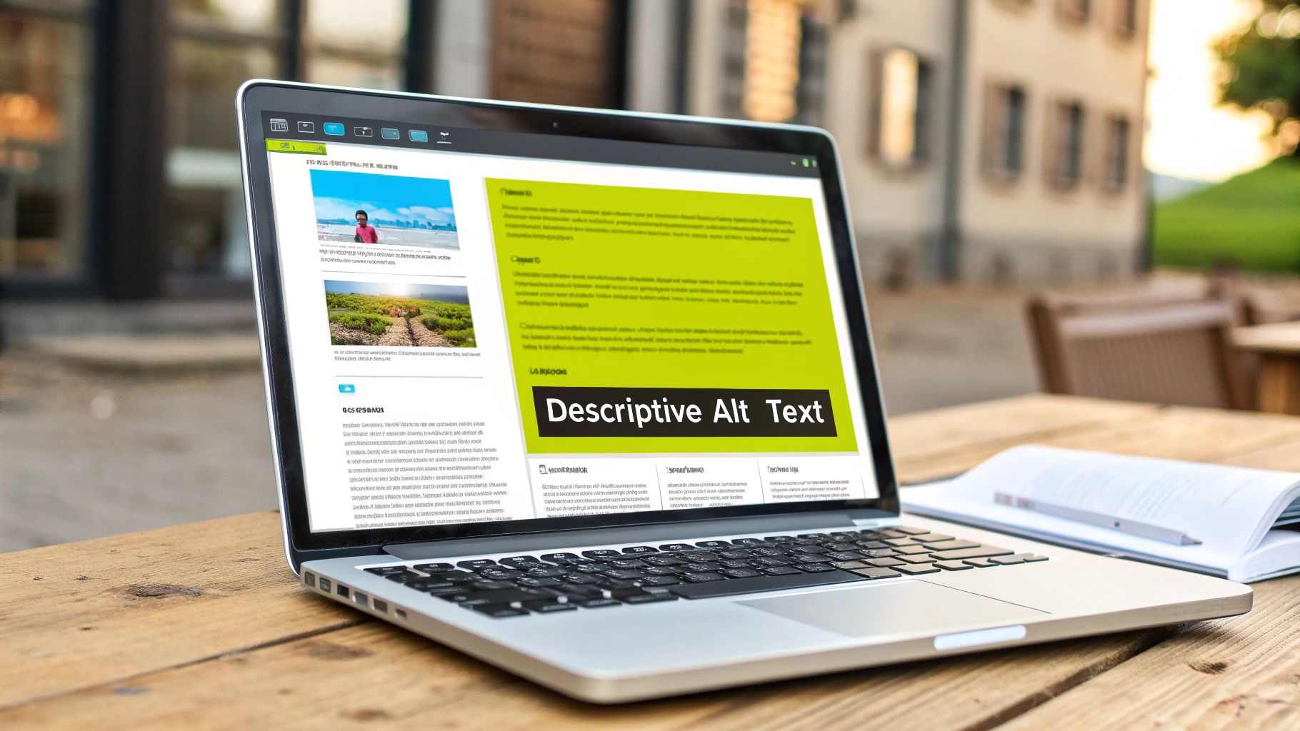
Alternative text, commonly known as alt text, is a fundamental pillar of any robust website accessibility checklist. It is a concise written description embedded in the HTML of an image, conveying its meaning and purpose to users who cannot see it. This text is read aloud by screen readers, ensuring that individuals with visual impairments receive the same contextual information as sighted users. It also serves as a placeholder if an image fails to load, preventing a complete loss of information.
Neglecting alt text effectively creates a barrier, excluding a significant portion of your audience from fully engaging with your content. For an e-commerce store, this could mean a potential customer is unable to understand a product's features, while for a service-based business, it could mean a key infographic explaining your process is completely incomprehensible. Proper implementation is a direct application of the Web Content Accessibility Guidelines (WCAG) success criterion 1.1.1 (Non-text Content).
How to Write Effective Alt Text
Writing meaningful alt text is more art than science. The goal is to describe the image's function and content within the context of the page, not just its visual characteristics.
- Be Descriptive and Concise: Describe what is happening in the image. For a product photo, you might write:
alt="A person wearing a red waterproof jacket with the hood up, hiking in a misty forest." - Context is Key: The same image may require different alt text depending on the surrounding content. If an image is purely decorative and adds no informational value, you should use a null alt attribute (
alt="") so screen readers skip it. - Avoid Redundancy: Screen readers announce that an element is an image, so there is no need to start your description with "Image of" or "Picture of." This is redundant and clutters the user experience.
- Handle Complex Images: For charts, graphs, or detailed diagrams, the alt text should provide a brief summary. A more detailed description should be provided in the body text immediately following the image or via a link to a long description page.
Key Insight: Great alt text focuses on the "why" an image is on the page, not just the "what." Ask yourself: "If I couldn't see this image, what information would I be missing?" That missing information is your alt text.
By perfecting your approach to alt text, you make your visual media accessible to everyone, enhance your site’s SEO, and demonstrate a commitment to inclusive design. This small but critical step is a non-negotiable part of any comprehensive website accessibility checklist.
2. Keyboard Navigation Support
Ensuring robust keyboard navigation support is a non-negotiable component of a comprehensive website accessibility checklist. It means that every piece of interactive content, from links and buttons to forms and menus, can be fully operated using only a keyboard. This is essential for users with motor disabilities who cannot use a mouse, as well as for screen reader users and power users who rely on keyboard shortcuts for efficiency.

Without keyboard accessibility, entire sections of your website become unusable for a significant audience. Imagine a customer on your Shopify store being unable to navigate to the checkout button or a potential client being unable to submit a contact form. These "keyboard traps," where a user can navigate to an element but not away from it, create frustrating dead ends. Adhering to this principle directly addresses WCAG 2.1.1 (Keyboard) and 2.1.2 (No Keyboard Trap).
How to Implement Effective Keyboard Navigation
Proper implementation goes beyond just making things clickable. It requires a thoughtful approach to logical order and clear visual feedback, ensuring a seamless and intuitive user journey.
- Test Your Site Manually: The simplest test is to put your mouse away. Use the Tab key to move forward through interactive elements, Shift+Tab to move backward, and Enter or the Spacebar to activate them. Use arrow keys for elements like dropdowns or carousels.
- Ensure Visible Focus: As you tab through the site, a visible outline or "focus indicator" must clearly highlight which element is currently active. This indicator needs to have sufficient color contrast to be easily seen. Without it, users have no idea where they are on the page.
- Implement "Skip Links": Provide a "Skip to Main Content" link at the very top of the page. This allows keyboard users to bypass long, repetitive navigation menus and jump directly to the primary content, saving time and effort.
- Use
tabindexCorrectly: Thetabindexattribute controls the focus order. Usetabindex="0"to include an element in the natural tab order. Usetabindex="-1"to make an element focusable via script but not through tabbing, which is useful for managing focus in complex components like modals. Avoid positivetabindexvalues (e.g.,tabindex="1") as they disrupt the logical flow.
Key Insight: True keyboard accessibility isn't just about functionality; it's about efficiency. The navigation order should be logical and predictable, mirroring the visual layout of the page to create an intuitive experience for everyone.
By prioritizing keyboard support, you empower a wider range of users to interact with your site effectively. This fundamental practice not only ensures compliance but also enhances the overall usability of your website, reflecting a deep commitment to an inclusive digital experience.
3. Color Contrast Compliance
Color contrast compliance is a critical component of any website accessibility checklist, ensuring that text and interactive elements are easily distinguishable from their background. This practice is vital for users with various visual impairments, including low vision and color blindness, who may find it difficult or impossible to read content with poor contrast. It involves adhering to specific mathematical ratios defined by the Web Content Accessibility Guidelines (WCAG) to guarantee legibility for the widest possible audience.

Failing to meet these standards can render your website unusable for many individuals. Key information, navigation links, and calls to action might blend into the background, creating a frustrating experience and a direct barrier to engagement. For an e-commerce site, this could mean a customer cannot read a product description or find the "Add to Cart" button. Adhering to these standards meets WCAG success criterion 1.4.3 (Contrast, Minimum) and 1.4.6 (Contrast, Enhanced).
How to Achieve Effective Color Contrast
Implementing proper color contrast involves more than just picking colors that look good; it requires deliberate testing and selection based on established guidelines. The goal is to make your content perceivable for everyone.
- Understand the Ratios: WCAG 2.1 AA requires a contrast ratio of at least 4.5:1 for normal text and 3:1 for large text (18pt/24px or 14pt/19px bold). The AAA standard requires 7:1 and 4.5:1, respectively.
- Use Testing Tools: You don't have to guess. Use free tools like WebAIM's Color Contrast Checker or the Colour Contrast Analyser (CCA) to input your foreground and background colors and instantly see if they pass.
- Don't Rely Solely on Color: Never use color alone to convey important information. For instance, if you indicate an error by only turning a field's border red, someone with red-green color blindness might miss it. Add an icon or text label as well.
- Test in Grayscale: A great way to quickly check for potential contrast issues is to view your design in grayscale. If elements are hard to distinguish without color, it's a clear sign your contrast needs improvement. For a more in-depth look at implementing these standards on your storefront, you can learn more about Shopify accessibility compliance on scaleshopify.com.
Key Insight: Prioritizing color contrast from the beginning of the design process is far more efficient than fixing it later. Build your brand’s color palette around accessible combinations to ensure compliance is a feature, not an afterthought.
By making color contrast a non-negotiable part of your design system, you ensure your website is readable and usable for all visitors. This fundamental step in your website accessibility checklist not only supports inclusivity but also enhances the overall user experience by improving clarity and readability for everyone.
4. Semantic HTML Structure
Semantic HTML is the practice of using HTML elements according to their intended meaning, not just their appearance. It forms the skeleton of a webpage, creating a logical and predictable document structure that assistive technologies like screen readers can easily interpret. Instead of using generic <div> and <span> tags for everything, semantic HTML employs elements like <header>, <nav>, <main>, <article>, and <footer> to define the different sections of a page.

When a page lacks a semantic structure, it is like a book with no chapter titles or page numbers. A screen reader user cannot easily jump to the main content, find the navigation menu, or understand the relationship between different parts of the page. This creates significant frustration and can render a site unusable. Implementing a proper document outline is a core requirement of the WCAG and is fundamental to creating a truly accessible experience for all users, making it a critical part of any website accessibility checklist.
How to Implement Semantic HTML
Building a semantic structure requires thinking about your content's purpose and organizing it logically. This practice not only aids accessibility but also improves SEO and makes your code more maintainable.
- Create a Logical Document Outline: Use heading tags (
<h1>through<h6>) in their correct hierarchical order. Your page should have only one<h1>, followed by<h2>s for main sections,<h3>s for subsections, and so on. Do not skip levels, like jumping from an<h2>to an<h4>. - Utilize Landmark Elements: Wrap your main content blocks in appropriate HTML5 landmark elements. Use
<nav>for primary navigation,<main>for the core content of the page, and<aside>for supplementary information like a sidebar. - Implement "Skip to Content" Links: For keyboard-only users, provide a link at the very top of the page that allows them to bypass repetitive navigation menus and jump directly to the
<main>content area. This is a massive quality-of-life improvement. - Validate Your Markup: Use tools like the W3C Markup Validation Service to check your HTML for errors. Clean, valid code is much more likely to be interpreted correctly by assistive technologies and browsers. For those on specific platforms, you can learn more about how a theme's structure impacts usability with a checklist for Shopify responsive theme setup.
Key Insight: Semantic HTML provides the "why" behind your content's layout. It tells assistive technology why a block of text is a header or why a list of links is a navigation menu, enabling users to navigate efficiently based on purpose, not just position.
By embracing semantic HTML, you build a robust and logical foundation for your website. This foundational step ensures that assistive technologies can understand and communicate your site's structure, providing a more inclusive and effective user experience for everyone.
5. Form Accessibility and Labels
Web forms are the primary way users interact with a site, whether signing up, making a purchase, or contacting support. Ensuring form accessibility is a critical part of any website accessibility checklist because it directly impacts a user's ability to complete essential tasks. Accessible forms have clearly labeled fields, intuitive error handling, and logical instructions, allowing people using assistive technologies like screen readers to navigate and submit information successfully.
An inaccessible form can be a dead end for users with disabilities, leading to frustration and abandonment. For an e-commerce store, this means lost sales when a customer cannot complete the checkout process. For a service provider, it means losing valuable leads from a contact form. Properly implemented forms adhere to several WCAG success criteria, including 1.3.1 (Info and Relationships), 3.3.2 (Labels or Instructions), and 4.1.2 (Name, Role, Value).
How to Build Accessible Forms
Creating accessible forms requires a thoughtful approach to structure, labeling, and user feedback. The goal is to make the process as clear and seamless as possible for every user.
- Use Explicit Labels: Every form input, such as a text field, checkbox, or radio button, must have an associated
<label>element. Theforattribute of the label should match theidof the input, creating a programmatic link that screen readers can announce. - Provide Clear Instructions and Error Messages: Don't rely solely on placeholder text for instructions, as it often disappears once a user starts typing. Place instructions before the form and use
aria-describedbyto link help text to specific fields. When errors occur, present them in an accessible way, clearly stating what the error is and how to fix it. - Group Related Elements: Use
<fieldset>and<legend>elements to group related controls, such as a set of radio buttons or checkboxes for a single question. This provides context to screen reader users, helping them understand the relationship between the options. For example, a "Shipping Method" section with "Standard" and "Express" options should be wrapped in a fieldset with a legend that reads "Shipping Method." If you are building forms on a platform like Shopify, you can learn more about making Shopify input fields accessible on scaleshopify.com. - Indicate Required Fields Clearly: Mark required fields visually (e.g., with an asterisk) and programmatically using the
aria-required="true"attribute. This ensures all users know which information is mandatory before they attempt to submit the form.
Key Insight: An accessible form anticipates user needs. It provides clear guidance upfront, labels every interactive element, and delivers helpful, non-disruptive feedback when a user makes a mistake. Think of it as a helpful conversation, not an interrogation.
By prioritizing form accessibility, you remove significant barriers for users with disabilities, improve the user experience for everyone, and ensure your site’s most critical conversion funnels are open to all. This makes it an indispensable item on any comprehensive website accessibility checklist.
6. Utilizing ARIA Labels and Roles
As websites become more dynamic with custom interactive components, standard HTML elements can sometimes fall short in conveying their purpose to assistive technologies. This is where ARIA (Accessible Rich Internet Applications) comes in, acting as a crucial enhancement in any modern website accessibility checklist. ARIA is a set of attributes you can add to HTML elements to provide additional semantic information, clarifying the role, state, and properties of user interface components for screen reader users.
Failing to implement ARIA for complex widgets like custom dropdowns, sliders, or tab panels means these elements might be confusing or completely unusable for people relying on screen readers. For an e-commerce site, a custom product variant selector without proper ARIA attributes could prevent a customer from choosing a size or color. This directly relates to WCAG's principle of making content understandable and operable, as ARIA helps bridge the gap where native HTML cannot. Leading platforms like Netflix and Adobe Creative Cloud web apps use ARIA extensively to make their complex video players and tool interfaces accessible.
How to Implement ARIA Correctly
Using ARIA effectively requires a thoughtful approach. It is meant to supplement, not replace, good semantic HTML. The first rule of ARIA is: if a native HTML element already has the accessibility features you need, use it first.
- Clarify Roles: Use the
roleattribute to define a custom element's purpose. For example, a set of<div>elements acting as a tabbed interface can be givenrole="tablist",role="tab", androle="tabpanel"to make them understandable to a screen reader. - Describe States and Properties: Use attributes like
aria-expanded,aria-selected, oraria-disabledto communicate the current state of an interactive element. For an accordion menu,aria-expanded="true"tells the user that the section is open. - Provide Accessible Names: The
aria-labelattribute can provide a name for an element that has no visible text label, such as an icon-only button. For example,aria-label="Close"on a button with an "X" icon. - Follow Established Patterns: Don't reinvent the wheel. The W3C's ARIA Authoring Practices Guide (APG) provides proven design patterns for common widgets. Following these patterns ensures your implementation is robust and predictable for users.
Key Insight: Think of ARIA as a contract with the user. When you assign a
role="button", you are promising that the element will behave like a button (e.g., it can be activated with Enter and Space keys). You must then use JavaScript to fulfill that promise.
By correctly implementing ARIA, you ensure that your advanced, dynamic web features are not barriers but are accessible to all users. This commitment to technical accessibility is a hallmark of a truly inclusive and compliant website.
7. Focus Management and Visual Indicators
Effective focus management is a critical component of any comprehensive website accessibility checklist, acting as a digital guide for users navigating without a mouse. It involves controlling which interactive element currently has keyboard focus and, just as importantly, making that focus state clearly visible. This ensures users, particularly those relying on keyboards or other assistive technologies, can always see where they are on the page and interact with elements confidently. Without it, a user is essentially navigating blind, unable to see which link, button, or form field is active.
Neglecting focus indicators and a logical focus order creates an unusable experience for a significant user base. On an e-commerce site, this could mean a customer cannot add a product to their cart or complete the checkout form. This practice directly addresses several WCAG success criteria, including 2.4.7 (Focus Visible) and 2.4.3 (Focus Order), making it a non-negotiable aspect of accessible design. Renowned sites like the GOV.UK Design System provide excellent guidance on implementing clear and consistent focus states.
How to Implement Proper Focus Management
Ensuring your site’s focus behavior is predictable and visible requires a multi-faceted approach. The goal is to create a seamless and intuitive path through your interactive content.
- Ensure Focus is Always Visible: Never use CSS to remove the default outline on focusable elements (
outline: none;) without providing a highly visible alternative. A clear, high-contrast border or background color change is essential. The:focus-visiblepseudo-class is the modern standard for showing focus indicators only for keyboard users, not mouse clicks. - Maintain Logical Focus Order: The order in which elements receive focus when a user presses the Tab key must be logical and predictable. It should follow the visual reading order of the page, typically from left-to-right and top-to-bottom.
- Trap Focus in Modals: When a modal window, pop-up, or off-canvas menu appears, keyboard focus must be "trapped" within it. Users should only be able to tab through the elements inside the modal. When the modal is closed, focus must return to the element that originally triggered it.
- Manage Focus for Dynamic Content: If content is loaded or changed dynamically (e.g., search results appearing), you may need to programmatically move focus to the new content to inform screen reader users that the page has been updated.
Key Insight: Don't just check if a focus indicator exists; check if it’s obvious. A good test is to step back from your screen and see if you can instantly spot the focused element as you tab through the page. If you have to hunt for it, it isn’t visible enough.
By mastering focus management, you empower keyboard users to navigate your site with the same ease and efficiency as mouse users. This fundamental practice improves usability for everyone and is an essential checkpoint in your website accessibility checklist.
8. Screen Reader Compatibility
Screen reader compatibility is a critical component of any website accessibility checklist, ensuring that your site is fully functional for users with visual impairments. A screen reader is a form of assistive technology that converts digital text and interface elements into synthesized speech or braille, allowing blind or low-vision users to navigate and interact with web content. Without proper optimization, a website can become an indecipherable maze of unlabeled buttons, unstructured text, and confusing links for these users.
Ensuring your site works seamlessly with screen readers means you are actively designing for inclusivity. For an e-commerce store, this means a user can hear product descriptions, navigate filters, and complete the checkout process independently. For a service-based business, it ensures that contact forms, service details, and case studies are all accessible. This practice directly addresses multiple WCAG criteria, most notably those related to perceivable information and operable user interfaces, like success criterion 4.1.2 (Name, Role, Value).
How to Ensure Screen Reader Compatibility
True compatibility goes beyond basic functionality; it involves creating a logical and intuitive user experience. The goal is to present information in a sequence that makes sense when heard, not just when seen.
- Test with Real Screen Readers: The only way to know if your site is compatible is to test it. Use popular screen readers like NVDA (free), JAWS (paid), and Apple's built-in VoiceOver to navigate your site. Listen for how content is read and identify any confusing or illogical sequences.
- Structure Content Logically: Use proper heading tags (
<h1>,<h2>,<h3>) to create a clear and navigable outline of your page. Screen reader users often use headings to quickly scan and jump to different sections of content, much like a sighted user skims visual titles. - Provide Link Context: Avoid generic link text like "Click Here" or "Read More." Instead, use descriptive text that explains the link's destination, such as
Learn more about our Shopify Plus development services.This provides essential context without requiring the user to guess. - Use ARIA for Dynamic Content: When content on a page updates without a full reload (like a product being added to a cart), use ARIA live regions (
aria-live="polite") to announce these changes to screen reader users. This prevents them from missing critical feedback.
Key Insight: Designing for screen readers isn't just a technical task; it's an empathetic one. Close your eyes and use a screen reader to navigate your own website. The friction and frustration you experience are the exact barriers you need to eliminate.
By prioritizing screen reader compatibility, you open your digital doors to a wider audience and build a more robust, user-friendly website for everyone. This commitment is a hallmark of a truly comprehensive website accessibility checklist and demonstrates a genuine dedication to inclusive design.
Website Accessibility Checklist Comparison
| Item | Implementation Complexity 🔄 | Resource Requirements ⚡ | Expected Outcomes 📊 | Ideal Use Cases 💡 | Key Advantages ⭐ |
|---|---|---|---|---|---|
| Alternative Text for Images | Moderate – requires contextual understanding | Time-intensive for large libraries | Improved accessibility, SEO boost, fallback for images | Websites with rich visual content | Essential for screen readers, SEO improvement |
| Keyboard Navigation Support | High – careful tab order & focus management | Developer effort for custom handlers | Enhanced usability, accessibility for motor impairments | Interactive sites, complex web apps | Crucial for motor disability users, power users |
| Color Contrast Compliance | Low to Moderate – testing and color choices | Requires design adjustments & tools | Better readability, legal compliance, visual clarity | Sites needing strong visual accessibility | Improves readability, legally mandated |
| Semantic HTML Structure | Moderate – requires semantic knowledge | Developer time to structure content | Improved navigation, SEO, maintainable accessible code | All web content, especially content-heavy sites | Boosts screen reader navigation and SEO |
| Form Accessibility and Labels | Moderate to High – form structure planning | Extra markup & validation implementation | Higher form completion, fewer errors, better mobile usability | E-commerce, government, and data input forms | Reduces errors, essential for screen reader users |
| ARIA Labels and Roles | High – careful use to avoid conflicts | Requires testing with assistive tech | Accessibility for dynamic custom components | Complex UIs, dynamic web apps | Enables accessibility where HTML falls short |
| Focus Management and Indicators | High – logical order & visible focus styling | Ongoing maintenance & design effort | Clear navigation, better UX, legal compliance | Keyboard navigation heavy interfaces | Critical for keyboard/screen reader users |
| Screen Reader Compatibility | High – extensive testing and markup | Testing with multiple screen readers | Full content access for blind users, improved SEO | All inclusive websites, especially public sector | Essential for legally compliant, inclusive design |
Turn Your Checklist into Action and Build a Better Web
Navigating the path to a fully accessible website can seem like a monumental task, but this comprehensive website accessibility checklist has broken it down into manageable, actionable steps. We have journeyed through the critical pillars of digital inclusion, from the foundational necessity of alternative text for images to the nuanced, dynamic world of ARIA roles and focus management. Each item on this list is more than a box to tick; it is a gateway to a better user experience for every visitor, regardless of their abilities.
Remember, accessibility is not a one-time project but a continuous commitment. It is an ongoing practice woven into the very fabric of your design, development, and content creation workflows. The goal is to shift from reactive fixes to proactive, inclusive design thinking.
Your Core Takeaways for Lasting Impact
As you move forward, keep these central themes in mind. They represent the philosophical shift that transforms a simple checklist into a powerful strategy for growth and inclusivity.
- Empathy is Your Primary Tool: Beyond technical compliance, the heart of accessibility is understanding the diverse ways people interact with the web. Think about the user who cannot use a mouse, the customer who relies on a screen reader to shop, or the visitor with low vision struggling to read low-contrast text. Designing for them makes the experience better for everyone.
- Consistency Breeds Usability: A user who learns how your site’s keyboard navigation or form labels work should be able to apply that knowledge across every page. Consistent application of semantic HTML, focus indicators, and ARIA labels creates a predictable and stress-free environment, boosting confidence and reducing user friction.
- Accessibility is a Business Advantage: This is not just a moral imperative; it is smart business. An accessible website expands your potential market to include the millions of users with disabilities. It also enhances your brand reputation, improves SEO, and often results in a cleaner, more efficient codebase that is easier to maintain.
Key Insight: True accessibility moves beyond mere compliance with WCAG guidelines. It is about creating genuinely usable, equitable, and enjoyable digital experiences that empower all users and reflect your brand's commitment to inclusivity.
Actionable Next Steps: From Checklist to Reality
Reading this checklist is the first step. Now, it is time to put this knowledge into practice. Here’s how you can start making a tangible difference today:
- Conduct a Self-Audit: Choose one high-traffic page, like your homepage or a key product page. Go through this website accessibility checklist item by item. Can you navigate it using only your keyboard? Are all images properly tagged? Use a free color contrast checker on your key brand colors and calls to action.
- Integrate and Automate: Begin integrating accessibility testing into your development process. Use browser extensions like axe DevTools or WAVE to catch issues early. Make accessibility a required sign-off point before any new feature or page goes live.
- Prioritize and Plan: You may have uncovered several issues. Don't get overwhelmed. Prioritize them based on impact. Critical issues like missing alt text on product images or inaccessible checkout forms should be addressed first. Create a realistic roadmap for tackling the rest.
- Educate Your Team: Share this checklist and your findings with your entire team, from developers and designers to content creators and marketers. Accessibility is a shared responsibility. When everyone understands the "why" behind the guidelines, the "how" becomes an integral part of their work.
By embracing the principles outlined here, you are not just optimizing your website. You are building a more welcoming, equitable, and effective digital storefront. You are sending a clear message to a significant portion of the population: you are seen, you are valued, and you belong here. This commitment will pay dividends in user loyalty, brand strength, and the quiet satisfaction of knowing you are building a better web for all.
Feeling overwhelmed by your accessibility audit? The team at E-commerce Dev Group specializes in transforming Shopify stores into fully compliant, high-performing, and user-friendly experiences. Let our experts handle the technical complexities, so you can focus on growing your business. Visit E-commerce Dev Group to learn how we can help you build a more inclusive and profitable online store.