


In the competitive world of e-commerce, creating a seamless user experience isn't just a nice-to-have; it's the engine of growth. While beautiful design and powerful features are important, they fall flat if users can't navigate your site, find what they need, or complete a purchase without frustration. This is where the power of usability testing comes in. Instead of relying on assumptions about how customers interact with your online store, you can gather direct, actionable evidence.
The right usability testing techniques illuminate hidden friction points, validate design choices, and ultimately pave the way for higher conversion rates and customer satisfaction. Guesswork leads to wasted development cycles and lost revenue, while data-driven insights create a direct path to a better, more profitable user experience. Understanding how real people use your platform is the most reliable way to make impactful improvements.
This guide moves beyond generic advice to give you a practical, actionable toolkit. We will walk you through eight distinct and powerful usability testing techniques, each with a clear breakdown of its process, benefits, and ideal application. You'll learn how to implement everything from quick, informal checks to large-scale quantitative analysis. Whether you are launching a new product feature, redesigning your homepage, or optimizing your entire checkout flow, mastering these methods will transform your development process from a game of chance into a data-driven strategy for success. Let's dive in.
1. Moderated In-Person Testing
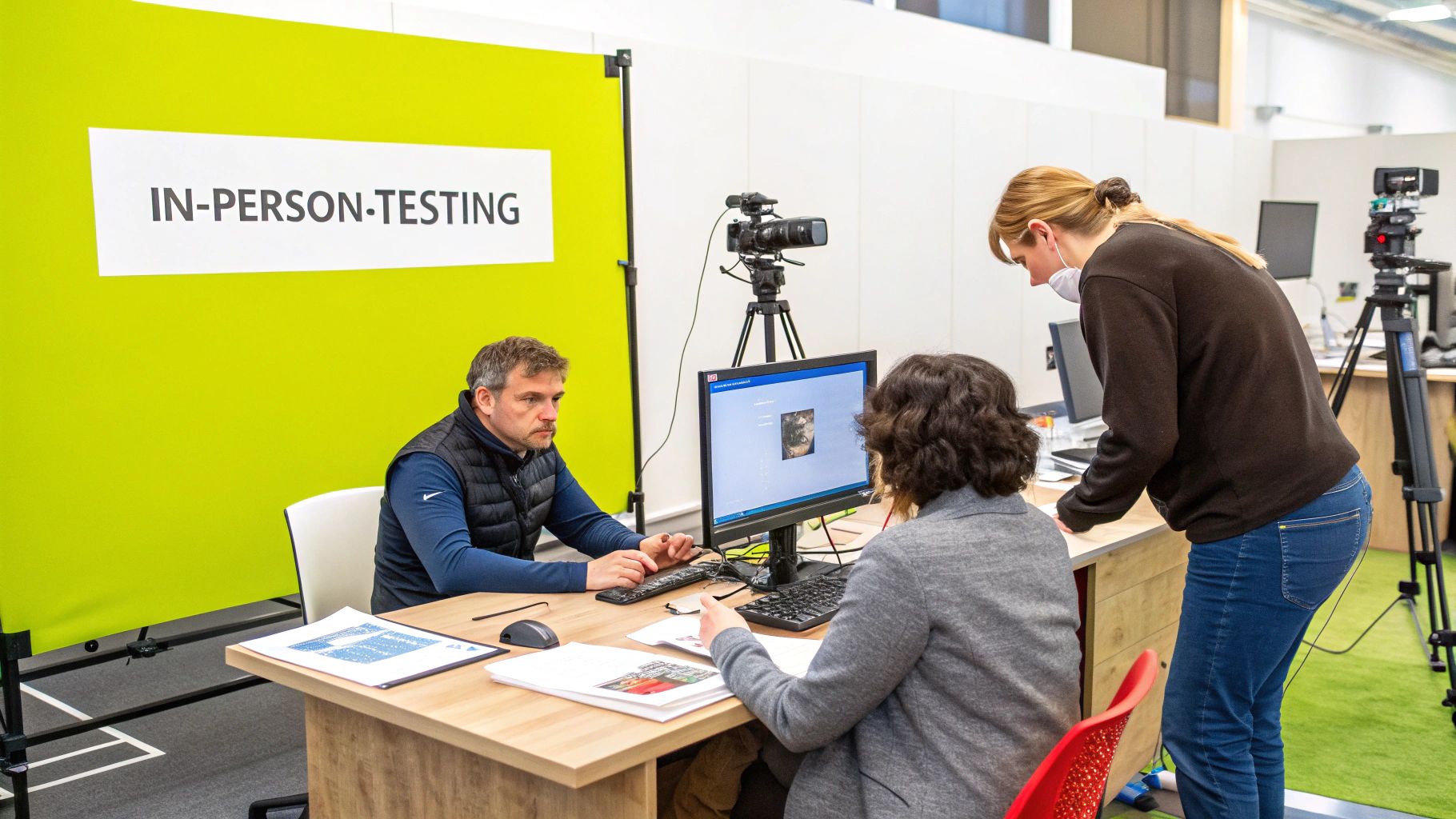
Moderated In-Person Testing is a foundational usability testing technique where a trained facilitator guides a participant through a set of tasks on a product or service in a controlled, physical setting. This classic method allows for direct observation of user behavior, body language, and verbal feedback in real time. The facilitator’s role is crucial: they create a comfortable atmosphere, ask probing follow-up questions, and ensure the session stays on track.
This direct interaction provides a depth of qualitative insight that is hard to replicate. Observing a user’s hesitation, facial expressions, or subtle gestures can reveal usability issues that they may not articulate. This makes it one of the most powerful usability testing techniques for understanding the "why" behind user actions.
When to Use This Method
Moderated In-Person Testing is ideal for complex products or when exploring early-stage concepts and prototypes. It excels when you need to understand intricate user flows, such as testing a new checkout process for your Shopify Plus store or evaluating a detailed product customization tool. It's also invaluable when testing with specific user groups, like elderly users interacting with a banking app, where direct support and observation are key.
Real-World Example: Apple's Interface Design
Apple heavily relies on in-person testing to refine its iOS and macOS interfaces. Before launching features like the Dynamic Island, prototypes are put in front of real users in a lab setting. Facilitators observe how users interact with the new design, asking questions to understand their mental models and discover any points of confusion. This rich, direct feedback is essential for creating the intuitive experiences Apple is known for.
How to Implement It Effectively
- Create a Welcoming Space: Ensure the testing room is comfortable and non-intimidating. Offer refreshments and explain that you are testing the product, not them.
- Develop a Flexible Script: Prepare a detailed test plan with clear tasks and goals, but empower the moderator to deviate when a participant uncovers an unexpected or insightful issue.
- Practice Active Listening: The moderator should listen more than they talk. Use neutral, open-ended questions like, "What are you thinking now?" or "What did you expect to happen?" Avoid leading questions such as, "Was that easy?"
- Record Everything: With permission, record the screen, the participant's face, and the audio. These recordings are invaluable for later analysis and for sharing powerful clips with stakeholders.
2. Remote Moderated Testing
Remote Moderated Testing is a highly effective method where a facilitator guides a participant through tasks using screen-sharing software and video conferencing tools. It captures the rich, qualitative feedback of in-person testing but removes geographical barriers, allowing for a broader and more diverse participant pool. The moderator observes the user's screen in real time, asks questions, and probes for deeper insights as the user interacts with the product from their own environment.
This technique strikes a powerful balance between control and convenience. You get the direct, guided interaction essential for deep understanding while accessing users you could never reach in a physical lab. This makes it one of the most versatile usability testing techniques, ideal for businesses with a global or geographically dispersed customer base.
When to Use This Method
Remote Moderated Testing is perfect when your target audience is spread across different regions or when you need quick feedback without the logistical overhead of in-person labs. It's excellent for testing websites, apps, and software with users in their natural context, like a Shopify merchant managing their store from their home office. This method is also crucial for understanding how environmental factors impact user experience, which is especially important when evaluating mobile interfaces. Understanding the distinctions between user experiences is key; you can learn more about mobile vs. desktop UX on scaleshopify.com.
Real-World Example: Shopify's Global Merchant Feedback
Shopify uses remote moderated testing to gather feedback from its merchants around the world. When developing a new feature for the merchant dashboard, their UX team can connect with a store owner in Australia, a marketer in the UK, and an entrepreneur in the US, all in the same day. Using tools like Zoom, they observe how these diverse users navigate the new interface, listen to their terminology, and identify usability hurdles specific to different markets, ensuring new features are globally intuitive.
How to Implement It Effectively
- Test Your Tech Rigorously: Before any sessions, conduct a dry run of your video conferencing and screen-sharing software. Ensure both you and your participant have stable internet connections.
- Provide Clear Instructions: Send participants a detailed email in advance with the meeting link, setup instructions, and any software they need to install. Reassure them and set clear expectations.
- Have a Backup Plan: Technology can fail. Have a backup communication method, like a phone number, in case the primary video conferencing tool crashes.
- Use Professional Tools: Platforms like UserZoom, Lookback, or UserTesting.com are designed for this purpose, offering features like integrated recording, note-taking, and clip creation to streamline your analysis.
3. Unmoderated Remote Testing
Unmoderated Remote Testing is a scalable method where participants complete predefined tasks on their own devices, in their own environment, without a facilitator present. Specialized software records their screen, audio commentary, and sometimes their webcam feed as they navigate the product or website. This self-guided approach removes the potential for moderator bias and captures user behavior in a more natural, real-world context.
Because it can be conducted asynchronously and at scale, this method provides a wealth of quantitative and qualitative data quickly. It’s one of the most efficient usability testing techniques for gathering feedback from a large and geographically diverse user base, making it a go-to for many modern product teams.
When to Use This Method
This method is perfect for validating specific user flows, testing new feature discoverability, or benchmarking performance against competitors. For an e-commerce store, it’s ideal for testing the efficiency of a checkout process with hundreds of users to identify common drop-off points. SaaS companies frequently use it to see if users can successfully navigate a new onboarding sequence or find a recently added feature without guidance.
Real-World Example: Netflix Interface Optimization
Netflix continuously refines its user interface using platforms like UserTesting.com for unmoderated remote tests. They can quickly deploy a new design variation to hundreds of participants globally, asking them to perform tasks like "Find a new comedy series to watch" or "Add a show to your watchlist." By analyzing the recorded sessions and success rates, Netflix gathers rapid, large-scale data to make informed decisions on which interface changes enhance user engagement and content discovery.
How to Implement It Effectively
- Write Crystal-Clear Instructions: Your tasks must be unambiguous since there is no moderator to clarify. Be specific and avoid internal jargon. For example, instead of "test the cart," use "Add a blue t-shirt in size medium to your cart and proceed to the shipping page."
- Pilot Your Test: Before launching to a large audience, run the test with a small group (3-5 people) to identify any confusing instructions or technical glitches in your setup.
- Use Screening Questions: Ensure you get relevant feedback by using screener questions to recruit participants who match your target demographic and psychographic profiles.
- Provide Essential Context: Give participants just enough background information to understand the scenario without leading them. Explain the user persona they should adopt, for instance, "Imagine you are shopping for a birthday gift."
4. Guerrilla Testing
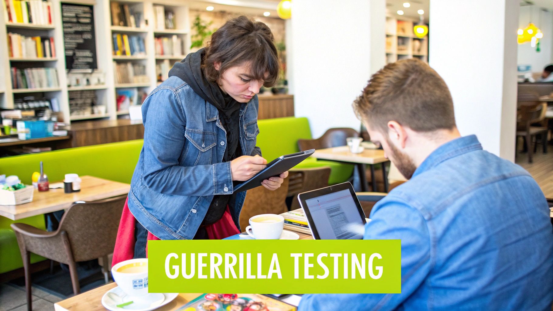
Guerrilla Testing is a lean, fast, and informal usability testing method where researchers approach people in public places like coffee shops, libraries, or co-working spaces to get quick feedback on designs or prototypes. Instead of recruiting participants for a formal lab study, this technique involves "going into the wild" to find users. It's built for speed and efficiency, trading the rigor of a controlled environment for immediate, real-world reactions.
This approach strips down the testing process to its essentials, making it one of the most accessible usability testing techniques for teams on a tight budget or timeline. The goal is not to gather exhaustive data but to quickly validate core concepts, identify major usability flaws, and gain diverse perspectives with minimal overhead. It's a powerful way to inject user feedback into the design process early and often.
When to Use This Method
Guerrilla Testing is perfect for the early stages of product development when you need to quickly test a hypothesis or validate a design direction. Use it to test specific components, like the clarity of a new navigation menu for your e-commerce store or the initial appeal of a landing page concept. It’s also excellent for startups testing a mobile app idea in a university common area or a local business wanting to validate new signage in a shopping mall.
Real-World Example: Validating a Non-Profit's Donation Flow
A non-profit organization wanted to improve its online donation process. Instead of investing in a lengthy lab study, their design team took a laptop to a local community center. They asked visitors to complete a simple task: "Imagine you want to donate $20; show me how you would do it." Within an afternoon, they identified three major friction points that were causing users to abandon the process, all for the cost of a few cups of coffee as a thank you.
How to Implement It Effectively
- Pick the Right Location: Go where your target users are. If you're designing an app for students, visit a campus library. If you're testing a luxury product, a high-end cafe might be more appropriate.
- Keep It Short and Sweet: Prepare a test that takes no more than 10-15 minutes. Respect that you are interrupting someone's day. Focus on a maximum of two or three key tasks or questions.
- Offer a Small Incentive: A small gesture like buying a coffee or offering a $5 gift card shows you value their time and can increase participation.
- Be Polite and Prepared for "No": Approach people respectfully, clearly explain what you're doing, and gracefully accept rejection if they're not interested. Always have your prototype ready to go.
5. A/B Testing
A/B Testing, also known as split testing, is a powerful quantitative method that pits two or more versions of a single design element against each other to see which one performs better. Users are randomly shown either the control (Version A) or a variation (Version B), and their behavior is tracked against a specific, predefined goal. This data-driven approach removes guesswork and provides statistical proof of what works best.
Unlike qualitative methods that explore the 'why', A/B testing definitively answers 'which'. It measures the impact of changes, from the color of a "Buy Now" button to the entire layout of a product page, on key metrics like conversion rates or click-through rates. This makes it one of the most essential usability testing techniques for optimizing performance and maximizing revenue.
To get started, here is a quick reference summarizing the core principles for a successful A/B test.
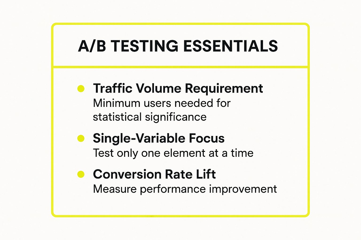
This highlights that disciplined, focused testing is crucial for obtaining clear and reliable results.
When to Use This Method
A/B testing is ideal for optimizing existing, high-traffic pages where even small improvements can lead to significant gains. Use it to refine critical steps in the user journey, such as your homepage call-to-action, product page layout, or checkout flow. For e-commerce stores, it's a non-negotiable tool for continuous improvement. If you're wondering whether a new product image style or a different headline will drive more sales, A/B testing provides the answer.
Real-World Example: Netflix's Thumbnail Optimization
Netflix is a master of A/B testing. To maximize viewer engagement, it continuously tests different thumbnail images for its shows and movies. A user might see a thumbnail for a show featuring the main character, while another user sees one focused on a dramatic scene. Netflix tracks which image gets more clicks and uses the winning version to boost a title's popularity, demonstrating how small visual tweaks can have a massive impact on user behavior.
How to Implement It Effectively
- Define One Clear Metric: Before starting, identify a single, measurable goal. Are you trying to increase clicks, form submissions, or add-to-cart actions? A clear success metric is non-negotiable.
- Test One Variable at a Time: To know what caused a change, you must isolate your variables. If you change both the headline and the button color, you won't know which one influenced the outcome.
- Ensure Statistical Significance: You need enough traffic and a long enough test duration to get reliable results. Making business decisions based on a small sample size can be misleading and costly. Run tests for full business cycles to account for weekly fluctuations in user behavior.
- Combine with Qualitative Insights: A/B testing tells you what happened, but not why. Pair your quantitative data with feedback from moderated testing or surveys to understand the user psychology behind the numbers.
For a deeper dive into applying this method, learn how to run A/B tests on Shopify for better conversions.
6. Card Sorting
Card Sorting is a user research method where participants organize topics, features, or content items into categories that make sense to them. This technique is designed to uncover users' mental models, helping you structure the information architecture of a website, application, or navigation system in a way that feels intuitive to your audience. Participants are given a set of "cards" (either physical or digital), each with a content label, and are asked to group them logically.
By observing how users group this information, you can make data-driven decisions about your site's navigation, menu labels, and content hierarchy. This makes it one of the most effective usability testing techniques for building a foundation of good information architecture before any design or development work begins.
When to Use This Method
Card Sorting is essential in the early stages of a new website or a major redesign, especially for sites with large amounts of content. It's perfect for an e-commerce store trying to figure out the best way to categorize thousands of products in its main navigation. It's also invaluable for software companies organizing complex feature sets within an application or for a university website structuring its academic departments and student services for clarity.
Real-World Example: E-commerce Product Categorization
Imagine a Shopify Plus merchant selling a wide range of home goods. They could use card sorting to determine if customers group products by room (e.g., "Kitchen," "Bedroom"), by function (e.g., "Storage," "Lighting"), or by material (e.g., "Wood," "Metal"). By running a card sort with target customers, they can discover the most natural categorization scheme and build a main navigation menu that directly reflects how shoppers think, reducing friction and improving product discovery.
How to Implement It Effectively
- Keep Cards Clear and Concise: Use jargon-free, easily understood labels on each card. Aim for 30-60 cards to provide enough substance for meaningful patterns without overwhelming the participant.
- Conduct a Pilot Test: Before launching your main study, test your card set with a small internal group. This helps identify any confusing card labels or logistical issues.
- Choose the Right Type: Decide between an "open" sort (where users create their own category names) for exploratory research or a "closed" sort (where users sort into predefined categories) to validate an existing structure. A hybrid approach can also be effective.
- Analyze with the Right Tools: Use software that can generate similarity matrices and dendrograms (tree diagrams) to visually analyze the data. These tools highlight which cards were most frequently grouped together, revealing strong patterns in user thinking.
7. Tree Testing
Tree Testing is a powerful usability testing technique focused specifically on evaluating a website's information architecture (IA). It assesses the findability of topics within a site's structure by presenting users with a simplified, text-only version of the navigation menu. Participants are then given tasks and asked to click through the "tree" to find where they would expect to locate specific information, without any visual design cues to guide them.
This method, sometimes called reverse card sorting, isolates the effectiveness of your category labels and hierarchical organization. By stripping away all visual design, you get pure, unbiased data on whether your navigation makes logical sense to users. This makes it one of the most effective usability testing techniques for validating a site’s structure before a single line of code is written or a pixel is designed.
When to Use This Method
Tree Testing is essential when you are planning a website redesign, restructuring your navigation, or adding new product categories. It's perfect for large e-commerce stores with extensive catalogs, such as a Shopify Plus merchant organizing thousands of products, or for complex sites like government or healthcare portals. It answers the fundamental question: "Can users find what they are looking for quickly and intuitively based on our proposed structure?" A well-organized structure also contributes to better accessibility. Learn more about making your Shopify store compliant on scaleshopify.com.
Real-World Example: Government of Canada Website
The Government of Canada's website (Canada.ca) is a massive portal providing services and information to millions. Before launching its streamlined, task-based IA, the team conducted extensive tree testing. They gave participants tasks like "Find information on parental leave benefits" or "Apply for a passport" and watched which paths they took through the proposed site structure. This data was critical in identifying confusing labels and illogical groupings, allowing them to build a user-centric navigation system that works for a diverse national audience.
How to Implement It Effectively
- Create Realistic Tasks: Write clear, specific tasks that reflect real user goals. Instead of "Find shoes," use "Find a pair of men's waterproof hiking boots in size 10."
- Test the Structure First: Run tree tests on your proposed IA before investing in wireframing or visual design. Fixing a flawed structure early is exponentially cheaper than fixing it after launch.
- Aim for a Solid Sample Size: For statistically reliable results, aim for a minimum of 15-20 participants per user group you are testing. Platforms like Optimal Workshop's Treejack make this easy to achieve.
- Analyze First-Click Data: Pay close attention to where users click first. A high rate of incorrect first clicks on a specific task is a clear indicator that your top-level category labels are misleading.
8. Eye Tracking Studies
Eye Tracking Studies are a biometric usability testing technique that uses specialized hardware to measure and analyze where a user's eyes are focused. This method provides objective, quantitative data on visual attention by tracking gaze points, fixation duration, and scan paths across an interface. It reveals what users actually see versus what they report seeing, offering deep insights into subconscious behaviors.
This technique is one of the most powerful usability testing techniques for understanding visual hierarchy and engagement. By generating heatmaps and gaze plots, researchers can identify which elements capture attention, which are ignored, and where users look when they encounter confusion. This data moves beyond subjective feedback to provide concrete evidence of how an interface guides or misguides the user's eye.

When to Use This Method
Eye tracking is ideal when you need to optimize the visual layout of a critical interface for maximum impact. It's perfect for testing the placement of a call-to-action button on an e-commerce product page, evaluating the effectiveness of a banner ad, or refining the layout of a complex dashboard. This method is also highly valuable for understanding reading patterns on content-heavy sites, like news articles or blog posts.
Real-World Example: Amazon's Product Pages
Amazon uses eye tracking data to meticulously arrange elements on its product pages. Through extensive testing, they've determined the optimal placement for images, titles, pricing, and the "Add to Cart" button. Heatmaps revealed that users' eyes are consistently drawn to product images first, followed by the title and price. This objective insight led to the highly effective layout that millions of users navigate seamlessly today, directly influencing conversion rates.
How to Implement It Effectively
- Calibrate for Every User: Ensure the eye tracking equipment is properly calibrated for each individual participant before the session begins. This guarantees the accuracy of the gaze data you collect.
- Define Areas of Interest (AOIs): Before analysis, define specific regions on the interface (e.g., the logo, a navigation menu, a specific button). This allows you to measure metrics like time to first fixation and total fixation duration for the elements that matter most.
- Combine with Other Methods: Eye tracking tells you where users look, but not why. Pair it with a think-aloud protocol to get qualitative context behind the quantitative gaze data. A user might stare at a button because they are confused, not because it's engaging.
- Supplement, Don't Replace: Use eye tracking as a specialized tool to answer specific visual questions. It should supplement, not replace, broader methods like moderated testing that uncover overall usability issues and user sentiment.
Usability Testing Techniques Comparison
| Method | Implementation Complexity 🔄 | Resource Requirements ⚡ | Expected Outcomes 📊 | Ideal Use Cases 💡 | Key Advantages ⭐ |
|---|---|---|---|---|---|
| Moderated In-Person Testing | High – requires facilitator and lab setup | High – dedicated space, equipment, personnel | Deep qualitative insights, rich behavioral data | Complex interfaces, early prototypes, deep user behavior | Real-time probing, captures non-verbal cues |
| Remote Moderated Testing | Moderate – requires remote tech setup | Moderate – stable internet, conferencing tools | Qualitative insights with broader reach | Diverse global users, natural user environment | Access to global participants, lower cost than in-person |
| Unmoderated Remote Testing | Low – fully automated task delivery | Low – software for recording and task automation | Quantitative data, natural user behavior | Large-scale studies, A/B validations, initial usability | Cost-effective, scalable, eliminates moderator bias |
| Guerrilla Testing | Low – informal, quick sessions | Very Low – minimal equipment needed | Immediate, actionable feedback | Fast validation, small teams, low budget | Fast, cost-effective, diverse spontaneous feedback |
| A/B Testing | Moderate – requires traffic and testing tools | Moderate to High – data platforms and traffic | Quantitative, statistically significant results | Conversion optimization, measurable business impact | Objective, scalable, real-world user data |
| Card Sorting | Low to Moderate – depends on task design | Low – physical or digital cards | Insights into user mental models and organization | Information architecture design, content categorization | Reveals user expectations, inexpensive |
| Tree Testing | Low to Moderate – task and tool setup | Low – mostly digital tools | Quantitative IA findability data | Navigation validation, pre-design IA testing | Identifies navigation issues cost-effectively |
| Eye Tracking Studies | High – specialized hardware and expertise | High – expensive equipment and trained staff | Objective visual attention data | Visual hierarchy optimization, advertising, layout design | Reveals subconscious visual behavior, compelling visuals |
Choosing Your Path: From Insights to Impact
You've just explored a powerful arsenal of usability testing techniques, moving from the direct, qualitative feedback of moderated sessions to the large-scale statistical validation of A/B testing. We’ve covered everything from quick and dirty Guerrilla Testing on a budget to the sophisticated, data-rich insights of Eye Tracking. The journey through these methods reveals a critical truth: there is no single "best" technique. Instead, the power lies in knowing which tool to pull from your toolkit for a specific challenge at a specific time.
The most important takeaway is to be strategic. The goal isn't just to do testing; it's to gather actionable insights that lead to tangible improvements in your user experience and, ultimately, your bottom line. Trying to validate a new navigation structure for your Shopify store? Card Sorting and Tree Testing are your go-to methods. Need to understand why users are abandoning a complex checkout process? A Remote Moderated test will uncover the specific points of friction and frustration.
Weaving a Strategy: Combining Usability Testing Techniques
The most sophisticated e-commerce brands don’t rely on a single method. They create a continuous feedback loop by layering different usability testing techniques throughout their design and development lifecycle. This creates a powerful, multi-faceted understanding of the user journey.
Consider this practical workflow for a Shopify Plus merchant:
- Start Broad (Identify Problems): Begin with a large-scale Unmoderated Remote Test to analyze key user flows, like product discovery or adding an item to the cart. This quantitative data will quickly highlight where the biggest drop-offs and friction points are occurring across a wide user base.
- Go Deep (Understand the 'Why'): Armed with data from the unmoderated test, conduct a small number of Remote Moderated Tests. Focus specifically on the problem areas you identified. This is your chance to ask follow-up questions and hear, in your users' own words, why they struggled.
- Validate Solutions (Test the Fix): Once you've developed a potential solution based on your qualitative insights, deploy an A/B Test. Pit the new design against the original on a high-traffic page to get statistically significant proof that your changes actually improve conversion rates or user engagement.
This hybrid approach transforms usability testing from a simple checklist item into a strategic driver of growth. It removes guesswork and bases critical business decisions on real user behavior and feedback.
The True Value: Building a User-Centric Culture
Mastering these usability testing techniques does more than just fix broken buttons or confusing navigation. It fundamentally shifts your company's perspective from being product-focused to being user-centric. When you consistently seek out, listen to, and act upon user feedback, you build a digital experience that feels intuitive, helpful, and trustworthy.
For Shopify store owners, this is paramount. A user-centric store doesn't just look good; it performs. It converts browsers into buyers, turns one-time purchasers into loyal customers, and builds a brand reputation for quality and care. By integrating even one or two of these testing methods into your regular workflow, you begin a powerful cycle of continuous improvement that sets you apart from the competition. Don't wait for the perfect moment or a massive budget. Start small, stay consistent, and watch as user insights become your most valuable asset for sustainable growth.
Is your Shopify Plus store optimized for conversions, or are you leaving money on the table due to hidden usability issues? At E-commerce Dev Group, we specialize in building and refining high-performance e-commerce experiences by integrating these exact usability testing techniques into our development process. Let our team of experts audit your site and implement data-driven solutions that turn user insights into measurable revenue growth.
