

In a digital-first economy, an accessible website is no longer a 'nice-to-have' feature; it's a fundamental requirement. The Americans with Disabilities Act (ADA) extends its civil rights protections to the digital realm, mandating that websites, including e-commerce stores, be accessible to people with disabilities. Failure to comply can lead to significant legal costs and brand damage. More importantly, it means excluding a massive segment of the population, as approximately 1 in 4 adults in the U.S. live with a disability that can affect how they browse, shop, and interact online.
This isn't just an American issue. The core principle of creating an inclusive online environment is reflected in various international laws, including global accessibility standards like the German Barrierefreiheitsstärkungsgesetz (BFSG), highlighting a worldwide shift towards universal web access. For business owners and e-commerce managers, this means that accessibility is now a key part of smart business strategy, not just legal defense.
This guide provides a straightforward, actionable ADA website compliance checklist designed to cut through the technical noise. You will learn how to address the most critical areas of web accessibility with practical steps and clear examples. We will cover seven essential elements:
- Alternative Text for Images: Ensuring visual content is understood by everyone.
- Keyboard Navigation Support: Allowing users to navigate without a mouse.
- Color Contrast Requirements: Making text readable for visually impaired users.
- Form Accessibility and Labels: Creating intuitive and usable forms.
- Heading Structure and Hierarchy: Organizing content for screen readers.
- Video and Audio Accessibility: Providing captions and transcripts.
- Page Titles and Language Declaration: Setting the stage for clear communication.
Whether you are auditing an existing site or launching a new Shopify store, this checklist will serve as your roadmap to building a more inclusive, user-friendly, and legally sound online presence.
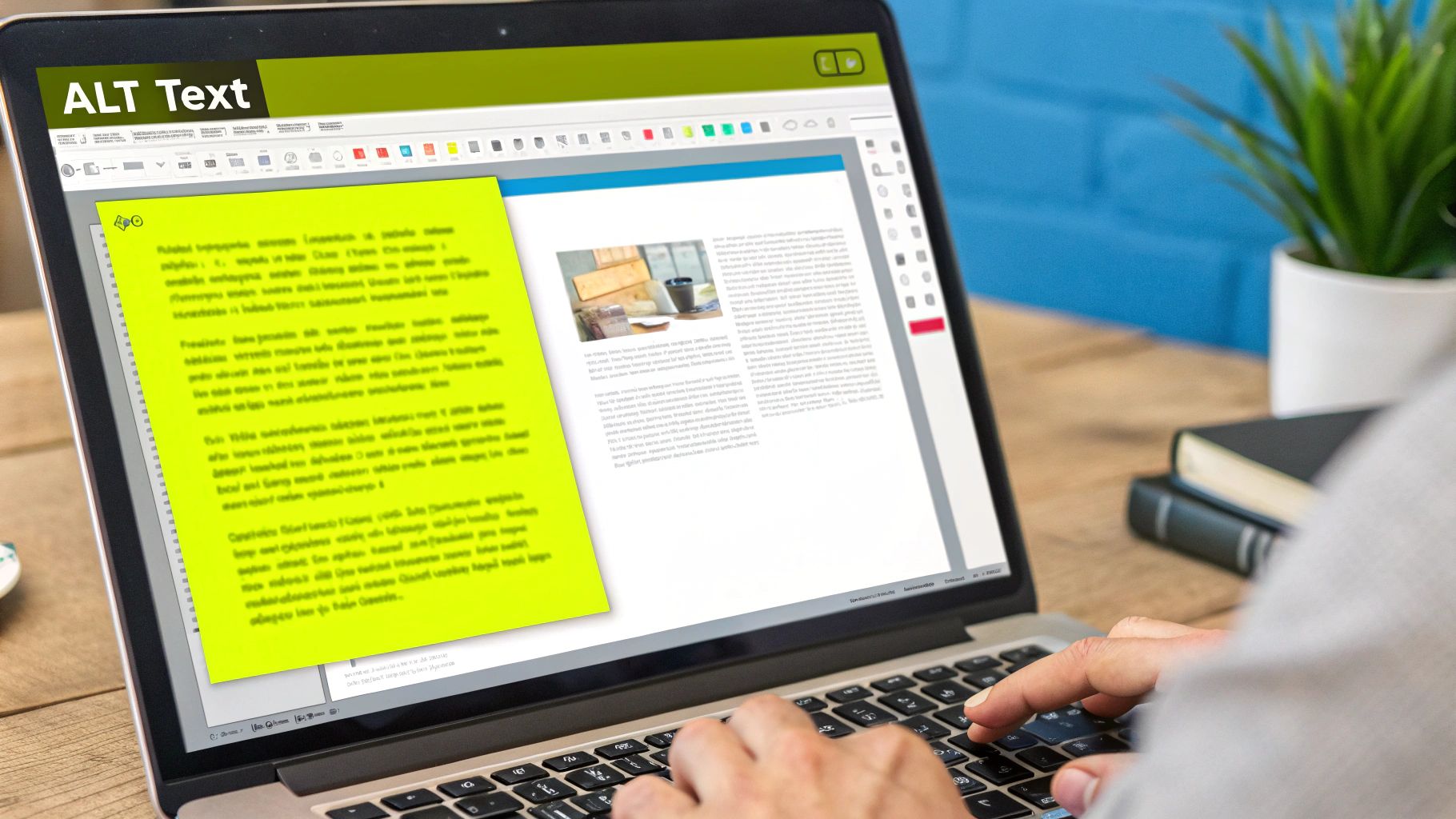
1. Alternative Text for Images
Alternative text, commonly known as alt text, is a brief written description added to an image's HTML code. This text is crucial for accessibility, as it provides a non-visual way to understand the content and function of images on a webpage. For users who are blind or have low vision and rely on screen readers, the alt text is read aloud, allowing them to "see" the image's purpose within the context of the page. This simple yet powerful feature is a cornerstone of any effective ADA website compliance checklist.
Without meaningful alt text, screen readers might only announce "image" or a confusing file name, leaving users without essential information. This is especially damaging for e-commerce sites where product images are vital for conveying details, or for informational graphics that communicate key data. Properly implemented alt text ensures that all users have an equivalent experience, regardless of visual ability.
How to Write Effective Alt Text
Writing good alt text is about conveying context and function. It’s not just about describing what the image is, but why it's there. The goal is to provide the same level of understanding a sighted user would get from looking at the image.
- Be Specific and Concise: Aim for under 125 characters. This length is a guideline, not a strict rule, to ensure compatibility with most screen readers. For example, instead of "dog," write "Golden retriever puppy chewing on a red toy."
- Describe the Image's Purpose: If an image is a button that says "Shop Now," the alt text should be "Shop Now," not "Blue button with white text." This describes the image's function.
- Avoid Redundancy: Never start with phrases like "image of" or "picture of." Screen readers already identify the element as an image, so this is unnecessary.
- Use Empty Alt Attributes for Decorative Images: For images that are purely for design and add no informational value, use an empty alt attribute (
alt=""). This tells screen readers to skip the image entirely, preventing unnecessary noise for the user.
Key Insight: The best alt text closes the gap between the visual and non-visual user experience. It should be descriptive enough to paint a mental picture but functional enough to guide the user's actions.
Beyond just alternative text, understanding how to name images for SEO can also contribute to overall image optimization and discoverability, creating a more cohesive and searchable online presence.
Practical Implementation and Testing
For Shopify store owners, adding alt text is straightforward. You can edit it directly within the product or media settings for each image. For more complex visual elements, like those in a custom-built theme, you may need to edit the Liquid code directly. For stores with extensive visual content, learning how to add custom image galleries in Shopify can help organize your media, making it easier to manage alt text consistently.
To ensure your alt text is working correctly, test it with a real screen reader. Tools like NVDA (free for Windows) or JAWS (paid) can give you direct insight into how a visually impaired user experiences your site. This practical step moves your efforts from a theoretical checklist item to a confirmed, accessible feature.
2. Keyboard Navigation Support
Keyboard navigation support ensures that every interactive element on a website can be accessed and operated using only a keyboard, without requiring a mouse. This is a critical component of any ADA website compliance checklist, as it directly impacts users with motor disabilities who cannot use a mouse, as well as visually impaired users who rely on screen readers that are controlled via keyboard commands. Without it, entire sections of a site become unusable for a significant portion of the audience.

When a user presses the Tab key, they should be able to move logically through all interactive elements like links, buttons, and form fields. Pressing Enter or the Spacebar should activate the selected element. Effective keyboard navigation means the user can confidently navigate menus, fill out forms, and complete a purchase journey, such as the checkout process on Amazon, without ever touching a mouse. This creates an equitable experience for all users.
How to Implement Effective Keyboard Navigation
Strong keyboard accessibility is built on two principles: logical order and clear visibility. The navigation path should follow the visual layout of the page, and users must always know which element is currently selected.
- Implement a Visible Focus Indicator: When a user tabs to an element, it must have a clear visual highlight, often a border or outline. This "focus ring" should have high contrast against the background so it's easy to see. For example, GitHub's interface uses a distinct blue outline around focused elements.
- Ensure a Logical Tab Order: The
Tabkey should move focus from one interactive element to the next in an intuitive sequence, typically from left to right and top to bottom, mirroring how a sighted user would read the page. - Add "Skip to Main Content" Links: These links, often the first focusable element on a page, allow keyboard users to bypass long, repetitive navigation menus and jump directly to the primary content.
- Ensure All Interactive Elements are Reachable: Every link, button, form field, and custom widget must be accessible and operable via the keyboard. This includes dropdown menus and interactive sliders.
Key Insight: True keyboard accessibility isn't just about making things reachable; it’s about making the journey efficient and predictable. A logical tab order and visible focus state transform a frustrating experience into a seamless one.
For e-commerce sites, ensuring keyboard accessibility is not just a compliance issue, it's a conversion issue. Exploring the ultimate guide to Shopify accessibility compliance can provide deeper insights into making your entire store, from product pages to checkout, fully navigable for every customer.
Practical Implementation and Testing
For Shopify store owners, most modern themes come with good keyboard navigation built-in. However, custom features, third-party apps, or complex menus can introduce accessibility barriers. It is crucial to verify that all added functionality adheres to these standards.
The most effective way to test is to unplug your mouse and try to navigate your entire website. Can you browse products, add an item to the cart, fill out all checkout fields, and complete a purchase using only your keyboard? This simple hands-on test will quickly reveal any gaps in your site's accessibility and is a non-negotiable step in your ADA compliance efforts.
3. Color Contrast Requirements
Color contrast is a critical element of accessible web design, ensuring that text is readable against its background for all users. This is particularly important for people with visual impairments like low vision or color blindness. The Web Content Accessibility Guidelines (WCAG) define specific contrast ratios that text and other important visual elements must meet, making this a non-negotiable item on any ADA website compliance checklist.

When the contrast between text and its background is too low, words can become difficult or impossible to read, leading to a frustrating user experience and lost conversions. For example, light gray text on a white background might look sleek, but it excludes a significant portion of your audience. Meeting these requirements ensures that your content, from product descriptions to checkout instructions, is clear and legible for everyone.
How to Meet Color Contrast Requirements
The WCAG 2.1 standards set clear benchmarks. The key is to achieve a minimum contrast ratio, which measures the difference in perceived "lightness" between the foreground and background colors.
- Standard Text: The contrast ratio must be at least 4.5:1. This applies to most text on your website.
- Large Text: For larger text (18pt normal weight or 14pt bold weight), the requirement is more lenient, at a 3:1 ratio. This is because larger, thicker letters are inherently easier to read.
- Non-Text Elements: UI components like buttons and form field borders, as well as essential parts of graphics, must have a contrast ratio of at least 3:1 against adjacent colors.
Key Insight: Strong color contrast is not just a compliance rule; it's a fundamental principle of good design that improves readability for all users, including those viewing your site in bright sunlight on a mobile device.
Major brands like Apple and Microsoft build their digital experiences around high-contrast principles, proving that accessibility and modern aesthetics can go hand-in-hand. Government sites, such as Medicare.gov, also serve as excellent examples of high-contrast design in practice.
Practical Implementation and Testing
Integrating contrast checks into your design process is the most effective way to ensure compliance. For Shopify merchants, many modern themes come with accessible, high-contrast color schemes built-in. However, when customizing colors, you must be vigilant.
To verify your color choices, use a contrast checking tool like the WebAIM Contrast Checker or Adobe's Color Contrast Analyzer. These tools allow you to input your foreground and background color hex codes and will instantly tell you if you meet WCAG AA and AAA standards. Testing your site with a color blindness simulator can also provide valuable insights into how users with different types of vision perceive your design.
4. Form Accessibility and Labels
Form accessibility is the practice of ensuring that all interactive elements within a form, such as text fields, checkboxes, and buttons, are clearly labeled and fully operable for users with disabilities. This is a critical component of any ADA website compliance checklist because forms are the primary way users interact with a site, whether for making a purchase, signing up for a newsletter, or contacting support. For individuals using assistive technologies like screen readers, inaccessible forms can be an insurmountable barrier, preventing them from completing essential tasks.

When forms lack proper labels, a screen reader cannot tell the user what information to enter into a specific field. Similarly, if error messages are only communicated visually, like a red border around an input box, a blind user may have no idea why their submission failed. Accessible forms use proper HTML and ARIA attributes to create a logical, intuitive, and navigable experience for everyone, ensuring that interactive parts of a website are truly universal.
How to Implement Accessible Forms
Making a form accessible involves connecting every input field with a clear label, providing instructions, and guiding users through the process, especially when errors occur. The goal is to eliminate any guesswork for assistive technology users.
- Use Explicit Labels: Every form input must have a corresponding
<label>tag that is programmatically linked to it using theforandidattributes. Avoid relying solely on placeholder text, as it disappears once the user starts typing and is often ignored by screen readers. - Group Related Fields: When you have a group of related inputs, like a set of radio buttons for shipping options, wrap them in a
<fieldset>element. Use a<legend>tag to provide a descriptive title for the entire group, giving users context for the choices. - Provide Clear Error Messages: When a user makes a mistake, the error message should be clear, specific, and programmatically associated with the problematic field. For example, instead of just "Invalid input," use "Please enter a valid email address." The message should appear next to the field and be announced by screen readers.
- Indicate Required Fields Clearly: Mark all required fields with an asterisk (*) and include a note at the beginning of the form explaining that an asterisk indicates a required field. You can also use the
aria-required="true"attribute to communicate this to screen readers.
Key Insight: Accessible forms don't just meet compliance standards; they create a better user experience for everyone. A clearly labeled and easy-to-navigate form reduces friction, lowers abandonment rates, and increases conversions.
Learning the specifics of implementation is crucial, especially for e-commerce platforms. For merchants looking to optimize their checkout and contact pages, understanding how to make Shopify input fields accessible provides a targeted guide for this essential task.
Practical Implementation and Testing
Implementing accessible forms often requires direct access to your site's HTML or theme code. For Shopify store owners, this might mean editing the Liquid files for your contact, product, or checkout pages to ensure all <input> elements have proper <label> tags. Platforms like Mailchimp and Salesforce are often cited as good examples because they build accessibility into their standard form templates.
The most reliable way to verify form accessibility is to test it yourself. Try navigating your forms using only your keyboard to ensure every field is reachable and interactive. Then, use a screen reader like NVDA or VoiceOver to listen to how your forms are presented. This firsthand testing will reveal any gaps in your implementation and confirm that your website provides an equitable experience for all users.
5. Heading Structure and Hierarchy
A proper heading structure is like a table of contents for your webpage. It uses HTML heading tags (H1, H2, H3, etc.) in a logical, sequential order to create a clear document outline. This structure is essential for accessibility, as users who rely on screen readers can use keyboard shortcuts to navigate a page by its headings. This allows them to quickly understand the page's layout and find the specific information they need without having to listen to every word. A well-organized heading hierarchy is a fundamental element of any comprehensive ADA website compliance checklist.
Without a logical heading structure, a webpage is just a wall of text to a screen reader user. They cannot easily skip from one section to the next, making the content difficult to scan and digest. For example, on a long product description page or a detailed blog post, a user might want to jump directly to the "Specifications" or "How to Use" section. Proper headings make this possible, ensuring a more efficient and less frustrating user experience for everyone.
How to Implement Correct Heading Structure
Implementing an effective heading hierarchy is about creating a logical outline for your content. The key is to think about the main topics and subtopics of your page and assign heading tags accordingly. It’s about structure, not style; headings should define the document’s architecture, not just make text look big or bold.
- Start with One H1: Each page should have only one H1 tag, which serves as the main title of the page. For a Shopify product page, this would be the product name. For a blog post, it's the article title.
- Don't Skip Levels: Headings must be nested in order. An H2 should be followed by an H3, not an H4. Skipping levels (e.g., going from an H2 to an H4) breaks the logical outline and can confuse screen readers and their users.
- Use Headings for Structure, Not Styling: Avoid using heading tags simply to make text bigger or bolder. Use CSS (Cascading Style Sheets) for visual styling. Headings are for creating a semantic and navigable structure.
- Make Headings Descriptive: Headings should accurately describe the content of the section that follows. Clear, concise headings like "Product Ingredients" or "Shipping and Returns Policy" provide immediate context.
Key Insight: Think of your webpage as a formal report. The H1 is the report's title, H2s are major chapter titles, H3s are sub-chapters, and so on. This mental model ensures you create a logical and navigable structure.
On a Shopify store, this is particularly important for collection pages, blog posts, and custom pages. For instance, a detailed "About Us" page might use an H2 for "Our Mission" and another H2 for "Meet the Team," with H3s for individual team member names.
Practical Implementation and Testing
In Shopify's theme editor or page builder, you can typically select heading levels from a dropdown menu in the rich text editor. When adding content to product descriptions, blog posts, or custom pages, be mindful of selecting the correct heading level to maintain the hierarchy. For example, if your page title is an H1, the main section titles within that page should be H2s.
To verify your heading structure, you can use browser extensions like the "WAVE Web Accessibility Evaluation Tool" or "axe DevTools." These tools will visually display your heading outline, immediately flagging any errors like skipped levels or multiple H1s. More importantly, test your site using a screen reader like NVDA or VoiceOver (on Mac/iOS) and use its "navigate by headings" feature. This will give you firsthand experience of how an accessible heading structure truly functions and benefits users.
6. Video and Audio Accessibility
Video and audio accessibility involves making multimedia content usable for everyone, particularly individuals who are deaf, hard of hearing, blind, or have low vision. This is achieved by providing alternatives like captions, transcripts, and audio descriptions. As video becomes a dominant form of online content for marketing, product demonstrations, and tutorials, ensuring it's accessible is a critical part of any modern ADA website compliance checklist.
Without these accessibility features, a significant portion of your audience is completely excluded from your message. For an e-commerce store, this could mean a potential customer is unable to understand a product demonstration video. For an informational site, it means key insights are lost. Addressing multimedia accessibility ensures your content reaches the widest possible audience and complies with legal standards.
How to Make Multimedia Content Accessible
Making video and audio content accessible requires a multi-faceted approach. It’s not just about one feature, but about providing multiple ways for users to consume the information based on their needs. This demonstrates a commitment to an inclusive user experience.
- Provide Accurate Captions: Captions are time-synchronized text that displays spoken dialogue and other important sounds. While auto-generated captions (like YouTube's) are a starting point, they are often inaccurate. Professional captioning is necessary for precision, especially for technical or branded content. Captions should also identify different speakers.
- Offer Full Transcripts: A transcript is a plain text version of all the speech and non-speech audio information. It allows users who cannot access the video or audio to read the content at their own pace. Transcripts are also beneficial for SEO, as they make your video content crawlable by search engines.
- Include Audio Descriptions: For users who are blind or have low vision, audio descriptions are a separate audio track that describes key visual information happening on screen. This includes actions, characters, scene changes, and on-screen text that are not conveyed through dialogue alone.
- Ensure Player Accessibility: The media player itself must be accessible. Users should be able to play, pause, and adjust the volume and other settings using only a keyboard.
Key Insight: True multimedia accessibility is about providing equivalent experiences. A user who cannot hear the audio should get the same information from captions and a transcript, while a user who cannot see the video should get the same context from audio descriptions.
For businesses using video extensively, understanding these requirements is as important as the video production itself. These features are not just add-ons; they are fundamental components of inclusive design.
Practical Implementation and Testing
Implementing these features on platforms like Shopify is straightforward. When embedding videos from services like YouTube or Vimeo, you can manage captions and other settings directly within those platforms. YouTube, for example, allows you to upload custom caption files (in .srt format) and edit auto-generated ones for accuracy.
To verify your implementation, test your content from different perspectives. Watch your videos with the sound off, relying only on captions to see if the message is clear. Use a screen reader like NVDA or VoiceOver to navigate your media player and listen to the audio descriptions. This hands-on testing will reveal gaps in your accessibility strategy and ensure you are not just ticking a box on a checklist but are genuinely providing an equitable experience for all users.
7. Page Titles and Language Declaration
Page titles and language declarations are foundational elements that provide essential context for assistive technologies. The page title, defined in the HTML <title> tag, is the first piece of information a screen reader announces, telling users where they are on a website. Similarly, the language declaration (lang attribute) tells screen readers how to pronounce the content correctly. These two components work together to orient users and ensure the content is understandable, making them a critical part of any ada website compliance checklist.
Without a unique and descriptive title, a user navigating with a screen reader might hear a generic file name or the same title for every page, causing significant confusion. Imagine trying to navigate a store where every aisle is labeled "Store Aisle." Likewise, if the language isn't declared, a screen reader might default to the user's system language, leading to mispronunciations of English content on a Spanish-configured device, for example. These elements are vital for a coherent and accessible user experience.
How to Write Effective Page Titles and Declare Language
The goal is to provide immediate, clear orientation. Page titles should be descriptive enough to distinguish one page from another, while the language declaration ensures accurate vocalization.
- Structure Titles Logically: Put the most important, unique information first. For a product page, this would be the product name. For a blog post, it’s the headline. The site or brand name should come last for consistency.
- Keep Titles Concise: While descriptive, titles should be brief. Search engines typically display the first 50-60 characters, and shorter titles are easier for users to digest quickly.
- Declare the Primary Language: Every page must have a language attribute in the opening
<html>tag, such aslang="en"for English. This is a simple but high-impact accessibility win. - Mark Language Changes: If a page contains a phrase or passage in a different language, wrap that specific text in a
<span>tag with its ownlangattribute (e.g.,<span lang="fr">c'est la vie</span>). This tells screen readers to switch pronunciation models.
Key Insight: A good page title orients the user before they even engage with the content. It’s like a clear signpost at a crossroads, instantly telling them which path they’ve taken and confirming they are in the right place.
For e-commerce sites, a structured approach to titles is also beneficial for search engine optimization. A common, effective format is "Product Name | Category | Brand Name." This structure helps both users and search engines understand the page's context immediately.
Practical Implementation and Testing
In Shopify, the page title is automatically generated from the title you enter in the admin panel for products, collections, pages, and blog posts. You can customize the global format by editing your theme's theme.liquid file to control how the site name is appended. The primary language is also set within your Shopify theme settings.
To test this, use a screen reader to navigate your site. Listen to what is announced as you open a new page or tab. Does it clearly identify the page? Is the pronunciation correct? Browser developer tools can also be used to quickly inspect the <title> tag and the lang attribute on the <html> element. This hands-on testing confirms that you've implemented these crucial navigational aids correctly.
ADA Compliance Checklist Comparison
| Accessibility Feature | Implementation Complexity 🔄 | Resource Requirements ⚡ | Expected Outcomes 📊 | Ideal Use Cases 💡 | Key Advantages ⭐ |
|---|---|---|---|---|---|
| Alternative Text for Images | Moderate – manual description for each image | Medium – time for writing/validation | Enhanced accessibility and SEO | Image-heavy sites needing assistive support | Improves screen reader support & SEO |
| Keyboard Navigation Support | High – requires focus management, tab order | Medium to High – development & testing | Fully keyboard operable interfaces | Sites with complex interactions or power users | Essential for motor disabilities & better UX |
| Color Contrast Requirements | Low to Moderate – design phase adjustments | Low – use of contrast tools | Improved readability and visual comfort | All text and UI elements | Meets legal standards; reduces eye strain |
| Form Accessibility and Labels | Moderate to High – labeling, error handling, ARIA | Medium to High – development and testing | Usable, accessible forms | Any form-driven site | Reduces abandonment; supports screen readers |
| Heading Structure and Hierarchy | Low – semantic HTML use | Low – authoring discipline | Improved navigation and SEO | Content-rich sites with many sections | Supports screen reader navigation & SEO |
| Video and Audio Accessibility | High – captions, transcripts, audio descriptions | High – captioning/transcription services | Accessible multimedia content | Multimedia-heavy sites, education, media | Enables access for hearing & visually impaired |
| Page Titles and Language Declaration | Low – set HTML attributes and titles | Low – authoring/content management | Better screen reader context and SEO | All web pages | Enhances navigation & assistive tech accuracy |
Putting It All Together: Your Next Steps Toward Full Compliance
Navigating the complexities of digital accessibility can feel like a monumental task, but by breaking it down, you transform an intimidating challenge into a series of achievable goals. This ada website compliance checklist was designed to give you that clarity, moving you from uncertainty to confident action. We’ve explored the foundational pillars of an accessible online experience, from the critical role of alternative text for images to the structural importance of a logical heading hierarchy.
Remember, each item we covered, whether it's ensuring full keyboard navigation or providing captions for your video content, represents a potential barrier for a segment of your audience. Fixing these issues isn't just about avoiding legal trouble; it’s about intentionally opening your digital doors to everyone, regardless of their ability. For a Shopify merchant, this translates directly into a larger potential customer base, enhanced brand reputation, and a better, more inclusive user experience for all.
From Checklist to Ongoing Practice
True ADA compliance is not a "set it and forget it" project. It's an ongoing commitment that should be woven into the very fabric of your business operations. Simply fixing existing issues is only the first step. The real goal is to prevent new accessibility barriers from ever being created.
To make this transition from a one-time fix to a continuous practice, consider these actionable next steps:
- Schedule Regular Audits: Don't wait for a customer complaint or a demand letter. Proactively schedule accessibility audits on a quarterly or semi-annual basis. Use a combination of automated tools and manual testing to catch issues that automated checkers might miss, especially those related to keyboard navigation and user flow.
- Train Your Team: Your content creators, marketers, and developers are on the front lines. Equip them with the knowledge they need. Train your marketing team to write descriptive alt text and your developers to code accessible forms. A well-informed team is your best defense against accessibility regressions.
- Integrate Accessibility into Your Workflow: Make accessibility a non-negotiable part of your development and content creation lifecycle. Add accessibility checks to your pre-launch checklists for new products, pages, or marketing campaigns. When accessibility is part of the initial design and development process, it's far more efficient and cost-effective than fixing problems after the fact.
- Gather User Feedback: Create a clear and easy-to-find channel for users to report accessibility issues. An "Accessibility Statement" page is an excellent place for this. This not only helps you identify and fix real-world problems but also demonstrates your commitment to inclusivity and continuous improvement.
The Broader Impact of an Accessible Website
Embracing the principles in this ada website compliance checklist yields benefits that extend far beyond legal compliance. Search engines like Google prioritize user experience, and many accessibility best practices, such as structured headings, descriptive alt text, and clear page titles, directly contribute to stronger SEO performance. An accessible site is often a faster, more intuitive, and more logically organized site for every single visitor.
Furthermore, committing to accessibility sends a powerful message about your brand's values. It shows that you care about providing an equitable experience for all customers, fostering loyalty and trust. As you finalize your efforts towards full compliance, referring to a comprehensive website accessibility checklist can help ensure no critical step is missed, solidifying your foundation. Ultimately, your journey toward compliance is a journey toward building a better, more robust, and more human-centric business.
Feeling overwhelmed by the technical demands of a fully accessible Shopify store? The team at E-commerce Dev Group specializes in crafting and maintaining ADA-compliant e-commerce experiences, ensuring your site is not only beautiful but usable by everyone. Let us handle the complexities of your code so you can focus on growing your business.