

At its core, website conversion optimization is all about turning more of your visitors into customers. It's the art and science of understanding how people move through your site, what's stopping them from taking action, and then making smart, data-backed changes to smooth out their journey.
The Foundation of a High-Converting Website

Before you even think about changing button colors or A/B testing headlines, you need to get the fundamentals right. Effective optimization isn't about throwing random tactics at the wall to see what sticks. It's about developing a genuine understanding of your visitors and bridging the gap between your business goals and their needs.
I always tell my clients to think of their website like a real-world retail store. If the aisles are messy, prices are hidden, or the checkout line is a mile long, people are going to walk out empty-handed. Your website is no different. Every broken link, slow-loading image, or confusing call-to-action creates friction that drives potential customers away.
Your Starting Point: The Conversion Audit
The first real step in any serious optimization strategy is a conversion audit. This isn’t just a one-off checklist; it’s an ongoing health check for your website to see exactly where you're losing money. An audit takes you from pure guesswork to a plan based on actual evidence.
The whole point is to answer some critical questions about the user experience:
- Where are people leaving? Digging into your sales funnel shows you the exact pages where you lose the most potential buyers.
- How do people actually use your key pages? Heatmaps can be eye-opening here. Are they even scrolling far enough to see your "Add to Cart" button? Are they trying to click on things that aren't links?
- What are customers telling you directly? Sometimes, the easiest way to find out what's wrong is just to ask. Simple surveys and feedback forms give you raw, honest insights into what they love and what drives them crazy.
A huge mistake I see all the time is founders assuming they know what their users want. A proper conversion audit forces you to set your ego aside and listen to what their behavior is telling you. This mindset shift is what really separates the sites that convert from the ones that don't.
To truly understand what's happening on your site, you need to look at the numbers and the stories behind them. Let's break down the core pillars that form the foundation of any successful conversion strategy.
Core Pillars of Website Conversion Optimization
This table summarizes the fundamental concepts and their direct impact on improving website performance and user engagement.
| Pillar | Primary Goal | Key Metrics |
|---|---|---|
| User Experience (UX) | Create a seamless, intuitive, and enjoyable journey for the visitor. | Bounce Rate, Time on Page, Pages per Session, Task Success Rate |
| Call-to-Action (CTA) | Guide users toward a specific, desired action clearly and compellingly. | Click-Through Rate (CTR), Conversion Rate, Form Submissions |
| Trust & Credibility | Build confidence in your brand, products, and security. | Social Proof (Reviews, Testimonials), Security Badges, Clear Return Policies |
| Performance & Speed | Ensure the website loads quickly and functions flawlessly on all devices. | Page Load Time, Core Web Vitals (LCP, FID, CLS), Mobile Usability Score |
By focusing on these four pillars, you create a holistic strategy. A fast website with a terrible user experience won't convert, and a beautiful site with unclear CTAs will fall just as flat. They all have to work together.
Ultimately, combining hard data (like bounce rates) with qualitative feedback (like user surveys) gives you the full picture. This initial audit provides more than just a to-do list; it gives you a strategic roadmap for every test and change you'll make. Getting these basics right is essential, as this knowledge is central to how to build websites that convert leads into customers.
Find the Conversion Killers Hiding on Your Site
https://www.youtube.com/embed/SaaDLcC0ahM
Before you can fix what's broken, you have to find the cracks. The best conversion optimization work I've seen always starts with an honest, deep look at the user experience (UX). It’s about getting out of your own head and seeing your website exactly how your visitors do—frustrations and all. A UX audit isn't just some technical checklist; it’s an exercise in empathy.
This process is all about uncovering those hidden points of friction that silently kill your sales. These "conversion blockers" can be anything from a confusing navigation menu to a checkout form that feels like an interrogation. Once you spot them, a vague goal like "increase sales" suddenly transforms into a concrete, actionable to-do list. The best part? You don't have to guess. The right tools can give you a front-row seat to your customers' actual experiences.
See Your Site Through Your Users' Eyes
Your first job is to get your hands on visual, behavioral data. Analytics will tell you what happened—for instance, that 50% of users bailed on the cart page—but they can’t tell you why. That's where you need to go a layer deeper.
-
Heatmaps: These tools are fantastic. They create a visual map showing exactly where people click, move their cursors, and scroll. A heatmap might reveal that everyone's clicking on a static image, thinking it's a link. Or it could show that a shocking 75% of users never scroll far enough to even see your main call-to-action. Big problem, easy fix.
-
Session Recordings: Think of these as a DVR for your website. You can watch anonymized replays of real user visits, seeing their mouse movements, where they hesitate, and where they rage-click in pure frustration. Seriously, watching just a few of these recordings can give you more "aha!" moments than a week of staring at spreadsheets.
I once worked with a store owner who was tearing his hair out over terrible mobile conversion rates. After watching just three session recordings, we spotted the culprit. A promotional pop-up's 'close' button was partially cut off on smaller screens, effectively trapping users and forcing them to leave.
Get Feedback Straight From the Source
Visual data is powerful, but sometimes the quickest way to an answer is to just ask. Don't ever underestimate what you can learn by getting direct feedback from your users. When you do it right, you'll uncover insights that heatmaps and recordings can miss, especially around what your customers are thinking and feeling.
Targeted Surveys and Polls
Forget those generic "How was your experience?" pop-ups that everyone ignores. Instead, use smart, targeted surveys that trigger based on what a user is doing.
- On-Page Polls: On a key product page, try a simple one-question poll: "Is there any information missing here that's stopping you from buying?"
- Exit-Intent Surveys: When a user is about to abandon their cart, show them a quick survey asking, "What was the main reason you didn't complete your purchase today?" You'll quickly see patterns emerge, whether it's unexpected shipping costs, a lack of payment options, or a technical glitch.
Usability Testing
This is where you ask real people to complete specific tasks on your site while you observe them. For example, give someone a simple goal, like "Find a blue t-shirt in a size medium and add it to your cart." You’ll be amazed at the navigational roadblocks and confusing elements you've become completely blind to over time.
This entire audit process is about building a prioritized list of things to fix. As you dig into your site's experience, remember that a customer's first impression is huge; applying effective onboarding UX design strategies can dramatically cut down on people leaving your site right away.
Once you’ve identified the biggest issues, you can finally move from guesswork to a focused action plan. If you want a more structured way to tackle this, a comprehensive Shopify store audit can methodically check every corner of your site for these performance and UX hurdles. This systematic review isn't a one-and-done task—it's an ongoing process of listening to your users and clearing the path to the checkout.
Use A/B Testing to Prove Your Ideas Actually Work
An idea, no matter how brilliant it sounds in a meeting, is just a guess until you have the data to back it up. This is exactly where A/B testing comes in. Think of it as the core engine behind real website conversion optimization. It’s how you separate changes that make a real impact from well-intentioned shots in the dark.
Instead of overhauling your site based on a hunch, A/B testing—also called split testing—lets you pit a specific change against the current version to see which one performs better. You're not asking for opinions; you're measuring what real people do.
This simple shift turns your optimization efforts from a purely creative task into a data-driven one. The results give you a clear mandate for every tweak you make to your website.
It All Starts with a Strong Hypothesis
Every good A/B test is built on a solid hypothesis. This isn’t just a vague idea like, "Let's make the button blue." A strong hypothesis is a clear, testable statement that connects a specific change to an expected outcome, and it should be rooted in the problems you found during your UX audit.
The formula I always use is straightforward: "If I change [X], then [Y] will happen, because [Z]."
Here are a few examples based on what I see all the time:
-
Problem: Low clicks on a key call-to-action.
-
Hypothesis: "If we change the 'Submit' button text on our contact form to 'Get Your Free Quote Now,' then form submissions will increase because the new text clarifies the value and adds a little urgency."
-
Problem: High checkout abandonment.
-
Hypothesis: "If we simplify our checkout form from six fields down to three, then our cart completion rate will go up because it lowers friction and makes the whole process feel faster."
The "because" part is critical. It forces you to explain why you think the change will work, linking it directly to something you've observed about your users.
A huge mistake I see people make is testing without a clear "why." When a test wins but you don't know the reason, you haven’t actually learned anything. A strong hypothesis ensures that every test—win or lose—teaches you something valuable about your customers.
The image below shows the basic A/B testing workflow, which all kicks off with designing variants based on your hypothesis.
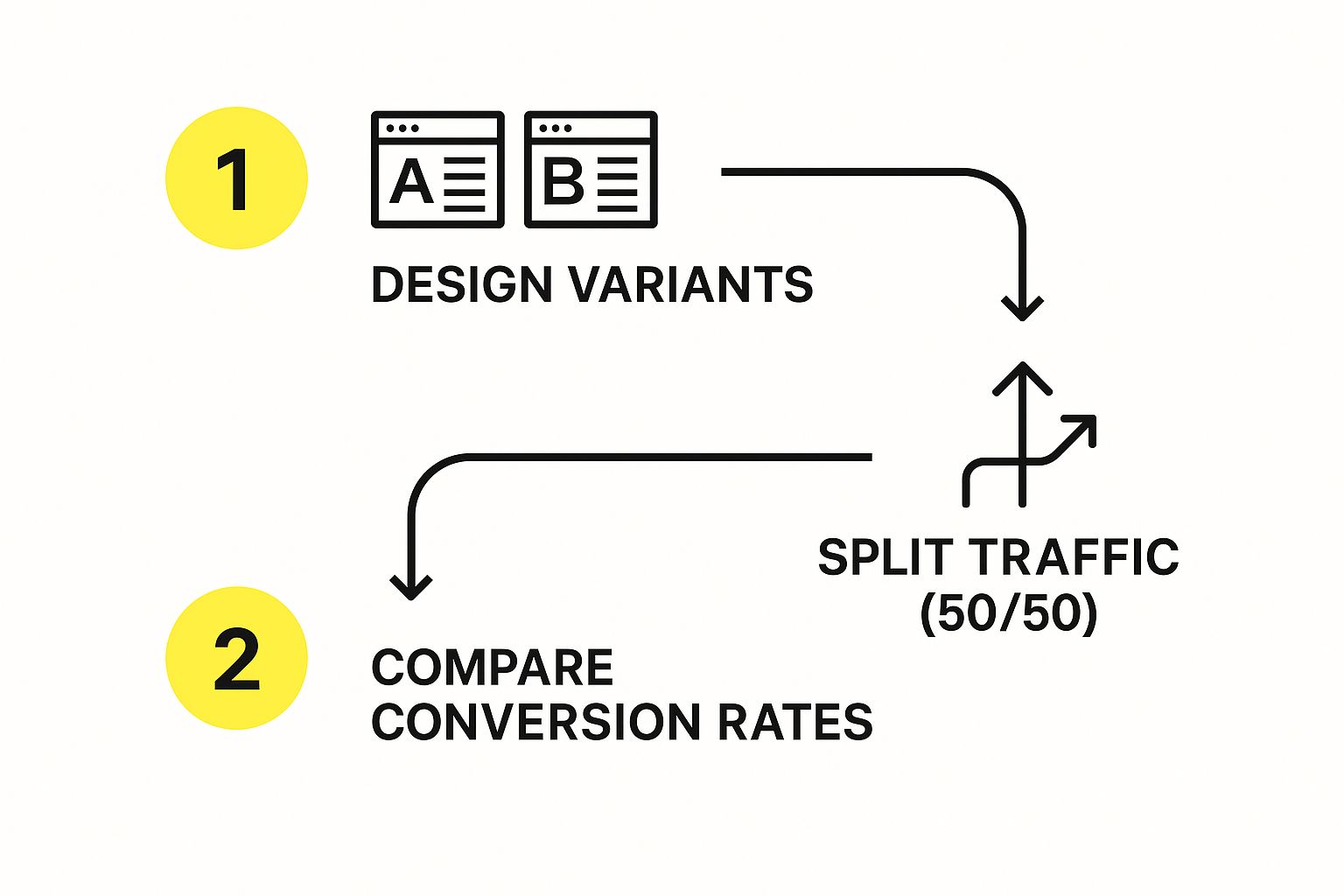
This process neatly shows how you can systematically compare a new idea against what you already have to find a clear winner.
Setting Up a Test You Can Trust
Once your hypothesis is locked in, setting up the test correctly is absolutely essential for getting trustworthy data. You’ll need to pick a tool—options range from the free Google Optimize to more robust platforms like VWO or Optimizely. If you're on Shopify, you have some specific tools and methods to work with. For a deep dive, check out our guide on how to run A/B tests on Shopify for better conversions.
Here’s what you need to nail down:
-
Isolate Your Variable: Pick just one thing to test at a time, like a headline, a hero image, or the layout of a form. Trying to test multiple changes at once (multivariate testing) is a lot more complex and requires way more traffic to get a clean result.
-
Define Your Success Metric: What’s the one number that will declare a winner? It should tie directly back to your hypothesis. If you’re testing a new CTA button, your main metric is the click-through rate on that button. Simple.
-
Aim for Statistical Significance: You have to let your test run long enough to collect enough data. Most tools will tell you when you've hit statistical significance, which is usually a 95% confidence level or higher. Don't stop a test early just because one version is ahead—early trends are often misleading and can lead you to the wrong conclusion.
Remember, site performance itself is a massive conversion factor. The average ecommerce conversion rate hovers between 2.5% and 3%, but that number can tank if your site is slow. Just a one-second improvement in load time can boost conversions by up to 7%. People just don't wait for slow sites anymore.
With the right setup, you can prove your hypothesis with hard numbers and start making changes that truly grow your business.
2. Match the Journey to the Traffic Source

Here’s a hard truth: not all website visitors are the same. Someone who clicked a link in your email newsletter has a completely different mindset than a person who just tapped on a TikTok ad. If you treat them identically, you're leaving money on the table.
Think of it like this. A customer recommended by a trusted friend is already warm; they're ready to listen. Someone who walks in off the street after seeing a billboard is cold; they need to be sold on why they should even be there. Your website traffic is no different. To really move the needle on conversions, you have to tailor the user's journey based on where they came from.
The data backs this up. Intent and conversion rates vary wildly depending on the channel.
- Direct Traffic: These are your warmest leads, typing in your URL directly. They convert at the highest rate, around 3.3%.
- Email Marketing: These folks know you and have opted in. They convert at about 2.8%.
- Organic Search (SEO): People from search engines have a problem and are actively looking for a solution. They convert at an average of 2.3%.
- Social Media: Organic social traffic converts around 1.8%, while paid social is slightly lower at 1.6%.
- Paid Search (PPC): These ads capture immediate interest and typically convert at 1.5%.
Understanding this is the first step. The next is to act on it.
Matching Your Message to Paid Traffic
Visitors from paid ads, whether on Google or Facebook, are on a mission. They clicked because your ad promised something specific. Dropping them on your generic homepage is a classic conversion killer—it forces them to hunt for what they were just promised, causing instant frustration.
The fix? Dedicated landing pages for every single ad campaign.
- Lock in the Message: The headline, images, and copy on the landing page must be a mirror image of the ad. If your ad screams "50% Off Winter Coats," that landing page better be filled with discounted winter coats. No exceptions.
- Create Tunnel Vision: A landing page has one job and one call-to-action (CTA). Get rid of everything else. That means no main navigation, no distracting footer links—nothing that doesn't push the user toward that one goal.
I once saw a client run a brilliant ad campaign for "custom leather dog collars" but point all the traffic to their general pet accessories page. The conversion rate was terrible. We built a simple landing page that focused only on those collars, with clear pricing and a huge "Customize Yours Now" button. The campaign’s conversion rate tripled almost overnight.
Building Trust with Organic Search Visitors
Someone arriving from a Google search might not know your brand, but they do have a problem. They’re looking for the best answer, and they’ve put their trust in the search engine to find it. Your immediate job is to prove that trust was well-placed.
Your content needs to instantly validate their search. If they Googled "best running shoes for flat feet," your page better greet them with clear expertise on that very topic. Sprinkle in social proof like customer reviews, testimonials, and trust badges ("As Seen In…") to build confidence fast.
Nurturing Your VIPs: Email and Direct Traffic
Email subscribers and direct visitors are pure gold. They already know you, trust you, and have either opted into your communications or remembered your URL on their own. These are your highest-intent users, and your website should roll out the red carpet for them.
This is where personalization shines. Greet them by name ("Welcome back, Sarah!"). Show them products related to their past purchases or browsing history. This simple act makes them feel seen and understood, reinforcing the relationship and nudging them toward their next purchase.
For a deeper dive into optimizing your site, our guide on Shopify store optimization is packed with powerful techniques to improve performance and drive sales.
Using AI and Personalization to Really Move the Needle

So, you've nailed the basics. Your UX is clean, and you're running A/B tests. Now, where do the truly game-changing gains come from? The answer is artificial intelligence (AI) and personalization. This is how you stop treating every visitor the same and start creating a unique, dynamic experience for each person who lands on your site.
Honestly, this isn't some far-off, futuristic concept anymore. It's a practical strategy that makes every customer feel like you get them. When you can anticipate what someone is looking for and put it right in front of them, you smooth out the path to purchase and make buying from you feel completely natural. This is what separates a good conversion rate from a truly great one.
Putting AI-Powered Personalization to Work in Real Time
The single biggest impact AI has on e-commerce is real-time personalization. We’ve all felt it on Amazon, where it seems like the site is reading your mind, showing you products you didn’t even know you wanted. That's not magic—it's just a really good recommendation engine. The great news is you can bring a version of that same power to your own store.
AI tools look at what a user is doing on your site right now—the pages they visit, the products they click, what they add to their cart—and instantly adjust what they see.
Here's what that looks like in the real world:
- Smarter Product Recommendations: Instead of a generic "Bestsellers" list, an AI tool can power a "You Might Also Like" section that's based on the specific items a person is looking at.
- Personalized Banners and Deals: A first-time visitor might see a "Get 10% Off Your First Order" banner. A loyal customer, on the other hand, could be shown an exclusive "VIP Early Access" offer. AI manages all of this on the fly.
- Tailored Content: If a visitor spent their last session browsing men's running shoes, why not greet them with a homepage banner featuring your newest running shoe collection when they return?
The goal here is simple: make your website feel less like a giant, anonymous warehouse and more like a conversation with an expert shop assistant who knows your style. That personal touch builds incredible trust and, you guessed it, drives conversions.
The results speak for themselves. AI-driven personalization can boost conversion rates by a staggering 15–20% and slash customer acquisition costs by up to 50%. Think about it: Amazon attributes a massive 35% of its yearly sales to its recommendation engine. It’s a proven model.
Don't Sleep on Voice Search
Another massive shift in how people shop online is the rise of voice search. More and more of your customers are asking Siri, Alexa, and Google Assistant to find products for them. With 20% of all mobile searches now happening by voice, you can't afford to ignore it.
People talk differently than they type. A voice search is almost always longer and more conversational.
- Typed Search: "best running shoes"
- Voice Search: "What are the best running shoes for long-distance trail running?"
To show up in these results, you need to think like your customers talk. This means building out FAQ pages that answer common questions directly and writing product descriptions that use natural, conversational language. And since 75% of people with a smart speaker search for local businesses every week, this is especially crucial if you have a brick-and-mortar presence.
If you're looking for more ways to bring artificial intelligence into your strategy, exploring the top marketing AI tools can give you a major leg up. Adopting these technologies is the key to building a site that doesn’t just meet customer expectations but actually gets ahead of them, pushing your conversion rates to a whole new level.
Got Questions About Conversion Optimization?
It's totally normal to have a ton of questions when you first dive into conversion optimization. You're mixing data with design and a little bit of customer psychology, so things can feel a bit fuzzy at the start. Let's clear up some of the most common questions I hear from business owners so you can start making changes with confidence.
A big one that always comes up is about timing. After all, you're putting in the work and you want to know when it's going to pay off.
How Long Does It Take to See CRO Results?
I wish I could give you a hard-and-fast number, but the honest answer is: it depends. The speed of your results really comes down to two things: how much traffic your site gets and how big of a change you’re making.
If you’re running A/B tests, the magic word is statistical significance. You need enough data to be sure the outcome wasn't just a fluke. For a website with heavy traffic, you might get a clear winner in just a few weeks. If your traffic is on the lighter side, you might need to let the test run for a month or more to get a reliable answer.
But not everything is an A/B test. Some changes give you a near-instant payoff. For example, fixing a busted checkout button or rewriting a super confusing headline can boost your conversions almost overnight. On the flip side, bigger projects, like a total overhaul of your product pages, will naturally take more time to show a measurable impact.
The key is to think of optimization as a marathon, not a sprint. You're not looking for a single magic bullet. You're building a system of continuous improvement where every test—win or lose—teaches you something valuable about your customers.
This brings us to the next big question people always ask.
What Is a Good Conversion Rate?
This is probably the #1 question I get, and my answer is always the same: it depends. A "good" conversion rate is completely relative to your business. It can swing wildly based on a few key things:
- Your Industry: A company selling high-end B2B software is going to have a very different "good" number than a Shopify store selling novelty socks.
- Where Your Traffic Comes From: Someone who types your store's URL directly into their browser is coming with a lot more intent than someone who clicked a link from a social media ad. We see this in the data—direct traffic often converts around 3.3%, while paid social might be closer to 1.6%.
- What You're Measuring: Are you counting a newsletter signup as a conversion? Or are you only counting a completed, high-ticket purchase? The goals are worlds apart, and the rates will be too.
You'll see a general benchmark of 2-3% thrown around for e-commerce, but trying to hit some universal average is a trap. The best thing you can do is figure out your own baseline and focus on beating that number, month after month. Your only real competition is who you were yesterday.
Can I Do CRO on a Small Budget?
Yes, absolutely! This is a huge misconception. While big companies have a suite of expensive tools, some of the most effective optimization work can be done for cheap, or even for free. You don't need a huge budget to get started.
You'd be surprised what you can uncover with tools you probably already have.
- Start with Free Tools: Google Analytics is your best friend here. It’s a powerhouse for finding your "leaky bucket" pages—the ones with high traffic but low conversions. That's your starting line.
- Just Ask Your Customers: Don't sleep on the power of qualitative feedback. You can use a tool like SurveyMonkey to run simple, inexpensive surveys. Or even better, just email a few recent customers and ask them to be brutally honest about their shopping experience.
- Focus on the Obvious Fixes: Often, the biggest conversion killers aren't complex design flaws. They're simple things like a muddled value proposition, confusing navigation, or hiding shipping costs until the very last second. Finding and fixing these doesn't require a big investment.
At its core, great conversion optimization isn't about outspending your competitors. It's about being more curious and systematic in figuring out what your customers really want—and then getting everything else out of their way.
Ready to turn your website into a powerful conversion engine? The experts at E-commerce Dev Group specialize in Shopify design, development, and optimization to help you drive real business growth. Learn more about how we can elevate your store's performance.