

Why Your Website Looks Different Everywhere (And Why It Matters)
Have you ever spent ages perfecting your Shopify store design, hit "publish," and then a customer emails you saying the checkout button has vanished? You look on your own computer, and it’s right where it should be. This kind of frustrating scenario is a daily reality in web development. The hard truth is, your beautiful site probably looks broken on at least one major browser, and you might not even realize it. What you see in Chrome is not what your customers see in Safari or Edge.
This isn't a knock on developers or designers; it's just how the web works. Every browser—whether it's Chrome, Firefox, Safari, or Edge—is a unique piece of software with its own "rendering engine." Think of a rendering engine like an interpreter. You provide the same set of instructions (your website's code), but each one translates it with a slightly different accent.
For example, one browser might follow a specific CSS command for spacing perfectly, while another ignores it, causing your layout to look jumbled. Or a bit of JavaScript powering your interactive "Add to Cart" button might work like a charm in Firefox but fail silently in an older version of Safari, making it impossible for customers to buy. These aren't just minor visual quirks; they are business-critical failures.
The Real Cost of Browser Inconsistency
Ignoring these differences can directly drain your revenue. We've seen firsthand how browser-specific bugs can lead to serious financial damage for online stores:
- Lost Sales: An e-commerce site we worked with found out their payment form wouldn't submit on Safari for iOS. For weeks, a huge chunk of their mobile traffic couldn't complete a purchase. The financial hit was massive.
- Damaged Trust: When someone lands on your site and sees a broken layout or a button that doesn't work, their first thought isn't, "Ah, a CSS rendering issue." It's, "This site is unprofessional and I don't trust it." This erodes confidence and sends your bounce rate climbing.
- Wasted Marketing Spend: Imagine spending thousands on a marketing campaign to drive traffic to a lead generation form. If that form has a JavaScript conflict that only shows up on Microsoft Edge, all the money you spent on those users is effectively thrown away.
The challenge of testing a website on different browsers isn't going anywhere. In fact, browser compatibility consistently ranks among the top hurdles for developers. The sheer variety of browsers, devices, and operating systems creates a complex web of potential problems, from CSS display issues to inconsistent JavaScript execution. If you want to go deeper, you can explore some of these common developer pain points on lambdatest.com. This reality makes a solid testing strategy not just a good idea, but a core business need.
To make sure your website looks great and works perfectly everywhere, you need to understand and use responsive design principles. This forward-thinking approach, paired with consistent cross-browser testing, is the foundation for a reliable and high-performing user experience that builds trust and drives sales, no matter how people find your site.
Which Browsers Actually Deserve Your Testing Time
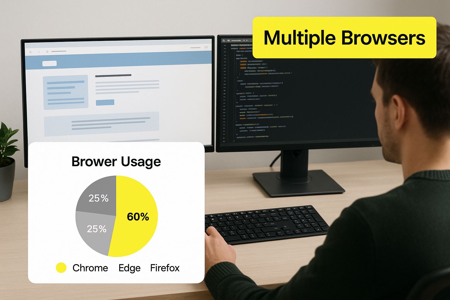
It’s easy to think you need to test your Shopify store on every browser imaginable, but that's a surefire way to burn through your time and budget. A much savvier approach is to focus your energy where it counts the most: on the browsers your actual customers are using. The first step in a solid cross-browser testing strategy is to ditch the guesswork and dive into your own data.
Your analytics platform, like Google Analytics, is your most valuable tool here. Head over to the audience reports and look at the traffic breakdown by browser. What you find might even surprise you. For instance, a B2B software company might see a lot of traffic from Microsoft Edge, as it's often the default in corporate settings. On the other hand, a Shopify store selling graphic tees to a younger crowd will almost certainly see more visitors from mobile Safari and Chrome. This data-driven approach instantly clarifies where to prioritize your efforts when testing a website on different browsers.
Prioritizing Based on Market Share
While your site's analytics are the ultimate source of truth, global market trends provide crucial context. They help you see the bigger picture and identify any potential blind spots you might have.
The infographic below highlights why focusing on the most popular browsers gives you the biggest bang for your buck.
This visual shows that a handful of browsers dominate the web, making them your absolute top testing priorities. As of late 2024, data shows Google Chrome leading the pack with a massive 68.34% market share, making it essential to test on all devices. Safari is next, with 18.57% of the market, largely thanks to its tight integration with Apple's ecosystem of iPhones, iPads, and Macs. If your Shopify store has issues on these two browsers, you could be turning away nearly nine out of every ten potential customers. You can find additional insights on top browsers for testing at plusqa.com to explore these statistics further.
When to Look Beyond the "Big Two"
So, does this mean you can just test on Chrome and Safari and call it a day? Not quite. To help guide your decisions, here's a practical priority matrix that breaks down browser market share and how you should approach testing for each.
Browser Market Share and Testing Priority Matrix
A comprehensive breakdown of browser market share percentages with recommended testing priority levels for different website types
| Browser | Global Market Share | Testing Priority | Key Considerations |
|---|---|---|---|
| Google Chrome | 68.34% | High | This is your top priority. Test thoroughly on both desktop and mobile as it represents the majority of your user base. |
| Safari | 18.57% | High | Non-negotiable, especially for mobile. Its dominance on iOS means any bug here will have a major impact on your sales. |
| Microsoft Edge | 5.08% | Medium | Growing in popularity and often the default on Windows. Crucial for B2B sites but important for all e-commerce stores too. |
| Firefox | 2.61% | Medium | While its share is smaller, Firefox has a dedicated and tech-savvy user base. Glitches here can damage your brand's reputation. |
| Samsung Internet | 2.28% | Situational | If your analytics show a significant number of Android users, especially on Samsung devices, this browser is worth a look. |
| Opera | 2.01% | Situational | Only test if your data specifically flags it as popular among your visitors. It's a niche browser for most Shopify stores. |
This tiered approach ensures you’re directing your valuable time and budget toward the areas with the highest return. By combining global market data with your site’s specific user statistics, you can build a testing plan that is both efficient and incredibly effective, catching the issues that truly impact your bottom line.
Building Your Testing Setup That Actually Works
Jumping into the world of testing a website on different browsers can feel like you're trying to build a complex machine from scratch. This is often where teams get stuck in a rut, overwhelmed by choices, or make mistakes that cost them down the line. But here’s the good news: your testing setup doesn't need to be an expensive, over-engineered fortress to be effective. It just needs to fit your workflow and give you consistent, reliable results.
The main goal is to create a controlled environment. Think of it like a science experiment—if your variables are always changing, you can't trust your findings. The same is true for testing. If you check your site on a browser loaded with personal extensions, a weird cache, or custom settings, you aren't seeing what a real user would. These little "gotchas" can give you a false sense of security, making you think everything is fine when it really isn't.
Your Local Machine: The Starting Point
For solo developers or small teams, the simplest way to start is right on your own computer. This means installing the browsers you prioritized directly onto your machine. It’s fast, free, and gives you instant access for quick manual checks whenever you need them.
Here’s a practical way to keep things clean and organized:
- Create Dedicated User Profiles: For each browser you use (like Chrome, Firefox, or Edge), set up a clean testing profile. This profile should be completely fresh—no extensions, no browsing history, and default settings. This approach mimics what a new user would experience every time you test.
- Use Portable Versions: Some browsers, like Firefox, offer portable versions. These can run from a single folder without a full system installation, which is great for keeping your main browser pristine and your testing environment isolated.
- Virtual Machines (VMs): When you need to test on a different operating system (like checking Safari on a Windows PC), a VM is your best friend. Tools like VirtualBox (which is free) or Parallels (for Mac) let you run a complete version of macOS or Windows inside your current OS. This is crucial for getting accurate results on OS-specific browser behavior.
This local setup is perfect for day-to-day development checks and spotting obvious bugs. But as your team gets bigger or your testing needs get more complex, trying to manage dozens of local browser-OS combinations becomes a huge headache. This is especially true for big projects like a major site rebuild. If you're tackling something complex, like a full platform change, you can learn more about managing a Shopify store migration and see how testing becomes a vital part of that journey. That's when it's time to look to the cloud.
Cloud-Based Platforms: Your Testing Lab on Demand
Cloud-based testing platforms are a real game-changer. They give you instant access to hundreds of real browser, OS, and device combinations without you having to set anything up. You just log into a service, pick the environment you want (say, Safari 15 on macOS Monterey), and a live, interactive session pops up in your browser. This approach is fundamental for any serious strategy for testing a website on different browsers.
Platforms like BrowserStack provide a dashboard where you can access a huge library of real devices and browsers for live testing.

The key benefit here is the sheer scale and ease of access. Instead of buying and maintaining a room full of physical devices, you have a virtual lab at your fingertips, ready for both manual and automated tests. This not only saves a ton of time and money but also ensures your results are based on real-world environments, not emulators that can sometimes miss subtle rendering bugs. This is the most scalable way to ensure broad compatibility.
By combining a simple local setup for quick checks with a cloud platform for thorough testing, you create a solid and efficient system that catches issues long before they ever reach your customers.
Manual Testing Techniques That Catch Real Problems
While automated tools are great for catching widespread issues, they can't replicate the experience of a real person using your site. A script can confirm a page loads, but it can't tell you if the "Add to Cart" button is awkward to tap on a small screen or if a pop-up animation feels sluggish on Firefox. This is where manual testing is irreplaceable—it helps you find those subtle, frustrating problems that make customers leave.
To successfully test a website on different browsers without feeling lost, you need a system. It’s about putting yourself in your customer’s shoes. I've learned that the most effective manual testing isn't just clicking around randomly. It's a focused walkthrough of the most important user journeys. For a Shopify store, that means finding a product, adding it to the cart, and checking out. By following these paths on each of your target browsers, you'll quickly see where the experience starts to fall apart.
The Tester’s Core Checklist for Every Page
Instead of aimless browsing, channel your energy into the elements most likely to cause cross-browser headaches. I suggest using a checklist for every key page—like your homepage, product pages, cart, and checkout—on each browser you test. This isn't just about finding visual glitches; it's about making sure everything actually works.
Here’s a practical checklist to guide your manual testing:
- Interactive Elements: Do all buttons, dropdowns, and sliders work correctly? Pay close attention to anything driven by JavaScript. For instance, test your product variant selectors for size and color on Safari, as they can sometimes act differently than in Chrome.
- Forms and Inputs: Can you fill out every field on your contact and checkout forms? Make sure validation errors appear when they should. I once found a Shopify store where the postal code field on the checkout page was completely broken on Microsoft Edge, blocking a whole group of users from buying anything.
- Navigation and Links: Click on every link in your header, footer, and main navigation. Do they all lead to the right page? Do any of them look misaligned or oddly spaced? These are tell-tale signs of CSS rendering differences between browsers.
- Pop-Ups and Modals: Trigger any email sign-up pop-ups or special offer modals. Do they show up correctly? Even more importantly, can you close them easily on every browser and screen size? A modal that traps a user is a guaranteed lost sale.
- Media and Visuals: Confirm that all images and videos load and display properly. Sometimes, newer image formats like WebP aren't supported on older browser versions, which can leave a blank space where a beautiful product photo should be.
Documenting Bugs So They Actually Get Fixed
Finding a bug is only half the job. If you can't explain it clearly to your development team, it’s like it never happened. Effective bug reporting is a skill that saves everyone time and frustration. When you spot an issue, don't just write, "The button is broken."
Instead, create a clear, repeatable bug report that includes:
- A Descriptive Title: "Checkout Button Unclickable on Safari 15.5 on macOS Monterey"
- The Environment: List the exact browser, its version, and the operating system you used.
- Steps to Reproduce: Give a numbered list of the exact clicks you made to find the bug.
- Expected vs. Actual Result: "I expected the 'Complete Purchase' button to submit the form. Instead, nothing happened when I clicked it."
- A Screenshot or Video: A picture can explain a lot, but a short screen recording is even better.
Providing this level of detail makes you a developer's favorite person. It removes the guesswork and helps them find and fix the problem fast, ensuring your website provides a smooth and reliable experience for every single visitor.
Automated Tools and Cloud Platforms That Deliver Results

While manual testing is fantastic for catching issues that need a human eye, it just doesn't scale. You can't personally check every feature on ten different browser versions after every small code change—you’d never get anything else done. This is where automation steps in, not to replace manual checks, but to act as a powerful partner that handles the repetitive, heavy lifting of testing a website on different browsers. The goal isn't to buy the most expensive tool, but to build a smart automation strategy that finds real problems without slowing you down.
Modern cross-browser testing has moved far beyond just seeing if a page loads. Today, it’s about making sure complex JavaScript functions correctly, CSS renders pixel-perfect, and responsive designs adapt flawlessly across countless browsers and operating systems. Open-source tools like Selenium are still a cornerstone for these efforts, valued for their flexibility in running tests across many browsers at once. You can read a complete guide to modern cross-browser testing on dev.to to see just how advanced these practices have become. This is where cloud platforms truly shine.
Scaling Up with Cloud-Based Testing Platforms
Cloud platforms are the go-to solution for scaling your testing efforts. They give you on-demand access to a massive library of real browsers on real operating systems, from the latest Chrome build on Windows 11 to an older Safari version on macOS. This completely removes the headache and cost of maintaining your own device lab.
However, choosing the right platform means knowing what you need. Some platforms are great for live, interactive testing, while others are built for running a high volume of automated tests in parallel. For thorough coverage and efficiency, cloud-based platforms like LambdaTest, a leading name in automated cross-browser testing, are a solid choice. These services integrate directly into your development workflow, letting you run your test suite automatically every time new code is pushed.
Making Automation Actually Work for You
The biggest trap with automation is writing tests that are fragile or check the wrong things. A test that just confirms an HTTP status of 200 is almost useless; it doesn't tell you if the "Buy Now" button is actually visible and clickable. Effective automated testing focuses on user behavior. Instead of just loading a page, your script should act like a real customer.
Imagine a script that follows a real user journey:
- Navigates to a product page.
- Selects a size and color variant.
- Clicks the "Add to Cart" button.
- Moves to the checkout page.
- Verifies that the total price is calculated correctly.
This is the core idea behind synthetic monitoring. It’s a method where scripts mimic these user paths at regular intervals, proactively checking that your most important business flows are working. For example, a synthetic test can run every 15 minutes to ensure your Shopify checkout isn’t broken, alerting you to an issue long before customers start complaining. This approach is essential for businesses that need to guarantee functionality 24/7. If you’re building a highly customized experience, this level of testing is non-negotiable. You might be interested in our expert insights on how Shopify custom development can drive growth and why solid testing is vital for its success.
To help you navigate the options, here’s a quick comparison of some popular tools and what they’re best suited for.
Cross-Browser Testing Tools Comparison
This table offers a detailed comparison of popular manual and automated testing tools, breaking down their features, pricing, and best use cases to help you find the right fit.
| Tool | Type | Key Features | Pricing Model | Best For |
|---|---|---|---|---|
| Selenium WebDriver | Open-Source Framework | Language flexibility (Java, Python, C#), high customization, strong community support. | Free | Teams with development resources to build and maintain custom test automation frameworks. |
| BrowserStack | Cloud Platform (Commercial) | Real device cloud, live testing, automated parallel testing, screenshot testing. | Subscription | Teams of all sizes needing a comprehensive solution for both manual and automated testing across many devices. |
| LambdaTest | Cloud Platform (Commercial) | Large grid for parallel testing, smart UI testing, real-time debugging tools. | Freemium/Subscription | Startups and large enterprises focused on accelerating their automated test execution at scale. |
| Cypress | Open-Source Framework | Real-time reloads, automatic waiting, time-travel debugging, excellent documentation. | Free (with paid dashboard) | Developers who want to write end-to-end tests quickly, especially for modern JavaScript applications. |
In the end, the best tool is one that fits your team's skills and workflow. By combining a smart automation strategy with the power of cloud platforms, you can build a testing process that catches critical bugs, builds confidence in your releases, and ensures your Shopify store delivers a flawless experience on every browser.
Fixing Common Browser Issues Without Breaking Everything Else
When you're deep in the trenches of testing a website on different browsers, you're going to find bugs. It's a given. The real trick isn't just spotting them; it's fixing them without accidentally creating a new mess elsewhere. What you need are practical fixes that get to the root of the problem, not just quick patches that cover up the symptoms. Let's dive into some of the most common—and frankly, frustrating—browser compatibility issues and how to solve them for good.
A lot of these headaches come down to two usual suspects: CSS and JavaScript. A layout that looks pixel-perfect in Chrome might be a jumbled disaster in Safari. This often happens because of how each browser's rendering engine handles CSS properties like Flexbox or Grid. In the same way, a JavaScript feature might run smoothly in Firefox but crash and burn in an older version of Edge because it doesn't support a specific piece of modern code.
Pinpointing the Problem: CSS vs. JavaScript
Your first move is always diagnosis. Is the problem visual (a CSS issue) or functional (a JavaScript issue)? A simple way to figure this out is to temporarily disable JavaScript in your browser's developer tools and refresh the page. If the layout is still broken, you’re looking at a CSS problem. If the layout snaps into place but your interactive elements are dead, then JavaScript is the likely culprit.
For CSS-related frustrations, the browser's DevTools are your best friend. Right-click on the troublesome element, select "Inspect," and head to the "Computed" styles tab. This view shows you exactly which CSS rules the browser is actually applying. You might discover that Safari, for instance, still needs specific vendor prefixes for certain properties that Chrome has moved on from. When you run into layout problems like elements overlapping incorrectly, knowing how to approach debugging Z-Index issues across browsers is a key skill for keeping your design consistent.
If JavaScript is the issue, the "Console" tab is where you'll find your clues. Errors will usually point you directly to the line of code that's failing. A very common problem is using a modern JavaScript feature, like an arrow function () => {}, which isn't supported by an older browser you're trying to support.
Implementing Smart, Lasting Fixes
Once you know what's wrong, the goal is to apply a targeted, surgical fix. Try to avoid broad, sweeping changes that could have unforeseen effects across your entire site.
Here are a few proven strategies I rely on:
- Use CSS Feature Queries: Instead of writing code for a specific browser, write it for a specific feature. The
@supportsrule in CSS lets you apply styles only if the browser actually understands a certain property. For example, you can define your layout with CSS Grid and then provide a simpler Flexbox-based fallback for browsers that don't support Grid. - Transpile Your JavaScript: Tools like Babel are lifesavers here. A transpiler is a tool that takes your modern JavaScript code and converts it into an older version that more browsers can understand. This lets you write clean, up-to-date code without worrying about leaving users on older browsers behind.
- Implement Polyfills: A polyfill is a snippet of code that adds functionality that you'd expect the browser to have built-in. If a browser doesn't support a particular JavaScript method or API, a polyfill can step in and provide it.
Fixing browser issues isn't a one-and-done task; it's an ongoing part of maintaining your site's health. A well-coded site is naturally more resistant to these kinds of problems. In fact, many compatibility bugs can also slow your site down. You might find our guide on Shopify performance optimization helpful, as a faster, cleaner codebase is often much easier to debug across browsers. Ultimately, a clean, well-structured codebase is your best defense against future compatibility headaches.
Creating a Testing Process That Sticks
A last-minute testing frenzy before a major launch might feel productive, but it’s not a sustainable way to ensure quality. Real quality comes from building a repeatable system where testing a website on different browsers is just another part of your development workflow. The goal is to make it a natural, ongoing habit, not a dreaded final task that everyone tries to sidestep. This kind of system catches issues long before they ever get close to your live Shopify store.
This all begins with a realistic testing schedule that lines up with your release cycles. You don't need to run a full-scale test on 20 different browsers for a minor text change. Instead, it's smarter to create a tiered approach.
- For daily code commits: Set up automated tests to run on core user journeys (like the checkout process) on your top three browsers—usually Chrome, Safari, and Edge.
- For weekly or feature releases: This is the time for thorough manual testing on the new features, going through your prioritized list of browsers.
- For major releases or quarterly reviews: Conduct a complete audit. This should include visual regression and performance testing across every single browser and device you support.
Documenting for Success
Good documentation is the glue that makes a process stick. Your team needs a central hub for checklists, issue tracking, and guides that they will actually use. Forget about a static, 50-page document that gathers digital dust. Think of it as a living, breathing resource.
You can create a simple, customizable checklist in a shared tool like Notion or your project management app. For each browser, list the critical user paths and interactive elements that need to be checked. When a tester spots a bug, they should follow a clear, templated format for reporting it. This ensures developers get all the details they need to reproduce and fix the problem without a lot of back-and-forth. This creates a tight feedback loop that makes your testing more effective over time.
By setting clear responsibilities and building these "quality gates" into your development cycle, you stop compatibility problems before they hit production. This balance of detailed testing and practical timelines means you can maintain your development speed without sacrificing the quality your customers expect.
Ready to build a Shopify store that's not just beautiful, but built on a foundation of quality and rigorous testing? At E-commerce Dev Group, we craft high-performing e-commerce experiences with rock-solid code. Learn how our expert developers can help you.