

Taming the Browser Beast: A 2025 Guide
For Shopify merchants, ensuring your website looks and functions flawlessly across all browsers is critical for conversions and brand reputation. This listicle tackles six common cross-browser compatibility issues that can impact your online store's performance. Learn how to address inconsistencies in CSS, JavaScript, fonts, DOM, image formats, and vendor prefixes. Understanding these cross-browser compatibility issues empowers you to deliver a seamless customer experience, no matter how shoppers access your site.
1. CSS Flexbox and Grid Layout Inconsistencies
Flexbox and Grid are two powerful layout tools in CSS that have revolutionized how we design responsive websites. They offer far more control and flexibility than older methods like floats and tables, allowing developers to create complex, dynamic layouts with ease. However, their relatively recent introduction into the web development landscape has led to cross-browser compatibility issues that can be a headache for developers and negatively impact user experience. These inconsistencies can manifest as anything from minor visual discrepancies to completely broken layouts, making cross-browser testing essential. This is a particularly important cross-browser compatibility issue for Shopify merchants as it directly impacts the storefront experience for their customers.

Flexbox, or the Flexible Box Layout Module, is designed for one-dimensional layouts, making it perfect for arranging items within a container either in a row or a column. It excels at handling the alignment and distribution of space among items, especially in scenarios with dynamic content where the size of elements might change. Grid, on the other hand, is a two-dimensional layout system, meaning it can control both rows and columns. This makes it ideal for more complex layouts, allowing developers to define the structure of the entire page or sections within it.
The core issue arises from the varying levels of support and interpretation of the Flexbox and Grid specifications across different browsers. Older browsers, particularly Internet Explorer, often have partial or buggy implementations of these features. Even among modern browsers, there can be subtle differences in how they handle edge cases, such as the calculation of flex-shrink and flex-grow properties or the interpretation of min-width and max-width within flex containers. Grid layouts can also suffer from inconsistencies in auto-placement algorithms and baseline alignment behaviors. These discrepancies can cause carefully crafted responsive designs to break or display incorrectly across different platforms.
Consider the example of a Shopify store aiming for a consistent brand experience across all browsers. If their responsive navigation menu relies heavily on Flexbox, inconsistencies in older browsers could lead to a misaligned or unusable menu, potentially costing them customers. This is why addressing these cross-browser compatibility issues is crucial for any online business, particularly for established Shopify merchants, e-commerce and IT managers, and enterprise clients seeking Shopify Plus solutions. Ensuring your website looks and functions correctly across all browsers is essential for a professional online presence and a seamless user experience.
While these inconsistencies pose challenges, the powerful responsive capabilities of Flexbox and Grid make them indispensable for modern web development. They generally offer cleaner, more maintainable code compared to older float-based layouts. To mitigate the risk of cross-browser compatibility issues, developers can employ several strategies. Using CSS feature queries (@supports) allows you to provide fallback styles for browsers that don’t fully support Flexbox or Grid. Learn more about CSS Flexbox and Grid Layout Inconsistencies. Regularly testing layouts in multiple browsers and devices is also essential. Implementing a mobile-first responsive design approach often simplifies the process and reduces the likelihood of encountering browser-specific quirks. Autoprefixer tools can automate the process of adding vendor prefixes, ensuring broader compatibility. Companies like Netflix and GitHub have successfully implemented these modern layout methods, using fallbacks and progressive enhancement to ensure their interfaces function seamlessly across a range of browsers. Mozilla’s developer documentation site also provides a solid example of how to implement Grid layouts with appropriate fallbacks.
By understanding the potential cross-browser compatibility issues with Flexbox and Grid and employing these best practices, developers can harness the power of these modern layout methods while minimizing the risk of inconsistencies across different platforms, ultimately delivering a consistent and high-quality user experience for everyone. For Shopify merchants, this translates directly to a better storefront experience and increased customer satisfaction.
2. JavaScript ES6+ Feature Support Variations
One of the most common cross-browser compatibility issues stems from variations in JavaScript (JS) support, specifically concerning features introduced with ECMAScript 2015 (ES6) and beyond. These modern JavaScript features, like arrow functions, template literals, destructuring assignments, async/await, classes, and modules, offer significant improvements to code readability, maintainability, and performance. However, their adoption hasn't been uniform across all browsers, particularly older versions and some mobile browsers. This discrepancy creates challenges for developers aiming to deliver a consistent user experience across different platforms. Failing to account for these variations can lead to broken functionality, JavaScript errors, and a degraded user experience for a segment of your audience. This is particularly critical for e-commerce platforms where a smooth and reliable user experience is paramount for conversions.

Modern JavaScript enables cleaner and more efficient code, incorporating powerful features that simplify complex tasks. For instance, arrow functions provide a concise syntax for writing functions, while template literals offer enhanced string interpolation capabilities. Async/await makes asynchronous code easier to read and reason about, greatly improving error handling and debugging capabilities. Features like modules facilitate code organization and maintainability, promoting a more modular and scalable architecture for your Shopify store's frontend. Using these features natively, when supported, also contributes to improved performance, resulting in a faster and more responsive user experience.
However, leveraging these advancements comes with the responsibility of ensuring compatibility with older browsers still used by a portion of your customer base. This often necessitates using build tools like Babel to transpile modern JavaScript code into ES5, a version understood by virtually all browsers. Transpilation converts your newer JS code into an older, equivalent version. While this ensures broader compatibility, it can increase your bundle size, potentially impacting initial page load times. This is where polyfills come into play. Polyfills are code snippets that provide the functionality of missing features in older browsers. For example, if a browser doesn't support Promise, a polyfill will implement a Promise object that mimics the behavior of the native implementation. This introduces another layer of complexity in testing, as you need to ensure your code functions correctly across various JavaScript engines with and without polyfills.
Companies like Airbnb, with their comprehensive JavaScript style guide, address these cross-browser ES6+ usage concerns directly. They outline best practices for writing compatible JavaScript while still leveraging modern features. Popular frameworks like React utilize Babel for transpilation to achieve broad browser compatibility, enabling developers to write modern JavaScript without worrying about breaking functionality in older browsers. Similarly, Vue.js CLI simplifies the process by providing automatic transpilation based on your target browser configuration.
To mitigate these cross-browser compatibility issues related to ES6+ JavaScript features, consider the following tips:
- Use Babel: Babel is the most widely used tool for transpiling modern JavaScript to ES5. Integrating Babel into your build process is essential for ensuring compatibility with older browsers.
- Implement Feature Detection: Before using newer APIs, employ feature detection to check if the browser natively supports the feature. This prevents runtime errors and allows you to provide fallback implementations when necessary.
- Configure Browserslist: Browserslist allows you to specify which browsers your project needs to support. This configuration informs tools like Babel and Autoprefixer which transformations are needed, streamlining your build process and optimizing output.
- Utilize core-js: core-js provides comprehensive polyfill coverage for a wide range of ES6+ features. Including core-js in your project ensures that missing features are seamlessly implemented in older browsers.
The push for modern JavaScript and its cross-browser compatibility has been significantly influenced by the Babel team, the TC39 committee (responsible for evolving JavaScript), and the Google Chrome team. Addressing ES6+ compatibility issues is crucial for delivering a consistent and reliable experience to all your Shopify store visitors. Ignoring these variations could result in lost sales and a damaged brand reputation, especially for enterprise clients seeking a seamless online experience. By understanding these challenges and implementing the recommended strategies, you can confidently utilize modern JavaScript while maintaining broad browser support.
3. Font Rendering and Typography Differences
Font rendering and typography differences represent a significant cross-browser compatibility issue that can drastically impact the visual consistency and readability of your Shopify store. This issue arises because different browsers employ varying text rendering engines, anti-aliasing methods, and font fallback mechanisms. These variations lead to inconsistencies in how text appears, its spacing, and overall readability, especially when using custom web fonts or icon fonts. This can create a fragmented user experience, where your carefully crafted branding appears differently depending on the browser a customer uses. For Shopify merchants, this inconsistency can affect brand perception and potentially even conversion rates. Ensuring consistent typography is crucial for maintaining a professional and polished online presence.

At the heart of this issue lie the different font smoothing and anti-aliasing algorithms employed by various browsers. These algorithms determine how the edges of text characters are rendered to appear smoother on screen. While aimed at improving readability, these differences can lead to subtle yet noticeable variations in font weight and clarity across browsers. Furthermore, browsers handle font fallback chains differently. A font fallback chain is a list of fonts specified in your CSS, allowing the browser to choose a suitable alternative if the primary font is unavailable. Inconsistent handling of these chains can result in unexpected font substitutions, significantly altering the intended design. Line-height and letter-spacing calculations can also vary, affecting the overall layout and visual rhythm of your text content. Lastly, the font-display property, which controls how fonts are displayed during the loading process, is also subject to varying interpretations across browsers, impacting the perceived performance of your site.
Several features contribute to both the challenges and opportunities presented by web fonts. Web fonts allow for consistent branding by enabling you to use specific typefaces that align with your brand identity. Modern browsers support advanced typography features like variable fonts, which allow for flexible and responsive typography adjustments based on screen size and user preferences. However, font loading can impact page performance, particularly if not managed effectively. Incorrectly configured fallback fonts can drastically alter the appearance of your design if the primary font fails to load. Furthermore, icon fonts, while visually appealing, can present accessibility issues in some browsers, making it challenging for users with assistive technologies to understand the content.
Successful implementations of optimized font rendering can be seen across the web. Google Fonts, for example, utilizes font-display: swap to improve perceived performance by displaying a fallback font while the custom font loads. Adobe Fonts provides tools and resources for cross-browser font loading optimization, ensuring a consistent experience for users across different platforms. Medium, the popular online publishing platform, uses a sophisticated font stacking strategy to achieve optimal readability across a wide range of devices and browsers.
For Shopify merchants, addressing font rendering differences is essential for maintaining a consistent brand image and providing a positive user experience. Here are some actionable tips:
- Use
font-display: swap: This property tells the browser to display a fallback font immediately while the custom font loads in the background. This prevents a "flash of invisible text" and improves perceived performance. - Implement proper font fallback stacks: Specify a sequence of fallback fonts in your CSS, ensuring that the final fallback is a system font readily available on all platforms. This prevents unexpected font substitutions and maintains a reasonable level of visual consistency.
- Test typography rendering across different operating systems and browsers: Use browser testing tools or virtual machines to ensure your typography renders consistently across various platforms. This helps identify and address potential issues before they impact your customers.
- Consider using system fonts for core content: System fonts offer excellent performance and consistency, as they are native to the user's operating system. Reserving custom fonts for headings and branding elements can improve performance without sacrificing visual identity.
By understanding the nuances of font rendering and implementing these strategies, Shopify merchants can ensure a consistent and visually appealing brand experience for all their customers, regardless of their chosen browser or operating system. This attention to detail contributes to a more professional online presence and can positively impact customer trust and engagement.
4. DOM API and Event Handling Inconsistencies
One of the most common and frustrating cross-browser compatibility issues revolves around the Document Object Model (DOM) API and event handling. The DOM is the structured representation of an HTML document, and the API provides methods for interacting with it – changing content, styles, and structure. Event handling dictates how your website responds to user interactions like clicks, mouseovers, keyboard input, and touch gestures. While ostensibly standardized, different browsers implement these APIs and event handling mechanisms with subtle variations that can significantly impact your website's interactive functionality, leading to broken features or inconsistent user experiences across different platforms. This makes thorough cross-browser testing a critical part of web development.
These inconsistencies manifest in several ways. For instance, the event object passed to event handlers can have different properties and methods across browsers. A property like offsetX, indicating the mouse position relative to the target element, might be available in one browser but not in another. Similarly, touch and pointer events, essential for mobile-friendly websites, have varying implementations. Older browsers might not support them at all, while others might offer different levels of precision or different event names. Even the relatively new Intersection Observer API, which allows you to efficiently detect when an element enters or leaves the viewport, can have varying levels of support and behavior. Learn more about DOM API and Event Handling Inconsistencies if you are working with Shopify's Storefront API and want to understand how this relates to potential rate limiting issues.
Another area of inconsistency lies in event propagation – the order in which events are handled by nested elements. While the concepts of "bubbling" (event traveling up the DOM tree) and "capturing" (event traveling down) are standardized, their precise behavior can differ. Furthermore, support for passive event listeners, a performance optimization for scroll events, is not universal. These variations can lead to unexpected behavior and performance issues, especially in complex interactive websites common in e-commerce environments.
However, the situation isn't all bleak. Modern APIs offer powerful interaction capabilities, and standardization efforts are continuously improving consistency across browsers. Furthermore, well-established patterns like event delegation, where a single event handler on a parent element manages events for all its children, work reliably when properly implemented. This approach simplifies code and reduces the risk of cross-browser issues.
For example, libraries and frameworks like React address these inconsistencies effectively. React's SyntheticEvents normalize browser differences, providing a consistent event object regardless of the underlying browser. Similarly, Hammer.js offers a unified API for handling touch gestures across different devices. For Shopify Plus merchants, incorporating these tools can greatly enhance the user experience and minimize development headaches.
Despite these advantages, cross-browser compatibility in event handling still poses challenges. Legacy browsers often require extensive polyfills – code that replicates missing functionality. Touch device compatibility necessitates careful testing on actual devices, as emulators don’t always accurately represent real-world behavior. Moreover, debugging event handling bugs can be tricky due to the asynchronous nature of events and the subtle differences between browser implementations.
To mitigate these cross-browser compatibility issues, consider the following tips:
- Feature Detection: Before using a newer API, check if it's supported by the target browsers using feature detection libraries like Modernizr. This prevents errors and allows you to provide fallback implementations for unsupported browsers.
- Event Delegation: Implement event delegation wherever possible. This simplifies event handling logic and reduces the potential for cross-browser inconsistencies.
- Test on Real Devices: Thoroughly test touch interactions on a variety of actual touch devices to ensure consistent behavior.
- Passive Event Listeners: Use passive event listeners for scroll-related events to improve scroll performance.
- Leverage Libraries: Consider using libraries like React or Hammer.js, which provide abstraction layers and handle cross-browser inconsistencies for you, especially if you're developing complex interactive features.
By understanding the nuances of DOM API and event handling inconsistencies and employing these strategies, you can build robust and interactive websites that provide a consistent and reliable user experience across all major browsers, crucial for the success of any online business, particularly for established Shopify merchants and enterprise clients seeking Shopify Plus solutions. This meticulous approach is key to delivering a seamless experience for your customers and maintaining a competitive edge in the e-commerce landscape.
5. CSS Property Support and Vendor Prefixes
Cross-browser compatibility issues often manifest as visual inconsistencies due to differing CSS property support. This can be a significant hurdle for Shopify merchants and e-commerce businesses striving for a consistent brand experience across all platforms. Ensuring your online store looks and functions seamlessly regardless of the browser your customers use is crucial for conversions and brand perception. This section dives into the challenges of CSS property support and how vendor prefixes, along with other strategies, can help address them.
CSS, the language that styles web pages, is constantly evolving. New properties and features are regularly introduced to enhance design possibilities and improve performance. However, these advancements aren't always immediately adopted by all browsers. Different browser vendors (like Google for Chrome, Mozilla for Firefox, and Apple for Safari) have their own implementation timelines and sometimes interpret specifications differently. This is where cross-browser compatibility issues related to CSS properties arise.
A primary example is the implementation of newer CSS properties like backdrop-filter, which allows for blurring or color-shifting of the area behind an element. While offering exciting visual possibilities, it wasn't initially supported universally. Similarly, features like CSS Grid and Flexbox, though now widely adopted, initially faced variations in support and behavior across different browsers. Even seemingly basic properties, like transform for rotations and scaling, or animation for dynamic effects, have historically required specific handling for cross-browser compatibility.
This is where vendor prefixes come into play. A vendor prefix is a way to add support for newer CSS properties before they become fully standardized. It's a string added before the property name, indicating the specific browser vendor it targets. For example, -webkit-transform targets WebKit-based browsers like Safari and older versions of Chrome, while -moz-transform targets Firefox. By including these prefixed versions alongside the standard property, developers can ensure their styles work across a broader range of browsers, enabling what’s known as progressive enhancement.
Features Related to CSS Property Support and Vendor Prefixes:
- Vendor prefix requirements for experimental properties: As discussed, prefixes are essential for using cutting-edge CSS features before they are standardized.
- Different implementation timelines for new CSS features: Browsers adopt new CSS features at varying paces, creating discrepancies in support.
- Varying support for CSS custom properties (variables): Even features like CSS variables, designed to simplify styling, have seen inconsistencies in initial implementations.
- Inconsistent handling of CSS units and calculations: Subtle differences in how browsers calculate values or interpret units can lead to unexpected layout shifts.
Pros:
- Early adoption of new features: Vendor prefixes empower developers to leverage the latest CSS functionalities without waiting for full standardization.
- Progressive enhancement: This approach ensures that users with older browsers still get a functional experience, albeit without the enhanced styling. It gracefully degrades the experience rather than breaking it entirely.
- Modern CSS provides powerful styling capabilities: Accessing new features allows for richer, more engaging web experiences.
Cons:
- Increased CSS file size with vendor prefixes: Including multiple prefixed versions increases the size of your CSS files, impacting page load times.
- Maintenance overhead for prefix management: Keeping track of and updating prefixes can be tedious and time-consuming.
- Testing required across multiple browser versions: Thorough testing across different browsers and their versions is crucial to ensure visual consistency.
Examples and Tools:
- Autoprefixer: This invaluable tool automates the process of adding and managing vendor prefixes, dramatically reducing development time and ensuring optimal cross-browser compatibility. (https://autoprefixer.github.io/)
- Bootstrap framework: Popular frameworks like Bootstrap often handle vendor prefixing internally, simplifying cross-browser styling for developers.
- Can I Use website: A crucial resource for developers, "Can I Use" provides up-to-date information on browser support for specific CSS properties and features. (https://caniuse.com/)
Actionable Tips for Shopify Merchants and Developers:
- Integrate Autoprefixer into your build process: Automating prefix management is essential for efficiency and accuracy.
- Implement CSS feature queries for progressive enhancement: This technique allows you to conditionally apply styles based on browser support for specific features.
- Regular browser support audits for cleaning up old prefixes: As properties become standardized, old prefixes can be removed to reduce file size and improve maintainability.
- Utilize CSS reset or normalize stylesheets for consistent defaults: These stylesheets establish a consistent baseline across browsers, reducing inconsistencies in default element styling.
For Shopify merchants, ensuring a consistent and appealing brand experience across all browsers is paramount. Understanding and addressing CSS property support and leveraging tools like Autoprefixer are essential for achieving this goal and optimizing your online store for maximum impact. By staying informed about the evolving landscape of CSS and employing best practices for cross-browser compatibility, you can deliver a seamless and engaging shopping experience to your customers, regardless of their browser choice.
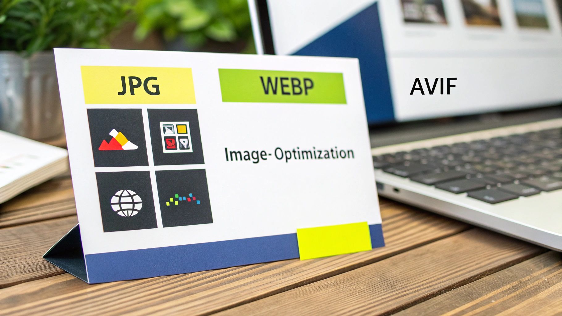
6. Image Format Support and Performance Variations
Image format support and performance variations represent a significant cross-browser compatibility issue that can impact user experience and website performance. This issue arises because different web browsers support a variety of image formats, each with its own level of optimization and performance characteristics. While striving for optimal image quality and fast loading times, developers often encounter challenges in ensuring consistent image display and performance across different browsers and devices. This makes understanding image format support crucial for anyone working on web development, especially for e-commerce platforms like Shopify where visual appeal is paramount.
The core of the problem lies in the evolving landscape of image formats. While traditional formats like JPEG and PNG are universally supported, newer, more efficient formats like WebP, AVIF, and HEIC offer superior compression and quality. These modern formats significantly reduce file sizes, leading to faster page load times and improved user experience. However, their adoption isn't universal. Older browsers may not support these formats, requiring fallback mechanisms to ensure all users can view the images. This introduces complexity in development, requiring developers to create multiple versions of the same image in different formats.
This disparity in browser support necessitates the implementation of fallback strategies, primarily using the <picture> element in HTML. The <picture> element allows developers to specify multiple image sources in different formats, letting the browser choose the most suitable format it supports. This ensures that users with modern browsers benefit from the advanced formats, while those with older browsers still see the image in a supported format, such as JPEG or PNG.
Different browsers also exhibit variations in image decoding and rendering performance. Some browsers might be more efficient at processing certain image formats, leading to discrepancies in page load times. Similarly, inconsistent handling of responsive images using the srcset attribute can further complicate matters. srcset allows specifying different image sizes for different screen resolutions, but its implementation and performance vary across browsers. Variations also exist in how browsers handle lazy loading attributes, affecting when and how images are loaded as users scroll down the page.
The benefits of using modern image formats are compelling. They can significantly reduce file sizes, leading to faster page load times and reduced bandwidth consumption. Features like progressive JPEG support can enhance perceived performance by displaying a lower-quality version of the image first, progressively refining it as it loads. Responsive images, implemented correctly, optimize bandwidth usage by serving appropriately sized images to different devices.
However, these advantages come with trade-offs. Generating multiple image formats adds to the development workflow and requires image optimization tools. These tools, while helpful, can sometimes produce inconsistent results across different platforms. Moreover, managing fallback mechanisms using the <picture> element adds complexity to the HTML structure. Learn more about Image Format Support and Performance Variations
For Shopify merchants, optimizing images is critical for conversion rates and SEO. Large image files can slow down page load times, negatively impacting both user experience and search engine rankings. Therefore, understanding and addressing cross-browser compatibility issues related to images is crucial for success.
Here are some actionable tips for managing image format support and performance variations:
- Utilize the
<picture>element: This allows you to specify multiple image sources with different formats, ensuring compatibility across various browsers. Always include a fallback JPEG or PNG version. - Implement proper
alttext: This is crucial for accessibility, ensuring that users with screen readers or those who have disabled images can understand the content. - Leverage lazy loading: Use the
loading='lazy'attribute to improve initial page load performance by deferring the loading of images until they are near the viewport. - Consider using image CDNs: Content Delivery Networks (CDNs) often offer automatic image optimization and format conversion based on the user's browser, simplifying the process and improving performance.
- Test thoroughly: Test your website across different browsers and devices to ensure consistent image display and performance.
Examples of successful implementation include Google's adoption of the WebP format across Chrome and Android, Netflix's use of AVIF for streaming service thumbnails, and Cloudinary's platform that provides automatic format optimization based on browser support. These examples highlight the importance and effectiveness of addressing image format compatibility for enhanced performance.
This aspect of cross-browser compatibility deserves attention because images are integral to the web experience, especially in e-commerce. Unoptimized images can lead to slow loading times, impacting user engagement and ultimately, sales. By understanding the nuances of image format support and performance variations, developers can create a more seamless and efficient experience for all users, regardless of their browser choice. This is particularly relevant for Shopify merchants, where optimized images are crucial for attracting and retaining customers in a competitive online marketplace.
Cross-Browser Compatibility Issues Comparison
| Issue | Implementation Complexity 🔄 | Resource Requirements ⚡ | Expected Outcomes 📊 | Ideal Use Cases 💡 | Key Advantages ⭐ |
|---|---|---|---|---|---|
| CSS Flexbox and Grid Layout Inconsistencies | Moderate – requires fallbacks and thorough cross-browser testing | Medium – needs testing tools and fallback strategies | Responsive, clean layouts but may break on legacy browsers | Responsive web design needing powerful layout control | Powerful responsive capabilities; cleaner code vs floats |
| JavaScript ES6+ Feature Support Variations | High – requires build tools and transpilation | High – build tools, polyfills increase bundle size | Cleaner, efficient JS with broad cross-browser compatibility | Modern web apps requiring modern JS features | Cleaner code; better debugging; improved performance |
| Font Rendering and Typography Differences | Moderate – needs testing across OS and browsers | Low to Medium – font loading optimization needed | Consistent branding with variable fonts but performance impact | Sites emphasizing typography and branding | Advanced typography features; variable fonts responsiveness |
| DOM API and Event Handling Inconsistencies | High – polyfills and careful event pattern implementations | Medium – requires testing on devices and polyfills | Reliable cross-browser interaction, but debugging can be complex | Interactive apps needing consistent event handling | Powerful APIs; improved interaction; event delegation works |
| CSS Property Support and Vendor Prefixes | Moderate – requires prefix management and progressive enhancement | Low to Medium – tooling like Autoprefixer reduces effort | Consistent visual effects across browsers | Experimental or new CSS feature usage | Early feature adoption; graceful degradation; powerful styling |
| Image Format Support and Performance Variations | Moderate – requires multiple format generation and fallbacks | Medium – image optimization tools and CDNs recommended | Improved page load and bandwidth optimization | Media-heavy sites requiring optimized image delivery | Significant file size reduction; responsive images |
Future-Proofing Your Web Presence
From CSS intricacies like Flexbox and Grid layouts to the nuances of JavaScript ES6+ support, ensuring a consistent user experience across different browsers can feel like navigating a minefield. We've explored key cross-browser compatibility issues, including variations in font rendering, DOM API behaviors, CSS property support, and image format performance. Mastering these concepts is crucial for delivering a seamless experience to every visitor, regardless of their browser choice. This directly impacts your brand's credibility, user engagement, and ultimately, your bottom line.
Addressing these challenges head-on is an investment in the future of your online presence. As technology evolves, so too will the complexities of web development. Automating your workflow can help reduce inconsistencies across different browsers and platforms. For further guidance on building robust pipelines, check out this comprehensive guide on CI/CD pipeline best practices from Pull Checklist. By proactively addressing cross-browser compatibility issues, you not only enhance user satisfaction but also future-proof your website against emerging browser technologies and updates.
A consistent online experience is paramount in today's competitive e-commerce landscape. Partnering with experts in cross-browser compatibility can significantly streamline this process. E-commerce Dev Group specializes in navigating these complexities, ensuring your Shopify store provides a seamless experience for every customer. Visit E-commerce Dev Group to learn how we can help you optimize your site for maximum reach and impact.